
Lists are containers of elements with built-in scrolling and focus.

Principles
Clear Organization: Lists should present information in a clear scannable vertical arrangement.
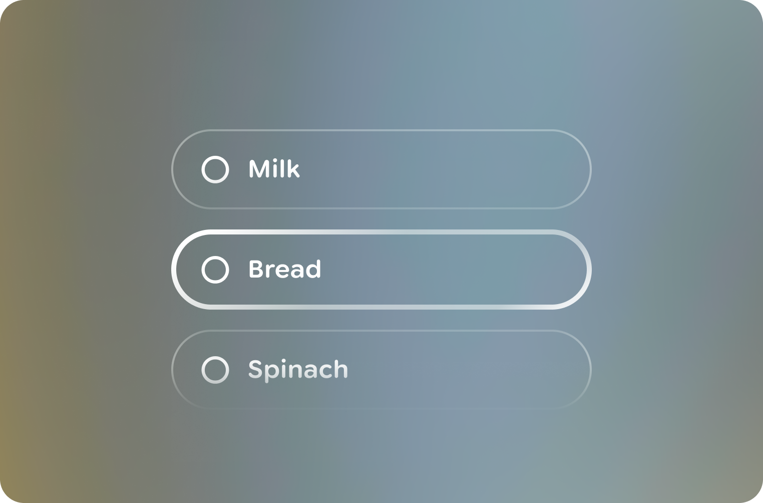
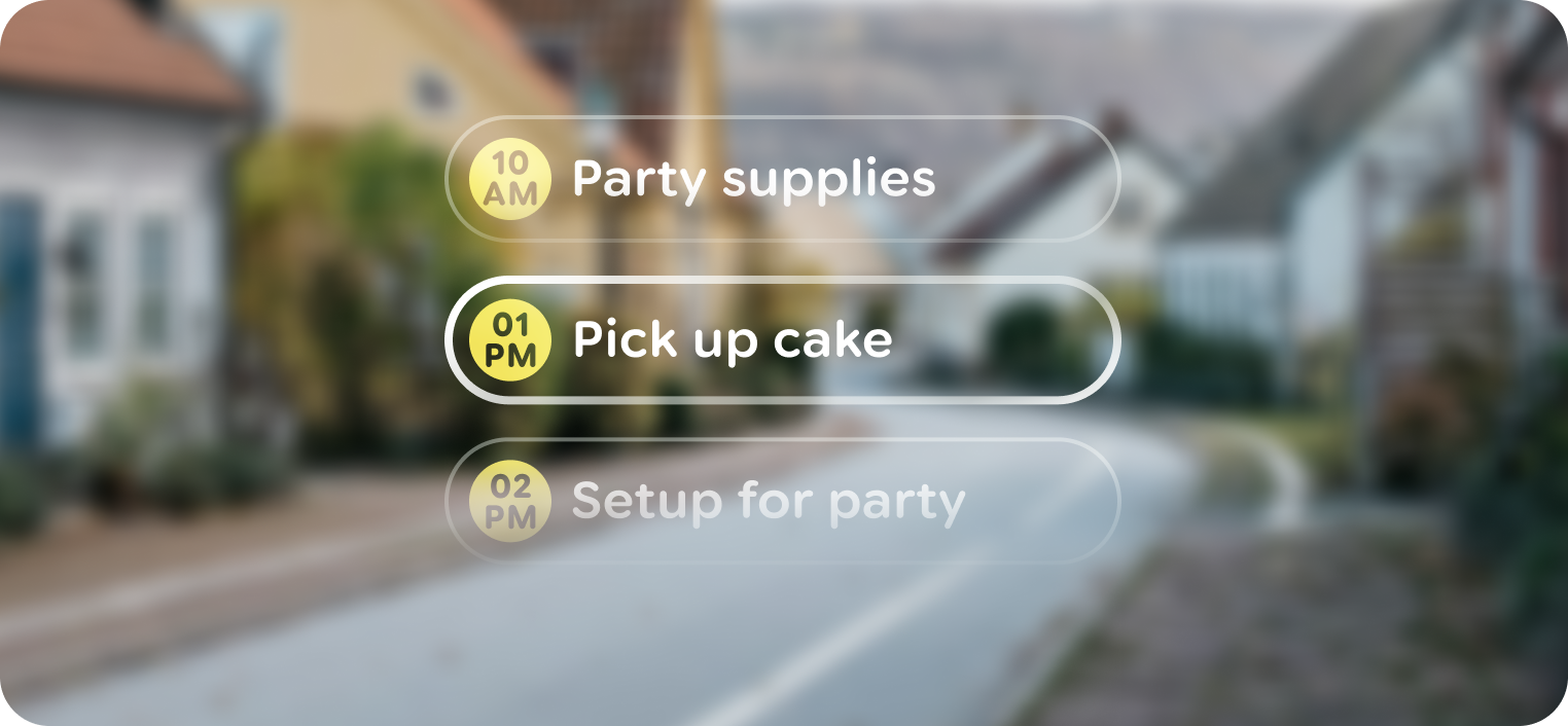
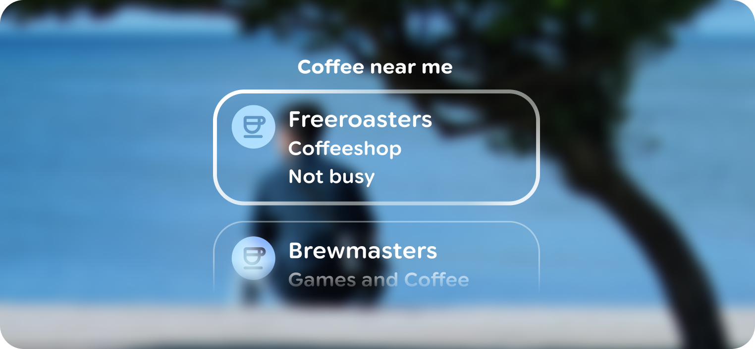
Consistent Item Presentation: List items should follow a consistent visual structure.
Focusability & Navigation: In interfaces relying on directional navigation, lists must clearly indicate the focused item.
Interactivity: List items often represent selectable or actionable elements.
Usage & Placement
Lists can contain various sibling content with repeatable elements. Unlike stacks, lists fill the app view container.
Use scrims to indicate overflow content
When a list contains more items than will fit within a view, a black scrim is used near the list's bounds.
Lists can use a title if necessary
A static or sticky title can be used in a list for clarity.

Don't
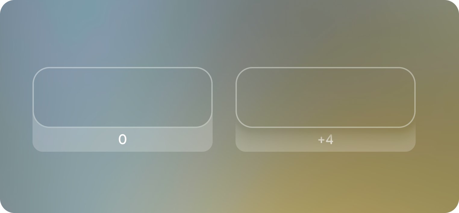 Use depth to indicate focus
List items move between 0 and +4 depth for unfocused and focused states.
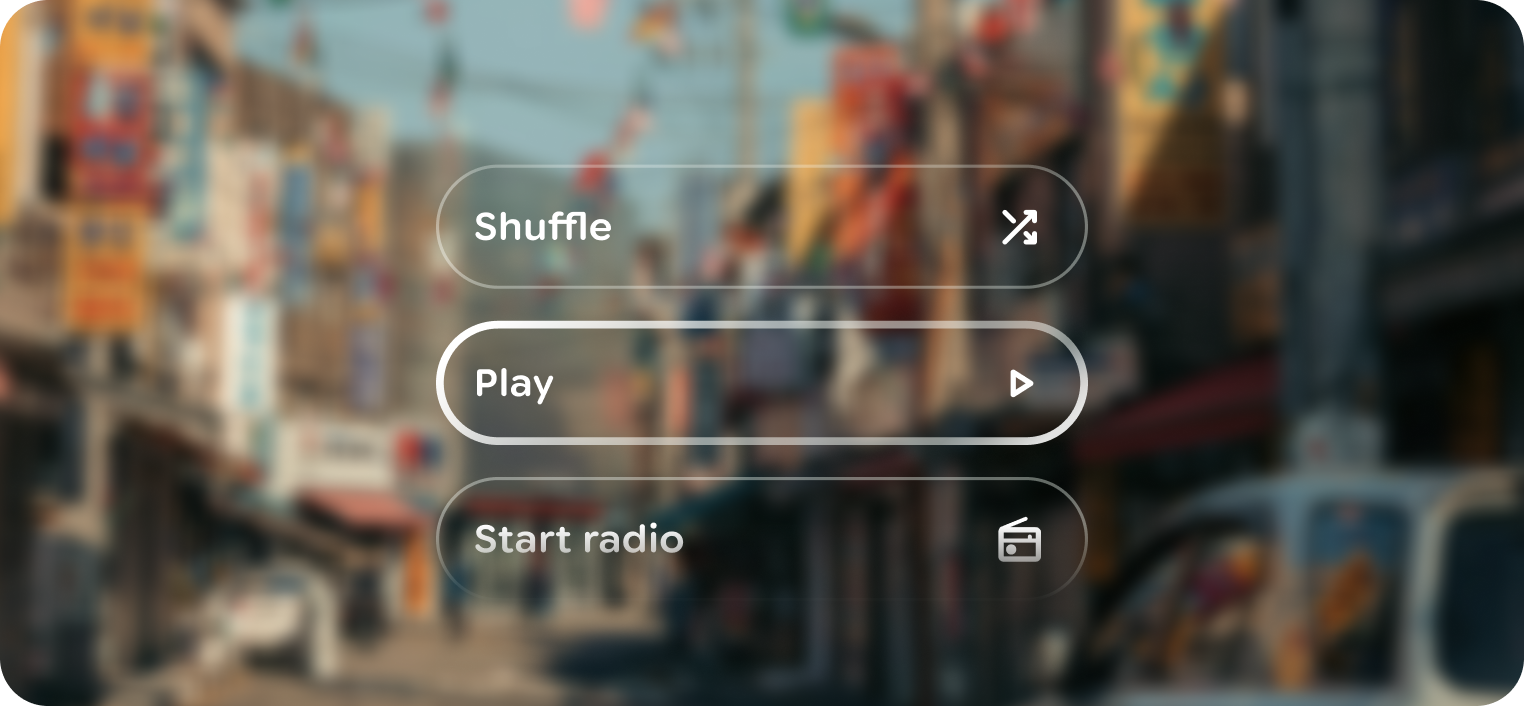
List items can be actionable
Items in a list can act as actions. Keep the action to the list item
Anatomy
List is composed of a scrolling container and consistently spaced list items. Lists should vertically scroll, with minimal overshoot, when the number of items exceeds the viewport.
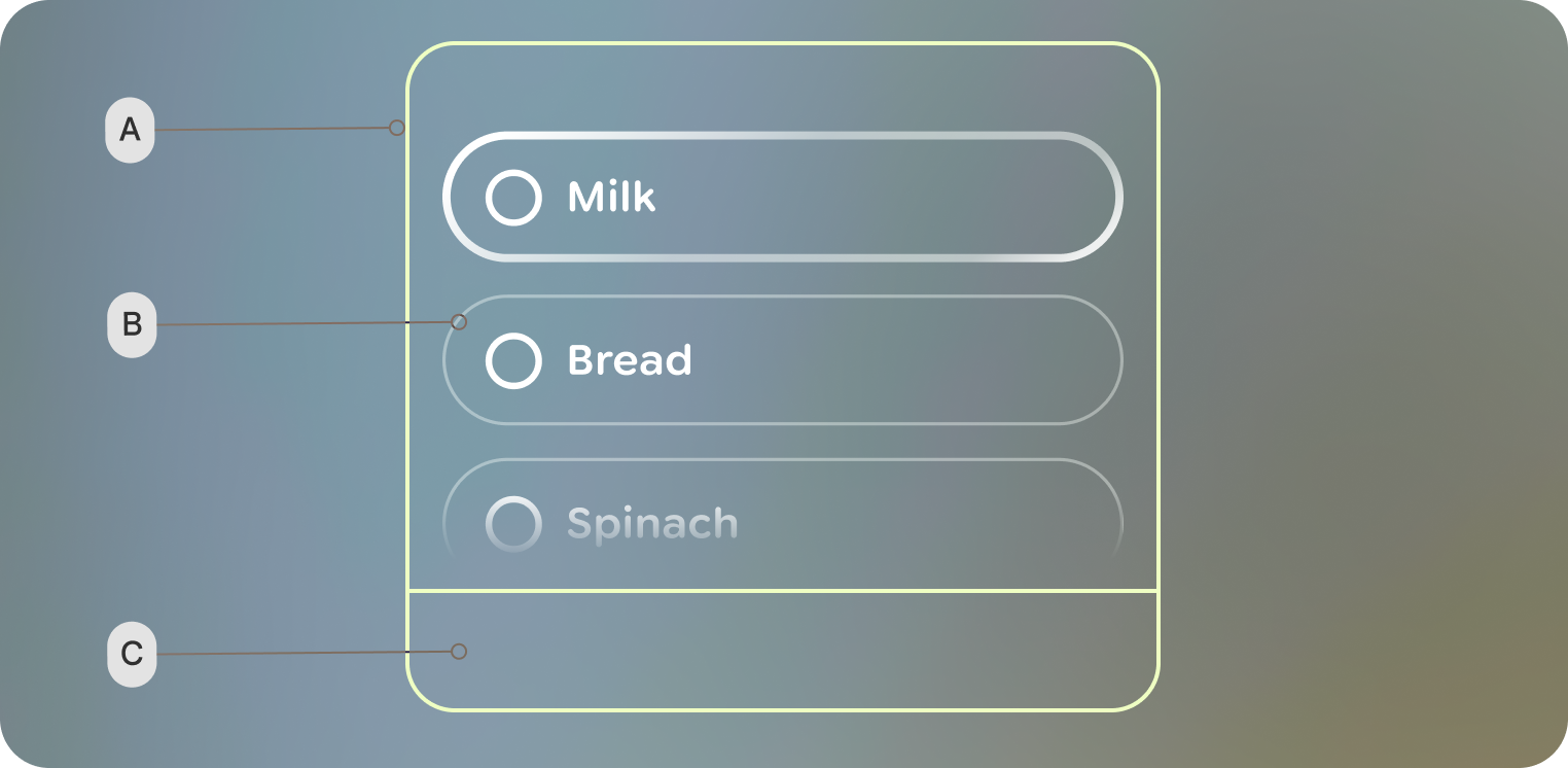 A. Container - scrollable area
B. List item
C. System bars
 List
Item: Each individual element within the list.
List
Item: Each individual element within the list.
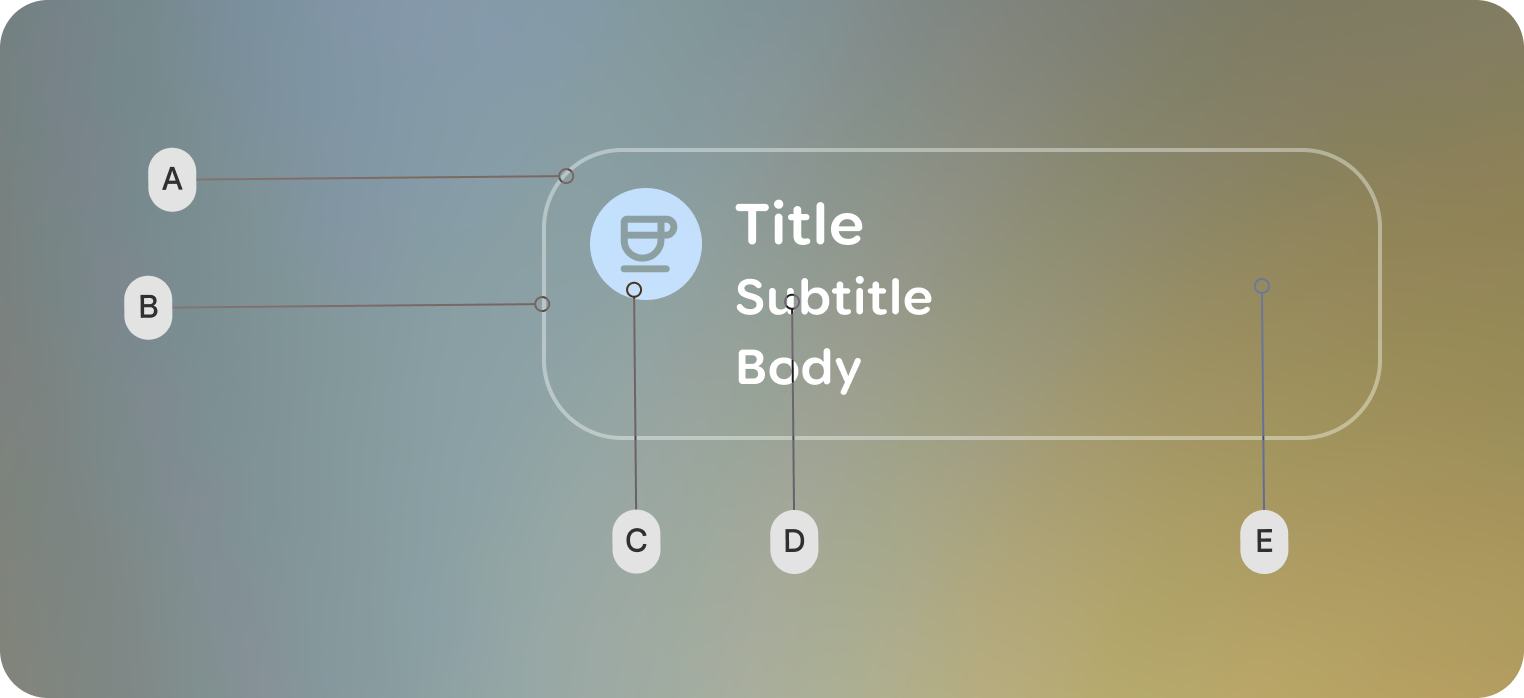
A. Shape
B. Border
C. Leading icon
D. Text content
E. Trailing indicator
Customization
The majority of customization happens with list items.
| Properties | Customization | Defaults |
|---|---|---|
| List item: Shape | Yes | 40 dp |
| List item: Leading and Trailing icon | Yes | Medium Symbol Icon |
| List item: Padding values | Yes | 2d dp, 20 dp |
| List item: Content | Yes | Single-line: One Text composable for the primary label using Body Small Double-line: A Column containing two Text composables for a primary and secondary label Primary: Title Small Secondary: Body Small |
| List: verticalArrangement | Yes | 20 dp |