
1. Before you begin
Compose for TV is the latest UI framework to develop apps that run on Android TV. It unlocks all the benefits of Jetpack Compose for TV apps, which makes it easier to build beautiful and functional UIs for your app. Some specific benefits of Compose for TV include the following:
- Flexibility. Compose can be used to create any type of UI from simple layouts to complex animations. Components work out of the box, but can also be customized and styled to fit your app's needs.
- Simplified and accelerated development. Compose is compatible with existing code and lets developers build apps with less code.
- Intuitiveness: Compose uses a declarative syntax that makes it intuitive to change your UI, and debug, understand, and review your code.
A common use case for TV apps is media consumption. Users browse content catalogs and select the content they want to watch. The content can be a movie, TV show, or podcast. After users select a piece of content, they might want to see more information about it, such as a short description, the playback length, and the names of the creators. In this codelab, you learn how to implement a catalog-browser screen and a details screen with Compose for TV.
Prerequisites
- Experience with Kotlin syntax, including lambdas.
- Basic experience with Compose. If you're unfamiliar with Compose, complete the Jetpack Compose basics codelab.
- Basic knowledge of composables and modifiers.
- Any of the following devices to run the sample app:
- An Android TV device
- An Android virtual device with a profile in the TV device definition category
What you build
- A video-player app with a catalog-browser screen and a details screen.
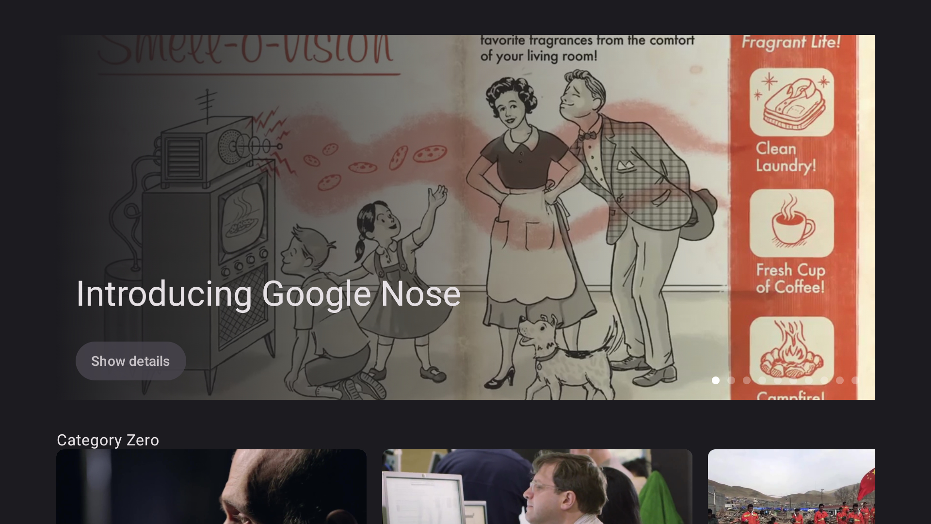
- A catalog-browser screen that shows a list of videos for users to choose. It looks like the following image:
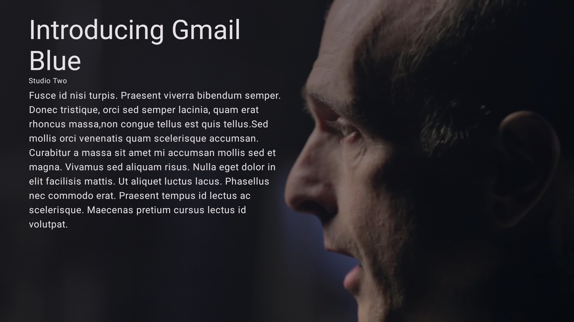
- A details screen that shows the metadata of a selected video, such as the title, description, and length. It looks like the following image:
What you need
- The latest version of Android Studio
- An Android TV device or a virtual device in TV device category
2. Get set up
To get the code that contains theming and basic setup for this codelab, do one of the following:
- Clone the code from this GitHub repository:
$ git clone https://github.com/android/tv-codelabs.git
The main branch contains the starter code and the solution branch contains the solution code.
- Download the
main.zipfile, which contains the starter code, and thesolution.zipfile, which contains the solution code.
Now that you've downloaded the code, open the IntroductionToComposeForTV project folder in Android Studio. You're now ready to get started.
3. Implement the catalog-browser screen
The catalog-browser screen lets users browse movie catalogs. You implement the catalog browser as a composable function. You can find the CatalogBrowser composable function in the CatalogBrowser.kt file. You implement the catalog-browser screen in this composable function.
The starter code has a ViewModel called the CatalogBrowserViewModel class that has several attributes and methods to retrieve Movie objects that describe movie content. You implement a catalog browser with retrieved Movie objects.
CatalogBrowser.kt
@OptIn(ExperimentalTvMaterial3Api::class)
@Composable
fun CatalogBrowser(
    modifier: Modifier = Modifier,
    catalogBrowserViewModel: CatalogBrowserViewModel = hiltViewModel(),
    onMovieSelected: (Movie) -> Unit = {}
) {
}
Display the category names
You can access a list of categories with the catalogBrowserViewModel.categoryList attribute, which is a flow of a Category list. The flow is collected as a Compose State object by calling its collectAsStateWithLifecycle method. A Category object has the name attribute, which is a String value that represents the category name.
To display the category names, follow these steps:
- In Android Studio, open the starter code's
CatalogBrowser.ktfile, and then add aLazyColumncomposable function to theCatalogBrowsercomposable function. - Call the
catalogBrowserViewModel.categoryList.collectAsStateWithLifeCycle()method to collect the flow as aStateobject. - Declare
categoryListas a delegated property of theStateobject that you created in the previous step. - Call the
itemsfunction with thecategoryListvariable as a parameter. - Call the
Textcomposable function with the category name as the parameter that's passed as an argument of the lambda.
CatalogBrowser.kt
@OptIn(ExperimentalTvMaterial3Api::class)
@Composable
fun CatalogBrowser(
    modifier: Modifier = Modifier,
    catalogBrowserViewModel: CatalogBrowserViewModel = hiltViewModel(),
    onMovieSelected: (Movie) -> Unit = {}
) {
    val categoryList by catalogBrowserViewModel.categoryList.collectAsStateWithLifecycle()
    LazyColumn(modifier = modifier) {
        items(categoryList) { category ->
            Text(text = category.name)
        }
    }
}
Display the content list for each category
A Category object has another attribute called movieList. The attribute is a list of Movie objects that represent movies that belong to the category.
To display the content list for each category, follow these steps:
- Add the
LazyRowcomposable function and then pass a lambda to it. - In the lambda, call the
itemsfunction with thecategory.movieListattribute value and then pass a lambda to it. - In the lambda passed to the
itemsfunction, call theMovieCardcomposable function with aMovieobject.
CatalogBrowser.kt
@OptIn(ExperimentalTvMaterial3Api::class)
@Composable
fun CatalogBrowser(
    modifier: Modifier = Modifier,
    catalogBrowserViewModel: CatalogBrowserViewModel = hiltViewModel(),
    onMovieSelected: (Movie) -> Unit = {}
) {
    val categoryList by
    catalogBrowserViewModel.categoryList.collectAsStateWithLifecycle()
    LazyColumn(modifier = modifier) {
        items(categoryList) { category ->
            Text(text = category.name)
            LazyRow {
                items(category.movieList) {movie ->
                    MovieCard(movie = movie)
                }
            }
        }
    }
}
Optional: Adjust the layout
- To set the gap between categories, pass an
Arrangementobject to theLazyColumncomposable function with theverticalArrangementparameter. TheArrangementobject is created by calling theArrangement#spacedBymethod. - To set the gap between movie cards, pass an
Arrangementobject to theLazyRowcomposable function with thehorizontalArrangementparameter. - To set an indentation to the column, pass a
PaddingValueobject with thecontentPaddingparameter.
CatalogBrowser.kt
@OptIn(ExperimentalTvMaterial3Api::class)
@Composable
fun CatalogBrowser(
    modifier: Modifier = Modifier,
    catalogBrowserViewModel: CatalogBrowserViewModel = hiltViewModel(),
    onMovieSelected: (Movie) -> Unit = {}
) {
    val categoryList by
    catalogBrowserViewModel.categoryList.collectAsStateWithLifeCycle()
    LazyColumn(
        modifier = modifier,
        verticalArrangement = Arrangement.spacedBy(16.dp),
        contentPadding = PaddingValues(horizontal = 48.dp, vertical = 32.dp)
    ) {
        items(categoryList) { category ->
            Text(text = category.name)
            LazyRow(
                horizontalArrangement = Arrangement.spacedBy(8.dp)
            ) {
                items(category.movieList) { movie ->
                    MovieCard(movie = movie)
                }
            }
        }
    }
}
4. Implement the details screen
The details screen shows the details of the selected movie. There's a Details composable function in the Details.kt file. You add code to this function to implement the details screen.
Details.kt
@Composable
fun Details(movie: Movie, modifier: Modifier = Modifier) {
}
Display the movie title, studio name, and description
A Movie object has the following three string attributes as metadata of the movie:
title. The movie title.studio. The name of the studio that produced the movie.description. A short summary of the movie.
To show this metadata on the details screen, follow these steps:
- Add a
Columncomposable function, and then set 32 dp vertical and 48 dp horizontal clearance around the column with theModifierobject created by theModifier.paddingmethod. - Add a
Textcomposable function to display the movie title. - Add a
Textcomposable function to display the studio name. - Add a
Textcomposable function to display the movie description.
Details.kt
@Composable
fun Details(movie: Movie, modifier: Modifier = Modifier) {
    Column(
        modifier = Modifier
            .padding(vertical = 32.dp, horizontal = 48.dp)
    ) {
        Text(text = movie.title)
        Text(text = movie.studio)
        Text(text = movie.description)
    }
}
The Modifier object specified in the parameter of the Details composable function is used in the next task.
Display the background image associated with a given Movie object
A Movie object has a backgroundImageUrl attribute that indicates the location of the background image for the movie described by the object.
To display the background image for a given movie, follow these steps:
- Add a
Boxcomposable function as a wrapper of theColumncomposable function with themodifierobject passed through theDetailscomposable function. - In the
Boxcomposable function, call thefillMaxSizemethod of themodifierobject to make theBoxcomposable function fill the maximum size that can be allocated to theDetailscomposable function. - Add an
AsyncImagecomposable function with the following parameters to theBoxcomposable function:
- Set the
backgroundImageUrlattribute's value of the givenMovieobject to amodelparameter. - Pass
nullto acontentDescriptionparameter.
- Pass a
ContentScale.Cropobject to acontentScaleparameter. To see the differentContentScaleoptions, see Content scale. - Pass the return value of the
Modifier.fillMaxSizemethod to themodifierparameter.
Details.kt
@Composable
fun Details(movie: Movie, modifier: Modifier = Modifier) {
    Box(modifier = modifier.fillMaxSize()) {
        AsyncImage(
            model = movie.cardImageUrl,
            contentDescription = null,
            contentScale = ContentScale.Crop,
            modifier = Modifier.fillMaxSize()
        )
        Column {
            Text(
                text = movie.title,
            )
            Text(
                text = movie.studio,
            )
            Text(text = movie.description)
        }
    }
}
Refer to the MaterialTheme object for consistent theming
The MaterialTheme object contains functions to reference current theme values, such as those in the Typography and ColorScheme classes.
To refer to the MaterialTheme object for consistent theming, follow these steps:
- Set the
MaterialTheme.typography.displayMediumproperty to the text style of the movie title. - Set the
MaterialTheme.typography.bodySmallproperty to the text style of the secondTextcomposable functions. - Set the
MaterialTheme.colorScheme.backgroundproperty to the background color of theColumncomposable function with theModifier.backgroundmethod.
Details.kt
@Composable
fun Details(movie: Movie, modifier: Modifier = Modifier) {
    Box(modifier = modifier.fillMaxSize()) {
        AsyncImage(
            model = movie.cardImageUrl,
            contentDescription = null,
            contentScale = ContentScale.Crop,
            modifier = Modifier.fillMaxSize()
        )
        Column(
            modifier = Modifier
                .background(MaterialTheme.colorScheme.background),
        ) {
            Text(
                text = movie.title,
                style = MaterialTheme.typography.displayMedium,
            )
            Text(
                text = movie.studio,
                style = MaterialTheme.typography.bodySmall,
            )
            Text(text = movie.description)
        }
    }
}
Optional: Adjust layout
To adjust layout of the Details composable function, follow these steps:
- Set the
Boxcomposable function to use the entire available space with thefillMaxSizemodifier - Set the background of the
Boxcomposable function with with thebackgroundmodifier to fill the background with a linear gradient that is created by callingBrush.linearGradientfunction with a list ofColorobjects containingMaterialTheme.colorScheme.backgroundvalue andColor.Transparent - Set the
48.dphorizontal and24.dpvertical clearance around theColumncomposable function with thepaddingModifier - Set the with of the
Columncomposable function with thewidthmodifier that is created by callingModifier.widthfunction with0.5fvalue - Add the
8.dpspace between the secondTextcomposable function and the thirdTextcomposable withSpacer. The height of theSpacercomposable function is specified with theheightmodifier that is created withModifier.heightfunction
Details.kt
@Composable
fun Details(movie: Movie, modifier: Modifier = Modifier) {
    Box(modifier = modifier.fillMaxSize()) {
        AsyncImage(
            model = movie.cardImageUrl,
            contentDescription = null,
            contentScale = ContentScale.Crop,
            modifier = Modifier.fillMaxSize()
        )
        Box(
            modifier = Modifier
                .background(
                    Brush.linearGradient(
                        listOf(
                            MaterialTheme.colorScheme.background,
                            Color.Transparent
                        )
                    )
                )
                .fillMaxSize()
        ) {
            Column(
                modifier = Modifier
                    .padding(horizontal = 48.dp, vertical = 24.dp)
                    .fillMaxWidth(0.5f)
            ) {
                Text(
                    text = movie.title,
                    style = MaterialTheme.typography.displayMedium,
                )
                Text(
                    text = movie.studio,
                    style = MaterialTheme.typography.bodySmall,
                )
                Spacer(modifier = Modifier.height(8.dp))
                Text(
                    text = movie.description,
                )
            }
        }
    }
}
5. Add navigation between the screens
Now you have the catalog-browser and details screens. After a user selects content on the catalog-browser screen, the screen must transition to the details screen. To make this possible, you use the clickable modifier to add an event listener to the MovieCard composable function. When the center button of the directional pad is pressed, the CatalogBrowserViewModel#showDetails method is called with the movie object associated with the MovieCard composable function as an argument.
- Open the
com.example.tvcomposeintroduction.ui.screens.CatalogBrowserfile. - Pass a lambda function to the
MovieCardcomposable function with anonClickparameter. - Call the
onMovieSelectedcallback with the movie object associated with theMovieCardcomposable function.
CatalogBrowser.kt
@Composable
fun CatalogBrowser(
    modifier: Modifier = Modifier,
    catalogBrowserViewModel: CatalogBrowserViewModel = hiltViewModel(),
    onMovieSelected: (Movie) -> Unit = {}
) {
    val categoryList by
    catalogBrowserViewModel.categoryList.collectAsStateWithLifecycle()
    LazyColumn(
        modifier = modifier,
        verticalArrangement = Arrangement.spacedBy(16.dp),
        contentPadding = PaddingValues(horizontal = 48.dp, vertical = 32.dp)
    ) {
        items(categoryList) { category ->
            Text(text = category.name)
            LazyRow(
                horizontalArrangement = Arrangement.spacedBy(8.dp)
            ) {
                items(category.movieList) { movie ->
                    MovieCard(movie = movie, onClick = { onMovieSelected(movie) })
                }
            }
        }
    }
}
6. Add a carousel to the catalog-browser screen to highlight featured content
Carousel is a commonly adapted UI component that automatically updates its slides after a specified duration. It's commonly used to highlight featured content.
To add a carousel to the catalog-browser screen to highlight movies in the featured content list, follow these steps:
- Open the
com.example.tvcomposeintroduction.ui.screens.CatalogBrowserfile. - Call the
itemfunction to add an item to theLazyColumncomposable function. - Declare
featuredMovieListas a delegated property in the lambda passed to theitemfunction and then set theStateobject to be delegated, which is collected from thecatalogBrowserViewModel.featuredMovieListattribute. - Call the
Carouselcomposable function inside theitemfunction and then pass in the following parameters:
- The size of the
featuredMovieListvariable through aslideCountparameter. - A
Modifierobject to specify carousel size with theModifier.fillMaxWidthandModifier.heightmethods. TheCarouselcomposable function uses 376 dp of the height by passing a376.dpvalue to theModifier.heightmethod. - A lambda called with an integer value that indicates the index of the visible carousel item.
- Retrieve the
Movieobject from thefeaturedMovieListvariable and the given index value. - Add a
Boxcomposable function to theCarouselcomposable function. - Add a
Textcomposable function to theBoxcomposable function to display the movie title.
CatalogBrowser.kt
@OptIn(ExperimentalTvMaterial3Api::class)
@Composable
fun CatalogBrowser(
    modifier: Modifier = Modifier,
    catalogBrowserViewModel: CatalogBrowserViewModel = hiltViewModel(),
    onMovieSelected: (Movie) -> Unit = {}
) {
    val categoryList by
    catalogBrowserViewModel.categoryList.collectAsStateWithLifecycle()
    LazyColumn(
        modifier = modifier,
        verticalArrangement = Arrangement.spacedBy(16.dp),
        contentPadding = PaddingValues(horizontal = 48.dp, vertical = 32.dp)
    ) {
        item {
            val featuredMovieList by catalogBrowserViewModel.featuredMovieList.collectAsStateWithLifecycle()
            Carousel(
                slideCount = featuredMovieList.size,
                modifier = Modifier
                    .fillMaxWidth()
                    .height(376.dp)
            ) { indexOfCarouselSlide ->
                val featuredMovie =
                    featuredMovieList[indexOfCarouselSlide]
                Box {
                    Text(text = featuredMovie.title)
                }
            }
        }
        items(categoryList) { category ->
            Text(text = category.name)
            LazyRow(
                horizontalArrangement = Arrangement.spacedBy(8.dp)
            ) {
                items(category.movieList) { movie ->
                    MovieCard(movie = movie, onClick = { onMovieSelected(movie) })
                }
            }
        }
    }
}
Display background images
Box composable function puts one component on top of another. Refer to Layout basics for details.
To display background images, follow these steps:
- Call the
AsyncImagecomposable function to load the background image associated with theMovieobject before theTextcomposable function. - Update the position and text style of the
Textcomposable function for better visibility. - Set a placeholder to the
AsyncImagecomposable function to avoid layout shift. The starter code has a placeholder as a drawable that you can reference with theR.drawable.placeholder.
CatalogBrowser.kt
@OptIn(ExperimentalTvMaterial3Api::class)
@Composable
fun CatalogBrowser(
    modifier: Modifier = Modifier,
    catalogBrowserViewModel: CatalogBrowserViewModel = hiltViewModel(),
    onMovieSelected: (Movie) -> Unit = {}
) {
    val categoryList by
    catalogBrowserViewModel.categoryList.collectAsStateWithLifecycle()
    LazyColumn(
        modifier = modifier,
        verticalArrangement = Arrangement.spacedBy(16.dp),
        contentPadding = PaddingValues(horizontal = 48.dp, vertical = 32.dp)
    ) {
        item {
            val featuredMovieList by catalogBrowserViewModel.featuredMovieList.collectAsStateWithLifecycle()
            Carousel(
                slideCount = featuredMovieList.size,
                modifier = Modifier
                    .fillMaxWidth()
                    .height(376.dp),
            ) { indexOfCarouselItem ->
                val featuredMovie = featuredMovieList[indexOfCarouselItem]
                Box{
                    AsyncImage(
                        model = featuredMovie.backgroundImageUrl,
                        contentDescription = null,
                        placeholder = painterResource(
                            id = R.drawable.placeholder
                        ),
                        contentScale = ContentScale.Crop,
                        modifier = Modifier.fillMaxSize(),
                    )
                    Text(text = featuredMovie.title)
                }
            }
        }
        items(categoryList) { category ->
            Text(text = category.name)
            LazyRow(
                horizontalArrangement = Arrangement.spacedBy(8.dp)
            ) {
                items(category.movieList) { movie ->
                    MovieCard(movie = movie, onClick = { onMovieSelected(movie) })
                }
            }
        }
    }
}
Add a screen transition to the details screen
You can add a Button to the carousel so that users can trigger a screen transition to the details screen by clicking the button.
To let users see the details of the movie in the visible carousel on the details screen, follow these steps:
- Call
Columncomposable function in theBoxcomposable in theCarouselcomposable - Move the
Textcomposable in theCarouselto theColumncomposable function - Call
Buttoncomposable function after theTextcomposable function in theColumncomposable function - Call
Textcomposable function in theButtoncomposable function with the return value ofstringResourcefunction called withR.string.show_details. - Call the
onMovieSelectedfunction with thefeaturedMovievariable in the lambda passed to theonClickparameter of theButtoncomposable function
CatalogBrowser.kt
@OptIn(ExperimentalTvMaterial3Api::class)
@Composable
fun CatalogBrowser(
    modifier: Modifier = Modifier,
    catalogBrowserViewModel: CatalogBrowserViewModel = hiltViewModel(),
    onMovieSelected: (Movie) -> Unit = {}
) {
    val categoryList by
    catalogBrowserViewModel.categoryList.collectAsStateWithLifecycle()
    LazyColumn(
        modifier = modifier,
        verticalArrangement = Arrangement.spacedBy(16.dp),
        contentPadding = PaddingValues(horizontal = 48.dp, vertical = 32.dp)
    ) {
        item {
            val featuredMovieList by catalogBrowserViewModel.featuredMovieList.collectAsStateWithLifecycle()
            Carousel(
                slideCount = featuredMovieList.size,
                modifier = Modifier
                    .fillMaxWidth()
                    .height(376.dp),
            ) { indexOfCarouselItem ->
                val featuredMovie = featuredMovieList[indexOfCarouselItem]
                Box {
                    AsyncImage(
                        model = featuredMovie.backgroundImageUrl,
                        contentDescription = null,
                        placeholder = painterResource(
                            id = R.drawable.placeholder
                        ),
                        contentScale = ContentScale.Crop,
                        modifier = Modifier.fillMaxSize(),
                    )
                    Column {
                        Text(text = featuredMovie.title)
                        Button(onClick = { onMovieSelected(featuredMovie) }) {
                            Text(text = stringResource(id = R.string.show_details))
                        }
                    }
                }
            }
        }
        items(categoryList) { category ->
            Text(text = category.name)
            LazyRow(
                horizontalArrangement = Arrangement.spacedBy(8.dp)
            ) {
                items(category.movieList) { movie ->
                    MovieCard(movie = movie, onClick = { onMovieSelected(movie) })
                }
            }
        }
    }
}
Optional: Adjust the layout
To adjust the layout of the carousel, follow these steps:
- Assign
backgroundColorvalue withMaterialTheme.colorScheme.backgroundvalue in theCarouselcomposable function - Wrap the
Columncomposable function with aBoxcomposable - Pass
Alignment.BottomStartvalue to thecontentAlignmentparameter of theBoxcomponent. - Pass the
fillMaxSizemodifier to the modifier parameter of theBoxcomposable function. ThefillMaxSizemodifier is created withModifier.fillMaxSize()function. - Call the
drawBehind()method over thefillMaxSizemodifier passed to theBoxcomposable - In the lambda passed to the
drawBehindmodifier, assignbrushvalue with aBrushobject that is created by callingBrush.linearGradientfunction with a list of twoColorobject. The list is created by callinglistOffunction withbackgroundColorvalue andColor.Transparentvalue. - Call
drawRectwith thebrushobject in the lambda passed to thedrawBehindmodifier to make a srim layer over the background image - Specify the padding of the
Columncomposable function with thepaddingmodifier that is created by callingModifier.paddingwith20.dpvalue. - Add a
Spacercomposable function with20.dpvalue between theTextcomposable and theButtoncomposable in theColumncomposable function
CatalogBrowser.kt
@OptIn(ExperimentalTvMaterial3Api::class)
@Composable
fun CatalogBrowser(
    modifier: Modifier = Modifier,
    catalogBrowserViewModel: CatalogBrowserViewModel = hiltViewModel(),
    onMovieSelected: (Movie) -> Unit = {}
) {
    val categoryList by catalogBrowserViewModel.categoryList.collectAsStateWithLifecycle()
    LazyColumn(
        modifier = modifier,
        verticalArrangement = Arrangement.spacedBy(32.dp),
        contentPadding = PaddingValues(horizontal = 58.dp, vertical = 36.dp)
    ) {
        item {
            val featuredMovieList by
            catalogBrowserViewModel.featuredMovieList.collectAsStateWithLifecycle()

            Carousel(
                itemCount = featuredMovieList.size,
                modifier = Modifier
                    .fillMaxWidth()
                    .height(376.dp),
            ) { indexOfCarouselItem ->
                val featuredMovie = featuredMovieList[indexOfCarouselItem]
                val backgroundColor = MaterialTheme.colorScheme.background

                Box {
                    AsyncImage(
                        model = featuredMovie.backgroundImageUrl,
                        contentDescription = null,
                        placeholder = painterResource(
                            id = R.drawable.placeholder
                        ),
                        contentScale = ContentScale.Crop,
                        modifier = Modifier.fillMaxSize(),
                    )
                    Box(
                        contentAlignment = Alignment.BottomStart,
                        modifier = Modifier
                            .fillMaxSize()
                            .drawBehind {
                                val brush = Brush.horizontalGradient(
                                    listOf(backgroundColor, Color.Transparent)
                                )
                                drawRect(brush)
                            }
                    ) {
                        Column(
                            modifier = Modifier.padding(20.dp)
                        ) {
                            Text(
                                text = featuredMovie.title,
                                style = MaterialTheme.typography.displaySmall
                            )
                            Spacer(modifier = Modifier.height(28.dp))
                            Button(onClick = { onMovieSelected(featuredMovie) }) {
                                Text(text = stringResource(id = R.string.show_details))
                            }
                        }
                    }
                }
            }
        }
        items(categoryList) { category ->
            Text(text = category.name)
            LazyRow(
                horizontalArrangement = Arrangement.spacedBy(16.dp),
                modifier = Modifier.height(200.dp)
            ) {
                items(category.movieList) { movie ->
                    MovieCard(
                        movie,
                        onClick = {
                            onMovieSelected(it)
                        }
                    )
                }
            }
        }
    }
}
7. Get the solution code
To download the solution code for this codelab, do one of the following:
- Click the following button to download it as a zip file, and then unzip it and open it in Android Studio.
- Retrieve it with Git:
$ git clone https://github.com/android/tv-codelabs.git
$ cd tv-codelabs
$ git checkout solution
$ cd IntroductionToComposeForTV
8. Congratulations.
Congratulations! You learned the basics of Compose for TV:
- How to implement a screen to show a content list by combining LazyColumn and LazyLow.
- Basic screen implementation to show content details.
- How to add screen transitions between the two screens.