
如要為應用程式提供資訊方塊,請把下列依附元件加入應用程式的 build.gradle 檔案內。
Groovy
dependencies {
    // Use to implement support for wear tiles
    implementation "androidx.wear.tiles:tiles:1.6.0"

    // Use to utilize standard components and layouts in your tiles
    implementation "androidx.wear.protolayout:protolayout:1.4.0"

    // Use to utilize components and layouts with Material Design in your tiles
    implementation "androidx.wear.protolayout:protolayout-material:1.4.0"

    // Use to include dynamic expressions in your tiles
    implementation "androidx.wear.protolayout:protolayout-expression:1.4.0"

    // Use to preview wear tiles in your own app
    debugImplementation "androidx.wear.tiles:tiles-renderer:1.6.0"

    // Use to fetch tiles from a tile provider in your tests
    testImplementation "androidx.wear.tiles:tiles-testing:1.6.0"
}
Kotlin
dependencies {
    // Use to implement support for wear tiles
    implementation("androidx.wear.tiles:tiles:1.6.0")

    // Use to utilize standard components and layouts in your tiles
    implementation("androidx.wear.protolayout:protolayout:1.4.0")

    // Use to utilize components and layouts with Material Design in your tiles
    implementation("androidx.wear.protolayout:protolayout-material:1.4.0")

    // Use to include dynamic expressions in your tiles
    implementation("androidx.wear.protolayout:protolayout-expression:1.4.0")

    // Use to preview wear tiles in your own app
    debugImplementation("androidx.wear.tiles:tiles-renderer:1.6.0")

    // Use to fetch tiles from a tile provider in your tests
    testImplementation("androidx.wear.tiles:tiles-testing:1.6.0")
}
核心概念
資訊方塊的建構方式與 Android 應用程式不同,且使用不同的概念:
- 版面配置範本:定義螢幕上視覺元素的整體排列方式。這項作業是由
primaryLayout()函式完成。 - 版面配置元素:代表個別圖形元素,例如按鈕或資訊卡,或使用資料欄、buttonGroup 或類似項目分組的多個這類元素。這些元素會嵌入版面配置範本中。
- 資源:
ResourceBuilders.Resources物件包含 Android 資源 (圖片) 的鍵/值對應對應,用於算繪版面配置,以及版本。 - 時間軸:
TimelineBuilders.Timeline物件是一或多個版面配置物件的執行個體清單。您可以提供各種機制和運算式,指出轉譯器應從一個版面配置物件切換至另一個物件的時間,例如在特定時間停止顯示版面配置。 - 狀態:
StateBuilders.State類型的資料結構,會在動態磚和應用程式之間傳遞,讓這兩個元件彼此通訊。舉例來說,如果使用者輕觸動態磚上的按鈕,狀態會保留按鈕的 ID。您也可以使用對應表交換資料類型。 - 動態磚:代表動態磚的
TileBuilders.Tile物件,包含時間軸、資源版本 ID、更新間隔和狀態。 - Protolayout:這個字詞會出現在各種與動態磚相關的類別名稱中,並參照 Wear OS Protolayout 程式庫,這是用於各種 Wear OS 介面的圖形程式庫。
建立資訊方塊
如要從應用程式提供動態磚,請實作 TileService 類型的服務,並在資訊清單中註冊。因此,系統會在呼叫 onTileRequest() 時要求必要的圖塊,並在呼叫 onTileResourcesRequest() 時要求資源。
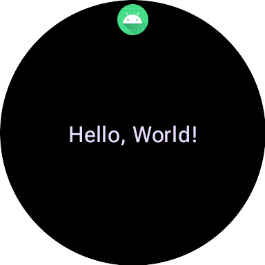
class MyTileService : TileService() { override fun onTileRequest(requestParams: RequestBuilders.TileRequest) = Futures.immediateFuture( Tile.Builder() .setResourcesVersion(RESOURCES_VERSION) .setTileTimeline( Timeline.fromLayoutElement( materialScope(this, requestParams.deviceConfiguration) { primaryLayout( mainSlot = { text("Hello, World!".layoutString, typography = BODY_LARGE) } ) } ) ) .build() ) override fun onTileResourcesRequest(requestParams: ResourcesRequest) = Futures.immediateFuture(Resources.Builder().setVersion(RESOURCES_VERSION).build()) }
接下來,請在 AndroidManifest.xml 檔案的 <application> 標記內新增服務。
<service android:name=".snippets.m3.tile.MyTileService" android:label="@string/tile_label" android:description="@string/tile_description" android:icon="@mipmap/ic_launcher" android:exported="true" android:permission="com.google.android.wearable.permission.BIND_TILE_PROVIDER"> <intent-filter> <action android:name="androidx.wear.tiles.action.BIND_TILE_PROVIDER" /> </intent-filter> <meta-data android:name="androidx.wear.tiles.PREVIEW" android:resource="@drawable/tile_preview" /> </service>
權限和意圖篩選器會將此服務註冊為資訊方塊提供者。
當使用者透過手機或手錶設定資訊方塊時,可看到圖示、標籤、說明和預覽資源。請注意,預覽資源支援所有 Android 的標準資源限定詞,因此可以根據螢幕大小和裝置語言等因素,調整預覽畫面。如需其他建議,請參閱預覽檢查清單。
部署應用程式,然後將資訊方塊新增至資訊方塊輪播介面 (還有更方便開發人員預覽資訊方塊的方式,但目前請手動操作)。
如需完整範例,請參閱 GitHub 上的程式碼範例或程式碼研究室。
建立資訊方塊 UI
Material 3 Expressive UI 元素是採用結構化方法建立,並以 Kotlin 的型別安全建構工具模式為基礎。
版面配置
如需瞭解如何根據設計原則建立有效率的回應式資訊方塊版面配置,請參閱「資訊方塊的常見版面配置」。
如要建立版面配置,請按照下列步驟操作:
啟動 Material Design 範圍:呼叫
materialScope()函式,並提供必要的context和deviceConfiguration。您可以加入選用參數,例如allowDynamicTheme和defaultColorScheme。allowDynamicTheme預設為true,而defaultColorScheme則代表動態色彩無法使用時 (例如使用者已關閉這項功能,或裝置不支援這項功能,或allowDynamicTheme為false時) 使用的ColorScheme。在範圍內建構 UI:特定動態磚版面配置的所有 UI 元件,都必須在單一頂層 materialScope() 呼叫的 lambda 中定義。這些元件函式 (例如
primaryLayout()和textEdgeButton()) 是MaterialScope的擴充函式,且只有在呼叫這個接收器範圍時才能使用。materialScope( context = context, deviceConfiguration = requestParams.deviceConfiguration, // requestParams is passed to onTileRequest defaultColorScheme = myFallbackColorScheme ) { // inside the MaterialScope, you can call functions like primaryLayout() primaryLayout( titleSlot = { text(text = "Title".layoutString) }, mainSlot = { text(text = "Main Content".layoutString) }, bottomSlot = { textEdgeButton( labelContent = { text("Action".layoutString) }, onClick = clickable() ) } ) }
運算單元
在 M3 中,圖塊版面配置採用 Compose 風格的做法,使用三種不同的插槽。由上而下分別為:
titleSlot,通常用於主要標題或標頭。- 核心內容的
mainSlot。 bottomSlot,通常用於動作或補充資訊。邊緣按鈕也會顯示在這裡。
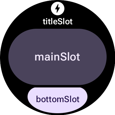
每個時段的內容如下:
titleSlot(選用):通常是text()生成的幾個字詞。mainSlot(必要):元件會整理成結構,例如資料列、資料欄和按鈕群組。這些元件也可以互相遞迴內嵌,例如資料欄可以包含資料列。bottomSlot(選用):通常會填入緊貼邊緣的按鈕或文字標籤。
由於無法捲動動態磚,因此沒有分頁、捲動或處理長內容清單的元件。請注意,字型大小增加或翻譯後文字變長時,內容是否仍可見。
UI 元件
protolayout-material3 程式庫提供大量元件,這些元件是根據 Material 3 Expressive 規格和使用者介面建議事項設計而成。
按鈕
按鈕主要以動作為導向,這些服務用於觸發特定動作。每個按鈕的內容 (例如圖示或簡短文字) 會識別動作。
- textButton():按鈕,單一版位可放置 (簡短) 文字內容
- iconButton():按鈕,具有代表圖示的單一版位
- avatarButton():藥丸形狀的顯示圖片按鈕,最多可提供三個位置,用來放置代表垂直堆疊標籤和次要標籤的內容,以及旁邊的圖片 (顯示圖片)
- imageButton():可點選的圖片按鈕,不提供額外位置,只有圖片 (例如
backgroundImage做為背景) - compactButton():精簡按鈕,最多提供兩個版位,可擷取代表圖示和旁邊文字的水平堆疊內容
- button():藥丸形按鈕,最多可提供三個版位,擷取代表垂直堆疊標籤和次要標籤的內容,以及旁邊的圖示
邊緣按鈕
邊緣按鈕是專用的全寬按鈕,錨定在智慧手錶圓形螢幕底部,代表目前動態磚畫面中最重要的動作。
- iconEdgeButton():邊緣按鈕,提供單一版位,可擷取圖示或類似的圓形小型內容
- textEdgeButton():邊緣按鈕,提供單一版位,可擷取文字或類似長度和寬度的內容
資訊卡
資訊卡主要以資訊為導向,這類資料庫會顯示相關的結構化資料集合。雖然你可以建立互動式資訊卡,但這類資訊卡通常只會顯示資訊摘要,使用者輕觸後即可查看更多詳細資料或執行相關動作。
- titleCard():片頭字幕,提供一到三個位置,通常以文字為主
- appCard():應用程式資訊卡,最多提供五個位置,通常以文字為主
- textDataCard():資料卡,最多可提供三個直向堆疊的欄位,通常以文字或數字為主
- iconDataCard():資料卡,最多可提供三個直向堆疊的欄位,通常是文字或數字,並附上圖示
- graphicDataCard():圖形資料資訊卡,提供圖形資料的插槽 (例如進度指標),以及最多兩個垂直堆疊的插槽 (通常用於文字說明)
進度指標
- circularProgressIndicator():使用放射狀元素顯示目標達成進度
- segmentedCircularProgressIndicator():使用具有不同階段的放射狀元素,顯示目標達成進度
群組版面配置元素
- buttonGroup():元件版面配置,可將子項以水平順序排列
- primaryLayout():全螢幕版面配置,代表建議使用的 M3 版面配置樣式,可回應並處理元素的位置,同時套用建議的邊界和邊框間距
套用主題
在 Material 3 Expressive 中,色彩系統是由 29 個標準顏色角色定義,並分為六組:主要、次要、第三重要、錯誤、表面和外框。
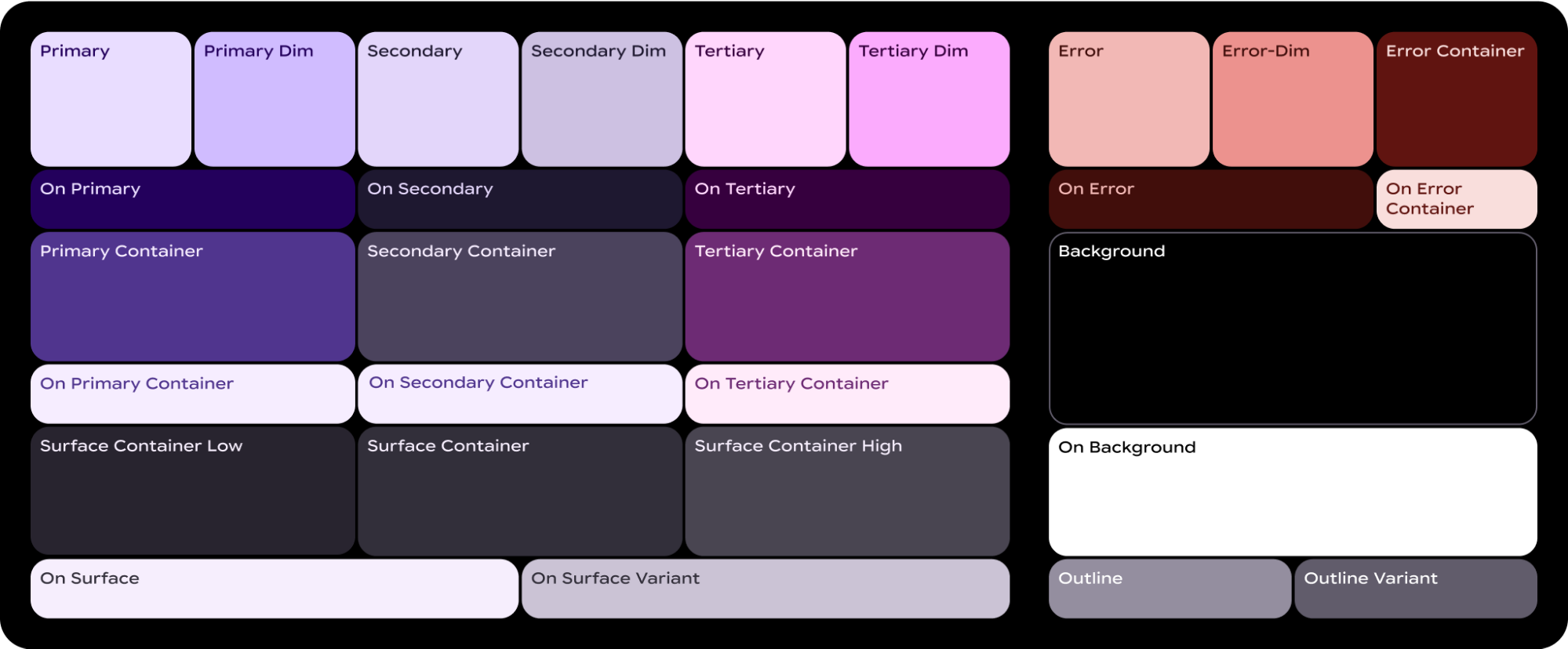
ColorScheme 會將這 29 個角色分別對應至相應的顏色,由於這是 MaterialScope 的一部分,且元件必須在其中建立,因此會自動從配置中取得顏色。這樣一來,所有 UI 元素都會自動遵循 Material Design 標準。
如要讓使用者在您定義的色彩配置 (例如反映品牌色彩的配置) 和系統提供的色彩配置之間做選擇 (系統提供的色彩配置可衍生自使用者目前的錶面,或由使用者選擇),請按照下列方式初始化 MaterialScope:
val myColorScheme = ColorScheme( primary = Color.rgb(0, 0, 255).argb, // Blue onPrimary = Color.rgb(255, 255, 255).argb, // White // 27 more ) materialScope( context = context, deviceConfiguration = requestParams.deviceConfiguration, defaultColorScheme = myColorScheme ) { // If the user selects "no theme" in settings, myColorScheme is used. // Otherwise, the system-provided theme is used. }
如果選擇這個選項,請提供單色動態磚圖示,以便系統正確套用顏色,在任何主題下都能清楚顯示。
如要強制讓動態磚顯示您提供的色彩配置,請將 allowDynamicTheme 設為 false,停用動態主題支援:
materialScope( context = context, deviceConfiguration = requestParams.deviceConfiguration, allowDynamicTheme = false, defaultColorScheme = myColorScheme ) { // myColorScheme is *always* used. }
顏色
每個個別元件都會使用 ColorScheme 定義的 29 個顏色角色子集。舉例來說,按鈕最多會使用四種顏色,預設取自有效 ColorScheme 的「主要」群組:
ButtonColors 元件權杖 |
ColorScheme 角色 |
|---|---|
| containerColor | 主要 |
| iconColor | onPrimary |
| labelColor | onPrimary |
| secondaryLabelColor | onPrimary (不透明度 0.8) |
如需在 Wear OS 設計中套用顏色的詳細指引,請參閱顏色設計指南。
您可能需要針對特定 UI 元素調整預設顏色符記。舉例來說,您可能希望 textEdgeButton 使用「次要」或「第三」群組的顏色,而非「主要」群組的顏色,以利凸顯並提供更佳的對比度。
您可以透過下列幾種方式自訂元件顏色:
使用預先定義顏色的輔助函式。使用
filledTonalButtonColors()等輔助函式,為 Material 3 Expressive 套用標準按鈕樣式。這些函式會建立預先設定的ButtonColors例項,將常見樣式 (例如填滿、色調或外框) 對應至MaterialScope中有效ColorScheme的適當角色。這樣一來,您就能套用一致的樣式,不必為常見的按鈕類型手動定義每種顏色。textEdgeButton( colors = filledButtonColors(), // default /* OR colors = filledTonalButtonColors() */ /* OR colors = filledVariantButtonColors() */ // ... other parameters )
如為卡片,請使用對等的
filledCardColors()函式系列。如果只需要變更一或兩個符記,也可以使用輔助函式的
copy()方法,修改輔助函式傳回的ButtonColors物件:textEdgeButton( colors = filledButtonColors() .copy( containerColor = colorScheme.tertiary, labelColor = colorScheme.onTertiary ), // ... other parameters )
明確提供替代顏色角色。建立自己的
ButtonColors物件,並傳遞至元件。如果是資訊卡,請使用對應的CardColors物件。textEdgeButton( colors = ButtonColors( // the materialScope makes colorScheme available containerColor = colorScheme.secondary, iconColor = colorScheme.secondaryDim, labelColor = colorScheme.onSecondary, secondaryLabelColor = colorScheme.onSecondary ), // ... other parameters )
指定固定顏色 (請謹慎使用)。一般而言,建議您依語意角色指定顏色 (例如
colorScheme.primary),但您也可以直接提供顏色值。這種做法應盡量少用,因為可能會導致整體主題不一致,尤其是主題會動態變更時。textEdgeButton( colors = filledButtonColors().copy( containerColor = android.graphics.Color.RED.argb, // Using named colors labelColor = 0xFFFFFF00.toInt().argb // Using a hex code for yellow ), // ... other parameters )
字體排版
如要進一步瞭解如何在設計中有效運用字體排版,請參閱字體排版設計指南。
為確保 Wear OS 平台上的視覺一致性,並提升效能,動態磚上的所有文字都會使用系統提供的字型。也就是說,動態磚不支援自訂字體。在 Wear OS 6 以上版本,這是 OEM 專屬字型。在大多數情況下,這會是可變字型,提供更具表現力的體驗和更精細的控制。
如要建立文字樣式,通常會使用 text() 方法,並搭配排版常數。這個元件可讓您使用 Material 3 Expressive 中預先定義的字體排版角色,協助資訊方塊遵循既有的字體排版最佳做法,確保可讀性和階層。這個程式庫提供一組 18 個語意字型常數,例如 BODY_MEDIUM。這些常數也會影響大小以外的字型軸。
text( text = "Hello, World!".layoutString, typography = BODY_MEDIUM, )
如要進一步控管,可以提供其他設定。在 Wear OS 6 以上版本中,系統可能會使用可變字型,您可以沿著「斜體」、「粗細」、「寬度」和「圓角」軸修改字型。你可以使用 settings 參數控制這些軸:
text( text = "Hello, World".layoutString, italic = true, // Use elements defined in androidx.wear.protolayout.LayoutElementBuilders.FontSetting settings = listOf( weight(500), width(100F), roundness(100) ), )
最後,如要控制大小或字母間距 (不建議),請使用 basicText() 而不是 text(),並使用 fontStyle() 建構 fontStyle 屬性的值。
形狀和邊界
您可以使用 shape 屬性,變更幾乎所有元件的圓角半徑。值來自 MaterialScope 屬性 shapes:
textButton( height = expand(), width = expand(), shape = shapes.medium, // OR another value like shapes.full colors = filledVariantButtonColors(), labelContent = { text("Hello, World!".layoutString) }, )
變更元件形狀後,如果認為螢幕邊緣周圍的空間過多或過少,請使用 primaryLayout() 的 margin 參數調整邊框間距:
primaryLayout( mainSlot = { textButton( shape = shapes.small, /* ... */ ) }, // margin constants defined in androidx.wear.protolayout.material3.PrimaryLayoutMargins margins = MAX_PRIMARY_LAYOUT_MARGIN, )
弧形
系統支援以下 Arc 容器子項:
ArcLine:在弧形周遭轉譯曲線。ArcText:在弧形內轉譯弧形文字。ArcAdapter:在弧形內轉譯基礎版面配置元素,然後在弧形的切線上繪製。
如要進一步瞭解每種元素類型,請參閱參考文件。
修飾符
每種可用版面配置元素都可以選擇套用修飾符。以下為修飾符的使用目的:
- 變更版面配置外觀,例如為版面配置元素新增背景、框線或邊框間距。
- 新增版面配置的中繼資料,例如為版面配置元素新增語意修飾符,與螢幕閱讀器搭配使用。
- 新增功能,例如為版面配置元素新增可供點選的修飾符,讓使用者與資訊方塊互動。詳情請參閱「與資訊方塊互動」一文。
舉例來說,我們可以自訂 Image 的預設外觀和中繼資料,如以下程式碼範例所示:
private fun myImage(): LayoutElement = Image.Builder() .setWidth(dp(24f)) .setHeight(dp(24f)) .setResourceId("image_id") .setModifiers( Modifiers.Builder() .setBackground(Background.Builder().setColor(argb(0xFFFF0000.toInt())).build()) .setPadding(ModifiersBuilders.Padding.Builder().setStart(dp(12f)).build()) .setSemantics(Semantics.Builder().setContentDescription("Image description").build()) .build() ) .build()
Spannable
Spannable 是特殊類型的容器,可以使用和文字類似的方式排列元素。如果您想為大型文字區塊中的單一子字串套用其他樣式,而 Text 元素無法達到這個效果,就適合使用這種容器。
Spannable 容器會由 Span 子項填滿,不得使用其他子項或巢狀 Spannable 例項。
Span 子項分為兩種類型:
舉例來說,您可以把「Hello World」資訊方塊內的「world」設為斜體,並在文字間插入圖片,如以下程式碼範例所示:
private fun mySpannable(): LayoutElement = LayoutElementBuilders.Spannable.Builder() .addSpan(SpanText.Builder().setText("Hello ").build()) .addSpan(SpanImage.Builder().setWidth(dp(24f)).setHeight(dp(24f)).setResourceId("image_id").build()) .addSpan( SpanText.Builder() .setText("world") .setFontStyle(FontStyle.Builder().setItalic(true).build()) .build() ) .build()
使用資源
資訊方塊無法存取應用程式的任何資源。也就是說,您無法將 Android 圖片 ID 傳遞至 Image 版面配置元素,並期望可以成功解析。請改為覆寫 onTileResourcesRequest() 方法,並手動提供所有資源。
您可以透過以下兩種方式在 onTileResourcesRequest() 方法中提供圖片:
- 使用
setAndroidResourceByResId()提供可繪製資源。 - 使用
setInlineResource()以ByteArray的形式提供動態圖片。
override fun onTileResourcesRequest( requestParams: ResourcesRequest ) = Futures.immediateFuture( Resources.Builder() .setVersion("1") .addIdToImageMapping( "image_from_resource", ResourceBuilders.ImageResource.Builder() .setAndroidResourceByResId( ResourceBuilders.AndroidImageResourceByResId.Builder() .setResourceId(R.drawable.ic_walk) .build() ).build() ) .addIdToImageMapping( "image_inline", ResourceBuilders.ImageResource.Builder() .setInlineResource( ResourceBuilders.InlineImageResource.Builder() .setData(imageAsByteArray) .setWidthPx(48) .setHeightPx(48) .setFormat(ResourceBuilders.IMAGE_FORMAT_RGB_565) .build() ).build() ).build() )
資訊方塊預覽圖片檢查清單
系統會在資訊方塊輪轉介面編輯器中顯示資訊方塊預覽圖片,供您新增資訊方塊。這張圖片會參照 Android 應用程式資訊清單。這個編輯器會顯示在 Wear OS 裝置和手機上的手錶隨附應用程式中。
為協助使用者充分利用這張預覽圖片,請確認圖塊的下列詳細資料:
- 反映最新設計。預覽畫面應如實呈現動態磚的最新設計。
- 使用建議的維度。為提供最佳顯示品質和良好的使用者體驗,預覽圖片的尺寸應為 400 像素 x 400 像素。
- 使用靜態色彩主題。使用動態色彩主題,而非動態色彩主題。
- 包含應用程式圖示。確認應用程式圖示顯示在預覽圖片頂端。
- 顯示已載入/已登入狀態。預覽畫面應顯示完整運作的「已載入」或「已登入」狀態,避免出現任何空白或預留位置內容。
- 運用資源解析規則進行自訂 (選用)。 建議使用 Android 的資源解析度規則,根據裝置的顯示大小、語言或語言代碼設定提供預覽畫面。如果動態磚在不同裝置上的外觀有所差異,這項功能就特別實用。