
Votre application peut comporter des tâches en plusieurs étapes pour les utilisateurs. Par exemple, elle peut avoir besoin de guider les utilisateurs lors de l'achat de contenu supplémentaire, de la configuration d'un paramètre complexe ou de la confirmation d'une décision. Toutes ces tâches nécessitent de guider les utilisateurs à travers une ou plusieurs étapes ou décisions ordonnées.
La bibliothèque androidx.leanback obsolète fournit des classes pour implémenter des tâches utilisateur
en plusieurs étapes. Cette page explique comment utiliser la
GuidedStepSupportFragment classe
pour guider un utilisateur à travers une série de décisions afin d'accomplir une tâche en utilisant
GuidedStepSupportFragment.
Fournir des détails pour une étape
Un GuidedStepSupportFragment représente une seule étape d'une série
d'étapes. Visuellement, il fournit une vue de guidage avec une
liste d'actions ou de décisions possibles pour l'étape.
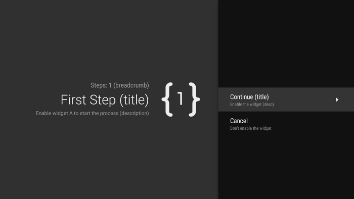
Figure 1. Exemple d'étape guidée.
Pour chaque étape de votre tâche en plusieurs étapes, étendez
GuidedStepSupportFragment et fournissez des informations contextuelles sur
l'étape et les actions que l'utilisateur peut effectuer. Remplacez
onCreateGuidance()
et renvoyez un nouveau
GuidanceStylist.Guidance contenant des informations contextuelles
telles que le titre, la description et l'icône de l'étape, comme illustré dans l'exemple suivant :
Kotlin
override fun onCreateGuidance(savedInstanceState: Bundle?): GuidanceStylist.Guidance {
    return GuidanceStylist.Guidance(
            getString(R.string.guidedstep_first_title),
            getString(R.string.guidedstep_first_description),
            getString(R.string.guidedstep_first_breadcrumb),
            activity.getDrawable(R.drawable.guidedstep_main_icon_1)
    )
}
Java
@Override
public GuidanceStylist.Guidance onCreateGuidance(Bundle savedInstanceState) {
    String title = getString(R.string.guidedstep_first_title);
    String breadcrumb = getString(R.string.guidedstep_first_breadcrumb);
    String description = getString(R.string.guidedstep_first_description);
    Drawable icon = getActivity().getDrawable(R.drawable.guidedstep_main_icon_1);
    return new GuidanceStylist.Guidance(title, description, breadcrumb, icon);
}
Ajoutez votre GuidedStepSupportFragment sous-classe à l'activité souhaitée en appelant GuidedStepSupportFragment.add()
dans la méthode onCreate() de votre activité.
Si votre activité ne contient que des GuidedStepSupportFragment
objets, utilisez GuidedStepSupportFragment.addAsRoot()
au lieu de add() pour ajouter le premier GuidedStepSupportFragment. L'utilisation de addAsRoot() permet de s'assurer que si l'utilisateur appuie sur le bouton Retour de la télécommande lorsqu'il regarde le premier GuidedStepSupportFragment, le GuidedStepSupportFragment et l'activité parente se ferment.
Remarque : Ajoutez des objets GuidedStepSupportFragment par programmation, et non dans vos fichiers XML de mise en page.
Créer et gérer des actions utilisateur
Ajoutez des actions utilisateur en remplaçant onCreateActions().
Dans votre remplacement, ajoutez un nouveau GuidedAction pour chaque élément d'action et fournissez la chaîne d'action, la description et l'ID. Utilisez GuidedAction.Builder pour ajouter de nouvelles actions.
Kotlin
override fun onCreateActions(actions: MutableList<GuidedAction>, savedInstanceState: Bundle?) {
    super.onCreateActions(actions, savedInstanceState)

    // Add "Continue" user action for this step
    actions.add(GuidedAction.Builder()
            .id(CONTINUE)
            .title(getString(R.string.guidedstep_continue))
            .description(getString(R.string.guidedstep_letsdoit))
            .hasNext(true)
            .build())
    ...
Java
@Override
public void onCreateActions(List<GuidedAction> actions, Bundle savedInstanceState) {
    // Add "Continue" user action for this step
    actions.add(new GuidedAction.Builder()
           .id(CONTINUE)
           .title(getString(R.string.guidedstep_continue))
           .description(getString(R.string.guidedstep_letsdoit))
           .hasNext(true)
           .build());
...
Les actions ne se limitent pas aux sélections sur une seule ligne. Voici d'autres types d'actions que vous pouvez créer :
-
Ajoutez une action de libellé d'informations pour fournir des informations supplémentaires sur les choix de l'utilisateur en définissant
infoOnly(true). LorsqueinfoOnlyest défini sur "true", les utilisateurs ne peuvent pas sélectionner l'action. -
Ajoutez une action de texte modifiable en définissant
editable(true). Lorsqueeditableest défini sur "true", l'utilisateur peut saisir du texte dans une action sélectionnée à l'aide de la télécommande ou d'un clavier connecté. RemplacezonGuidedActionEditedAndProceed()pour obtenir le texte modifié saisi par l'utilisateur. Vous pouvez également remplaceronGuidedActionEditCanceled()pour savoir quand l'utilisateur annule la saisie. -
Ajoutez un ensemble d'actions qui se comportent comme des cases d'option à cocher en utilisant
checkSetId()avec une valeur d'ID commune pour regrouper les actions dans un ensemble. Toutes les actions de la même liste avec le même ID d'ensemble de cases à cocher sont considérées comme liées. Lorsque l'utilisateur sélectionne l'une des actions de cet ensemble, elle est cochée et toutes les autres actions sont décochées. -
Ajoutez une action de sélecteur de date en utilisant
GuidedDatePickerAction.Builderau lieu deGuidedAction.BuilderdansonCreateActions(). RemplacezonGuidedActionEditedAndProceed()pour obtenir la valeur de date modifiée saisie par l'utilisateur. - Ajoutez une action qui utilise des sous-actions pour permettre à l'utilisateur de choisir parmi une liste étendue d'options. Les sous-actions sont décrites dans la section Ajouter des sous-actions.
- Ajoutez une action de bouton qui s'affiche à droite de la liste d'actions et qui est facilement accessible. Les actions de bouton sont décrites dans la section Ajouter des actions de bouton.
Vous pouvez également ajouter un indicateur visuel indiquant qu'une action mène à une nouvelle étape en définissant hasNext(true).
Pour connaître tous les attributs que vous pouvez définir, consultez GuidedAction.
Pour répondre aux actions, remplacez
onGuidedActionClicked() et traitez le
GuidedAction transmis. Identifiez l'action sélectionnée en examinant GuidedAction.getId().
Ajouter des sous-actions
Certaines actions peuvent nécessiter que vous fournissiez à l'utilisateur un ensemble de choix supplémentaires. Un GuidedAction peut spécifier une liste de sous-actions qui s'affichent sous forme de menu d'actions enfants.
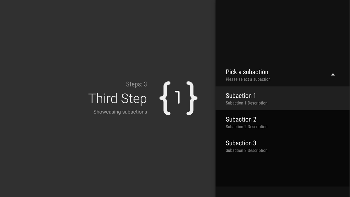
Figure 2. Sous-actions d'une étape guidée.
La liste des sous-actions peut contenir des actions régulières ou des actions de cases d'option, mais pas des actions de sélecteur de date ni de texte modifiable. De plus, une sous-action ne peut pas avoir son propre ensemble de sous-actions, car le système ne prend pas en charge plus d'un niveau de sous-actions.
Pour ajouter des sous-actions, commencez par créer et remplir une liste d'objets GuidedAction qui agissent comme des sous-actions, comme illustré dans l'exemple suivant :
Kotlin
subActions.add(GuidedAction.Builder()
        .id(SUBACTION1)
        .title(getString(R.string.guidedstep_subaction1_title))
        .description(getString(R.string.guidedstep_subaction1_desc))
        .build())
...
Java
List<GuidedAction> subActions = new ArrayList<GuidedAction>();
subActions.add(new GuidedAction.Builder()
       .id(SUBACTION1)
       .title(getString(R.string.guidedstep_subaction1_title))
       .description(getString(R.string.guidedstep_subaction1_desc))
       .build());
...
Dans onCreateActions(), créez un GuidedAction de premier niveau qui affiche la liste des sous-actions lorsqu'il est sélectionné :
Kotlin
    ...
    actions.add(GuidedAction.Builder()
            .id(SUBACTIONS)
            .title(getString(R.string.guidedstep_subactions_title))
            .description(getString(R.string.guidedstep_subactions_desc))
            .subActions(subActions)
            .build())
    ...
Java
@Override
public void onCreateActions(List<GuidedAction> actions, Bundle savedInstanceState) {
...
    actions.add(new GuidedAction.Builder()
           .id(SUBACTIONS)
           .title(getString(R.string.guidedstep_subactions_title))
           .description(getString(R.string.guidedstep_subactions_desc))
           .subActions(subActions)
           .build());
...
}
Enfin, répondez aux sélections de sous-actions en remplaçant onSubGuidedActionClicked() :
Kotlin
override fun onSubGuidedActionClicked(action: GuidedAction): Boolean {
    // Check for which action was clicked and handle as needed
    when(action.id) {
        SUBACTION1 -> {
            // Subaction 1 selected
        }
    }
    // Return true to collapse the subactions menu or
    // false to keep the menu expanded
    return true
}
Java
@Override
public boolean onSubGuidedActionClicked(GuidedAction action) {
   // Check for which action was clicked and handle as needed
   if (action.getId() == SUBACTION1) {
       // Subaction 1 selected
   }
   // Return true to collapse the subactions menu or
   // false to keep the menu expanded
   return true;
}
Ajouter des actions de bouton
Si votre étape guidée comporte une longue liste d'actions, les utilisateurs devront peut-être faire défiler la liste pour accéder aux actions les plus couramment utilisées. Utilisez des actions de bouton pour séparer les actions courantes de la liste d'actions. Les actions de bouton s'affichent à côté de la liste d'actions et sont faciles à atteindre.
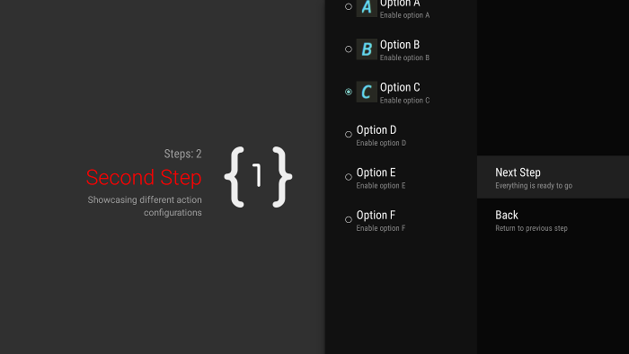
Figure 3. Actions de bouton d'une étape guidée.
Les actions de bouton sont créées et gérées comme des actions régulières, mais vous créez
des actions de bouton dans
onCreateButtonActions()
au lieu de onCreateActions(). Répondez aux actions de bouton dans onGuidedActionClicked().
Utilisez des actions de bouton pour des actions simples, telles que des actions de navigation entre les étapes. N'utilisez pas l'action de sélecteur de date ni d'autres actions modifiables comme actions de bouton. De plus, les actions de bouton ne peuvent pas avoir de sous-actions.
Regrouper les étapes guidées dans une séquence guidée
Un GuidedStepSupportFragment représente une seule étape. Pour créer une séquence ordonnée d'étapes, regroupez plusieurs
GuidedStepSupportFragment objets à l'aide de
GuidedStepSupportFragment.add() afin d'ajouter
l'étape suivante de la séquence à la pile de fragments.
Kotlin
override fun onGuidedActionClicked(action: GuidedAction) {
    val fm = fragmentManager
    when(action.id) {
        CONTINUE -> GuidedStepSupportFragment.add(fm, SecondStepFragment())
    }
}
Java
@Override
public void onGuidedActionClicked(GuidedAction action) {
    FragmentManager fm = getFragmentManager();
    if (action.getId() == CONTINUE) {
       GuidedStepSupportFragment.add(fm, new SecondStepFragment());
    }
...
Si l'utilisateur appuie sur le bouton Retour de la télécommande, l'appareil affiche le GuidedStepSupportFragment précédent dans la pile de fragments. Si vous fournissez votre propre GuidedAction qui revient à l'étape précédente, vous pouvez implémenter le comportement Retour en appelant getFragmentManager().popBackStack().
Si vous devez renvoyer l'utilisateur à une étape encore plus ancienne de la séquence, utilisez
popBackStackToGuidedStepSupportFragment()
pour revenir à un GuidedStepSupportFragment spécifique dans la pile de fragments.
Lorsque l'utilisateur termine la dernière étape de la séquence, utilisez
finishGuidedStepSupportFragments() pour supprimer toutes les instances
GuidedStepSupportFragment de la pile actuelle et revenir à l'activité parente d'origine. Si le
premier GuidedStepSupportFragment est ajouté
à l'aide de addAsRoot(), l'appel de
finishGuidedStepSupportFragments() ferme également l'activité parente.
Personnaliser la présentation des étapes
La classe GuidedStepSupportFragment peut utiliser des thèmes personnalisés qui contrôlent des aspects de présentation tels que la mise en forme du texte du titre ou les animations de transition des étapes. Les thèmes personnalisés doivent hériter de Theme_Leanback_GuidedStep et peuvent fournir des valeurs de remplacement pour les attributs définis dans GuidanceStylist et GuidedActionsStylist.
Pour appliquer un thème personnalisé à votre GuidedStepSupportFragment, procédez de l'une des manières suivantes :
-
Appliquez le thème à l'activité parente en définissant l'attribut
android:themesur l'élément d'activité dans le fichier manifeste Android. La définition de cet attribut applique le thème à toutes les vues enfants. Il s'agit du moyen le plus simple d'appliquer un thème personnalisé si l'activité parente ne contient que des objetsGuidedStepSupportFragment. -
Si votre activité utilise déjà un thème personnalisé et que vous ne souhaitez pas appliquer les styles
GuidedStepSupportFragmentà d'autres vues de l'activité, ajoutez l'attributLeanbackGuidedStepTheme_guidedStepThemeà votre thème d'activité personnalisé existant. Cet attribut pointe vers le thème personnalisé que seuls les objetsGuidedStepSupportFragmentde votre activité utilisent. -
Si vous utilisez des objets
GuidedStepSupportFragmentdans différentes activités qui font partie de la même tâche globale en plusieurs étapes et que vous souhaitez utiliser un thème visuel cohérent pour toutes les étapes, remplacezGuidedStepSupportFragment.onProvideTheme()et renvoyez votre thème personnalisé.
Pour en savoir plus sur l'ajout de styles et de thèmes, consultez Styles et thèmes.
La classe GuidedStepSupportFragment utilise des classes de styliste spéciales pour accéder aux attributs de thème et les appliquer.
La classe GuidanceStylist utilise les informations de thème pour contrôler la présentation de la vue de guidage de gauche, tandis que la classe GuidedActionsStylist utilise les informations de thème pour contrôler la présentation de la vue d'actions de droite.
Pour personnaliser le style visuel de vos étapes au-delà de ce que permet la personnalisation du thème, créez une sous-classe
GuidanceStylist ou
GuidedActionsStylist et renvoyez votre sous-classe dans
GuidedStepSupportFragment.onCreateGuidanceStylist() ou
GuidedStepSupportFragment.onCreateActionsStylist().
Pour en savoir plus sur ce que vous pouvez personnaliser dans ces sous-classes, consultez la documentation sur GuidanceStylist et GuidedActionsStylist.