
Jetpack Compose is a modern toolkit for building native Android UI. Jetpack Compose simplifies and accelerates UI development on Android with less code, powerful tools, and intuitive Kotlin APIs.
In this tutorial, you'll build a simple UI component with declarative functions. You won't be editing any XML layouts or using the Layout Editor. Instead, you will call composable functions to define what elements you want, and the Compose compiler will do the rest.

-
4 lessons
Lesson 1: Composable functions
Jetpack Compose is built around composable functions. These functions let you define your
app's UI programmatically by describing how it should look and providing data dependencies,
rather than focusing on the process of the UI's construction (initializing an element,
attaching it to a parent, etc.). To create a composable function, just add the
@Composable annotation to the function name.

Add a text element
To begin, download the most recent version of Android Studio, and create an app by selecting New Project, and under the Phone and Tablet category, select Empty Activity. Name your app ComposeTutorial and click Finish. The default template already contains some Compose elements, but in this tutorial you will build it up step by step.
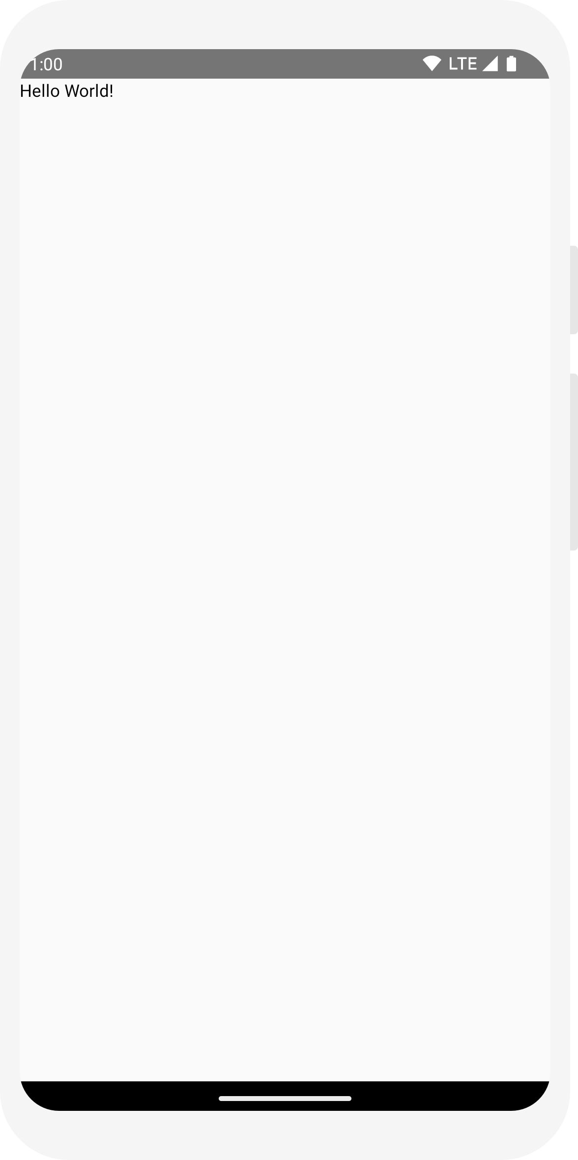
First, display a “Hello world!” text by adding a text element inside the
onCreate method. You do this by defining a content
block, and calling the
Text composable function. The
setContent block defines the activity's layout where
composable functions are called. Composable functions can only be called from other composable
functions.
Jetpack Compose uses a Kotlin compiler plugin to transform these composable functions into the
app's UI elements. For example, the Text composable
function that is defined by the Compose UI library displays a text label on the screen.
import android.os.Bundle
import androidx.activity.ComponentActivity
import androidx.activity.compose.setContent
import androidx.compose.material3.Text

class MainActivity : ComponentActivity() {
    override fun onCreate(savedInstanceState: Bundle?) {
        super.onCreate(savedInstanceState)
        setContent {
            Text("Hello world!")
        }
    }
}
Define a composable function
To make a function composable, add the @Composable annotation.
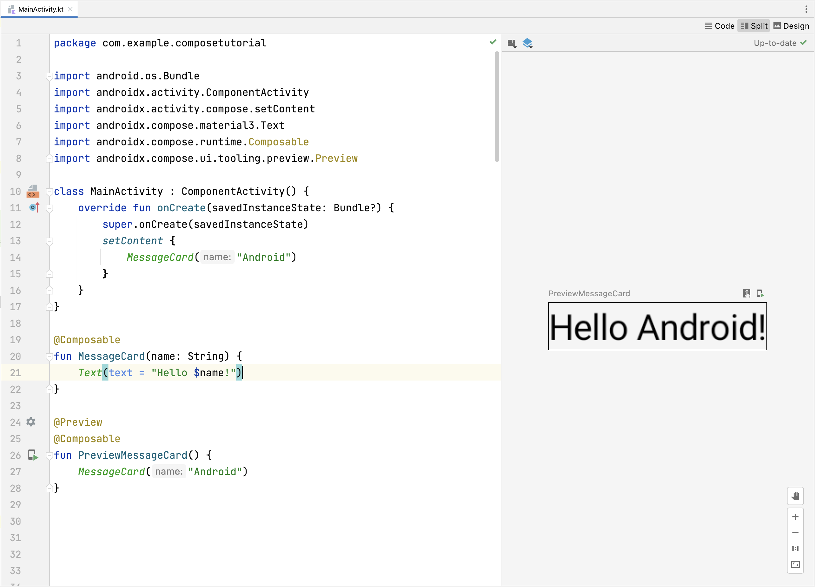
To try this out, define a MessageCard function which is
passed a name, and uses it to configure the text element.
// ...
import androidx.compose.runtime.Composable

class MainActivity : ComponentActivity() {
    override fun onCreate(savedInstanceState: Bundle?) {
        super.onCreate(savedInstanceState)
        setContent {
            MessageCard("Android")
        }
    }
}

@Composable
fun MessageCard(name: String) {
    Text(text = "Hello $name!")
}

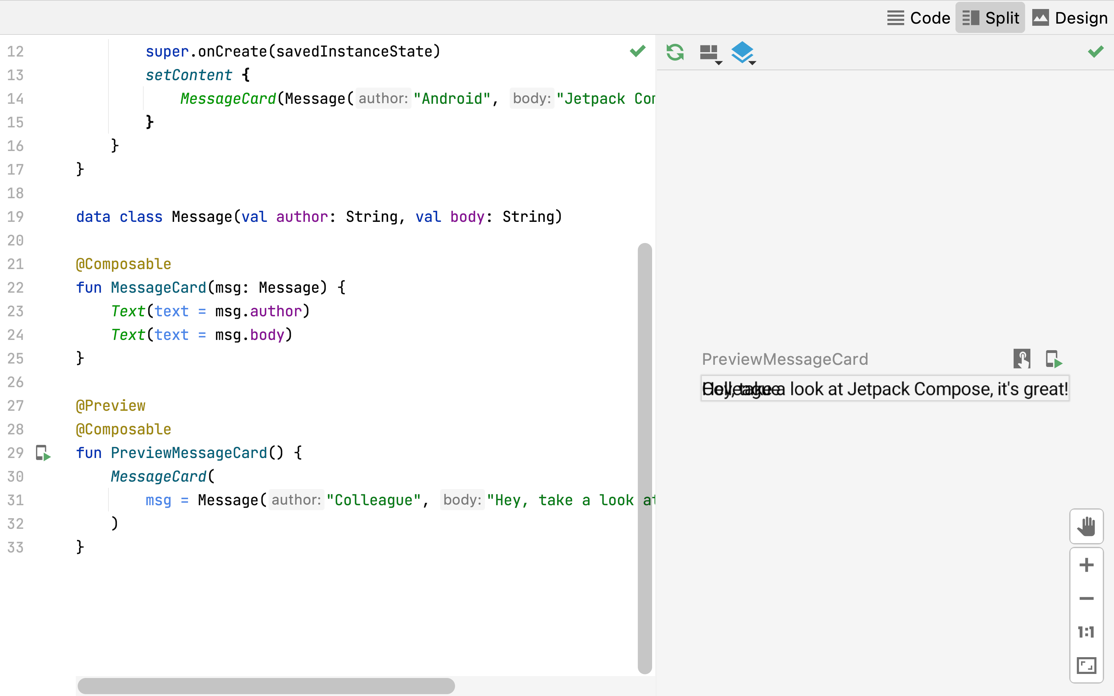
Preview your function in Android Studio
The @Preview annotation lets you preview your composable functions within Android
Studio without having to build and install the app to an Android device or emulator. The
annotation must be used on a composable function that does not take in parameters. For this
reason, you can't preview the MessageCard function
directly. Instead, make a second function named
PreviewMessageCard, which calls
MessageCard with an appropriate parameter. Add the
@Preview annotation before
@Composable.
// ...
import androidx.compose.ui.tooling.preview.Preview

@Composable
fun MessageCard(name: String) {
    Text(text = "Hello $name!")
}

@Preview
@Composable
fun PreviewMessageCard() {
    MessageCard("Android")
}
Rebuild your project. The app itself doesn't change, since the new
PreviewMessageCard function isn't called anywhere,
but Android Studio adds a preview window which you can expand by clicking on the split
(design/code) view. This window shows a preview of the UI elements created by composable
functions marked with the @Preview annotation. To update
the previews at any time, click the refresh button at the top of the preview window.
import android.os.Bundle
import androidx.activity.ComponentActivity
import androidx.activity.compose.setContent
import androidx.compose.material3.Text

class MainActivity : ComponentActivity() {
    override fun onCreate(savedInstanceState: Bundle?) {
        super.onCreate(savedInstanceState)
        setContent {
            Text("Hello world!")
        }
    }
}
// ...
import androidx.compose.runtime.Composable

class MainActivity : ComponentActivity() {
    override fun onCreate(savedInstanceState: Bundle?) {
        super.onCreate(savedInstanceState)
        setContent {
            MessageCard("Android")
        }
    }
}

@Composable
fun MessageCard(name: String) {
    Text(text = "Hello $name!")
}
// ...
import androidx.compose.ui.tooling.preview.Preview

@Composable
fun MessageCard(name: String) {
    Text(text = "Hello $name!")
}

@Preview
@Composable
fun PreviewMessageCard() {
    MessageCard("Android")
}
Lesson 2: Layouts
UI elements are hierarchical, with elements contained in other elements. In Compose, you build a UI hierarchy by calling composable functions from other composable functions.

Add multiple texts
So far you’ve built your first composable function and preview! To discover more Jetpack Compose capabilities, you’re going to build a simple messaging screen containing a list of messages that can be expanded with some animations.
Start by making the message composable richer by displaying the name of its author and a
message content. You need to first change the composable parameter to accept a
Message object instead of a
String, and add another
Text composable inside the
MessageCard composable. Make sure to update the preview
as well.
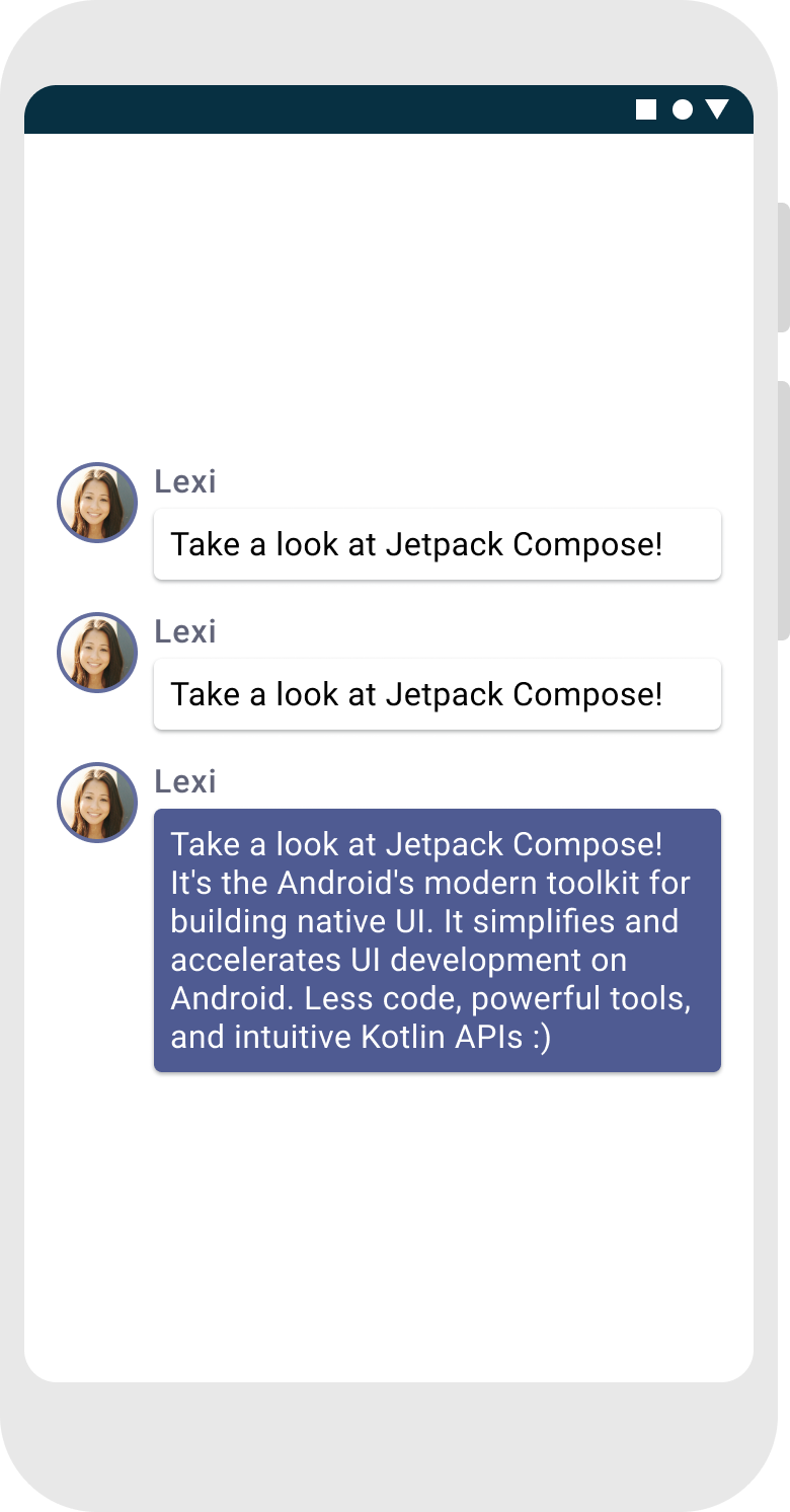
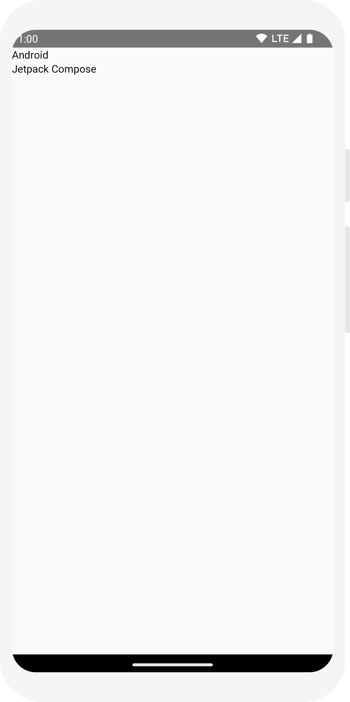
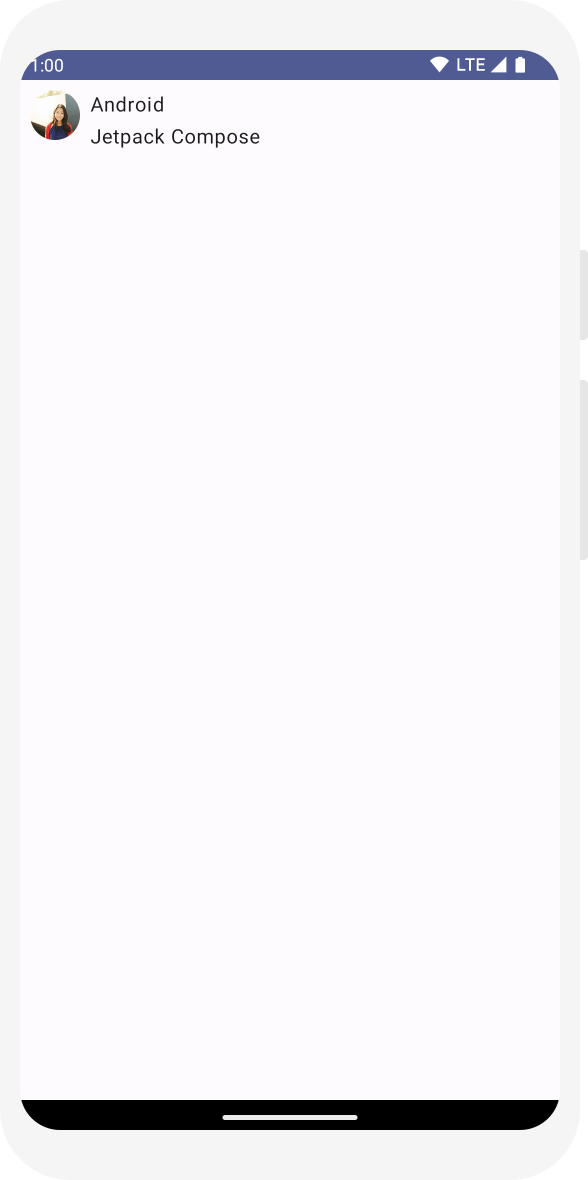
// ...

class MainActivity : ComponentActivity() {
    override fun onCreate(savedInstanceState: Bundle?) {
        super.onCreate(savedInstanceState)
        setContent {
            MessageCard(Message("Android", "Jetpack Compose"))
        }
    }
}

data class Message(val author: String, val body: String)

@Composable
fun MessageCard(msg: Message) {
    Text(text = msg.author)
    Text(text = msg.body)
}

@Preview
@Composable
fun PreviewMessageCard() {
    MessageCard(
        msg = Message("Lexi", "Hey, take a look at Jetpack Compose, it's great!")
    )
}
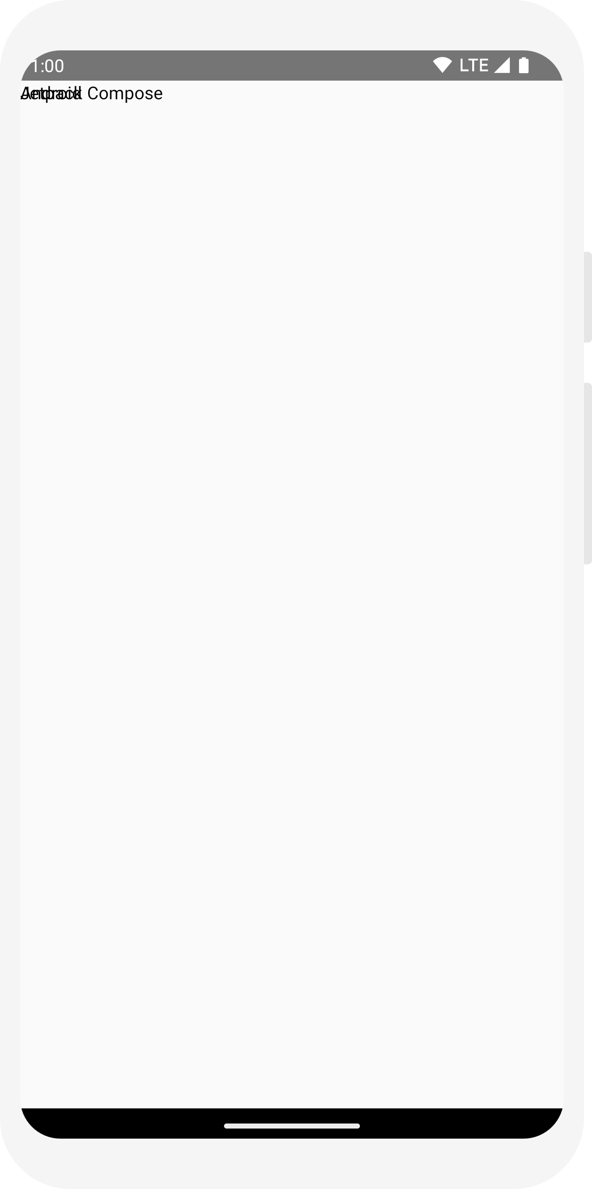
This code creates two text elements inside the content view. However, since you haven't provided any information about how to arrange them, the text elements are drawn on top of each other, making the text unreadable.
Using a Column
// ...
import androidx.compose.foundation.layout.Column

@Composable
fun MessageCard(msg: Message) {
    Column {
        Text(text = msg.author)
        Text(text = msg.body)
    }
}
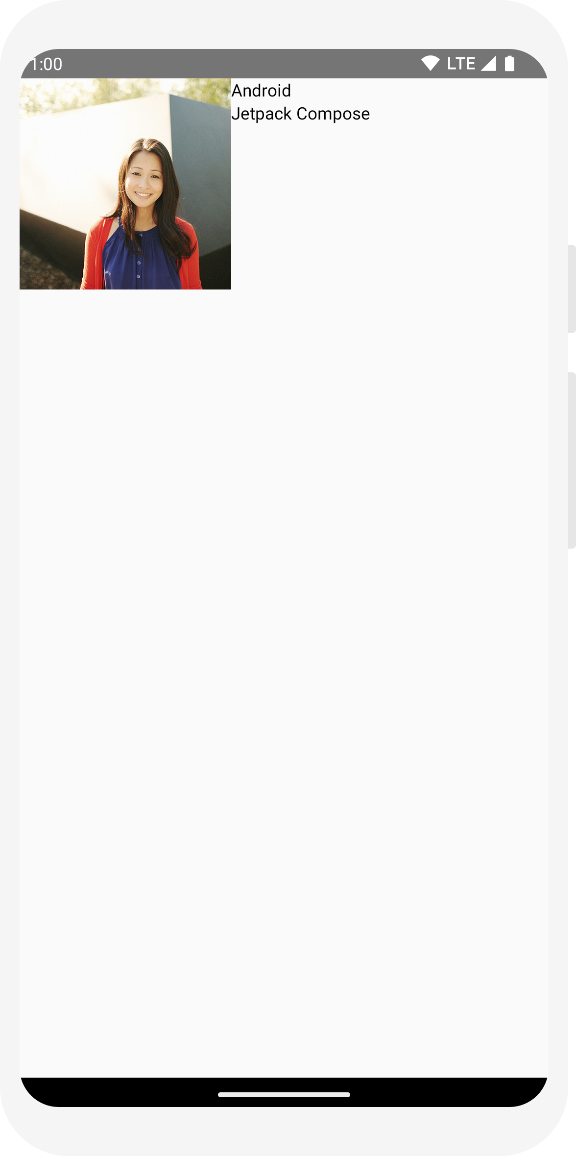
Add an image element
Enrich your message card by adding a profile picture of the sender. Use the
Resource Manager
to import an image from your photo library or use this one. Add a
Row composable to have a well structured design and an
Image composable inside it.
// ...
import androidx.compose.foundation.Image
import androidx.compose.foundation.layout.Row
import androidx.compose.ui.res.painterResource

@Composable
fun MessageCard(msg: Message) {
    Row {
        Image(
            painter = painterResource(R.drawable.profile_picture),
            contentDescription = "Contact profile picture",
        )

       Column {
            Text(text = msg.author)
            Text(text = msg.body)
        }

    }

}
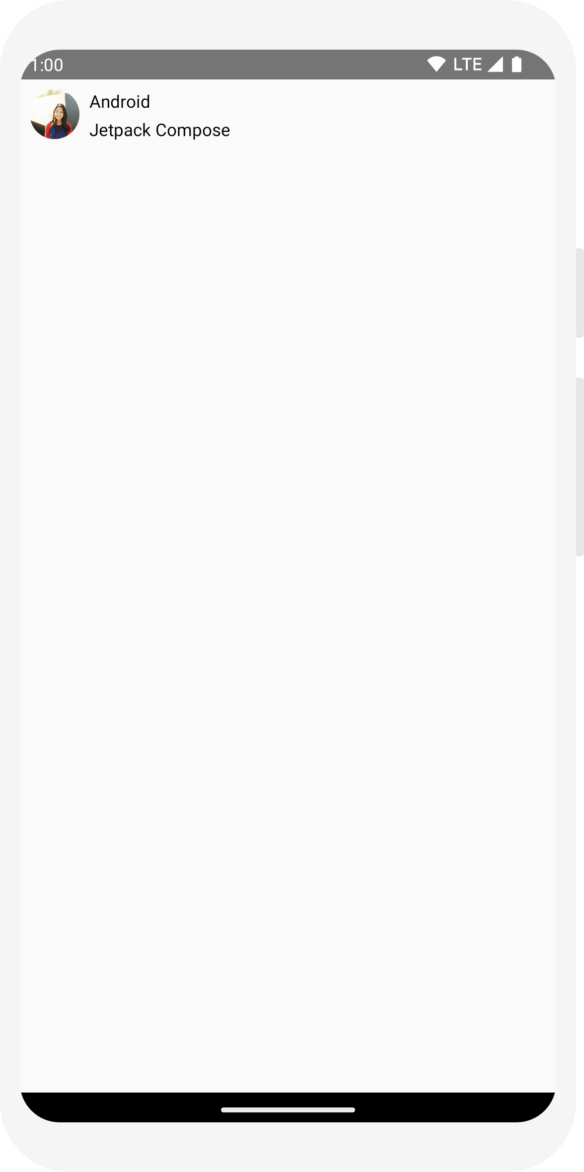
Configure your layout
Your message layout has the right structure but its elements aren't well spaced and the image is too big! To decorate or configure a composable, Compose uses modifiers. They allow you to change the composable's size, layout, appearance or add high-level interactions, such as making an element clickable. You can chain them to create richer composables. You'll use some of them to improve the layout.
// ...
import androidx.compose.foundation.layout.Spacer
import androidx.compose.foundation.layout.height
import androidx.compose.foundation.layout.padding
import androidx.compose.foundation.layout.size
import androidx.compose.foundation.layout.width
import androidx.compose.foundation.shape.CircleShape
import androidx.compose.ui.Modifier
import androidx.compose.ui.draw.clip
import androidx.compose.ui.unit.dp

@Composable
fun MessageCard(msg: Message) {
    // Add padding around our message
    Row(modifier = Modifier.padding(all = 8.dp)) {
        Image(
            painter = painterResource(R.drawable.profile_picture),
            contentDescription = "Contact profile picture",
            modifier = Modifier
                // Set image size to 40 dp
                .size(40.dp)
                // Clip image to be shaped as a circle
                .clip(CircleShape)
        )

        // Add a horizontal space between the image and the column
        Spacer(modifier = Modifier.width(8.dp))

        Column {
            Text(text = msg.author)
            // Add a vertical space between the author and message texts
            Spacer(modifier = Modifier.height(4.dp))
            Text(text = msg.body)
        }
    }
}
// ...

class MainActivity : ComponentActivity() {
    override fun onCreate(savedInstanceState: Bundle?) {
        super.onCreate(savedInstanceState)
        setContent {
            MessageCard(Message("Android", "Jetpack Compose"))
        }
    }
}

data class Message(val author: String, val body: String)

@Composable
fun MessageCard(msg: Message) {
    Text(text = msg.author)
    Text(text = msg.body)
}

@Preview
@Composable
fun PreviewMessageCard() {
    MessageCard(
        msg = Message("Lexi", "Hey, take a look at Jetpack Compose, it's great!")
    )
}
// ...
import androidx.compose.foundation.layout.Column

@Composable
fun MessageCard(msg: Message) {
    Column {
        Text(text = msg.author)
        Text(text = msg.body)
    }
}
// ...
import androidx.compose.foundation.Image
import androidx.compose.foundation.layout.Row
import androidx.compose.ui.res.painterResource

@Composable
fun MessageCard(msg: Message) {
    Row {
        Image(
            painter = painterResource(R.drawable.profile_picture),
            contentDescription = "Contact profile picture",
        )

       Column {
            Text(text = msg.author)
            Text(text = msg.body)
        }

    }

}
// ...
import androidx.compose.foundation.layout.Spacer
import androidx.compose.foundation.layout.height
import androidx.compose.foundation.layout.padding
import androidx.compose.foundation.layout.size
import androidx.compose.foundation.layout.width
import androidx.compose.foundation.shape.CircleShape
import androidx.compose.ui.Modifier
import androidx.compose.ui.draw.clip
import androidx.compose.ui.unit.dp

@Composable
fun MessageCard(msg: Message) {
    // Add padding around our message
    Row(modifier = Modifier.padding(all = 8.dp)) {
        Image(
            painter = painterResource(R.drawable.profile_picture),
            contentDescription = "Contact profile picture",
            modifier = Modifier
                // Set image size to 40 dp
                .size(40.dp)
                // Clip image to be shaped as a circle
                .clip(CircleShape)
        )

        // Add a horizontal space between the image and the column
        Spacer(modifier = Modifier.width(8.dp))

        Column {
            Text(text = msg.author)
            // Add a vertical space between the author and message texts
            Spacer(modifier = Modifier.height(4.dp))
            Text(text = msg.body)
        }
    }
}
Lesson 3: Material Design
Compose is built to support Material Design principles. Many of its UI elements implement Material Design out of the box. In this lesson, you'll style your app with Material Design widgets.

Use Material Design
Your message design now has a layout, but it doesn't look great yet.
Jetpack Compose provides an implementation of Material Design 3 and its UI elements out of the
box. You'll improve the appearance of our MessageCard
composable using Material Design styling.
To start, wrap the MessageCard function with the
Material theme created in your project, ComposeTutorialTheme,
as well as a Surface.
Do it both in the @Preview and in the
setContent function. Doing so will allow your composables
to inherit styles as defined in your app's theme ensuring consistency across your app.
Material Design is built around three pillars: Color,
Typography, and Shape.
You will add them one by one.
Note: the Empty Compose Activity template generates a default theme for your project that
allows you to customize
MaterialTheme.
If you named your project anything different from
ComposeTutorial, you can find your custom theme in the
Theme.kt file in the
ui.theme subpackage.
// ...

class MainActivity : ComponentActivity() {
    override fun onCreate(savedInstanceState: Bundle?) {
        super.onCreate(savedInstanceState)
        setContent {
            ComposeTutorialTheme {
                Surface(modifier = Modifier.fillMaxSize()) {
                    MessageCard(Message("Android", "Jetpack Compose"))
                }
            }
        }
    }
}

@Preview
@Composable
fun PreviewMessageCard() {
    ComposeTutorialTheme {
        Surface {
            MessageCard(
                msg = Message("Lexi", "Take a look at Jetpack Compose, it's great!")
            )
        }
    }
}
Color
Use MaterialTheme.colorScheme to style with colors from the
wrapped theme. You can use these values from the theme anywhere a color is needed. This example uses dynamic theming colors (defined by device preferences).
You can set dynamicColor to false in the MaterialTheme.kt file to change this.
Style the title and add a border to the image.
// ...
import androidx.compose.foundation.border
import androidx.compose.material3.MaterialTheme

@Composable
fun MessageCard(msg: Message) {
   Row(modifier = Modifier.padding(all = 8.dp)) {
       Image(
           painter = painterResource(R.drawable.profile_picture),
           contentDescription = null,
           modifier = Modifier
               .size(40.dp)
               .clip(CircleShape)
               .border(1.5.dp, MaterialTheme.colorScheme.primary, CircleShape)
       )

       Spacer(modifier = Modifier.width(8.dp))

       Column {
           Text(
               text = msg.author,
               color = MaterialTheme.colorScheme.secondary
           )

           Spacer(modifier = Modifier.height(4.dp))
           Text(text = msg.body)
       }
   }
}

Typography
Material Typography styles are available in the MaterialTheme,
just add them to the Text composables.
// ...

@Composable
fun MessageCard(msg: Message) {
   Row(modifier = Modifier.padding(all = 8.dp)) {
       Image(
           painter = painterResource(R.drawable.profile_picture),
           contentDescription = null,
           modifier = Modifier
               .size(40.dp)
               .clip(CircleShape)
               .border(1.5.dp, MaterialTheme.colorScheme.primary, CircleShape)
       )
       Spacer(modifier = Modifier.width(8.dp))

       Column {
           Text(
               text = msg.author,
               color = MaterialTheme.colorScheme.secondary,
               style = MaterialTheme.typography.titleSmall
           )

           Spacer(modifier = Modifier.height(4.dp))

           Text(
               text = msg.body,
               style = MaterialTheme.typography.bodyMedium
           )
       }
   }
}

Shape
With Shapeyou can add the final touches. First, wrap the
message body text around a
Surface composable. Doing so allows customizing the
message body's shape and elevation. Padding is also added to the message for a better layout.
// ...
import androidx.compose.material3.Surface

@Composable
fun MessageCard(msg: Message) {
   Row(modifier = Modifier.padding(all = 8.dp)) {
       Image(
           painter = painterResource(R.drawable.profile_picture),
           contentDescription = null,
           modifier = Modifier
               .size(40.dp)
               .clip(CircleShape)
               .border(1.5.dp, MaterialTheme.colorScheme.primary, CircleShape)
       )
       Spacer(modifier = Modifier.width(8.dp))

       Column {
           Text(
               text = msg.author,
               color = MaterialTheme.colorScheme.secondary,
               style = MaterialTheme.typography.titleSmall
           )

           Spacer(modifier = Modifier.height(4.dp))

           Surface(shape = MaterialTheme.shapes.medium, shadowElevation = 1.dp) {
               Text(
                   text = msg.body,
                   modifier = Modifier.padding(all = 4.dp),
                   style = MaterialTheme.typography.bodyMedium
               )
           }
       }
   }
}

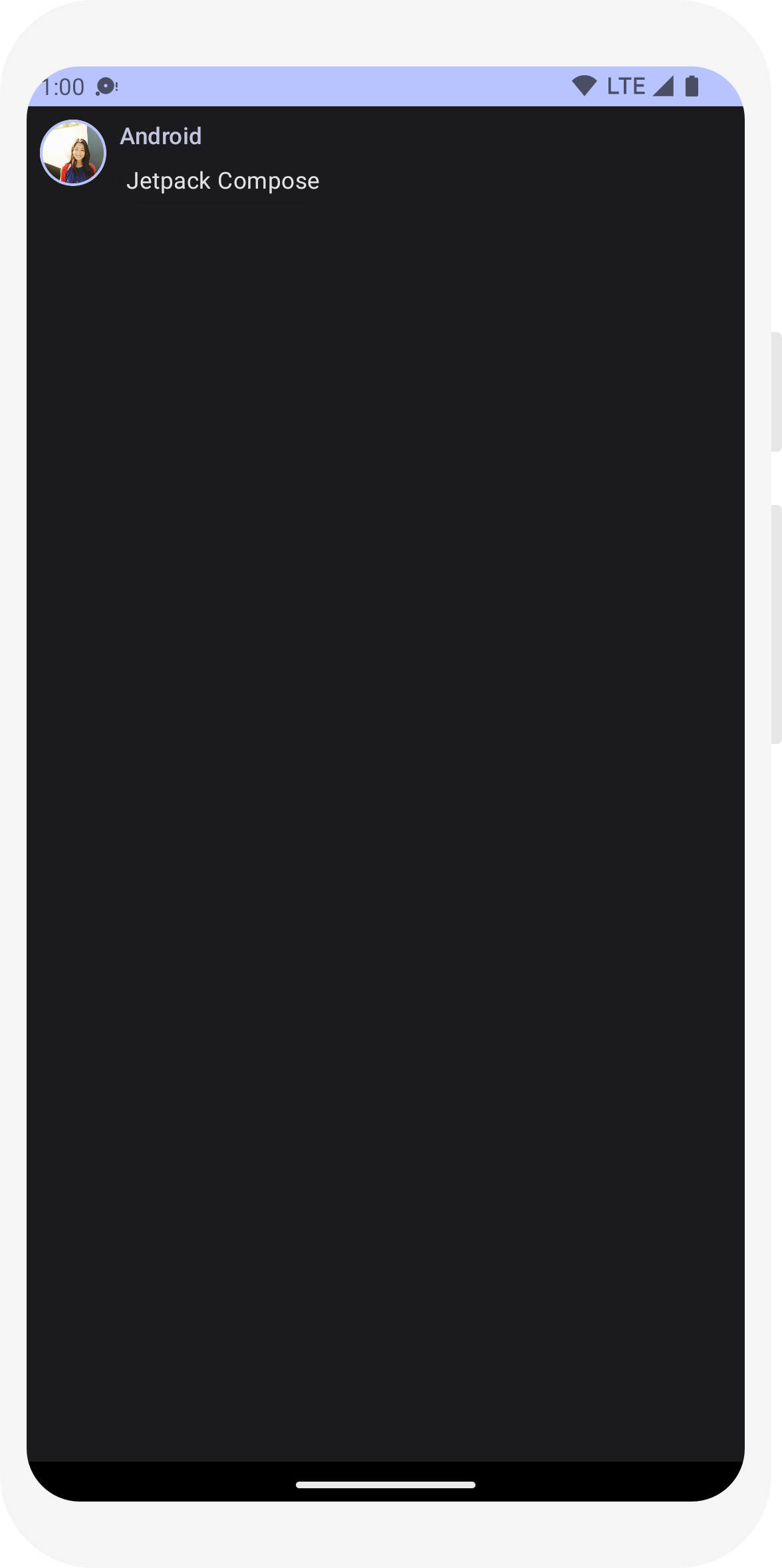
Enable dark theme
Dark theme (or night mode) can be enabled to avoid a bright display especially at night, or simply to save the device battery. Thanks to the Material Design support, Jetpack Compose can handle the dark theme by default. Having used Material Design colors, text and backgrounds will automatically adapt to the dark background.
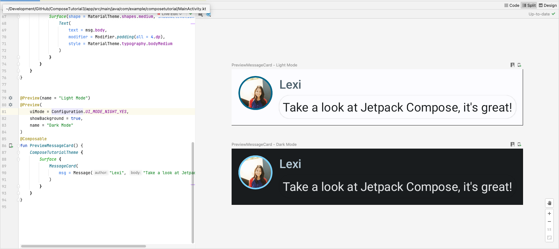
You can create multiple previews in your file as separate functions, or add multiple annotations to the same function.
Add a new preview annotation and enable night mode.
// ...
import android.content.res.Configuration

@Preview(name = "Light Mode")
@Preview(
    uiMode = Configuration.UI_MODE_NIGHT_YES,
    showBackground = true,
    name = "Dark Mode"
)
@Composable
fun PreviewMessageCard() {
   ComposeTutorialTheme {
    Surface {
      MessageCard(
        msg = Message("Lexi", "Hey, take a look at Jetpack Compose, it's great!")
      )
    }
   }
}
Color choices for the light and dark themes are defined in the IDE-generated
Theme.kt file.
So far, you've created a message UI element that displays an image and two texts with different styles, and it looks good both in light and dark themes!
// ...
import android.content.res.Configuration

@Preview(name = "Light Mode")
@Preview(
    uiMode = Configuration.UI_MODE_NIGHT_YES,
    showBackground = true,
    name = "Dark Mode"
)
@Composable
fun PreviewMessageCard() {
   ComposeTutorialTheme {
    Surface {
      MessageCard(
        msg = Message("Lexi", "Hey, take a look at Jetpack Compose, it's great!")
      )
    }
   }
}
// ...

class MainActivity : ComponentActivity() {
    override fun onCreate(savedInstanceState: Bundle?) {
        super.onCreate(savedInstanceState)
        setContent {
            ComposeTutorialTheme {
                Surface(modifier = Modifier.fillMaxSize()) {
                    MessageCard(Message("Android", "Jetpack Compose"))
                }
            }
        }
    }
}

@Preview
@Composable
fun PreviewMessageCard() {
    ComposeTutorialTheme {
        Surface {
            MessageCard(
                msg = Message("Lexi", "Take a look at Jetpack Compose, it's great!")
            )
        }
    }
}
// ...
import androidx.compose.foundation.border
import androidx.compose.material3.MaterialTheme

@Composable
fun MessageCard(msg: Message) {
   Row(modifier = Modifier.padding(all = 8.dp)) {
       Image(
           painter = painterResource(R.drawable.profile_picture),
           contentDescription = null,
           modifier = Modifier
               .size(40.dp)
               .clip(CircleShape)
               .border(1.5.dp, MaterialTheme.colorScheme.primary, CircleShape)
       )

       Spacer(modifier = Modifier.width(8.dp))

       Column {
           Text(
               text = msg.author,
               color = MaterialTheme.colorScheme.secondary
           )

           Spacer(modifier = Modifier.height(4.dp))
           Text(text = msg.body)
       }
   }
}
// ...

@Composable
fun MessageCard(msg: Message) {
   Row(modifier = Modifier.padding(all = 8.dp)) {
       Image(
           painter = painterResource(R.drawable.profile_picture),
           contentDescription = null,
           modifier = Modifier
               .size(40.dp)
               .clip(CircleShape)
               .border(1.5.dp, MaterialTheme.colorScheme.primary, CircleShape)
       )
       Spacer(modifier = Modifier.width(8.dp))

       Column {
           Text(
               text = msg.author,
               color = MaterialTheme.colorScheme.secondary,
               style = MaterialTheme.typography.titleSmall
           )

           Spacer(modifier = Modifier.height(4.dp))

           Text(
               text = msg.body,
               style = MaterialTheme.typography.bodyMedium
           )
       }
   }
}
// ...
import androidx.compose.material3.Surface

@Composable
fun MessageCard(msg: Message) {
   Row(modifier = Modifier.padding(all = 8.dp)) {
       Image(
           painter = painterResource(R.drawable.profile_picture),
           contentDescription = null,
           modifier = Modifier
               .size(40.dp)
               .clip(CircleShape)
               .border(1.5.dp, MaterialTheme.colorScheme.primary, CircleShape)
       )
       Spacer(modifier = Modifier.width(8.dp))

       Column {
           Text(
               text = msg.author,
               color = MaterialTheme.colorScheme.secondary,
               style = MaterialTheme.typography.titleSmall
           )

           Spacer(modifier = Modifier.height(4.dp))

           Surface(shape = MaterialTheme.shapes.medium, shadowElevation = 1.dp) {
               Text(
                   text = msg.body,
                   modifier = Modifier.padding(all = 4.dp),
                   style = MaterialTheme.typography.bodyMedium
               )
           }
       }
   }
}
// ...
import android.content.res.Configuration

@Preview(name = "Light Mode")
@Preview(
    uiMode = Configuration.UI_MODE_NIGHT_YES,
    showBackground = true,
    name = "Dark Mode"
)
@Composable
fun PreviewMessageCard() {
   ComposeTutorialTheme {
    Surface {
      MessageCard(
        msg = Message("Lexi", "Hey, take a look at Jetpack Compose, it's great!")
      )
    }
   }
}
Lesson 4: Lists and animations
Lists and animations are everywhere in apps. In this lesson, you will learn how Compose makes it easy to create lists and fun to add animations.

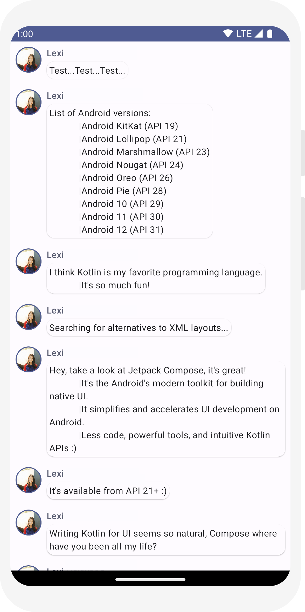
Create a list of messages
A chat with one message feels a bit lonely, so we are going to change the conversation to have more than
one message. You'll need to create a Conversation function
that will show multiple messages. For this use case, use Compose’s
LazyColumn and
LazyRow. These composables render only the elements
that are visible on screen, so they are designed to be very efficient for long lists.
In this code snippet, you can see that LazyColumn has an
items child. It takes a
List as a parameter and its lambda
receives a parameter we’ve named message (we could have
named it whatever we want) which is an instance of Message.
In short, this lambda is called for each item of the provided
List. Copy the
sample dataset
into your project to help bootstrap the conversation quickly.
// ...
import androidx.compose.foundation.lazy.LazyColumn
import androidx.compose.foundation.lazy.items

@Composable
fun Conversation(messages: List<Message>) {
    LazyColumn {
        items(messages) { message ->
            MessageCard(message)
        }
    }
}

@Preview
@Composable
fun PreviewConversation() {
    ComposeTutorialTheme {
        Conversation(SampleData.conversationSample)
    }
}
Animate messages while expanding
The conversation is getting more interesting. It's time to play with animations! You will add
the ability to expand a message to show a longer one, animating both the content size and the
background color. To store this local UI state, you need to keep track of whether a message has
been expanded or not. To keep track of this state change, you have to use the functions
remember and
mutableStateOf.
Composable functions can store local state in memory by using
remember, and track changes to the value passed to
mutableStateOf. Composables (and their children) using
this state will get redrawn automatically when the value is updated. This is called
recomposition.
By using Compose’s state APIs like remember and
mutableStateOf, any changes to state automatically update the UI.
Note: You need to add the following imports to correctly use Kotlin's
delegated property syntax (the by keyword). Alt+Enter or Option+Enter adds them
for you.
      import androidx.compose.runtime.getValue
      import androidx.compose.runtime.setValue
// ...
import androidx.compose.foundation.clickable
import androidx.compose.runtime.getValue
import androidx.compose.runtime.mutableStateOf
import androidx.compose.runtime.remember
import androidx.compose.runtime.setValue

class MainActivity : ComponentActivity() {
   override fun onCreate(savedInstanceState: Bundle?) {
       super.onCreate(savedInstanceState)
       setContent {
           ComposeTutorialTheme {
               Conversation(SampleData.conversationSample)
           }
       }
   }
}

@Composable
fun MessageCard(msg: Message) {
    Row(modifier = Modifier.padding(all = 8.dp)) {
        Image(
            painter = painterResource(R.drawable.profile_picture),
            contentDescription = null,
            modifier = Modifier
                .size(40.dp)
                .clip(CircleShape)
                .border(1.5.dp, MaterialTheme.colorScheme.primary, CircleShape)
        )
        Spacer(modifier = Modifier.width(8.dp))

        // We keep track if the message is expanded or not in this
        // variable
        var isExpanded by remember { mutableStateOf(false) }

        // We toggle the isExpanded variable when we click on this Column
        Column(modifier = Modifier.clickable { isExpanded = !isExpanded }) {
            Text(
                text = msg.author,
                color = MaterialTheme.colorScheme.secondary,
                style = MaterialTheme.typography.titleSmall
            )

            Spacer(modifier = Modifier.height(4.dp))

            Surface(
                shape = MaterialTheme.shapes.medium,
                shadowElevation = 1.dp,
            ) {
                Text(
                    text = msg.body,
                    modifier = Modifier.padding(all = 4.dp),
                    // If the message is expanded, we display all its content
                    // otherwise we only display the first line
                    maxLines = if (isExpanded) Int.MAX_VALUE else 1,
                    style = MaterialTheme.typography.bodyMedium
                )
            }
        }
    }
}
Now you can change the background of the message content based on
isExpanded when we click on a message. You will use the
clickable modifier to handle click events on the
composable. Instead of just toggling the background color of the
Surface, you will animate the background color by
gradually modifying its value from
MaterialTheme.colorScheme.surface to
MaterialTheme.colorScheme.primary and vice versa. To do so,
you will use the animateColorAsState function. Lastly, you
will use the animateContentSize modifier to animate the
message container size smoothly:
// ...
import androidx.compose.animation.animateColorAsState
import androidx.compose.animation.animateContentSize

@Composable
fun MessageCard(msg: Message) {
    Row(modifier = Modifier.padding(all = 8.dp)) {
        Image(
            painter = painterResource(R.drawable.profile_picture),
            contentDescription = null,
            modifier = Modifier
                .size(40.dp)
                .clip(CircleShape)
                .border(1.5.dp, MaterialTheme.colorScheme.secondary, CircleShape)
        )
        Spacer(modifier = Modifier.width(8.dp))

        // We keep track if the message is expanded or not in this
        // variable
        var isExpanded by remember { mutableStateOf(false) }
        // surfaceColor will be updated gradually from one color to the other
        val surfaceColor by animateColorAsState(
            if (isExpanded) MaterialTheme.colorScheme.primary else MaterialTheme.colorScheme.surface,
        )

        // We toggle the isExpanded variable when we click on this Column
        Column(modifier = Modifier.clickable { isExpanded = !isExpanded }) {
            Text(
                text = msg.author,
                color = MaterialTheme.colorScheme.secondary,
                style = MaterialTheme.typography.titleSmall
            )

            Spacer(modifier = Modifier.height(4.dp))

            Surface(
                shape = MaterialTheme.shapes.medium,
                shadowElevation = 1.dp,
                // surfaceColor color will be changing gradually from primary to surface
                color = surfaceColor,
                // animateContentSize will change the Surface size gradually
                modifier = Modifier.animateContentSize().padding(1.dp)
            ) {
                Text(
                    text = msg.body,
                    modifier = Modifier.padding(all = 4.dp),
                    // If the message is expanded, we display all its content
                    // otherwise we only display the first line
                    maxLines = if (isExpanded) Int.MAX_VALUE else 1,
                    style = MaterialTheme.typography.bodyMedium
                )
            }
        }
    }
}
// ...
import androidx.compose.foundation.lazy.LazyColumn
import androidx.compose.foundation.lazy.items

@Composable
fun Conversation(messages: List<Message>) {
    LazyColumn {
        items(messages) { message ->
            MessageCard(message)
        }
    }
}

@Preview
@Composable
fun PreviewConversation() {
    ComposeTutorialTheme {
        Conversation(SampleData.conversationSample)
    }
}
// ...
import androidx.compose.foundation.clickable
import androidx.compose.runtime.getValue
import androidx.compose.runtime.mutableStateOf
import androidx.compose.runtime.remember
import androidx.compose.runtime.setValue

class MainActivity : ComponentActivity() {
   override fun onCreate(savedInstanceState: Bundle?) {
       super.onCreate(savedInstanceState)
       setContent {
           ComposeTutorialTheme {
               Conversation(SampleData.conversationSample)
           }
       }
   }
}

@Composable
fun MessageCard(msg: Message) {
    Row(modifier = Modifier.padding(all = 8.dp)) {
        Image(
            painter = painterResource(R.drawable.profile_picture),
            contentDescription = null,
            modifier = Modifier
                .size(40.dp)
                .clip(CircleShape)
                .border(1.5.dp, MaterialTheme.colorScheme.primary, CircleShape)
        )
        Spacer(modifier = Modifier.width(8.dp))

        // We keep track if the message is expanded or not in this
        // variable
        var isExpanded by remember { mutableStateOf(false) }

        // We toggle the isExpanded variable when we click on this Column
        Column(modifier = Modifier.clickable { isExpanded = !isExpanded }) {
            Text(
                text = msg.author,
                color = MaterialTheme.colorScheme.secondary,
                style = MaterialTheme.typography.titleSmall
            )

            Spacer(modifier = Modifier.height(4.dp))

            Surface(
                shape = MaterialTheme.shapes.medium,
                shadowElevation = 1.dp,
            ) {
                Text(
                    text = msg.body,
                    modifier = Modifier.padding(all = 4.dp),
                    // If the message is expanded, we display all its content
                    // otherwise we only display the first line
                    maxLines = if (isExpanded) Int.MAX_VALUE else 1,
                    style = MaterialTheme.typography.bodyMedium
                )
            }
        }
    }
}
// ...
import androidx.compose.animation.animateColorAsState
import androidx.compose.animation.animateContentSize

@Composable
fun MessageCard(msg: Message) {
    Row(modifier = Modifier.padding(all = 8.dp)) {
        Image(
            painter = painterResource(R.drawable.profile_picture),
            contentDescription = null,
            modifier = Modifier
                .size(40.dp)
                .clip(CircleShape)
                .border(1.5.dp, MaterialTheme.colorScheme.secondary, CircleShape)
        )
        Spacer(modifier = Modifier.width(8.dp))

        // We keep track if the message is expanded or not in this
        // variable
        var isExpanded by remember { mutableStateOf(false) }
        // surfaceColor will be updated gradually from one color to the other
        val surfaceColor by animateColorAsState(
            if (isExpanded) MaterialTheme.colorScheme.primary else MaterialTheme.colorScheme.surface,
        )

        // We toggle the isExpanded variable when we click on this Column
        Column(modifier = Modifier.clickable { isExpanded = !isExpanded }) {
            Text(
                text = msg.author,
                color = MaterialTheme.colorScheme.secondary,
                style = MaterialTheme.typography.titleSmall
            )

            Spacer(modifier = Modifier.height(4.dp))

            Surface(
                shape = MaterialTheme.shapes.medium,
                shadowElevation = 1.dp,
                // surfaceColor color will be changing gradually from primary to surface
                color = surfaceColor,
                // animateContentSize will change the Surface size gradually
                modifier = Modifier.animateContentSize().padding(1.dp)
            ) {
                Text(
                    text = msg.body,
                    modifier = Modifier.padding(all = 4.dp),
                    // If the message is expanded, we display all its content
                    // otherwise we only display the first line
                    maxLines = if (isExpanded) Int.MAX_VALUE else 1,
                    style = MaterialTheme.typography.bodyMedium
                )
            }
        }
    }
}
Next steps
Congratulations, you’ve finished the Compose tutorial! You’ve built a simple chat screen efficiently showing a list of expandable & animated messages containing an image and texts, designed using Material Design principles with a dark theme included and previews—all in under 100 lines of code!
Here’s what you've learned so far:
- Defining composable functions
- Adding different elements in your composable
- Structuring your UI component using layout composables
- Extending composables by using modifiers
- Creating an efficient list
- Keeping track of state and modifying it
- Adding user interaction on a composable
- Animating messages while expanding them
If you want to dig deeper on some of these steps, explore the resources below.