Health Connect UI guidelines

Your app's user interface (UI) should focus on articulating the benefits of using Health Connect, and explain key concepts in a way that enhances user knowledge of what an integration entails.

Your user experience (UX) should adhere to three guiding principles:

  1. Consistency: Ensure that flows are aligned throughout the integration process.
  2. Transparency: Be up front in explaining how Health Connect works alongside your app.
  3. Clarity: Help users access Health Connect through your app.

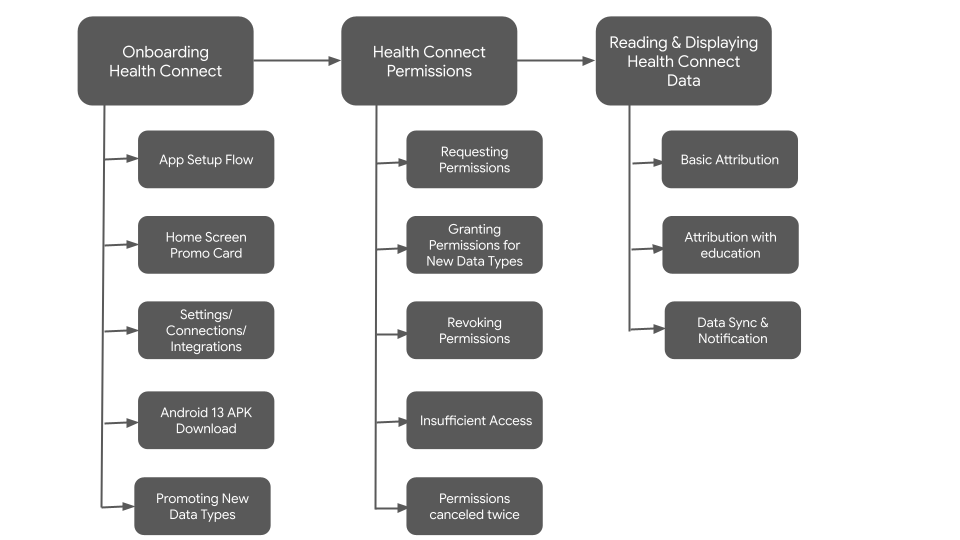
At a high-level, the UX flow can be broken down into the following stages:

Health Connect UX flow

Promote Health Connect

Showcasing Health Connect in your app depends on the UX patterns and conventions established in your UI.

Focus on the user benefit

The first time you introduce Health Connect to users, aim to offer a meaningful reason for them to make use of your integration.

Rather than describing Health Connect's features, tailor your message to how a user benefits from those features.

Health Connect user benefits

Use clear language

Don't ask users to "Connect to Health Connect." This is a jarring sentence and may also confuse a user's understanding of the relationship between apps in the Health Connect ecosystem.

Your UX should help users form an idea of how Health Connect interacts with your app, so it's important to consider which button labels work best toward achieving that goal.

Try using verb phrases like "set up" or "get started" on your button labels. Or, if you're launching the permissions view, use more specific button text, like "Choose data to share."

Health Connect clear language

Promote Health Connect

Here are a few ways you can promote Health Connect in your app:

App setup and requesting permissions flow

App setup and request permissions

Home Screen Promo Card Flow

Home screen promo flow

Settings

Settings with entry point

Android 13 APK Download

Android 13 APK download

Onboard new data type(s) and requesting permissions

Apps that already have a Health Connect integration can request new data types in addition to the already granted ones.

Only the new data type(s) requested should be shown in the permissions screen, to avoid confusing users.

The following are a few examples of how to promote new data types(s):

Reuse existing conventions

If your app already promotes new data in other ecosystems, we recommend doing the same for Health Connect in Android, and adapt the language where relevant.

Emphasize the value proposition

Why would users want to use this data in your app?

  • Examples: reading the data
    • Gives users more accurate insights in your app
    • Users can see all data in one place in your app
  • Example: writing the data
    • Users can share this new data from your app with other compatible health and fitness apps on their phone

Contextualize permissions

Ask for new permissions where it makes sense for users, so they know what's being asked of them.

Examples:

  • Ask for exercise routes permission after users finish a workout in your app.
  • If your app implements new permissions, show these together in one promo on the home screen.
  • If you have a dedicated section in your app, for example Sleep, promote the corresponding permission there.

Requesting new data type

Revoked and cancelled permissions

Your app's Settings screen should show users how to revoke permissions to Health Connect data types:

Revoked and cancelled permissions

Insufficient access

If your app has insufficient Health Connect access, users should be presented with the following screen across all entry points:

App with insufficient access

Permissions cancelled twice

If the user selects Cancel on the permissions request screen twice in a row, your app should present the user with a screen similar to the following:

Permissions cancelled twice by user

Reading & displaying data

To build trust and assure users that their data is being read correctly, it's important to show users how your app obtains data, which comes from the packageName property of the DataOrigin class.

There are two ways to achieve this:

  1. Basic attribution
  2. Attribution with education

Basic attribution

At a minimum, your user interface (UI) should display the app source icon and name (or only the app name if the icon can't be shown). Basic attribution is suitable for the following screens: Home, Activity log, and Activity details.

Basic attribution for reading data

Attribution with education

Your app should help users obtain information about where data originates from, with a direct link to the "App permissions" screen in Health Connect. This type of attribution is suitable for the following screens: Activity details, Reports and insights.

Data Sync

If there's enough latency when syncing your app with Health Connect, we recommend that your app show this notification while the data is syncing. This informs the user that something is happening and that it may take a while to finish.

Data sync status shown

Assets

Product icons should be used on a white or a very light gray background. You may also use the icon on a black background if necessary.

Icon guidelines

Download the following icons: