Stay organized with collections
Save and categorize content based on your preferences.
The Chip component is a compact, interactive UI element. It represents complex
entities like a contact or tag, often with an icon and label. It can be
checkable, dismissible, or clickable.
The five types of chips and where you might use them are as follows:
Assist: Guides the user during a task. Often appears as a temporary UI
element in response to user input.
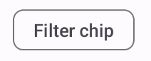
Filter: Lets users refine content from a set of options. They can be
selected or deselected, and may include a checkmark icon when selected.
Input: Represents user-provided information, such as selections in a
menu. They can contain an icon and text, and provide an 'X' for removal.
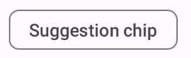
Suggestion: Provides recommendations to the user based on their recent
activity or input. Typically appear beneath an input field to prompt user
actions.
Elevated: Has an elevated appearance instead of looking flat.
Version compatibility
This implementation requires that your project minSDK be set to API level 21 or
higher.
Dependencies
Create an assist chip
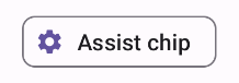
The AssistChip composable provides a straightforward way to create an
assist chip that nudges the user in a particular direction. One distinguishing
feature is its leadingIcon parameter that lets you display an icon on the left
side of the chip, as shown in figure 1. The following example demonstrates how
you can implement it:
Figure 1. Assist chip.
Create a filter chip
The FilterChip composable requires you to track whether or not the chip
is selected. The following example demonstrates how you can show a leading
checked icon only when the user has selected the chip:
You can use the InputChip composable to create chips that result from
user interaction. For example, in an email client, when the user is writing an
email, an input chip might represent a person whose address the user has entered
into the "to:" field.
The following implementation demonstrates an input chip that is in a selected
state. The user dismisses the chip when they press it.
Results
Figure 4. Input chip.
Create a suggestion chip
The SuggestionChip composable is the most basic of the composables listed
on this page, both in its API definition and its common use cases. Suggestion
chips present dynamically generated hints. For example, in an AI chat app, you
might use suggestion chips to present possible responses to the most recent
message.
Consider this implementation of SuggestionChip:
Results
Figure 5. Assist chip.
Create an elevated chip
All the examples in this document use the base composables that take a flat
appearance. If you want a chip that has an elevated appearance, use one of the
three following composables:
Content and code samples on this page are subject to the licenses described in the Content License. Java and OpenJDK are trademarks or registered trademarks of Oracle and/or its affiliates.
Last updated 2025-08-26 UTC.
[[["Easy to understand","easyToUnderstand","thumb-up"],["Solved my problem","solvedMyProblem","thumb-up"],["Other","otherUp","thumb-up"]],[["Missing the information I need","missingTheInformationINeed","thumb-down"],["Too complicated / too many steps","tooComplicatedTooManySteps","thumb-down"],["Out of date","outOfDate","thumb-down"],["Samples / code issue","samplesCodeIssue","thumb-down"],["Other","otherDown","thumb-down"]],["Last updated 2025-08-26 UTC."],[],[],null,["\u003cbr /\u003e\n\nThe `Chip` component is a compact, interactive UI element. It represents complex\nentities like a contact or tag, often with an icon and label. It can be\ncheckable, dismissible, or clickable.\n\nThe five types of chips and where you might use them are as follows:\n\n- [Assist](#assist): Guides the user during a task. Often appears as a temporary UI element in response to user input.\n- [Filter](#filter): Lets users refine content from a set of options. They can be selected or deselected, and may include a checkmark icon when selected.\n- [Input](#input): Represents user-provided information, such as selections in a menu. They can contain an icon and text, and provide an 'X' for removal.\n- [Suggestion](#suggestion): Provides recommendations to the user based on their recent activity or input. Typically appear beneath an input field to prompt user actions.\n- [Elevated](#elevated): Has an elevated appearance instead of looking flat.\n\nVersion compatibility\n\nThis implementation requires that your project minSDK be set to API level 21 or\nhigher.\n\nDependencies\n\nCreate an assist chip\n\nThe [`AssistChip`](/reference/kotlin/androidx/compose/material3/package-summary#AssistChip(kotlin.Function0,kotlin.Function0,androidx.compose.ui.Modifier,kotlin.Boolean,kotlin.Function0,kotlin.Function0,androidx.compose.ui.graphics.Shape,androidx.compose.material3.ChipColors,androidx.compose.material3.ChipElevation,androidx.compose.foundation.BorderStroke,androidx.compose.foundation.interaction.MutableInteractionSource)) composable provides a straightforward way to create an\nassist chip that nudges the user in a particular direction. One distinguishing\nfeature is its `leadingIcon` parameter that lets you display an icon on the left\nside of the chip, as shown in figure 1. The following example demonstrates how\nyou can implement it:\n**Figure 1.** Assist chip.\n\nCreate a filter chip\n\nThe [`FilterChip`](/reference/kotlin/androidx/compose/material3/package-summary#FilterChip(kotlin.Boolean,kotlin.Function0,kotlin.Function0,androidx.compose.ui.Modifier,kotlin.Boolean,kotlin.Function0,kotlin.Function0,androidx.compose.ui.graphics.Shape,androidx.compose.material3.SelectableChipColors,androidx.compose.material3.SelectableChipElevation,androidx.compose.foundation.BorderStroke,androidx.compose.foundation.interaction.MutableInteractionSource)) composable requires you to track whether or not the chip\nis selected. The following example demonstrates how you can show a leading\nchecked icon only when the user has selected the chip:\n\nResults **Figure 2.** Unselected filter chip. **Figure 3.** Selected filter chip.\n\nCreate an input chip\n\nYou can use the [`InputChip`](/reference/kotlin/androidx/compose/material3/package-summary#InputChip(kotlin.Boolean,kotlin.Function0,kotlin.Function0,androidx.compose.ui.Modifier,kotlin.Boolean,kotlin.Function0,kotlin.Function0,kotlin.Function0,androidx.compose.ui.graphics.Shape,androidx.compose.material3.SelectableChipColors,androidx.compose.material3.SelectableChipElevation,androidx.compose.foundation.BorderStroke,androidx.compose.foundation.interaction.MutableInteractionSource)) composable to create chips that result from\nuser interaction. For example, in an email client, when the user is writing an\nemail, an input chip might represent a person whose address the user has entered\ninto the \"to:\" field.\n\nThe following implementation demonstrates an input chip that is in a selected\nstate. The user dismisses the chip when they press it.\n| **Note:** Consider how you might use a chip like this in the preceding email use case, with a name passed in for the `text` parameter, and a function that performs the necessary network calls for `onDismiss`.\n\nResults **Figure 4.** Input chip.\n\nCreate a suggestion chip\n\nThe [`SuggestionChip`](/reference/kotlin/androidx/compose/material3/package-summary#SuggestionChip(kotlin.Function0,kotlin.Function0,androidx.compose.ui.Modifier,kotlin.Boolean,kotlin.Function0,androidx.compose.ui.graphics.Shape,androidx.compose.material3.ChipColors,androidx.compose.material3.ChipElevation,androidx.compose.foundation.BorderStroke,androidx.compose.foundation.interaction.MutableInteractionSource)) composable is the most basic of the composables listed\non this page, both in its API definition and its common use cases. Suggestion\nchips present dynamically generated hints. For example, in an AI chat app, you\nmight use suggestion chips to present possible responses to the most recent\nmessage.\n\nConsider this implementation of `SuggestionChip`:\n\nResults **Figure 5.** Assist chip. **Note:** Although the suggestion chip component is intended for informational purposes, it does still take an `onClick` lambda that you can use to create interactivity.\n\nCreate an elevated chip\n\nAll the examples in this document use the base composables that take a flat\nappearance. If you want a chip that has an elevated appearance, use one of the\nthree following composables:\n\n- [`ElevatedAssistChip`](/reference/kotlin/androidx/compose/material3/package-summary#ElevatedAssistChip(kotlin.Function0,kotlin.Function0,androidx.compose.ui.Modifier,kotlin.Boolean,kotlin.Function0,kotlin.Function0,androidx.compose.ui.graphics.Shape,androidx.compose.material3.ChipColors,androidx.compose.material3.ChipElevation,androidx.compose.foundation.BorderStroke,androidx.compose.foundation.interaction.MutableInteractionSource))\n- [`ElevatedFilterChip`](/reference/kotlin/androidx/compose/material3/package-summary#ElevatedFilterChip(kotlin.Boolean,kotlin.Function0,kotlin.Function0,androidx.compose.ui.Modifier,kotlin.Boolean,kotlin.Function0,kotlin.Function0,androidx.compose.ui.graphics.Shape,androidx.compose.material3.SelectableChipColors,androidx.compose.material3.SelectableChipElevation,androidx.compose.foundation.BorderStroke,androidx.compose.foundation.interaction.MutableInteractionSource))\n- [`ElevatedSuggestionChip`](/reference/kotlin/androidx/compose/material3/package-summary#ElevatedSuggestionChip(kotlin.Function0,kotlin.Function0,androidx.compose.ui.Modifier,kotlin.Boolean,kotlin.Function0,androidx.compose.ui.graphics.Shape,androidx.compose.material3.ChipColors,androidx.compose.material3.ChipElevation,androidx.compose.foundation.BorderStroke,androidx.compose.foundation.interaction.MutableInteractionSource))\n\nKey points\n\nFour composables correspond to the four types of chips, and they share the\nfollowing parameters:\n\n- **`label`**: The string that appears on the chip.\n- **`icon`** : The icon displayed at the start of the chip. Some composables have a separate `leadingIcon` and `trailingIcon` parameter.\n- **`onClick`**: The lambda that the chip calls when the user clicks it.\n\nCollections that contain this guide\n\nThis guide is part of these curated Quick Guide collections that cover\nbroader Android development goals: \n\nDisplay interactive components \nLearn how composable functions can enable you to easily create beautiful UI components based on the Material Design design system. \n[Quick guide collection](/develop/ui/compose/quick-guides/collections/display-interactive-components) \n\nHave questions or feedback \nGo to our frequently asked questions page and learn about quick guides or reach out and let us know your thoughts. \n[Go to FAQ](/quick-guides/faq) [Leave feedback](https://issuetracker.google.com/issues/new?component=1573691&template=1993320)"]]