

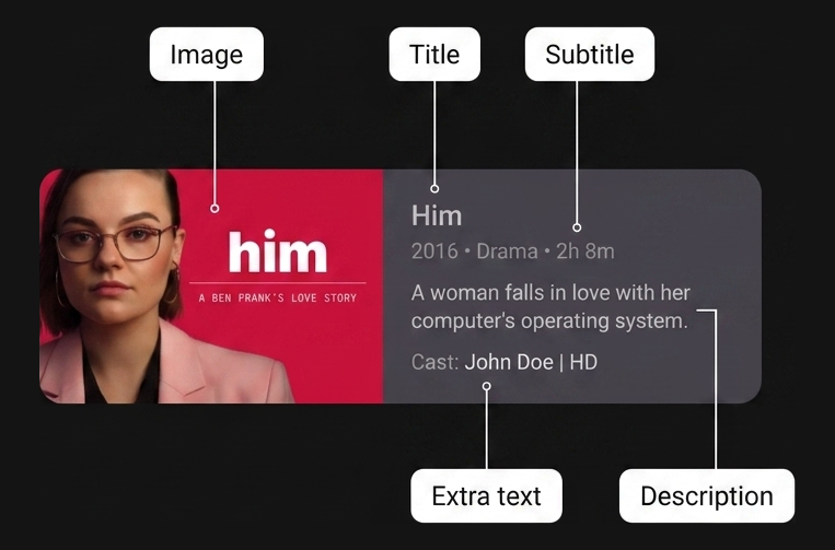
The TV app design guidelines define a card variant
called the Wide classic card,
which displays an image and its descriptive content block side by side.
When building complex two-dimensional layouts for TV screens,
using traditional coordinate-based positioning
or deeply nested Row and Column containers can make your code difficult
to read, maintain, and refactor.
The Wide classic card is an ideal use case for the Jetpack Compose Grid API,
helping you structure side-by-side elements cleanly using semantic,
user-defined 2D layout areas.
Best practices
Implement the card layout with Grid.
Using the Grid container improves code readability
by decoupling physical layout dimensions from child item placement.
Rather than relying on exact track indexes,
define semantic named areas with the area function
and place child composables with the gridItem modifier.
Combine flexible track sizing, such as GridTrackSize.Auto
and minmax(0.dp, 1.fr),
with exact track gaps (gap(row = 8.dp, column = 16.dp))
to organize complex side-by-side card components clearly and robustly.
Ingredients
Grid: A 2D container layout in Jetpack Compose that arranges child composables into rows and columns based on a configuration lambdagridItem: AModifierextension that associates a child UI element with a specific namedareaIdinside aGridlayoutarea: A configuration DSL function withinGridConfigurationScopethat maps a semanticareaIdto specific row and column spans or rangesCard: A Material Design container composable that groups related UI elements and stylingGridTrackSize.MinMax: A track sizing property that defines flexible bounds (minandmax) for row or column dimensionsGridTrackSize.Auto: A track sizing property that sizes the row or column track automatically to fit its content (column(GridTrackSize.Auto))gap: A configuration function that specifies the vertical (row) and horizontal (column) spacing between grid tracks
Steps
Define area identifiers, configure the grid tracks and areas, then place the child composables.
1. Define semantic area identifiers
First, create a type-safe representation of the regions inside your Wide classic
card layout. An enum class avoids string typos and provides
compile-time safety when mapping tracks and placing child items.
enum class CardArea { Image, Title, Subtitle, Description, ExtraText, }
2. Configure the 2D grid tracks and named areas
Inside your Grid composable's config lambda, define the columns and rows
that make up the card structure. Use GridTrackSize.Auto for the image column
so it wraps the thumbnail width cleanly. Use minmax(0.dp, 1.fr) for the
content column so it expands flexibly across the remaining card width. Specify
track spacing with gap(row = 8.dp, column = 16.dp). Map your CardArea
identifiers to their physical track coordinates using the area function.
Grid( config = { // Define columns: left column for image, right for content column(GridTrackSize.Auto) column(minmax(0.dp, 1.fr)) // Define row tracks for the vertical content stack row(GridTrackSize.Auto) row(GridTrackSize.Auto) row(GridTrackSize.Auto) row(GridTrackSize.Auto) // Map semantic identifiers to grid coordinates and spans area(CardArea.Image, row = 1, column = 1, rowSpan = 4) area(CardArea.Title, row = 1, column = 2) area(CardArea.Subtitle, row = 2, column = 2) area(CardArea.Description, row = 3, column = 2) area(CardArea.ExtraText, row = 4, column = 2) gap(row = 8.dp, column = 16.dp) } ) { // Child elements placed in Step 3 }
3. Place child composables using the gridItem modifier
With your tracks and areas configured, place each child UI element purely by
semantic intent using the gridItem modifier. You can declare child
composables in any order. The Grid container positions each element
directly into its assigned 2D region automatically.
@Composable fun WideClassicCard( imageContent: @Composable () -> Unit, title: String, subtitle: String, description: String, extraText: String, modifier: Modifier = Modifier, ) { Card(modifier = modifier) { Grid( config = { // Define columns: left column for image, right for content column(GridTrackSize.Auto) column(minmax(0.dp, 1.fr)) // Define row tracks for the vertical content stack row(GridTrackSize.Auto) row(GridTrackSize.Auto) row(GridTrackSize.Auto) row(GridTrackSize.Auto) // Map semantic identifiers to grid coordinates and spans area(CardArea.Image, row = 1, column = 1, rowSpan = 4) area(CardArea.Title, row = 1, column = 2) area(CardArea.Subtitle, row = 2, column = 2) area(CardArea.Description, row = 3, column = 2) area(CardArea.ExtraText, row = 4, column = 2) gap(row = 8.dp, column = 16.dp) }, ) { Box(modifier = Modifier.gridItem(CardArea.Image)) { imageContent() } Text( text = title, style = MaterialTheme.typography.titleLarge, modifier = Modifier .gridItem(CardArea.Title) .padding(top = 16.dp, end = 16.dp), ) Text( text = subtitle, style = MaterialTheme.typography.titleMedium, modifier = Modifier .gridItem(CardArea.Subtitle) .padding(end = 16.dp), ) Text( text = description, style = MaterialTheme.typography.bodyMedium, modifier = Modifier .gridItem(CardArea.Description) .padding(end = 16.dp), ) Text( text = extraText, style = MaterialTheme.typography.labelSmall, modifier = Modifier .gridItem(CardArea.ExtraText) .padding(bottom = 16.dp, end = 16.dp), ) } } }
Results
By organizing your Wide classic card with Grid and named areas,
you achieve a clean separation between physical layout tracks, area
coordinates, and child composable placement.
This structure makes your layout readable and maintainable
while following TV app design guidelines
for side-by-side thumbnail and description components.