

This recipe shows how the Grid API improves code readability compared to traditional nested structures. By configuring auto-sized tracks, you can create a grid that dynamically adapts to cell width and height based on the intrinsic size of your text composables.
In this recipe, you build a table using the Grid API.
| Layout | Lazy loading | Soft wrap | Dynamic layout update | |
|---|---|---|---|---|
FlexBox |
1D | No | Yes | Yes |
Grid |
2D | No | No | Yes |
Best practices
Use the Grid composable to improve table readability and maintainability. Grid gives you precise control over column dimensions and alignment across all rows without manually synchronizing widths.
Ingredients
Grid: A composable layout that places items in a two-dimensional grid. The layout configuration is specified inside theconfiglambda parameter, while UI content items are declared inside thecontentlambda parameter.GridTrackSize.Auto: Specifies automatic track sizing within the grid configuration based on content intrinsic size, for example,column(GridTrackSize.Auto)androw(GridTrackSize.Auto).gap(): Configures row and column spacing withinGridConfigurationScope, such asgap(row = 8.dp, column = 16.dp).
Steps
Build a multi-column comparison table using a single Grid layout with
automatic column alignment and track sizing for all items.
1. Count grid rows and columns to determine track sizes
First, count your columns and rows to determine the size of the tracks:
- Columns: The number of attributes you are comparing, plus one column for the item name.
- Rows: The number of items you are comparing, plus one header row.
For this recipe comparing two components (FlexBox and Grid) across four attributes, you need five columns and three rows.
2. Implement comparison table using Grid
Create a TableInGrid composable that uses Grid to lay out your table items. Call the column and row functions inside the config lambda to define track sizes, and set cell spacing with gap(). Because text has intrinsic size, GridTrackSize.Auto automatically sizes columns and rows to fit their content.
Inside the content lambda, place your table headers and data. Grid automatically handles the placement and alignment of all cells:
@Composable fun TableInGrid( modifier: Modifier = Modifier, ) { Grid( config = { column(GridTrackSize.Auto) column(GridTrackSize.Auto) column(GridTrackSize.Auto) column(GridTrackSize.Auto) column(GridTrackSize.Auto) row(GridTrackSize.Auto) row(GridTrackSize.Auto) row(GridTrackSize.Auto) gap(row = 8.dp, column = 16.dp) }, modifier = modifier, ) { // Table Header Text(text = "", fontWeight = FontWeight.Bold) Text(text = "Layout", fontWeight = FontWeight.Bold) Text(text = "Lazy loading", fontWeight = FontWeight.Bold) Text(text = "Soft wrap", fontWeight = FontWeight.Bold) Text(text = "Dynamic layout update", fontWeight = FontWeight.Bold) // FlexBox Row Text(text = "FlexBox", fontWeight = FontWeight.Bold) Text(text = "1D") Text(text = "No") Text(text = "Yes") Text(text = "Yes") // Grid Row Text(text = "Grid", fontWeight = FontWeight.Bold) Text(text = "2D") Text(text = "No") Text(text = "No") Text(text = "Yes") } }
Results
You've now built a clean, two-dimensional comparison table with automatic column alignment and cellspacing.
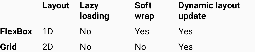
Grid.