

The Grid composable creates structural, two-dimensional screen layouts.
Grid defines a responsive layout structure using explicitly defined tracks
(rows and columns) and gaps as the foundational architecture of your UI.
Because Grid is a structural rather than a lazy-loading container, it requires you to
explicitly define every element placed within it without recycling items on scroll.
As a result, rendering large or dynamic datasets directly within a Grid can cause performance
bottlenecks as all items compose simultaneously.
To display large collections of data within a structured screen layout, embed
lazy components such as LazyColumn or LazyRow in your Grid cells.
But note: flexible tracks (with specifications such as 1.fr) query the
intrinsic sizes of child elements. Because SubcomposeLayout does not support intrinsic measurement passes,
placing a lazy list inside a flexible track causes an
IllegalStateException crash. To safely place lazy lists inside a flexible grid
track, you must use GridTrackSize.MinMax sizing (such as minmax(0.dp, 1.fr))
to bypass the intrinsic measurement pass.
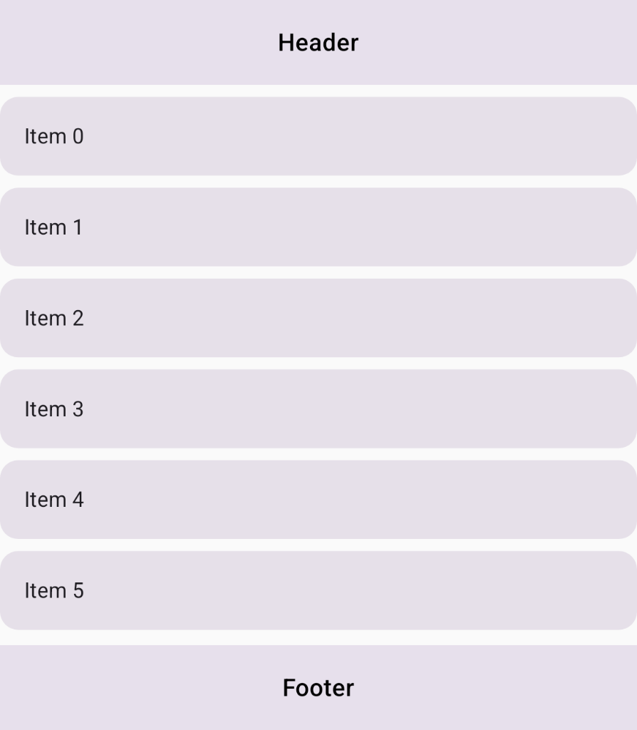
LazyColumn for content.Best practices
- Use lazy lists instead of large explicit loops: To display large or
dynamic datasets within a structured
Grid, embed lazy components (typicallyLazyColumnorLazyRow) inside specific grid cells rather than creating large explicit loops over items, asGriddoes not recycle items and has a limit of 1000 tracks. - Use
MinMaxtrack sizing for lazy lists: BecauseLazyColumnandLazyRowdon't support intrinsic measurement passes (seeSubcomposeLayout), useGridTrackSize.MinMaxon flexible tracks hosting lazy components to bypass intrinsic measurements safely.
Ingredients
Grid: Composable layout that places items in a two-dimensional grid structure configured using explicit row and column tracks.LazyColumn: Vertically scrolling list that composes and recycles only the items currently visible on screen.GridTrackSize.MinMax: Track sizing property that defines flexible bounds (minandmax) to safely host lazy components without triggering runtime measurement crashes.gridItem: ComposeModifierextension that assigns a child UI element to a specific cell or named area inside aGrid.
Steps
Structure your screen layout by defining semantic area identifiers, configuring
grid tracks with minmax sizing for lazy list compatibility, and embedding
LazyColumn inside the grid content area.
1. Configure grid tracks and named areas
Create an enum class to represent the distinct regions of your screen layout,
and define a GridConfigurationScope lambda for your layout tracks and named
areas. Use GridTrackSize.MaxContent for the header and footer rows to fit their
content dimensions, and use minmax(0.dp, 1.fr) for the content track hosting
the lazy list to allocate flexible space without querying unsupported intrinsic
measurements:
enum class ScreenArea { Header, Content, Footer } val lazyConfig: GridConfigurationScope.() -> Unit = { column(minmax(0.dp, 1.fr)) row(GridTrackSize.MaxContent) row(minmax(0.dp, 1.fr)) row(GridTrackSize.MaxContent) area(ScreenArea.Header, row = 1, column = 1) area(ScreenArea.Content, row = 2, column = 1) area(ScreenArea.Footer, row = 3, column = 1) gap(8.dp) }
2. Place static components in the Grid
In your composable, pass lazyConfig to the Grid container. Inside the
content lambda, place static components (Header and Footer) and position them
using Modifier.gridItem() with their respective area identifiers.
3. Embed LazyColumn in the content area
In the content cell, embed LazyColumn using Modifier.gridItem(ScreenArea.Content).
Because the content track was configured with minmax(0.dp, 1.fr) in Step 1,
LazyColumn can safely measure and recycle items on scroll without querying unsupported
intrinsic dimensions:
@Composable fun GridWithLazyColumn( modifier: Modifier = Modifier, items: List<String> = emptyList(), ) { Grid( modifier = modifier.fillMaxSize(), config = lazyConfig ) { Text("Header", Modifier.gridItem(ScreenArea.Header).padding(16.dp)) Text("Footer", Modifier.gridItem(ScreenArea.Footer).padding(16.dp)) // LazyColumn placed in the content area for large datasets LazyColumn( modifier = Modifier .gridItem(ScreenArea.Content) .fillMaxSize(), verticalArrangement = Arrangement.spacedBy(8.dp) ) { items(items) { item -> Text(item, Modifier.padding(16.dp)) } } } }
Results
Your screen layout now utilizes the Grid API to define the overall
two-dimensional page structure, while embedding a LazyColumn in a flexible
track with minmax sizing to recycle list items efficiently and avoid runtime
exceptions.