ภาษาการออกแบบที่สื่อความหมายของ Material 3
จัดทุกอย่างให้เป็นระเบียบอยู่เสมอด้วยคอลเล็กชัน
บันทึกและจัดหมวดหมู่เนื้อหาตามค่ากำหนดของคุณ
Material 3 Expressive (M3) สร้างขึ้นเพื่อตอบสนองความต้องการของผู้ใช้ที่ต้องการประสบการณ์การใช้งานที่ทันสมัย เกี่ยวข้อง และโดดเด่น การแสดงออกยังช่วยให้นักออกแบบสะท้อนอารมณ์และความรู้สึกที่เฉพาะเจาะจงในเลย์เอาต์และการแสดงอินเทอร์เฟซได้ด้วย
สีและการจัดรูปแบบตัวอักษร
ระบบสีจะขยายการให้บริการเพื่อใช้ชุดโทนสีที่เข้มขึ้นและชุดโทเค็นที่กว้างขึ้นของ M3 และการปรับขนาดแบบอักษรที่เรียบง่ายขึ้นจะใช้แกนแบบอักษรแบบผันแปรเพื่อแสดงออกมากขึ้น ซึ่งทำให้การโต้ตอบมีความชัดเจนและน่าพึงพอใจยิ่งขึ้น
ธีมสี
โทเค็นใหม่ช่วยให้ใช้สีได้มากขึ้นกับธีมต่างๆ และบริบทของระบบการออกแบบโดยรวม
แบบอักษรที่ปรับแต่งได้
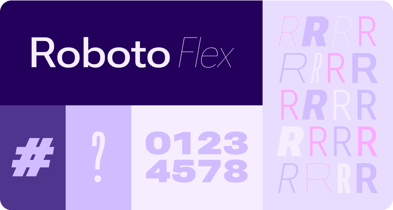
ข้อควรพิจารณาที่อัปเดตสำหรับแบบอักษรแบบผันแปรและแกนที่ปรับแต่งได้นั้นครอบคลุมมากกว่า 1 ฝ่ายเพื่อรองรับ Use Case ของบุคคลที่สามด้วย เช่น Roboto Flex ซึ่งมีชุดแกนผันแปรที่คล้ายกัน
แกนของแบบอักษรที่ปรับแต่งได้ขณะเคลื่อนไหว
การใช้แกนแบบอักษรแบบแปรผันเพื่อส่งสัญญาณความคิดเห็นเกี่ยวกับการเคลื่อนไหวที่สื่ออารมณ์ และทำให้อินเทอร์แอกชันสื่ออารมณ์และน่าใช้มากขึ้น
ตัวอย่างกรณีการใช้งาน
- น้ำหนักแบบอักษรแบบไดนามิก
- ความกว้างแบบอักษรแบบไดนามิก
- น้ำหนักและความกว้างแบบอักษรแบบไดนามิก
บทบาทประเภทต่างๆ
นอกจากการปรับขนาดแบบอักษรที่อัปเดตและเพิ่มประสิทธิภาพแล้ว เรายังเปิดตัวบทบาทแบบอักษรใหม่ที่จะแสดงรูปแบบที่น่าสนใจบน Wear โดยเฉพาะ
บทบาทประเภทใหม่เหล่านี้รองรับ Use Case หลายรายการ ซึ่งรวมถึงข้อความโค้งสำหรับชื่อแพลตฟอร์ม เนื้อหาเชิงรุกที่มีพื้นที่โฆษณาแบบเรียลไทม์ และบทบาทประเภทสำหรับตัวเลขโดยเฉพาะ ซึ่งช่วยให้ใช้ข้อความที่มีขนาดและรูปแบบมากขึ้นสำหรับสตริงที่ไม่จำเป็นต้องแปลได้
รูปร่างและการเคลื่อนไหว
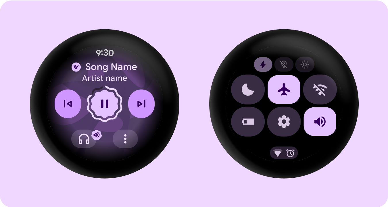
นอกจากนี้ เรายังใช้ภาษาของรูปร่างในลักษณะที่ครอบคลุมและสื่อความหมายมากขึ้นด้วยการใช้รูปร่างของคอนเทนเนอร์ที่ยืดหยุ่นเพื่อใช้การปัดเหลี่ยมมุมให้มนและแหลมคมเพื่อรองรับรายการและสถานะของปุ่มที่เปลี่ยนรูปร่าง เราขอแนะนำปุ่มที่แนบไปกับขอบเป็นรูปแบบการออกแบบใหม่ที่เป็นเอกลักษณ์และโดดเด่นสำหรับอุปกรณ์แบบกลมใน Wear
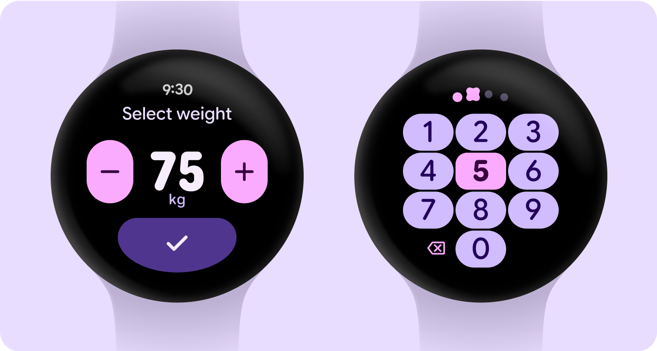
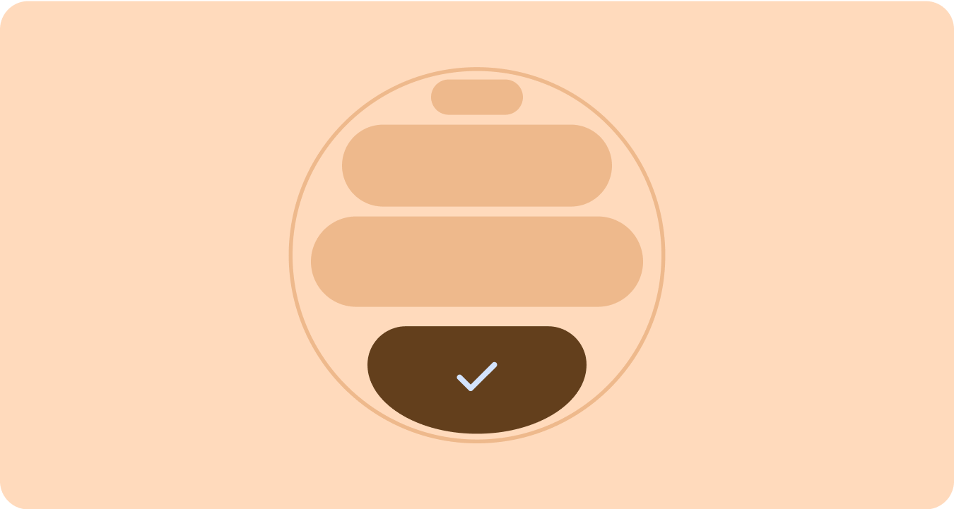
คอนเทนเนอร์ที่ชิดขอบ
ขอแนะนําคอนเทนเนอร์รูปทรงที่รองรับรูปทรงกลมและเพิ่มพื้นที่ภายในรูปแบบของอุปกรณ์แบบกลมให้ได้สูงสุด
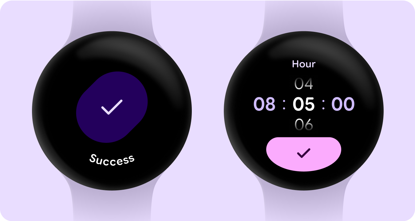
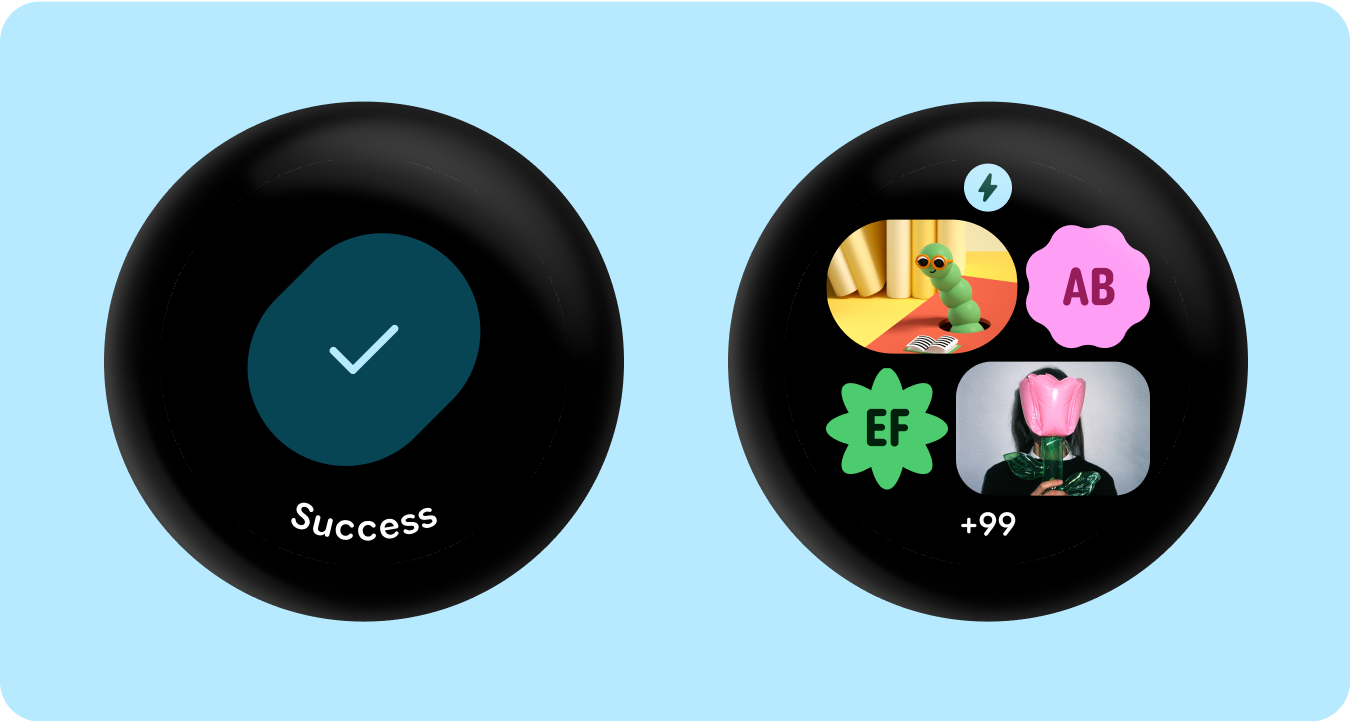
ใช้รูปร่างแล้ว
การใช้รัศมีมุมและรูปร่างที่ไม่ซ้ำกันเป็นตัวยึดเพื่อรองรับการออกแบบที่สื่อความหมาย ซึ่งรวมถึงภาพเคลื่อนไหวการโหลดที่น่าพึงพอใจ เลย์เอาต์ที่น่าสนใจ ปุ่มที่เปลี่ยนรูปร่าง และกลุ่มปุ่มที่ปรับเปลี่ยนได้
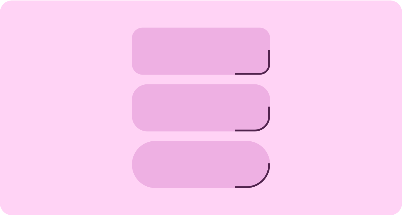
รัศมีมุม
การใช้รูปทรงมุมของ Material 3 เพื่อสร้างความหลากหลาย ความโดดเด่น และความสัมพันธ์ระหว่างรูปทรงของคอนเทนเนอร์
คอนเทนเนอร์ที่จัดกลุ่ม
คอนเทนเนอร์คอมโพเนนต์ใช้เทคนิคเลย์เอาต์ที่ยืดหยุ่นเพื่อปรับให้เข้ากับพื้นที่ว่างที่มีอยู่แบบไดนามิก โดยอาจจัดสรรพื้นที่นี้อย่างสมดุลเพื่อให้สมมาตร หรือจัดเรียงองค์ประกอบอย่างมีกลยุทธ์เพื่อสร้างลำดับชั้นภาพ เน้นเนื้อหาที่สําคัญ และแนะนําการโต้ตอบของผู้ใช้ผ่านสิ่งบอกใบ้ที่สื่อความหมายและเน้นการเคลื่อนไหว
ตัวอย่างเนื้อหาและโค้ดในหน้าเว็บนี้ขึ้นอยู่กับใบอนุญาตที่อธิบายไว้ในใบอนุญาตการใช้เนื้อหา Java และ OpenJDK เป็นเครื่องหมายการค้าหรือเครื่องหมายการค้าจดทะเบียนของ Oracle และ/หรือบริษัทในเครือ
อัปเดตล่าสุด 2025-07-27 UTC
[[["เข้าใจง่าย","easyToUnderstand","thumb-up"],["แก้ปัญหาของฉันได้","solvedMyProblem","thumb-up"],["อื่นๆ","otherUp","thumb-up"]],[["ไม่มีข้อมูลที่ฉันต้องการ","missingTheInformationINeed","thumb-down"],["ซับซ้อนเกินไป/มีหลายขั้นตอนมากเกินไป","tooComplicatedTooManySteps","thumb-down"],["ล้าสมัย","outOfDate","thumb-down"],["ปัญหาเกี่ยวกับการแปล","translationIssue","thumb-down"],["ตัวอย่าง/ปัญหาเกี่ยวกับโค้ด","samplesCodeIssue","thumb-down"],["อื่นๆ","otherDown","thumb-down"]],["อัปเดตล่าสุด 2025-07-27 UTC"],[],[],null,["# Material 3 Expressive design language\n\nMaterial 3 Expressive (M3) was built to meet user demand for experiences that\nare modern, relevant, and distinct. Expressive also allows designers to mirror\nspecific emotions and feelings in the layout and presentation of the interface.\n\nColor and typography\n--------------------\n\nThe [color system](/design/ui/wear/guides/styles/color/system) is expanding to adopt M3's deeper tonal palettes and a\nwider token set and the simpler typography scale is utilizing variable font axes\nfor more expression, making interactions more expressive and delightful.\n\n### Color theming\n\n\nThe [new tokens](/design/ui/wear/guides/styles/color/roles-tokens) allow for more color to be applied across different themes\nand in context of the design system as a whole. \n\n\u003cbr /\u003e\n\n### Variable fonts\n\n\nThe updated considerations for variable fonts and their customizable axis,\nextend beyond 1P to also serve 3P use cases such as Roboto Flex, which has a\nsimilar set of variable axis. \n\n\u003cbr /\u003e\n\n### Variable font axis in motion\n\n\nUtilizing variable font axis to signal expressive motion feedback and making\ninteractions more expressive and delightful to use.\n\nExample use-cases:\n\n- Dynamic font weight\n- Dynamic font width\n- Dynamic font weight and width \n\n\u003cbr /\u003e\n\n### Type roles\n\n\nAlong with an updated and optimized type scale, we are also introducing new type\nroles that specifically serve notable patterns on Wear.\n\nThese new type roles support several use cases---including Arc Text for surface\ntitles, proactive content with live space, and a type role specifically for\nNumerals---that allow for bigger and more styled text sizes for strings that don't\nneed to be localized. \n\n\u003cbr /\u003e\n\nShape and motion\n----------------\n\nWe are also leaning into shape language in a much more expansive and meaningful\nway by utilizing flexible container shapes to apply rounding and sharpening of\ncorner radius to support shape morphing lists and button states. We're\nintroducing edge-hugging buttons as a new ownable and iconic design pattern for\nround devices on Wear.\n\n### Edge-hugging containers\n\n\nIntroducing shape containers that embrace round and maximize the space within\nthe circular form factor. \n\n\u003cbr /\u003e\n\n### Shape applied\n\n\nUsing corner radius and unique shapes as containers to embrace expressive design\n---extending to delightful loading animations, interesting layouts, shape-morphing\nbuttons and adaptive button groups. \n\n\u003cbr /\u003e\n\n### Corner radius\n\n\nUtilizing Material 3 corner shapes to enable variety, distinction, and\nrelationship between container shapes. \n\n\u003cbr /\u003e\n\n### Grouped containers\n\n\nComponent containers use flexible layout techniques to dynamically adapt to\navailable space. They can distribute this space evenly for symmetry, or\nstrategically arrange elements to establish visual hierarchy, emphasize\nimportant content, and guide user interaction through expressive and motion-lead\nvisual cues. \n\n\u003cbr /\u003e"]]