שפת העיצוב הדרמטית של Material 3
קל לארגן דפים בעזרת אוספים
אפשר לשמור ולסווג תוכן על סמך ההעדפות שלך.
גרסת Material 3 Expressive (M3) נוצרה כדי לענות על הביקוש של המשתמשים לחוויות מודרניות, רלוונטיות וייחודיות. העיצוב היצירתי מאפשר למעצבים לשקף רגשות ותחושות ספציפיים בפריסה ובתצוגה של הממשק.
צבע וטיפוגרפיה
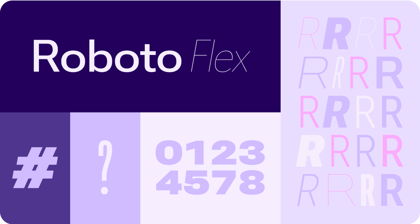
מערכת הצבעים מתרחבת כדי לכלול את ערכות הצבעים העשירות יותר של M3 ואת קבוצת האסימונים הרחבה יותר. בנוסף, סולם הטיפוגרפיה הפשוט יותר משתמש בצירים של גופנים משתנים כדי להוסיף ביטוי, וכך האינטראקציות הן חזותיות ומעניינות יותר.
עיצוב לפי צבע
האסימונים החדשים מאפשרים להשתמש בצבעים נוספים בנושאים שונים ובהקשר של מערכת העיצוב בכללותה.
גופנים משתנים
השיקולים המעודכנים לגבי גופנים ניתנים להתאמה אישית ויש להם צירים שניתן להתאים אישית, שחלים גם על צד ראשון (1P) וגם על צד שלישי (3P) בתרחישי שימוש כמו Roboto Flex, שיש לו קבוצה דומה של צירים ניתנים להתאמה אישית.
ציר של גופן משתנה בתנועה
שימוש בציר של גופן משתנה כדי לסמן משוב תנועה מודגש ולהפוך את האינטראקציות ליותר מודגשות ומהנות לשימוש.
תרחישים לדוגמה:
- משקל גופן דינמי
- רוחב גופן דינמי
- עובי ורוחבו של גופן דינמי
תפקידים מסוג Type
בנוסף לסולם מודלים מעודכן ומותאם, אנחנו משיקים גם תפקידים חדשים של מודלים שמתאימים במיוחד לדפוסים בולטים ב-Wear.
תפקידים חדשים מסוגים אלה תומכים בכמה תרחישים לדוגמה – כולל טקסט Arc לכותרות של משטחים, תוכן יזום עם שטח פעיל ותפקיד סוג ספציפי למספרים – שמאפשרים להגדיל את גודל הטקסט ולשנות את הסגנון שלו במחרוזות שלא צריך לבצע להן לוקליזציה.
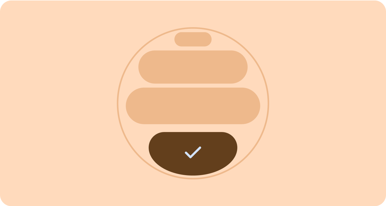
צורה ותנועה
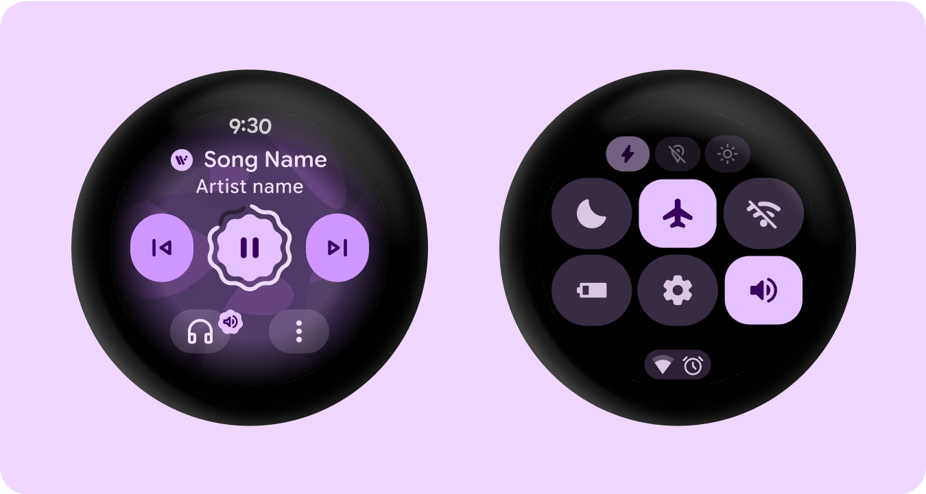
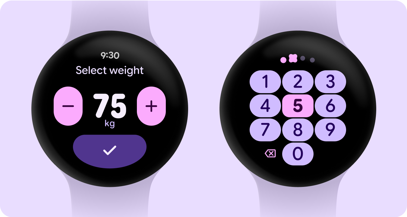
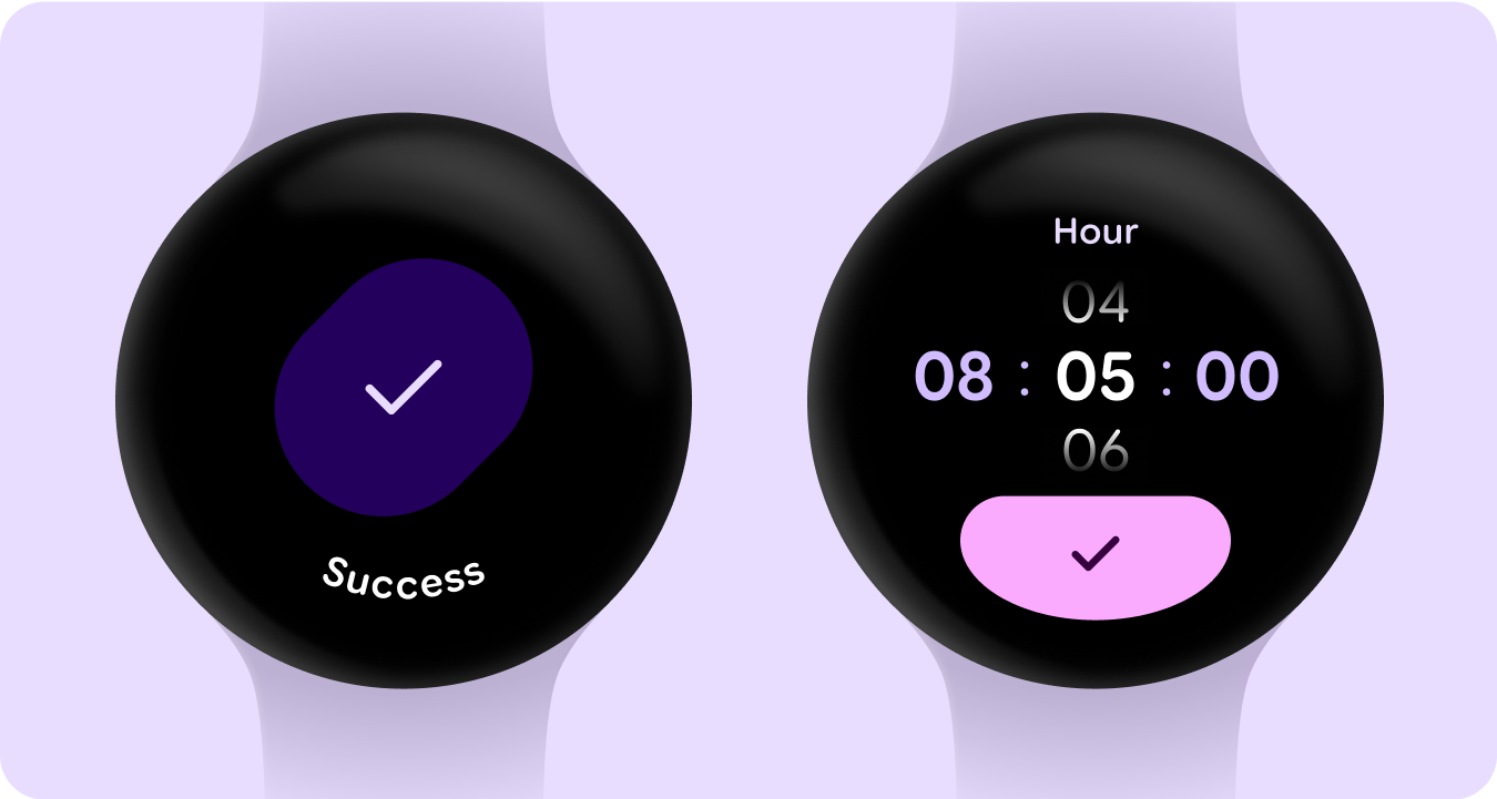
אנחנו גם משתמשים בשפת הצורות בצורה רחבה ומשמעותית יותר, באמצעות צורות גמישות של קונטיינרים כדי להחיל עיגול והתחדדות של רדיוס הפינות, כדי לתמוך ברשימות ובמצבי לחצנים שמשתנים בצורה דרמטית. אנחנו משיקים לחצנים שמקיפים את הקצוות כסגנון עיצוב חדש ומובהק למכשירים עגולים ב-Wear.
קונטיינרים שמתאימים לקצוות
אנחנו שמחים להציג קונטיינרים בצורת עיגול שמנצלים את כל המרחב בגורם הצורה העגול.
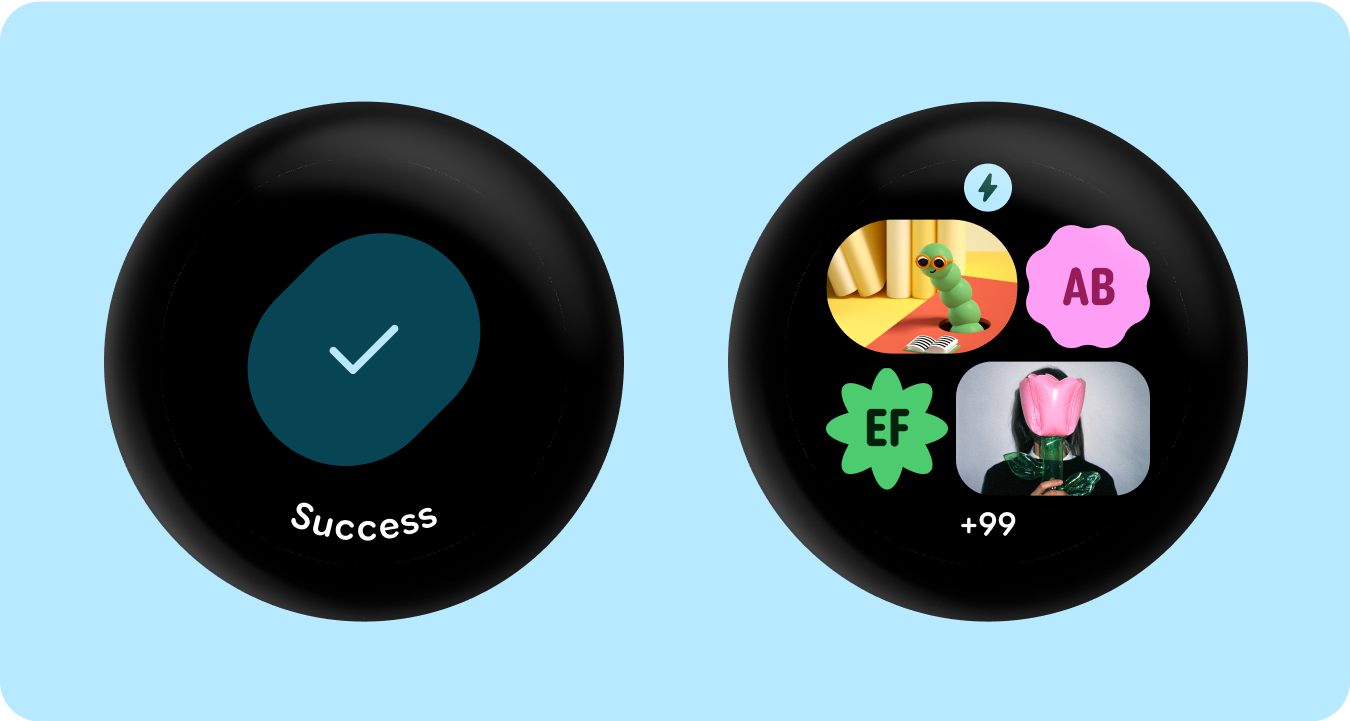
הצורה הוחלפה
שימוש בקוטר פינות ובצורות ייחודיות כקונטיינרים כדי ליצור עיצוב מודגש – כולל אנימציות טעינה מהנות, פריסות מעניינות, לחצנים שמשתנים צורה וקבוצות לחצנים מותאמות.
רדיוס הפינה
שימוש בצורות של פינות ב-Material 3 כדי ליצור מגוון, הבחנה וקשר בין צורות הקונטיינרים.
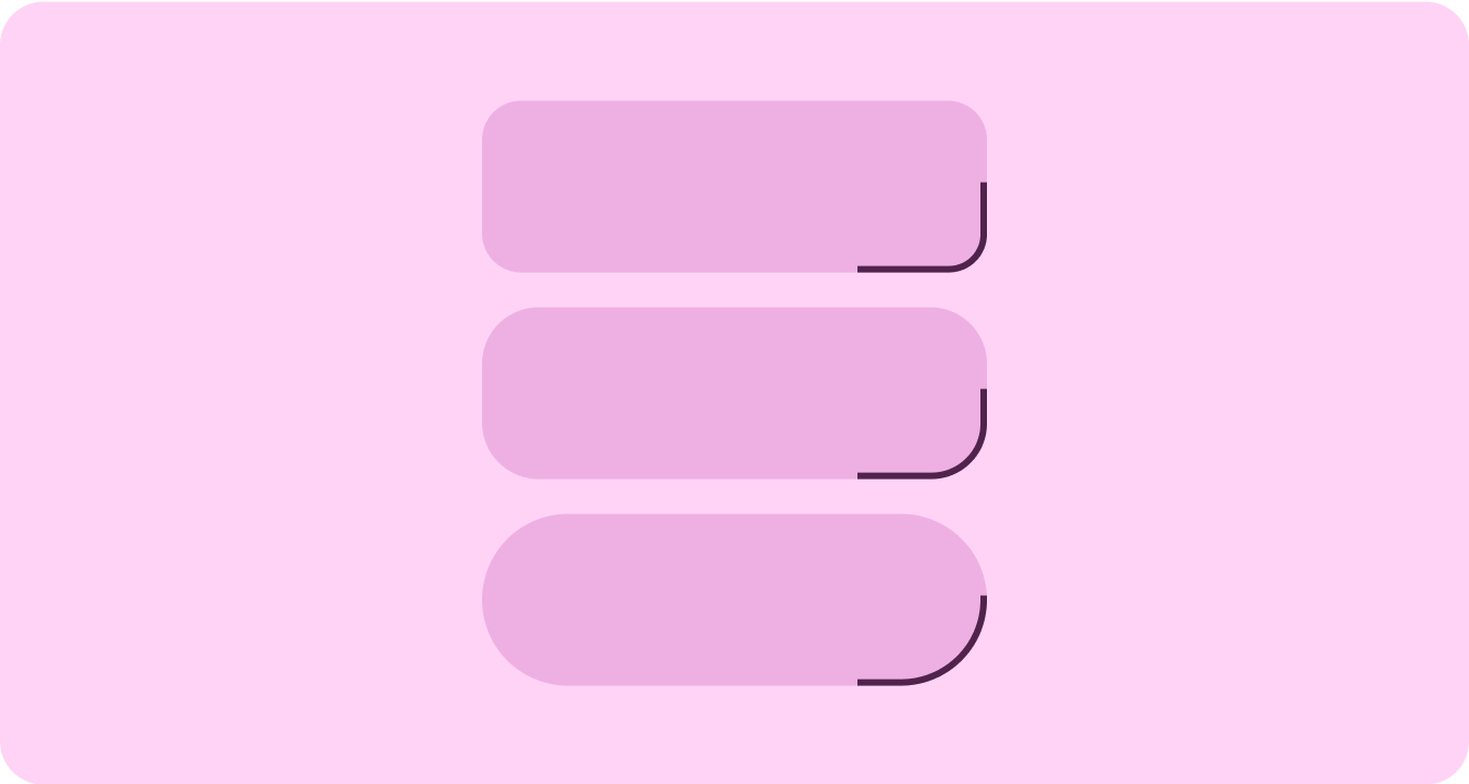
קונטיינרים מקובצים
בקונטיינרים של רכיבים נעשה שימוש בשיטות גמישות של פריסה כדי להתאים את עצמם באופן דינמי למרחב הזמין. הם יכולים לחלק את המרחב הזה באופן שווה כדי ליצור סימטריה, או לסדר את הרכיבים באופן אסטרטגי כדי ליצור היררכיה חזותית, להדגיש תוכן חשוב ולכוון את האינטראקציה של המשתמשים באמצעות סימנים חזותיים מודגשים ומובילים תנועה.
דוגמאות התוכן והקוד שבדף הזה כפופות לרישיונות המפורטים בקטע רישיון לתוכן. Java ו-OpenJDK הם סימנים מסחריים או סימנים מסחריים רשומים של חברת Oracle ו/או של השותפים העצמאיים שלה.
עדכון אחרון: 2025-07-27 (שעון UTC).
[[["התוכן קל להבנה","easyToUnderstand","thumb-up"],["התוכן עזר לי לפתור בעיה","solvedMyProblem","thumb-up"],["סיבה אחרת","otherUp","thumb-up"]],[["חסרים לי מידע או פרטים","missingTheInformationINeed","thumb-down"],["התוכן מורכב מדי או עם יותר מדי שלבים","tooComplicatedTooManySteps","thumb-down"],["התוכן לא עדכני","outOfDate","thumb-down"],["בעיה בתרגום","translationIssue","thumb-down"],["בעיה בדוגמאות/בקוד","samplesCodeIssue","thumb-down"],["סיבה אחרת","otherDown","thumb-down"]],["עדכון אחרון: 2025-07-27 (שעון UTC)."],[],[],null,["# Material 3 Expressive design language\n\nMaterial 3 Expressive (M3) was built to meet user demand for experiences that\nare modern, relevant, and distinct. Expressive also allows designers to mirror\nspecific emotions and feelings in the layout and presentation of the interface.\n\nColor and typography\n--------------------\n\nThe [color system](/design/ui/wear/guides/styles/color/system) is expanding to adopt M3's deeper tonal palettes and a\nwider token set and the simpler typography scale is utilizing variable font axes\nfor more expression, making interactions more expressive and delightful.\n\n### Color theming\n\n\nThe [new tokens](/design/ui/wear/guides/styles/color/roles-tokens) allow for more color to be applied across different themes\nand in context of the design system as a whole. \n\n\u003cbr /\u003e\n\n### Variable fonts\n\n\nThe updated considerations for variable fonts and their customizable axis,\nextend beyond 1P to also serve 3P use cases such as Roboto Flex, which has a\nsimilar set of variable axis. \n\n\u003cbr /\u003e\n\n### Variable font axis in motion\n\n\nUtilizing variable font axis to signal expressive motion feedback and making\ninteractions more expressive and delightful to use.\n\nExample use-cases:\n\n- Dynamic font weight\n- Dynamic font width\n- Dynamic font weight and width \n\n\u003cbr /\u003e\n\n### Type roles\n\n\nAlong with an updated and optimized type scale, we are also introducing new type\nroles that specifically serve notable patterns on Wear.\n\nThese new type roles support several use cases---including Arc Text for surface\ntitles, proactive content with live space, and a type role specifically for\nNumerals---that allow for bigger and more styled text sizes for strings that don't\nneed to be localized. \n\n\u003cbr /\u003e\n\nShape and motion\n----------------\n\nWe are also leaning into shape language in a much more expansive and meaningful\nway by utilizing flexible container shapes to apply rounding and sharpening of\ncorner radius to support shape morphing lists and button states. We're\nintroducing edge-hugging buttons as a new ownable and iconic design pattern for\nround devices on Wear.\n\n### Edge-hugging containers\n\n\nIntroducing shape containers that embrace round and maximize the space within\nthe circular form factor. \n\n\u003cbr /\u003e\n\n### Shape applied\n\n\nUsing corner radius and unique shapes as containers to embrace expressive design\n---extending to delightful loading animations, interesting layouts, shape-morphing\nbuttons and adaptive button groups. \n\n\u003cbr /\u003e\n\n### Corner radius\n\n\nUtilizing Material 3 corner shapes to enable variety, distinction, and\nrelationship between container shapes. \n\n\u003cbr /\u003e\n\n### Grouped containers\n\n\nComponent containers use flexible layout techniques to dynamically adapt to\navailable space. They can distribute this space evenly for symmetry, or\nstrategically arrange elements to establish visual hierarchy, emphasize\nimportant content, and guide user interaction through expressive and motion-lead\nvisual cues. \n\n\u003cbr /\u003e"]]