با مجموعهها، منظم بمانید
ذخیره و طبقهبندی محتوا براساس اولویتهای شما.
مؤلفه Dialog پیامهای پاپآپ را نمایش میدهد یا ورودی کاربر را در لایهای بالای محتوای اصلی برنامه درخواست میکند. این یک تجربه رابط کاربری وقفهای ایجاد میکند تا توجه کاربر را به خود جلب کند.
از جمله موارد استفاده برای دیالوگ موارد زیر است:
تأیید عملکرد کاربر، مانند هنگام حذف یک فایل.
درخواست ورودی کاربر، مانند برنامه فهرست کارها.
ارائه فهرستی از گزینهها برای انتخاب کاربر، مانند انتخاب کشور در تنظیمات نمایه.
این پیاده سازی مستلزم آن است که minSDK پروژه شما روی سطح API 21 یا بالاتر تنظیم شود.
وابستگی ها
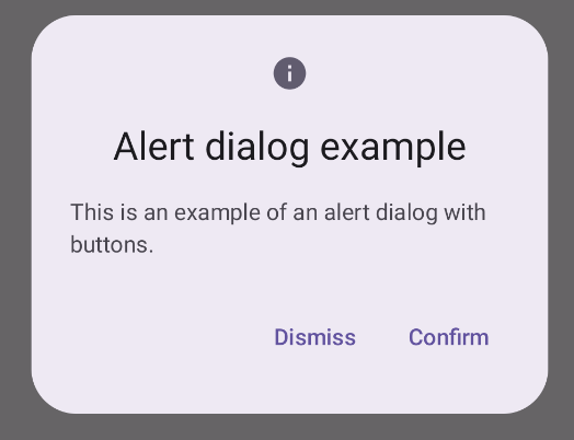
یک گفتگوی هشدار ایجاد کنید
AlertDialog composable یک API مناسب برای ایجاد یک گفتگو با موضوع طراحی مواد ارائه می دهد. مثال زیر دو دکمه را در یک گفتگوی هشدار اجرا می کند، یکی که گفتگو را رد می کند و دیگری که درخواست آن را تایید می کند:
این پیاده سازی مستلزم یک composable والد است که آرگومان های قابل ترکیب را به این ترتیب به فرزند ارسال می کند:
نتایج
شکل 1. گفتگوی هشدار با دکمه ها.
نکات کلیدی
AlertDialog دارای پارامترهای خاصی برای مدیریت عناصر خاصی از گفتگو است. از جمله موارد زیر است:
title : متنی که در بالای دیالوگ ظاهر می شود.
text : متنی که در مرکز گفتگو ظاهر می شود.
icon : گرافیکی که در بالای دیالوگ ظاهر می شود.
onDismissRequest : تابعی که وقتی کاربر دیالوگ را رد می کند، مثلاً با ضربه زدن در خارج از آن، فراخوانی می شود.
dismissButton : قابل ترکیب که به عنوان دکمه رد کردن عمل می کند.
confirmButton : قابل ترکیب که به عنوان دکمه تایید عمل می کند.
هنگامی که کاربر روی هر یک از دکمه ها کلیک می کند، گفتگو بسته می شود. وقتی کاربر تأیید را کلیک می کند، تابعی را فراخوانی می کند که تأیید را نیز کنترل می کند. در این مثال، آن توابع onDismissRequest() و onConfirmRequest() هستند.
در مواردی که گفتگوی شما به مجموعه پیچیده تری از دکمه ها نیاز دارد، ممکن است از استفاده از Dialog composable و پر کردن آن به شیوه ای آزادتر بهره مند شوید.
یک دیالوگ ایجاد کنید
Dialog یک ترکیب اولیه است که هیچ گونه استایل یا جایگاه های از پیش تعریف شده ای برای محتوا ارائه نمی دهد. این یک ظرف ساده است که باید آن را با ظرفی مانند Card پر کنید. در زیر برخی از پارامترهای کلیدی یک دیالوگ آمده است:
onDismissRequest : زمانی که کاربر کادر گفتگو را می بندد، لامبدا فراخوانی می شود.
properties : نمونه ای از DialogProperties که فضای بیشتری را برای سفارشی سازی فراهم می کند.
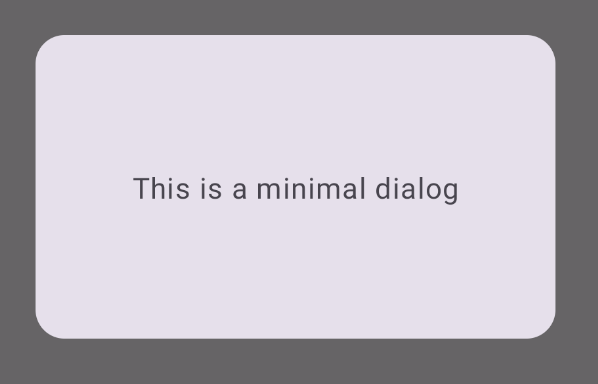
یک گفتگوی اساسی ایجاد کنید
مثال زیر یک پیاده سازی اساسی از Dialog composable است. توجه داشته باشید که از یک Card به عنوان ظرف ثانویه استفاده می کند. بدون Card ، جزء Text به تنهایی بالای محتوای اصلی برنامه ظاهر میشود.
نتیجه
توجه داشته باشید که وقتی کادر گفتگو باز است، محتوای اصلی برنامه در زیر آن تیره و خاکستری به نظر می رسد:
شکل 2. گفتگوی حداقل.
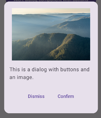
یک گفتگوی پیشرفته ایجاد کنید
زیر یک پیاده سازی پیشرفته تر از Dialog composable است. در این مورد، کامپوننت به صورت دستی یک رابط مشابه با مثال قبلی AlertDialog پیاده سازی می کند.
نتیجه
شکل 3. یک گفتگو که شامل یک تصویر است.
مجموعه هایی که حاوی این راهنما هستند
این راهنما بخشی از مجموعههای راهنمای Quick Guide است که اهداف توسعه Android گستردهتری را پوشش میدهد:
نمایش متن
متن بخش مرکزی هر رابط کاربری است. روش های مختلفی را بیابید که می توانید متن را در برنامه خود ارائه دهید تا تجربه کاربری لذت بخشی را ارائه دهید.
محتوا و نمونه کدها در این صفحه مشمول پروانههای توصیفشده در پروانه محتوا هستند. جاوا و OpenJDK علامتهای تجاری یا علامتهای تجاری ثبتشده Oracle و/یا وابستههای آن هستند.
تاریخ آخرین بهروزرسانی 2025-02-06 بهوقت ساعت هماهنگ جهانی.
[[["درک آسان","easyToUnderstand","thumb-up"],["مشکلم را برطرف کرد","solvedMyProblem","thumb-up"],["غیره","otherUp","thumb-up"]],[["اطلاعاتی که نیاز دارم وجود ندارد","missingTheInformationINeed","thumb-down"],["بیشازحد پیچیده/ مراحل بسیار زیاد","tooComplicatedTooManySteps","thumb-down"],["قدیمی","outOfDate","thumb-down"],["مشکل ترجمه","translationIssue","thumb-down"],["مشکل کد / نمونهها","samplesCodeIssue","thumb-down"],["غیره","otherDown","thumb-down"]],["تاریخ آخرین بهروزرسانی 2025-02-06 بهوقت ساعت هماهنگ جهانی."],[],[],null,["\u003cbr /\u003e\n\nThe [`Dialog`](/reference/kotlin/androidx/compose/ui/window/package-summary#Dialog(kotlin.Function0,androidx.compose.ui.window.DialogProperties,kotlin.Function0)) component displays pop-up messages or requests user input on a\nlayer above the main app content. It creates an interruptive UI experience to\ncapture user attention.\n\nAmong the use cases for a dialog are the following:\n\n- Confirming user action, such as when deleting a file.\n- Requesting user input, such as in a to-do list app.\n- Presenting a list of options for user selection, like choosing a country in a profile setup.\n\nThis topic provides the following implementations:\n\n- [Alert](#alert)\n- [Basic dialog](#basic)\n- [Advanced dialog](#advanced)\n\nVersion compatibility\n\nThis implementation requires that your project minSDK be set to API level 21 or\nhigher.\n\nDependencies\n\nCreate an Alert dialog\n\nThe [`AlertDialog`](/reference/kotlin/androidx/compose/material3/package-summary#AlertDialog(kotlin.Function0,kotlin.Function0,androidx.compose.ui.Modifier,kotlin.Function0,kotlin.Function0,kotlin.Function0,kotlin.Function0,androidx.compose.ui.graphics.Shape,androidx.compose.ui.graphics.Color,androidx.compose.ui.graphics.Color,androidx.compose.ui.graphics.Color,androidx.compose.ui.graphics.Color,androidx.compose.ui.unit.Dp,androidx.compose.ui.window.DialogProperties)) composable provides a convenient API for creating a\nMaterial Design themed dialog. The following example implements two buttons in\nan alert dialog, one that dismisses the dialog, and another that confirms its\nrequest:\n\nThis implementation implies a parent composable that passes arguments to the\nchild composable in this way:\n\nResults **Figure 1.** An alert dialog with buttons.\n\nKey points\n\n`AlertDialog` has specific parameters for handling particular elements of the\ndialog. Among them are the following:\n\n- `title`: The text that appears along the top of the dialog.\n- `text`: The text that appears centered within the dialog.\n- `icon`: The graphic that appears at the top of the dialog.\n- `onDismissRequest`: The function called when the user dismisses the dialog, such as by tapping outside of it.\n- `dismissButton`: A composable that serves as the dismiss button.\n- `confirmButton`: A composable that serves as the confirm button.\n\n- When the user clicks either of the buttons, the dialog closes. When the user\n clicks confirm, it calls a function that also handles the confirmation. In\n this example, those functions are `onDismissRequest()` and\n `onConfirmRequest()`.\n\n In cases where your dialog requires a more complex set of buttons, you may\n benefit from using the `Dialog` composable and populating it in a more\n freeform manner.\n\nCreate a dialog\n\n[`Dialog`](/reference/kotlin/androidx/compose/ui/window/package-summary#Dialog(kotlin.Function0,androidx.compose.ui.window.DialogProperties,kotlin.Function0)) is a basic composable that doesn't provide any styling or\npredefined slots for content. It is a straightforward container that you should\npopulate with a container such as `Card`. The following are some of the key\nparameters of a dialog:\n\n- **`onDismissRequest`**: The lambda called when the user closes the dialog.\n- **`properties`** : An instance of [`DialogProperties`](/reference/kotlin/androidx/compose/ui/window/DialogProperties) that provides some additional scope for customization.\n\n| **Caution:** You must manually specify the size and shape of `Dialog`. You also must provide an inner container.\n\nCreate a basic dialog\n\nThe following example is a basic implementation of the `Dialog` composable. Note\nthat it uses a `Card` as the secondary container. Without the `Card`, the `Text`\ncomponent would appear alone above the main app content.\n\nResult\n\nNote that when the dialog is open, the main app content beneath it appears\ndarkened and grayed out:\n**Figure 2.** Minimal dialog.\n\nCreate an advanced dialog\n\nThe following is a more advanced implemented of the `Dialog` composable. In this\ncase, the component manually implements a similar interface to the preceding\n`AlertDialog` example.\n| **Caution:** If you only need to display a two-button dialog as in this example, you should use `AlertDialog` and its more convenient API. However, if you want to create a more complex dialog, perhaps with forms and multiple buttons, you should use `Dialog` with custom content, as in the following example.\n\nResult **Figure 3.** A dialog that includes an image.\n\nCollections that contain this guide\n\nThis guide is part of these curated Quick Guide collections that cover\nbroader Android development goals: \n\nDisplay text \nText is a central piece of any UI. Find out different ways you can present text in your app to provide a delightful user experience. \n[Quick guide collection](/develop/ui/compose/quick-guides/collections/display-text) \n\nRequest user input \nLearn how to implement ways for users to interact with your app by entering text and using other means of input. \n[Quick guide collection](/develop/ui/compose/quick-guides/collections/request-user-input) \n\nDisplay interactive components \nLearn how composable functions can enable you to easily create beautiful UI components based on the Material Design design system. \n[Quick guide collection](/develop/ui/compose/quick-guides/collections/display-interactive-components) \n\nHave questions or feedback \nGo to our frequently asked questions page and learn about quick guides or reach out and let us know your thoughts. \n[Go to FAQ](/quick-guides/faq) [Leave feedback](https://issuetracker.google.com/issues/new?component=1573691&template=1993320)"]]