
사용자가 앱에서 기능을 탐색하고 액세스하는 데 도움이 되는 하단 앱 바를 만듭니다. 이 가이드를 따라 BottomAppBar 컴포저블을 사용하여 앱에 하단 앱 바를 추가합니다.
버전 호환성
이 구현을 사용하려면 프로젝트 minSDK를 API 수준 21 이상으로 설정해야 합니다.
종속 항목
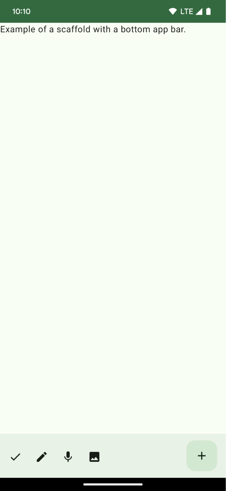
하단 앱 바 만들기
다음 코드를 사용하여 아이콘 버튼 4개와 플로팅 작업 버튼이 포함된 하단 앱 바를 만듭니다.
@Composable fun BottomAppBarExample() { Scaffold( bottomBar = { BottomAppBar( actions = { IconButton(onClick = { /* do something */ }) { Icon(Icons.Filled.Check, contentDescription = "Localized description") } IconButton(onClick = { /* do something */ }) { Icon( Icons.Filled.Edit, contentDescription = "Localized description", ) } IconButton(onClick = { /* do something */ }) { Icon( Icons.Filled.Mic, contentDescription = "Localized description", ) } IconButton(onClick = { /* do something */ }) { Icon( Icons.Filled.Image, contentDescription = "Localized description", ) } }, floatingActionButton = { FloatingActionButton( onClick = { /* do something */ }, containerColor = BottomAppBarDefaults.bottomAppBarFabColor, elevation = FloatingActionButtonDefaults.bottomAppBarFabElevation() ) { Icon(Icons.Filled.Add, "Localized description") } } ) }, ) { innerPadding -> Text( modifier = Modifier.padding(innerPadding), text = "Example of a scaffold with a bottom app bar." ) } }
코드 관련 핵심 사항
bottomBar가 설정된 외부Scaffold- 작업 목록이 포함된
bottomBar구현입니다. - 이미지 및 콘텐츠 설명 텍스트의
Icon를 포함하는IconButton의 구현인 작업으로, 각 작업에는 이러한 작업을 실행하는onClick람다 함수가 있습니다.
다음과 같은 주요 매개변수에 컴포저블을 전달할 수 있습니다.
actions: 막대 왼쪽에 표시되는 일련의 아이콘입니다. 일반적으로 이러한 작업은 특정 화면의 주요 작업 또는 탐색 항목입니다.floatingActionButton: 막대 오른쪽에 표시되는 플로팅 작업 버튼입니다.
결과
이 가이드가 포함된 컬렉션
이 가이드는 더 광범위한 Android 개발 목표를 다루는 선별된 빠른 가이드 모음의 일부입니다.
홈 화면 스캐폴드 만들기
표준화된 플랫폼을 사용하여 복잡한 사용자 인터페이스를 빌드하는 방법을 알아보세요. 스켈레톤은 UI의 여러 부분을 함께 유지하여 앱에 일관된 디자인과 느낌을 제공합니다.
대화형 구성요소 표시
구성 가능한 함수를 사용하여 Material Design 디자인 시스템을 기반으로 멋진 UI 구성요소를 쉽게 만드는 방법을 알아보세요.
질문이나 의견이 있으신가요?
자주 묻는 질문(FAQ) 페이지로 이동하여 빠른 가이드를 알아보거나 문의하여 의견을 보내주세요.