با مجموعهها، منظم بمانید
ذخیره و طبقهبندی محتوا براساس اولویتهای شما.
یک نوار برنامه پایین ایجاد کنید تا به کاربران کمک کنید تا به عملکردهای برنامه شما دسترسی داشته باشند. این دستورالعمل را دنبال کنید تا با استفاده از BottomAppBar composable نوار برنامه پایینی را به برنامه خود اضافه کنید.
سازگاری نسخه
این پیاده سازی مستلزم آن است که minSDK پروژه شما روی سطح API 21 یا بالاتر تنظیم شود.
وابستگی ها
یک نوار برنامه پایین ایجاد کنید
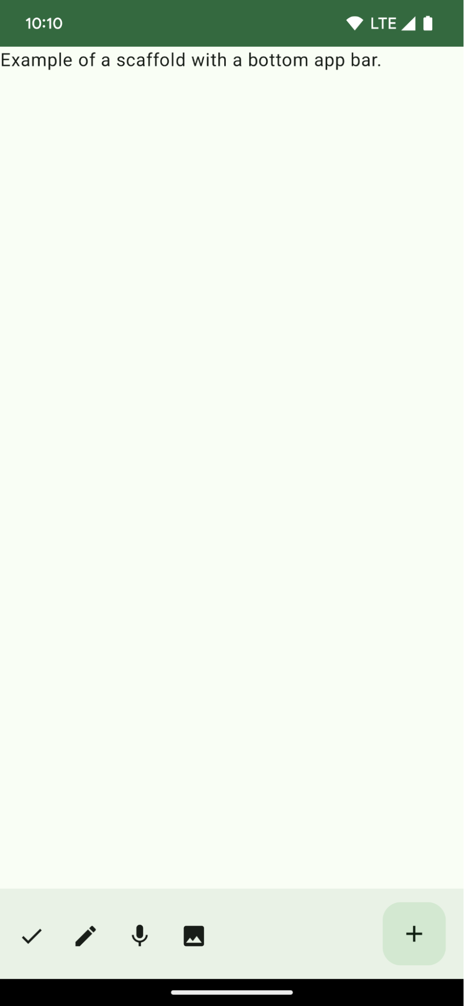
از کد زیر برای ایجاد یک نوار برنامه پایین حاوی چهار دکمه آیکون و یک دکمه عمل شناور استفاده کنید:
@ComposablefunBottomAppBarExample(){Scaffold(bottomBar={BottomAppBar(actions={IconButton(onClick={/* do something */}){Icon(Icons.Filled.Check,contentDescription="Localized description")}IconButton(onClick={/* do something */}){Icon(Icons.Filled.Edit,contentDescription="Localized description",)}IconButton(onClick={/* do something */}){Icon(Icons.Filled.Mic,contentDescription="Localized description",)}IconButton(onClick={/* do something */}){Icon(Icons.Filled.Image,contentDescription="Localized description",)}},floatingActionButton={FloatingActionButton(onClick={/* do something */},containerColor=BottomAppBarDefaults.bottomAppBarFabColor,elevation=FloatingActionButtonDefaults.bottomAppBarFabElevation()){Icon(Icons.Filled.Add,"Localized description")}})},){innerPadding->
Text(modifier=Modifier.padding(innerPadding),text="Example of a scaffold with a bottom app bar.")}}
یک Scaffold بیرونی که دارای یک مجموعه bottomBar است.
پیاده سازی bottomBar که حاوی لیستی از اقدامات است.
کنشهایی که پیادهسازی IconButton هستند که حاوی Icon برای تصویر و متن توضیحات محتوا هستند، که هر کدام دارای یک onClick lambda برای انجام این اقدامات هستند.
می توانید composable ها را برای پارامترهای کلیدی زیر ارسال کنید:
actions : مجموعه ای از نمادها که در سمت چپ نوار ظاهر می شوند. اینها معمولاً یا اقدامات کلیدی برای صفحه داده شده یا موارد ناوبری هستند.
این راهنما بخشی از مجموعههای راهنمای Quick Guide است که اهداف توسعه Android گستردهتری را پوشش میدهد:
یک داربست صفحه اصلی ایجاد کنید
نحوه استفاده از یک پلتفرم استاندارد برای ایجاد رابط های کاربری پیچیده را بیابید. داربست قسمتهای مختلف رابط کاربری را کنار هم نگه میدارد و به برنامهها ظاهر و احساسی منسجم میدهد.
محتوا و نمونه کدها در این صفحه مشمول پروانههای توصیفشده در پروانه محتوا هستند. جاوا و OpenJDK علامتهای تجاری یا علامتهای تجاری ثبتشده Oracle و/یا وابستههای آن هستند.
تاریخ آخرین بهروزرسانی 2025-06-04 بهوقت ساعت هماهنگ جهانی.
[[["درک آسان","easyToUnderstand","thumb-up"],["مشکلم را برطرف کرد","solvedMyProblem","thumb-up"],["غیره","otherUp","thumb-up"]],[["اطلاعاتی که نیاز دارم وجود ندارد","missingTheInformationINeed","thumb-down"],["بیشازحد پیچیده/ مراحل بسیار زیاد","tooComplicatedTooManySteps","thumb-down"],["قدیمی","outOfDate","thumb-down"],["مشکل ترجمه","translationIssue","thumb-down"],["مشکل کد / نمونهها","samplesCodeIssue","thumb-down"],["غیره","otherDown","thumb-down"]],["تاریخ آخرین بهروزرسانی 2025-06-04 بهوقت ساعت هماهنگ جهانی."],[],[],null,["# Display a bottom app bar\n\n\u003cbr /\u003e\n\nCreate a bottom app bar to help users navigate and access functions in your app.\nFollow this guidance to add a bottom app bar to your app by using the\n[`BottomAppBar`](/reference/com/google/android/material/bottomappbar/BottomAppBar) composable.\n\nVersion compatibility\n---------------------\n\nThis implementation requires that your project minSDK be set to API level 21 or\nhigher.\n\n### Dependencies\n\n### Kotlin\n\n\u003cbr /\u003e\n\n```kotlin\n implementation(platform(\"androidx.compose:compose-bom:2025.08.00\"))\n implementation (\"androidx.compose.material:material-icons-extended\")\n \n```\n\n\u003cbr /\u003e\n\n### Groovy\n\n\u003cbr /\u003e\n\n```groovy\n implementation platform('androidx.compose:compose-bom:2025.08.00')\n implementation 'androidx.compose.material:material-icons-extended'\n \n```\n\n\u003cbr /\u003e\n\nCreate a bottom app bar\n-----------------------\n\nUse the following code to create a bottom app bar containing four icon buttons,\nand a floating action button:\n\n\n```kotlin\n@Composable\nfun BottomAppBarExample() {\n Scaffold(\n bottomBar = {\n BottomAppBar(\n actions = {\n IconButton(onClick = { /* do something */ }) {\n Icon(Icons.Filled.Check, contentDescription = \"Localized description\")\n }\n IconButton(onClick = { /* do something */ }) {\n Icon(\n Icons.Filled.Edit,\n contentDescription = \"Localized description\",\n )\n }\n IconButton(onClick = { /* do something */ }) {\n Icon(\n Icons.Filled.Mic,\n contentDescription = \"Localized description\",\n )\n }\n IconButton(onClick = { /* do something */ }) {\n Icon(\n Icons.Filled.Image,\n contentDescription = \"Localized description\",\n )\n }\n },\n floatingActionButton = {\n FloatingActionButton(\n onClick = { /* do something */ },\n containerColor = BottomAppBarDefaults.bottomAppBarFabColor,\n elevation = FloatingActionButtonDefaults.bottomAppBarFabElevation()\n ) {\n Icon(Icons.Filled.Add, \"Localized description\")\n }\n }\n )\n },\n ) { innerPadding -\u003e\n Text(\n modifier = Modifier.padding(innerPadding),\n text = \"Example of a scaffold with a bottom app bar.\"\n )\n }\n}https://github.com/android/snippets/blob/dd30aee903e8c247786c064faab1a9ca8d10b46e/compose/snippets/src/main/java/com/example/compose/snippets/components/AppBar.kt#L138-L183\n```\n\n\u003cbr /\u003e\n\n### Key points about the code\n\n- An outer [`Scaffold`](/reference/kotlin/androidx/compose/material/package-summary#Scaffold(androidx.compose.foundation.layout.WindowInsets,androidx.compose.ui.Modifier,androidx.compose.material.ScaffoldState,kotlin.Function0,kotlin.Function0,kotlin.Function1,kotlin.Function0,androidx.compose.material.FabPosition,kotlin.Boolean,kotlin.Function1,kotlin.Boolean,androidx.compose.ui.graphics.Shape,androidx.compose.ui.unit.Dp,androidx.compose.ui.graphics.Color,androidx.compose.ui.graphics.Color,androidx.compose.ui.graphics.Color,androidx.compose.ui.graphics.Color,androidx.compose.ui.graphics.Color,kotlin.Function1)) that has a `bottomBar` set.\n- A `bottomBar` implementation that contains a list of actions.\n- Actions that are implementations of [`IconButton`](/reference/kotlin/androidx/compose/material/package-summary#IconButton(kotlin.Function0,androidx.compose.ui.Modifier,kotlin.Boolean,androidx.compose.foundation.interaction.MutableInteractionSource,kotlin.Function0)) that contain [`Icon`](/reference/kotlin/androidx/compose/material3/package-summary#Icon(androidx.compose.ui.graphics.ImageBitmap,kotlin.String,androidx.compose.ui.Modifier,androidx.compose.ui.graphics.Color)) for image and content description text, each with an `onClick` lambda to perform these actions.\n\nYou can pass composables for the following key parameters:\n\n- `actions`: a series of icons that appear on the left side of the bar. These are commonly either key actions for the given screen, or navigation items.\n- [`floatingActionButton`](/reference/com/google/android/material/floatingactionbutton/FloatingActionButton): the floating action button that appears on the right side of the bar.\n\n| **Note:** After you add the bottom app bar, you can customize it with content as you do with other containers by filling the `BottomAppBar` composable with other content. You can also use `BottomAppBar` without passing a value for `actions` or `floatingActionButton`.\n\nResults\n-------\n\n**Figure 1.** An example of a bottom app bar.\n\nCollections that contain this guide\n-----------------------------------\n\nThis guide is part of these curated Quick Guide collections that cover\nbroader Android development goals: \n\n### Create a home screen scaffold\n\nFind out how to use a standardized platform to build complex user interfaces. The scaffold holds together different parts of the UI, giving apps a coherent look and feel. \n[Quick guide collection](/develop/ui/compose/quick-guides/collections/create-a-home-screen-scaffold) \n\n### Display interactive components\n\nLearn how composable functions can enable you to easily create beautiful UI components based on the Material Design design system. \n[Quick guide collection](/develop/ui/compose/quick-guides/collections/display-interactive-components) \n\nHave questions or feedback\n--------------------------\n\nGo to our frequently asked questions page and learn about quick guides or reach out and let us know your thoughts. \n[Go to FAQ](/quick-guides/faq) [Leave feedback](https://issuetracker.google.com/issues/new?component=1573691&template=1993320)"]]