یک جزء داربست برای نگه داشتن رابط کاربری در کنار هم ایجاد کنید
با مجموعهها، منظم بمانید
ذخیره و طبقهبندی محتوا براساس اولویتهای شما.
در طراحی متریال، داربست یک ساختار اساسی است که یک پلت فرم استاندارد شده برای رابط های کاربری پیچیده فراهم می کند. بخشهای مختلف رابط کاربری، مانند نوارهای برنامه و دکمههای عمل شناور را در کنار هم نگه میدارد و به برنامهها ظاهر و احساسی منسجم میدهد.
سازگاری نسخه
این پیاده سازی مستلزم آن است که minSDK پروژه شما روی سطح API 21 یا بالاتر تنظیم شود.
وابستگی ها
یک داربست ایجاد کنید
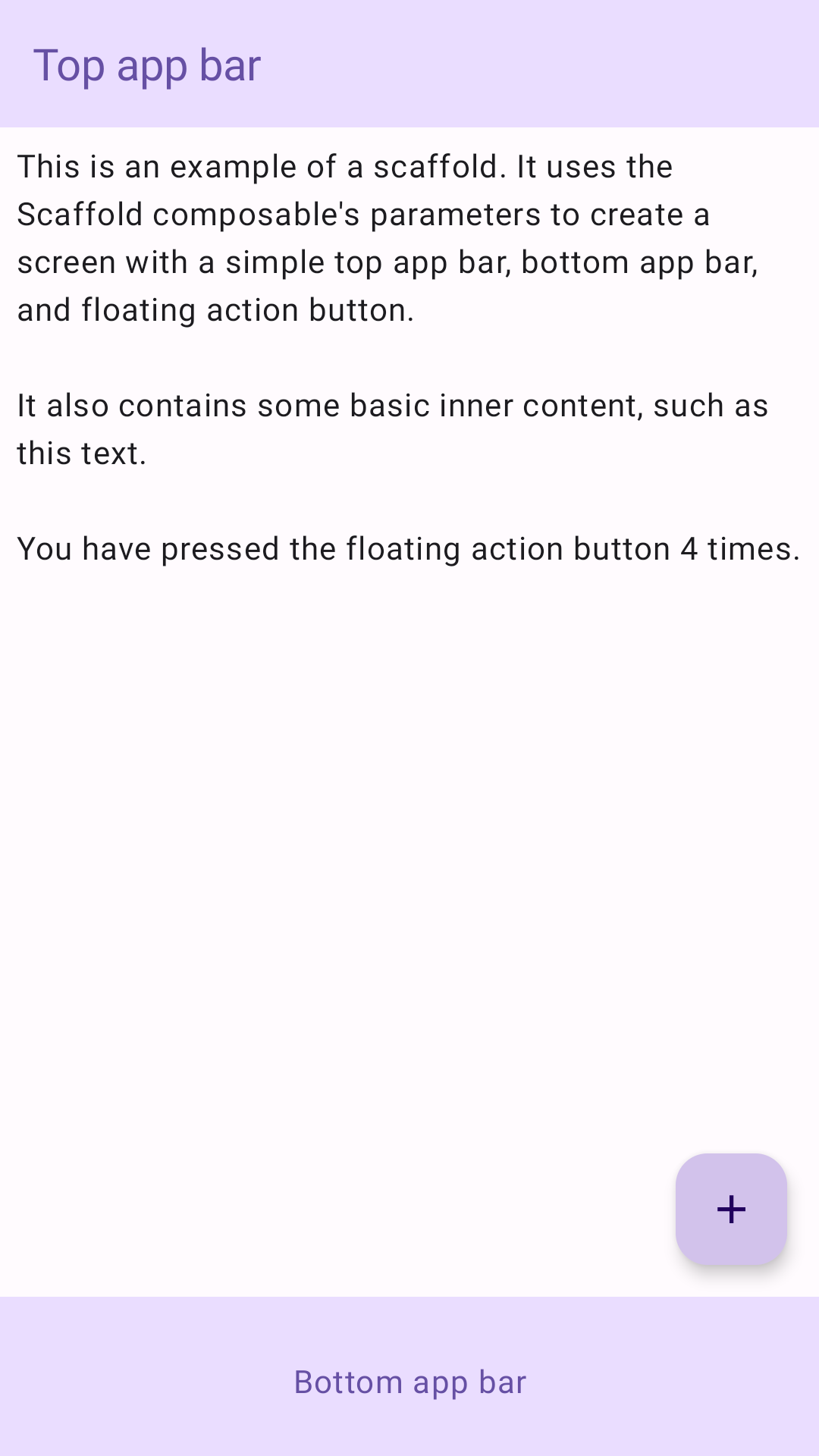
مثال زیر یک مثال کامل از نحوه پیاده سازی Scaffold را ارائه می دهد. این شامل یک نوار برنامه بالا، نوار برنامه پایین و یک دکمه عمل شناور است که با وضعیت داخلی Scaffold تعامل دارد.
نتایج
شکل 1. اجرای داربست.
نکات کلیدی
Scaffold composable یک API ساده ارائه می دهد که می توانید از آن برای جمع آوری سریع ساختار برنامه خود مطابق با دستورالعمل های طراحی متریال استفاده کنید. Scaffold چندین ترکیب پذیر را به عنوان پارامتر می پذیرد. از جمله موارد زیر است:
topBar : نوار برنامه در بالای صفحه.
bottomBar : نوار برنامه در پایین صفحه.
floatingActionButton : دکمهای که روی گوشه سمت راست پایین صفحه قرار میگیرد و میتوانید از آن برای نمایش اقدامات کلیدی استفاده کنید.
برای مثالهای دقیقتر در مورد نحوه اجرای هر دو نوار برنامه بالا و پایین، به صفحه نوار برنامه مراجعه کنید.
همچنین میتوانید محتوای Scaffold را همانطور که به ظروف دیگر منتقل میکنید ارسال کنید. یک مقدار innerPadding را به content lambda ارسال میکند که میتوانید از آن در composableهای فرزند استفاده کنید.
مجموعه هایی که حاوی این راهنما هستند
این راهنما بخشی از مجموعههای راهنمای Quick Guide است که اهداف توسعه Android گستردهتری را پوشش میدهد:
یک داربست صفحه اصلی ایجاد کنید
نحوه استفاده از یک پلتفرم استاندارد برای ایجاد رابط های کاربری پیچیده را بیابید. داربست قسمتهای مختلف رابط کاربری را کنار هم نگه میدارد و به برنامهها ظاهر و احساسی منسجم میدهد.
محتوا و نمونه کدها در این صفحه مشمول پروانههای توصیفشده در پروانه محتوا هستند. جاوا و OpenJDK علامتهای تجاری یا علامتهای تجاری ثبتشده Oracle و/یا وابستههای آن هستند.
تاریخ آخرین بهروزرسانی 2025-02-06 بهوقت ساعت هماهنگ جهانی.
[[["درک آسان","easyToUnderstand","thumb-up"],["مشکلم را برطرف کرد","solvedMyProblem","thumb-up"],["غیره","otherUp","thumb-up"]],[["اطلاعاتی که نیاز دارم وجود ندارد","missingTheInformationINeed","thumb-down"],["بیشازحد پیچیده/ مراحل بسیار زیاد","tooComplicatedTooManySteps","thumb-down"],["قدیمی","outOfDate","thumb-down"],["مشکل ترجمه","translationIssue","thumb-down"],["مشکل کد / نمونهها","samplesCodeIssue","thumb-down"],["غیره","otherDown","thumb-down"]],["تاریخ آخرین بهروزرسانی 2025-02-06 بهوقت ساعت هماهنگ جهانی."],[],[],null,["# Create a scaffold component to hold the UI together\n\n\u003cbr /\u003e\n\nIn Material Design, a scaffold is a fundamental structure that provides a\nstandardized platform for complex user interfaces. It holds together different\nparts of the UI, such as app bars and floating action buttons, giving apps a\ncoherent look and feel.\n\nVersion compatibility\n---------------------\n\nThis implementation requires that your project minSDK be set to API level 21\nor higher.\n\n### Dependencies\n\n### Kotlin\n\n\u003cbr /\u003e\n\n```kotlin\n implementation(platform(\"androidx.compose:compose-bom:2025.08.00\"))\n \n```\n\n\u003cbr /\u003e\n\n### Groovy\n\n\u003cbr /\u003e\n\n```groovy\n implementation platform('androidx.compose:compose-bom:2025.08.00')\n \n```\n\n\u003cbr /\u003e\n\nCreate a scaffold\n-----------------\n\nThe following example provides a full example of how you might implement\n[`Scaffold`](/reference/kotlin/androidx/compose/material/package-summary#Scaffold(androidx.compose.foundation.layout.WindowInsets,androidx.compose.ui.Modifier,androidx.compose.material.ScaffoldState,kotlin.Function0,kotlin.Function0,kotlin.Function1,kotlin.Function0,androidx.compose.material.FabPosition,kotlin.Boolean,kotlin.Function1,kotlin.Boolean,androidx.compose.ui.graphics.Shape,androidx.compose.ui.unit.Dp,androidx.compose.ui.graphics.Color,androidx.compose.ui.graphics.Color,androidx.compose.ui.graphics.Color,androidx.compose.ui.graphics.Color,androidx.compose.ui.graphics.Color,kotlin.Function1)). It contains a top app bar, bottom app bar, and a floating action\nbutton that interacts with `Scaffold`'s internal state.\n\n\u003cbr /\u003e\n\n```kotlin\n@Composable\nfun ScaffoldExample() {\n var presses by remember { mutableIntStateOf(0) }\n\n Scaffold(\n topBar = {\n TopAppBar(\n colors = topAppBarColors(\n containerColor = MaterialTheme.colorScheme.primaryContainer,\n titleContentColor = MaterialTheme.colorScheme.primary,\n ),\n title = {\n Text(\"Top app bar\")\n }\n )\n },\n bottomBar = {\n BottomAppBar(\n containerColor = MaterialTheme.colorScheme.primaryContainer,\n contentColor = MaterialTheme.colorScheme.primary,\n ) {\n Text(\n modifier = Modifier\n .fillMaxWidth(),\n textAlign = TextAlign.Center,\n text = \"Bottom app bar\",\n )\n }\n },\n floatingActionButton = {\n FloatingActionButton(onClick = { presses++ }) {\n Icon(Icons.Default.Add, contentDescription = \"Add\")\n }\n }\n ) { innerPadding -\u003e\n Column(\n modifier = Modifier\n .padding(innerPadding),\n verticalArrangement = Arrangement.spacedBy(16.dp),\n ) {\n Text(\n modifier = Modifier.padding(8.dp),\n text =\n \"\"\"\n This is an example of a scaffold. It uses the Scaffold composable's parameters to create a screen with a simple top app bar, bottom app bar, and floating action button.\n\n It also contains some basic inner content, such as this text.\n\n You have pressed the floating action button $presses times.\n \"\"\".trimIndent(),\n )\n }\n }\n}\n \n https://github.com/android/snippets/blob/dd30aee903e8c247786c064faab1a9ca8d10b46e/compose/snippets/src/main/java/com/example/compose/snippets/components/Scaffold.kt#L47-L100\n \n```\n\n\u003cbr /\u003e\n\nResults\n-------\n\n**Figure 1.** An implementation of scaffold.\n\nKey points\n----------\n\nThe [`Scaffold`](/reference/kotlin/androidx/compose/material/ScaffoldState) composable provides a straightforward API you can use to\nquickly assemble your app's structure according to Material Design guidelines.\n`Scaffold` accepts several composables as parameters. Among these are the\nfollowing:\n\n- `topBar`: The app bar across the top of the screen.\n- `bottomBar`: The app bar across the bottom of the screen.\n- `floatingActionButton`: A button that hovers over the bottom-right corner of the screen that you can use to expose key actions.\n\nFor more detailed examples on how you can implement both top and bottom\napp bars, see the app bars page.\n\nYou can also pass `Scaffold` content as you would to other containers. It passes\nan `innerPadding` value to the `content` lambda that you can then use in child\ncomposables.\n\nCollections that contain this guide\n-----------------------------------\n\nThis guide is part of these curated Quick Guide collections that cover\nbroader Android development goals: \n\n### Create a home screen scaffold\n\nFind out how to use a standardized platform to build complex user interfaces. The scaffold holds together different parts of the UI, giving apps a coherent look and feel. \n[Quick guide collection](/develop/ui/compose/quick-guides/collections/create-a-home-screen-scaffold) \n\n### Display interactive components\n\nLearn how composable functions can enable you to easily create beautiful UI components based on the Material Design design system. \n[Quick guide collection](/develop/ui/compose/quick-guides/collections/display-interactive-components) \n\nHave questions or feedback\n--------------------------\n\nGo to our frequently asked questions page and learn about quick guides or reach out and let us know your thoughts. \n[Go to FAQ](/quick-guides/faq) [Leave feedback](https://issuetracker.google.com/issues/new?component=1573691&template=1993320)"]]