
In Material Design, a scaffold is a fundamental structure that provides a standardized platform for complex user interfaces. It holds together different parts of the UI, such as app bars and floating action buttons, giving apps a coherent look and feel.
Results
Version compatibility
This implementation requires that your project minSDK be set to API level 21 or higher.
Dependencies
Create a scaffold
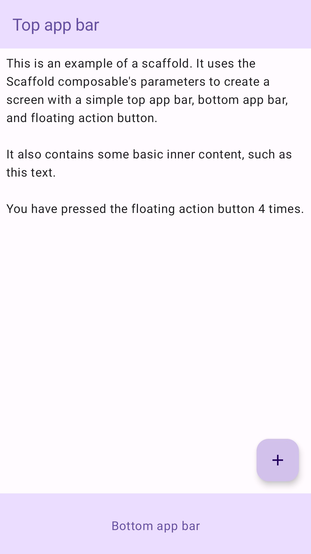
The following example provides a full example of how you might implement
Scaffold. It contains a top app bar, bottom app bar, and a floating action
button that interacts with Scaffold's internal state.
Key points
The Scaffold composable provides a straightforward API you can use to
quickly assemble your app's structure according to Material Design guidelines.
Scaffold accepts several composables as parameters. Among these are the
following:
topBar: The app bar across the top of the screen.bottomBar: The app bar across the bottom of the screen.floatingActionButton: A button that hovers over the bottom-right corner of the screen that you can use to expose key actions.
For more detailed examples on how you can implement both top and bottom app bars, see the app bars page.
You can also pass Scaffold content as you would to other containers. It passes
an innerPadding value to the content lambda that you can then use in child
composables.
Collections that contain this guide
This guide is part of these curated Quick Guide collections that cover broader Android development goals:

Create a home screen scaffold
Display interactive components