탐색 창 구성요소로 슬라이드 인 메뉴 만들기
컬렉션을 사용해 정리하기
내 환경설정을 기준으로 콘텐츠를 저장하고 분류하세요.
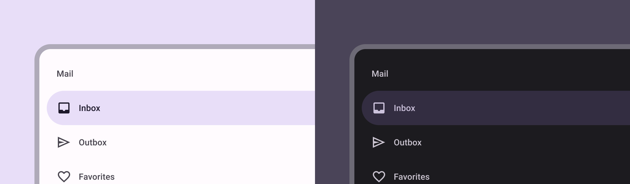
탐색 창 구성요소는 사용자가 앱의 다양한 섹션으로 이동할 수 있는 슬라이드 인 메뉴입니다. 사용자는 측면에서 스와이프하거나 메뉴 아이콘을 탭하여 이를 활성화할 수 있습니다.
탐색 창을 구현하기 위한 다음 세 가지 사용 사례를 고려해 보세요.
- 콘텐츠 구성: 사용자가 뉴스 또는 블로그 앱과 같이 여러 카테고리 간에 전환할 수 있도록 합니다.
- 계정 관리: 사용자 계정이 있는 앱에서 계정 설정 및 프로필 섹션으로 연결되는 빠른 링크를 제공합니다.
- 기능 탐색: 단일 메뉴에 여러 기능과 설정을 정리하여 복잡한 앱에서 사용자 탐색 및 액세스를 용이하게 합니다.
Material Design에는 두 가지 유형의 탐색 창이 있습니다.
- 표준: 화면 내 공간을 다른 콘텐츠와 공유합니다.
- 모달: 화면 내 다른 콘텐츠 위에 표시됩니다.
버전 호환성
이 구현을 사용하려면 프로젝트 minSDK를 API 수준 21 이상으로 설정해야 합니다.
종속 항목
탐색 창 구현하기
ModalNavigationDrawer
컴포저블을 사용하여 탐색 창을 구현할 수 있습니다.
핵심사항
탐색 창 동작 제어
창이 열리고 닫히는 방식을 제어하려면 DrawerState
를 사용하세요.
핵심사항
drawerState
매개변수를 사용하여 DrawerState
를 ModalNavigationDrawer
에 전달합니다.
DrawerState
를 통해 현재 창 상태와 관련된 속성뿐만 아니라 open
및 close
함수에도 액세스할 수 있습니다. 이러한 정지 함수에는 CoroutineScope
가 필요하며 rememberCoroutineScope
를 사용하여 인스턴스화할 수 있습니다. UI 이벤트에 대한 응답으로 일시중지 함수를 호출할 수도 있습니다.
결과
그림 1. 표준 탐색 창 (왼쪽)과 모달 탐색 창 (오른쪽)
이 가이드가 포함된 컬렉션
이 가이드는 더 광범위한 Android 개발 목표를 다루는 선별된 빠른 가이드 모음의 일부입니다.
대화형 구성요소 표시
구성 가능한 함수를 사용하여 Material Design 디자인 시스템을 기반으로 멋진 UI 구성요소를 쉽게 만드는 방법을 알아보세요.
이 페이지에 나와 있는 콘텐츠와 코드 샘플에는 콘텐츠 라이선스에서 설명하는 라이선스가 적용됩니다. 자바 및 OpenJDK는 Oracle 및 Oracle 계열사의 상표 또는 등록 상표입니다.
최종 업데이트: 2025-02-06(UTC)
[[["이해하기 쉬움","easyToUnderstand","thumb-up"],["문제가 해결됨","solvedMyProblem","thumb-up"],["기타","otherUp","thumb-up"]],[["필요한 정보가 없음","missingTheInformationINeed","thumb-down"],["너무 복잡함/단계 수가 너무 많음","tooComplicatedTooManySteps","thumb-down"],["오래됨","outOfDate","thumb-down"],["번역 문제","translationIssue","thumb-down"],["샘플/코드 문제","samplesCodeIssue","thumb-down"],["기타","otherDown","thumb-down"]],["최종 업데이트: 2025-02-06(UTC)"],[],[],null,["# Create a slide-in menu with the navigation drawer component\n\n\u003cbr /\u003e\n\nThe [navigation drawer](https://material.io/components/navigation-drawer) component is a slide-in menu that lets users navigate\nto various sections of your app. Users can activate it by swiping from the side\nor tapping a menu icon.\n\nConsider these three use cases for implementing a navigation drawer:\n\n- **Content organization:** Enable users to switch between different categories, such as in news or blogging apps.\n- **Account management:** Provide quick links to account settings and profile sections in apps with user accounts.\n- **Feature discovery:** Organize multiple features and settings in a single menu to facilitate user discovery and access in complex apps.\n\nIn Material Design, there are two types of navigation drawers:\n\n- **Standard:** Share space within a screen with other content.\n- **Modal:** Appears over the top of other content within a screen.\n\nVersion compatibility\n---------------------\n\nThis implementation requires that your project minSDK be set to API level 21 or\nhigher.\n\n### Dependencies\n\n### Kotlin\n\n\u003cbr /\u003e\n\n```kotlin\n implementation(platform(\"androidx.compose:compose-bom:2025.08.00\"))\n \n```\n\n\u003cbr /\u003e\n\n### Groovy\n\n\u003cbr /\u003e\n\n```groovy\n implementation platform('androidx.compose:compose-bom:2025.08.00')\n \n```\n\n\u003cbr /\u003e\n\nImplement a navigation drawer\n-----------------------------\n\nYou can use the [`ModalNavigationDrawer`](/reference/kotlin/androidx/compose/material3/package-summary#ModalNavigationDrawer(kotlin.Function0,androidx.compose.ui.Modifier,androidx.compose.material3.DrawerState,kotlin.Boolean,androidx.compose.ui.graphics.Color,kotlin.Function0)) composable to implement a\nnavigation drawer:\n\n\u003cbr /\u003e\n\n```kotlin\nModalNavigationDrawer(\n drawerContent = {\n ModalDrawerSheet {\n Text(\"Drawer title\", modifier = Modifier.padding(16.dp))\n HorizontalDivider()\n NavigationDrawerItem(\n label = { Text(text = \"Drawer Item\") },\n selected = false,\n onClick = { /*TODO*/ }\n )\n // ...other drawer items\n }\n }\n) {\n // Screen content\n}\n \n https://github.com/android/snippets/blob/dd30aee903e8c247786c064faab1a9ca8d10b46e/compose/snippets/src/main/java/com/example/compose/snippets/layouts/MaterialLayoutSnippets.kt#L290-L305\n \n```\n\n\u003cbr /\u003e\n\n### Key points\n\n- Use the `drawerContent` slot to provide a [`ModalDrawerSheet`](/reference/kotlin/androidx/compose/material3/package-summary#ModalDrawerSheet(androidx.compose.ui.Modifier,androidx.compose.ui.graphics.Shape,androidx.compose.ui.graphics.Color,androidx.compose.ui.graphics.Color,androidx.compose.ui.unit.Dp,androidx.compose.foundation.layout.WindowInsets,kotlin.Function1)) and\n provide the drawer's contents.\n\n- `ModalNavigationDrawer` accepts a number of additional drawer parameters.\n For example, you can toggle whether or not the drawer responds to drags with\n the `gesturesEnabled` parameter as in the following example:\n\n \u003cbr /\u003e\n\n ```kotlin\n ModalNavigationDrawer(\n drawerContent = {\n ModalDrawerSheet {\n // Drawer contents\n }\n },\n gesturesEnabled = false\n ) {\n // Screen content\n }\n \n https://github.com/android/snippets/blob/dd30aee903e8c247786c064faab1a9ca8d10b46e/compose/snippets/src/main/java/com/example/compose/snippets/layouts/MaterialLayoutSnippets.kt#L312-L321\n \n ```\n\n \u003cbr /\u003e\n\nControl navigation drawer behavior\n----------------------------------\n\nTo control how the drawer opens and closes, use [`DrawerState`](/reference/kotlin/androidx/compose/material3/DrawerState):\n\n\u003cbr /\u003e\n\n```kotlin\nval drawerState = rememberDrawerState(initialValue = DrawerValue.Closed)\nval scope = rememberCoroutineScope()\nModalNavigationDrawer(\n drawerState = drawerState,\n drawerContent = {\n ModalDrawerSheet { /* Drawer content */ }\n },\n) {\n Scaffold(\n floatingActionButton = {\n ExtendedFloatingActionButton(\n text = { Text(\"Show drawer\") },\n icon = { Icon(Icons.Filled.Add, contentDescription = \"\") },\n onClick = {\n scope.launch {\n drawerState.apply {\n if (isClosed) open() else close()\n }\n }\n }\n )\n }\n ) { contentPadding -\u003e\n // Screen content\n }\n}\n \n https://github.com/android/snippets/blob/dd30aee903e8c247786c064faab1a9ca8d10b46e/compose/snippets/src/main/java/com/example/compose/snippets/layouts/MaterialLayoutSnippets.kt#L328-L356\n \n```\n\n\u003cbr /\u003e\n\n### Key points\n\n- Pass a `DrawerState` to `ModalNavigationDrawer` using the `drawerState` parameter.\n- `DrawerState` provides access to the [`open`](/reference/kotlin/androidx/compose/material3/DrawerState#open) and [`close`](/reference/kotlin/androidx/compose/material3/DrawerState#close) functions, as well as properties related to the current drawer state. These suspending functions require a `CoroutineScope`, which you can instantiate using [`rememberCoroutineScope`](/reference/kotlin/androidx/compose/runtime/package-summary#remembercoroutinescope). You can also call the suspending functions in response to UI events.\n\nResults\n-------\n\n\n**Figure 1.** A standard navigation drawer (left) and a modal navigation drawer (right).\n\n\u003cbr /\u003e\n\nCollections that contain this guide\n-----------------------------------\n\nThis guide is part of these curated Quick Guide collections that cover\nbroader Android development goals: \n\n### Display interactive components\n\nLearn how composable functions can enable you to easily create beautiful UI components based on the Material Design design system. \n[Quick guide collection](/develop/ui/compose/quick-guides/collections/display-interactive-components) \n\nHave questions or feedback\n--------------------------\n\nGo to our frequently asked questions page and learn about quick guides or reach out and let us know your thoughts. \n[Go to FAQ](/quick-guides/faq) [Leave feedback](https://issuetracker.google.com/issues/new?component=1573691&template=1993320)"]]