
The navigation drawer component is a slide-in menu that lets users navigate to various sections of your app. Users can activate it by swiping from the side or tapping a menu icon.
Consider these three use cases for implementing a navigation drawer:
- Content organization: Enable users to switch between different categories, such as in news or blogging apps.
- Account management: Provide quick links to account settings and profile sections in apps with user accounts.
- Feature discovery: Organize multiple features and settings in a single menu to facilitate user discovery and access in complex apps.
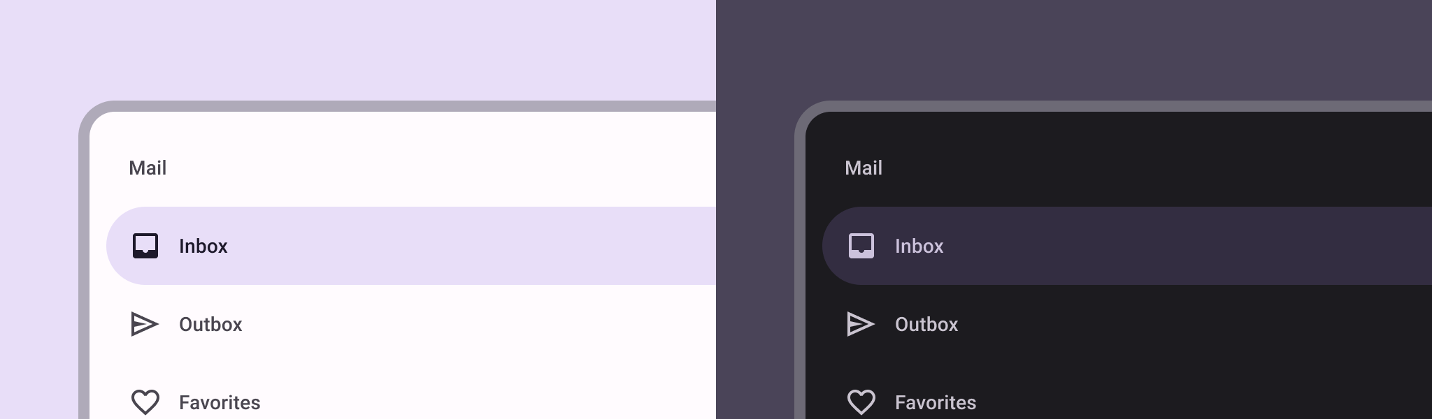
In Material Design, there are two types of navigation drawers:
- Standard: Share space within a screen with other content.
- Modal: Appears over the top of other content within a screen.
Results
Version compatibility
This implementation requires that your project minSDK be set to API level 21 or higher.
Dependencies
Implement a navigation drawer
You can use the ModalNavigationDrawer composable to implement a
navigation drawer:
Key points
Use the
drawerContentslot to provide aModalDrawerSheetand provide the drawer's contents.ModalNavigationDraweraccepts a number of additional drawer parameters. For example, you can toggle whether or not the drawer responds to drags with thegesturesEnabledparameter as in the following example:
Control navigation drawer behavior
To control how the drawer opens and closes, use DrawerState:
Key points
- Pass a
DrawerStatetoModalNavigationDrawerusing thedrawerStateparameter. DrawerStateprovides access to theopenandclosefunctions, as well as properties related to the current drawer state. These suspending functions require aCoroutineScope, which you can instantiate usingrememberCoroutineScope. You can also call the suspending functions in response to UI events.
Collections that contain this guide
This guide is part of these curated Quick Guide collections that cover broader Android development goals:

Display interactive components