Stay organized with collections
Save and categorize content based on your preferences.
A floating action button (FAB) is a high-emphasis button that lets the user
perform a primary action in an application. It promotes a single, focused action
that is the most common pathway a user might take and is typically found
anchored to the bottom right of the screen.
Consider these three use cases where you might use a FAB:
Create new item: In a note-taking app, a FAB might be used to quickly
create a new note.
Add new contact: In a chat app, a FAB could open an interface that lets
the user add someone to a conversation.
Center location: In a map interface, a FAB could center the map on the
user's current location.
To create a small floating action button, use the
SmallFloatingActionButton composable. The following example demonstrates
how to do so, with the addition of custom colors.
To create a large floating action button, use the
LargeFloatingActionButton composable. This composable is not
significantly different from the other examples aside from the fact that it
results in a bigger button.
The following is a straightforward implementation of a large FAB.
You can create more complex floating action buttons with the
ExtendedFloatingActionButton composable. The key difference between it
and FloatingActionButton is that it has dedicated icon and text
parameters. They let you create a button with more complex content that scales
to fit its content appropriately.
The following snippet demonstrates how to implement
ExtendedFloatingActionButton, with example values passed for icon and
text.
Figure 4. A floating action button with both text and an icon.
Key points
Although there are several composables you can use to create floating action
buttons consistent with Material Design, their parameters don't differ greatly.
Among the key parameters you should keep in mind are the following:
onClick: The function called when the user presses the button.
containerColor: The color of the button.
contentColor: The color of the icon.
z## Collections that contain this guide
This guide is part of these curated Quick Guide collections that cover
broader Android development goals:
Display interactive components
Learn how composable functions can enable you to easily
create beautiful UI components based on the Material Design design
system.
Content and code samples on this page are subject to the licenses described in the Content License. Java and OpenJDK are trademarks or registered trademarks of Oracle and/or its affiliates.
Last updated 2025-08-20 UTC.
[[["Easy to understand","easyToUnderstand","thumb-up"],["Solved my problem","solvedMyProblem","thumb-up"],["Other","otherUp","thumb-up"]],[["Missing the information I need","missingTheInformationINeed","thumb-down"],["Too complicated / too many steps","tooComplicatedTooManySteps","thumb-down"],["Out of date","outOfDate","thumb-down"],["Samples / code issue","samplesCodeIssue","thumb-down"],["Other","otherDown","thumb-down"]],["Last updated 2025-08-20 UTC."],[],[],null,["# Create a floating action button (FAB)\n\n\u003cbr /\u003e\n\nA floating action button (FAB) is a high-emphasis button that lets the user\nperform a primary action in an application. It promotes a single, focused action\nthat is the most common pathway a user might take and is typically found\nanchored to the bottom right of the screen.\n\nConsider these three use cases where you might use a FAB:\n\n- **Create new item**: In a note-taking app, a FAB might be used to quickly create a new note.\n- **Add new contact**: In a chat app, a FAB could open an interface that lets the user add someone to a conversation.\n- **Center location**: In a map interface, a FAB could center the map on the user's current location.\n\nIn Material Design, there are four types of FAB:\n\n- [FAB](#basic): A floating action button of ordinary size.\n- [Small FAB](#small): A smaller floating action button.\n- [Large FAB](#large): A larger floating action button.\n- [Extended FAB](#extended): A floating action button that contains more than just an icon.\n\nVersion compatibility\n---------------------\n\nThis implementation requires that your project minSDK be set to API level 21 or\nhigher.\n\n### Dependencies\n\n### Kotlin\n\n\n```kotlin\n implementation(platform(\"androidx.compose:compose-bom:2025.08.00\"))\n```\n\n\u003cbr /\u003e\n\n### Groovy\n\n\n```groovy\n implementation platform('androidx.compose:compose-bom:2025.08.00')\n```\n\n\u003cbr /\u003e\n\nCreate a basic floating action button\n-------------------------------------\n\n
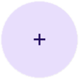
To create a general floating action button, use the basic\n[`FloatingActionButton`](/reference/kotlin/androidx/compose/material3/package-summary#FloatingActionButton(kotlin.Function0,androidx.compose.ui.Modifier,androidx.compose.ui.graphics.Shape,androidx.compose.ui.graphics.Color,androidx.compose.ui.graphics.Color,androidx.compose.material3.FloatingActionButtonElevation,androidx.compose.foundation.interaction.MutableInteractionSource,kotlin.Function0)) composable:\n\n\n```kotlin\n@Composable\nfun Example(onClick: () -\u003e Unit) {\n FloatingActionButton(\n onClick = { onClick() },\n ) {\n Icon(Icons.Filled.Add, \"Floating action button.\")\n }\n}https://github.com/android/snippets/blob/dd30aee903e8c247786c064faab1a9ca8d10b46e/compose/snippets/src/main/java/com/example/compose/snippets/components/FloatingActionButton.kt#L61-L68\n```\n\n\u003cbr /\u003e\n\n### Result\n\n**Figure 1.** A floating action button.\n\nCreate a small floating action button\n-------------------------------------\n\nTo create a small floating action button, use the\n[`SmallFloatingActionButton`](/reference/kotlin/androidx/compose/material3/package-summary#SmallFloatingActionButton(kotlin.Function0,androidx.compose.ui.Modifier,androidx.compose.ui.graphics.Shape,androidx.compose.ui.graphics.Color,androidx.compose.ui.graphics.Color,androidx.compose.material3.FloatingActionButtonElevation,androidx.compose.foundation.interaction.MutableInteractionSource,kotlin.Function0)) composable. The following example demonstrates\nhow to do so, with the addition of custom colors.\n\n\n```kotlin\n@Composable\nfun SmallExample(onClick: () -\u003e Unit) {\n SmallFloatingActionButton(\n onClick = { onClick() },\n containerColor = MaterialTheme.colorScheme.secondaryContainer,\n contentColor = MaterialTheme.colorScheme.secondary\n ) {\n Icon(Icons.Filled.Add, \"Small floating action button.\")\n }\n}https://github.com/android/snippets/blob/dd30aee903e8c247786c064faab1a9ca8d10b46e/compose/snippets/src/main/java/com/example/compose/snippets/components/FloatingActionButton.kt#L83-L92\n```\n\n\u003cbr /\u003e\n\n| **Note:** Because the various FAB composables share many parameters, you can use the approach in this example to customize colors with other composables.\n\n### Result\n\n**Figure 2.** A small floating action button.\n\nCreate a large floating action button\n-------------------------------------\n\nTo create a large floating action button, use the\n[`LargeFloatingActionButton`](/reference/kotlin/androidx/compose/material3/package-summary#LargeFloatingActionButton(kotlin.Function0,androidx.compose.ui.Modifier,androidx.compose.ui.graphics.Shape,androidx.compose.ui.graphics.Color,androidx.compose.ui.graphics.Color,androidx.compose.material3.FloatingActionButtonElevation,androidx.compose.foundation.interaction.MutableInteractionSource,kotlin.Function0)) composable. This composable is not\nsignificantly different from the other examples aside from the fact that it\nresults in a bigger button.\n\nThe following is a straightforward implementation of a large FAB.\n| **Note:** This example passes `CircleShape` as the value for the `shape` parameter, resulting in a round button, rather than a square with rounded borders. You can pass any instance of `Shape`, or set the value of `MaterialTheme.shape.large` to adjust it across your app.\n\n\n```kotlin\n@Composable\nfun LargeExample(onClick: () -\u003e Unit) {\n LargeFloatingActionButton(\n onClick = { onClick() },\n shape = CircleShape,\n ) {\n Icon(Icons.Filled.Add, \"Large floating action button\")\n }\n}https://github.com/android/snippets/blob/dd30aee903e8c247786c064faab1a9ca8d10b46e/compose/snippets/src/main/java/com/example/compose/snippets/components/FloatingActionButton.kt#L96-L104\n```\n\n\u003cbr /\u003e\n\n### Result\n\n**Figure 3.** A large floating action button.\n\nCreate an extended floating action button\n-----------------------------------------\n\nYou can create more complex floating action buttons with the\n[`ExtendedFloatingActionButton`](/reference/kotlin/androidx/compose/material3/package-summary#ExtendedFloatingActionButton(kotlin.Function0,kotlin.Function0,kotlin.Function0,androidx.compose.ui.Modifier,kotlin.Boolean,androidx.compose.ui.graphics.Shape,androidx.compose.ui.graphics.Color,androidx.compose.ui.graphics.Color,androidx.compose.material3.FloatingActionButtonElevation,androidx.compose.foundation.interaction.MutableInteractionSource)) composable. The key difference between it\nand [`FloatingActionButton`](/reference/kotlin/androidx/compose/material3/package-summary#FloatingActionButton(kotlin.Function0,androidx.compose.ui.Modifier,androidx.compose.ui.graphics.Shape,androidx.compose.ui.graphics.Color,androidx.compose.ui.graphics.Color,androidx.compose.material3.FloatingActionButtonElevation,androidx.compose.foundation.interaction.MutableInteractionSource,kotlin.Function0)) is that it has dedicated `icon` and `text`\nparameters. They let you create a button with more complex content that scales\nto fit its content appropriately.\n\nThe following snippet demonstrates how to implement\n`ExtendedFloatingActionButton`, with example values passed for `icon` and\n`text`.\n\n\n```kotlin\n@Composable\nfun ExtendedExample(onClick: () -\u003e Unit) {\n ExtendedFloatingActionButton(\n onClick = { onClick() },\n icon = { Icon(Icons.Filled.Edit, \"Extended floating action button.\") },\n text = { Text(text = \"Extended FAB\") },\n )\n}https://github.com/android/snippets/blob/dd30aee903e8c247786c064faab1a9ca8d10b46e/compose/snippets/src/main/java/com/example/compose/snippets/components/FloatingActionButton.kt#L72-L79\n```\n\n\u003cbr /\u003e\n\n### Result\n\n**Figure 4.** A floating action button with both text and an icon.\n\nKey points\n----------\n\nAlthough there are several composables you can use to create floating action\nbuttons consistent with Material Design, their parameters don't differ greatly.\nAmong the key parameters you should keep in mind are the following:\n\n- `onClick`: The function called when the user presses the button.\n- `containerColor`: The color of the button.\n- `contentColor`: The color of the icon.\n\nz## Collections that contain this guide\n\nThis guide is part of these curated Quick Guide collections that cover\nbroader Android development goals: \n\n### Display interactive components\n\nLearn how composable functions can enable you to easily create beautiful UI components based on the Material Design design system. \n[Quick guide collection](/develop/ui/compose/quick-guides/collections/display-interactive-components) \n\nHave questions or feedback\n--------------------------\n\nGo to our frequently asked questions page and learn about quick guides or reach out and let us know your thoughts. \n[Go to FAQ](/quick-guides/faq) [Leave feedback](https://issuetracker.google.com/issues/new?component=1573691&template=1993320)"]]