Enjoy seamless access to your favorite movies, TV shows, music, and more on the big screen, anytime at home.
Resources
| Type | Link | Status |
|---|---|---|
| Design | Design source (Figma) | Available |
| Inter (Google Fonts) | Available | |
| Implementation | Jetpack Compose (Github) | Available |
Theme
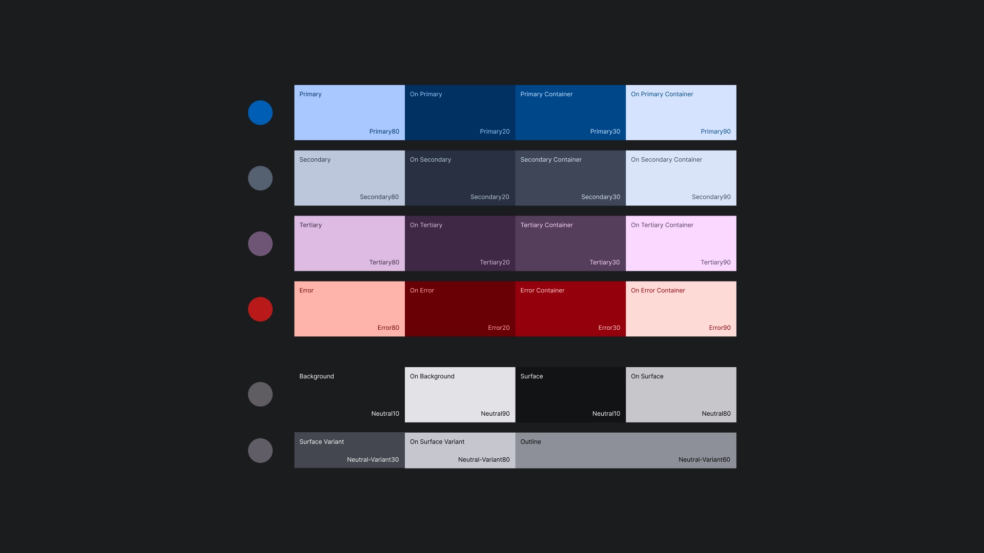
Color theme
A color theme is generated using the Material Design 3
theme generator.
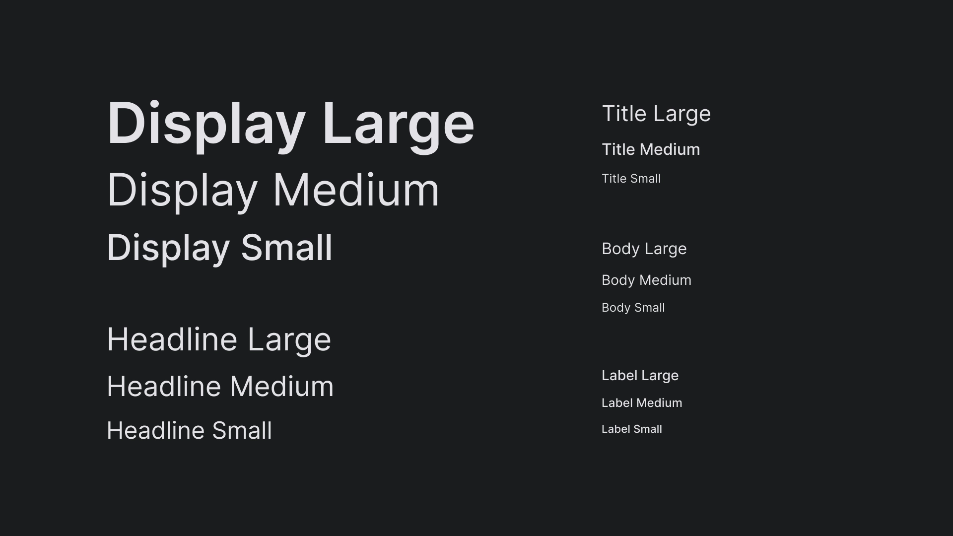
Typography
JetStream's type scale uses the Inter typeface to create a simple and clear look for TV screens.
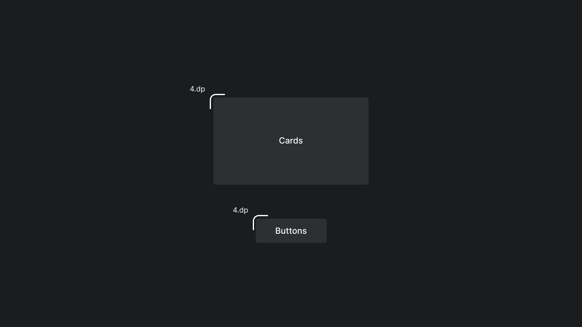
Shape
A subtle radius is applied to the cards and buttons to create friendly and approachable edges.
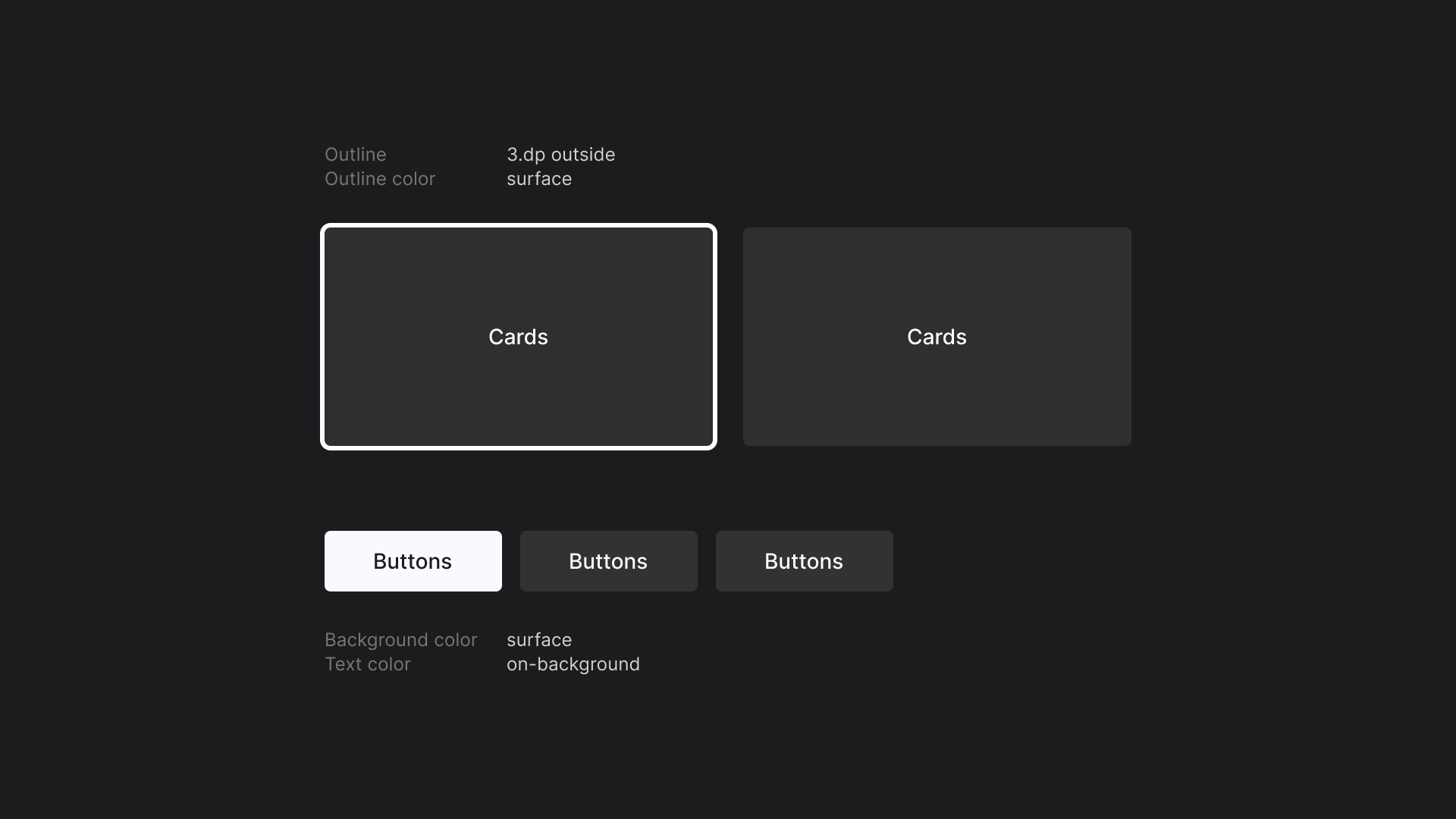
Focus
A 3dp outline with an outline color is used in JetStream.
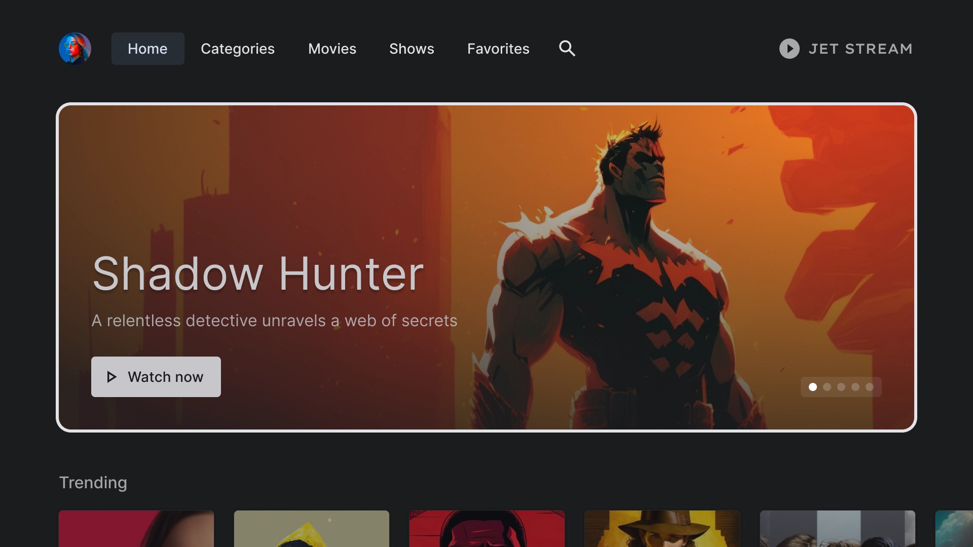
Home
Home
Landing page of JetStream app.
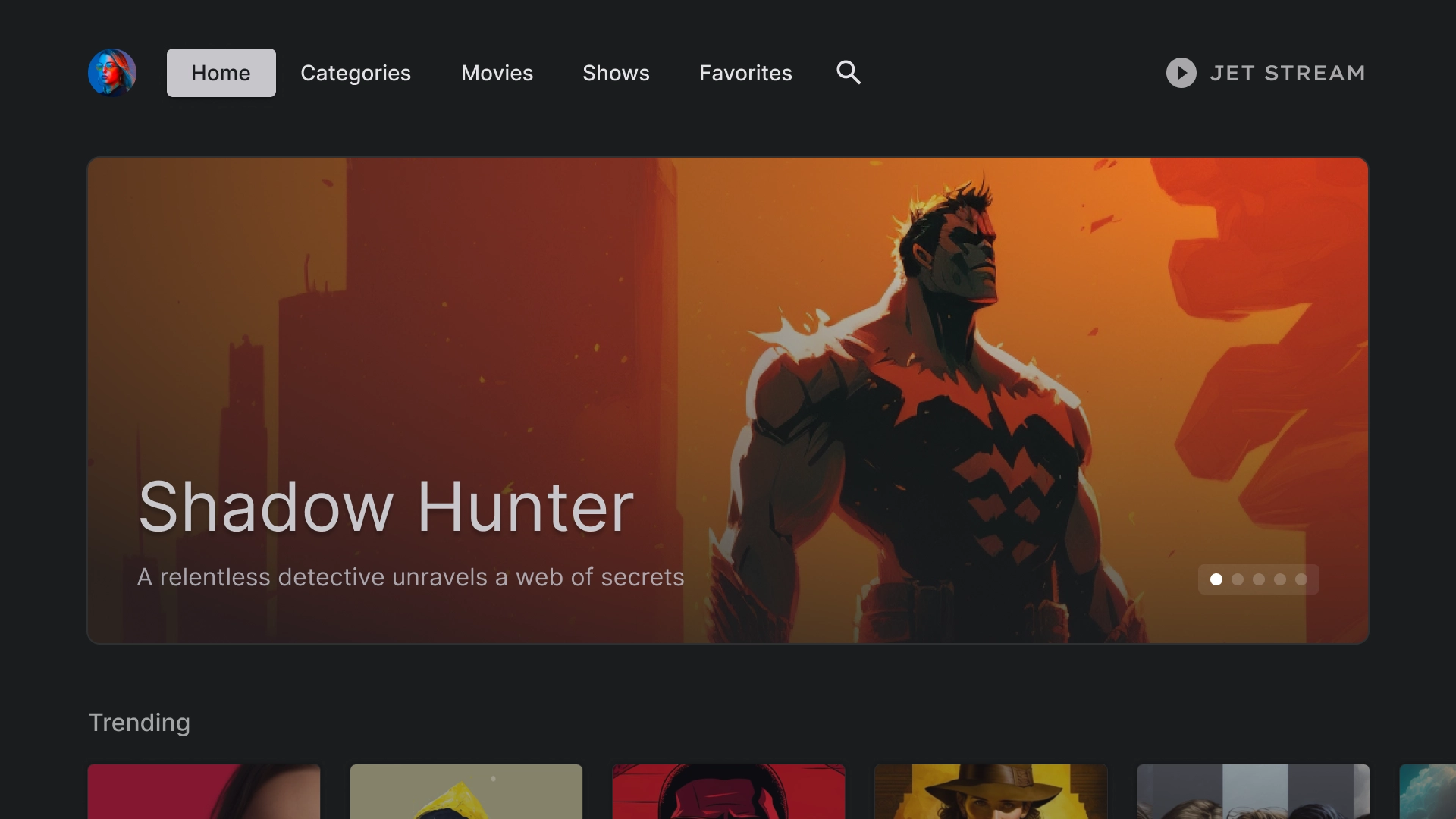
Featured carousel
A carousel with a card-style layout.
Content row
JetStream utilizes a standard card style with a 2:3 aspect ratio in a 5-column layout.
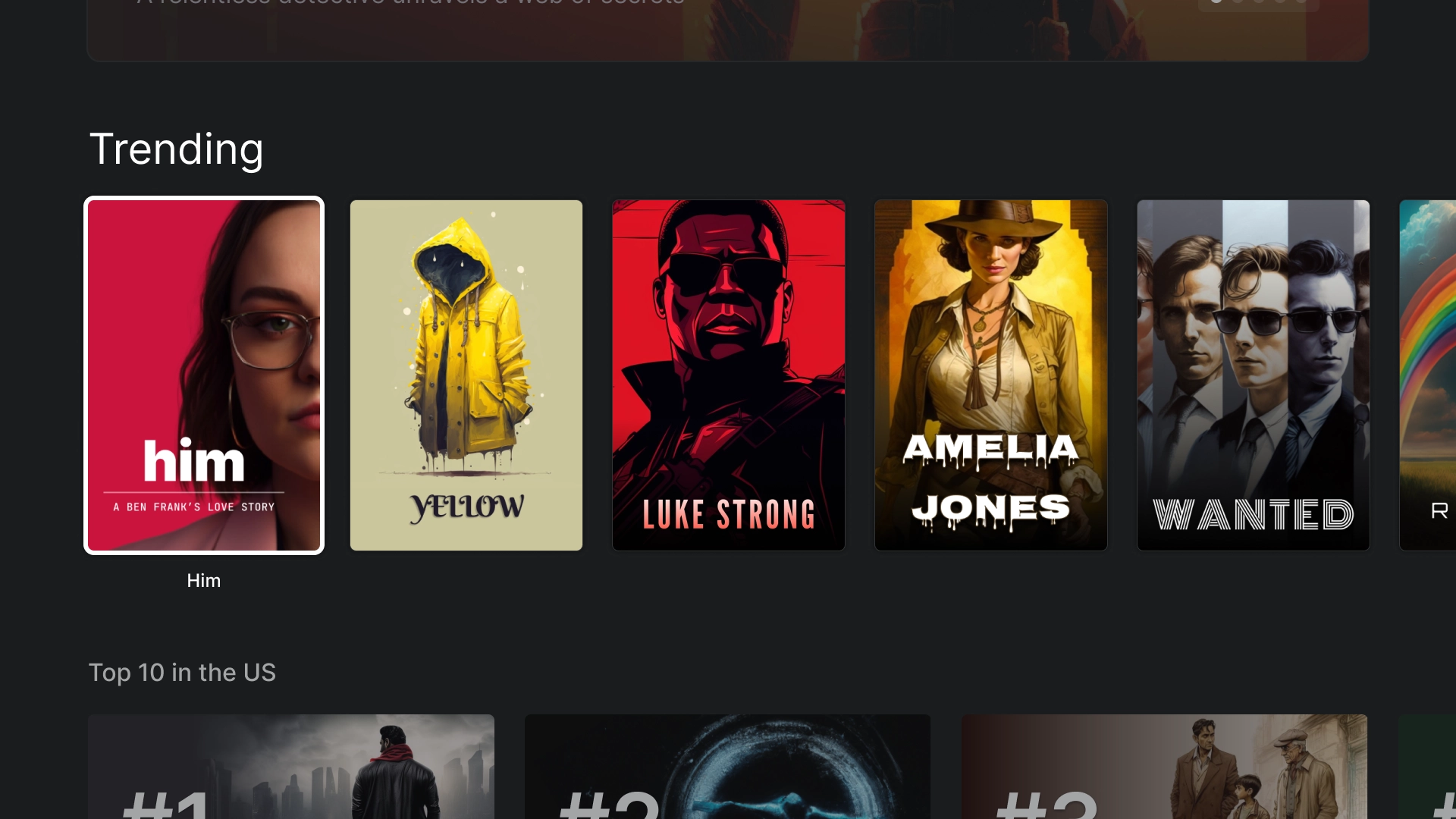
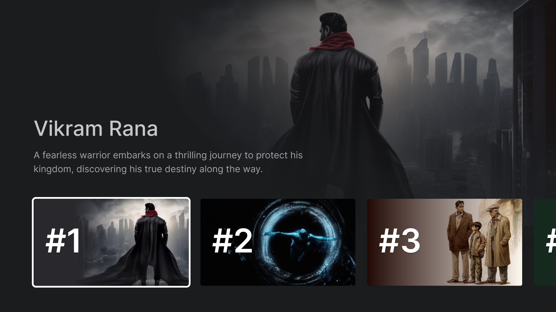
Immersive list
Highlight special content in the app using the Immersive list component, such as top 10 trending movies.
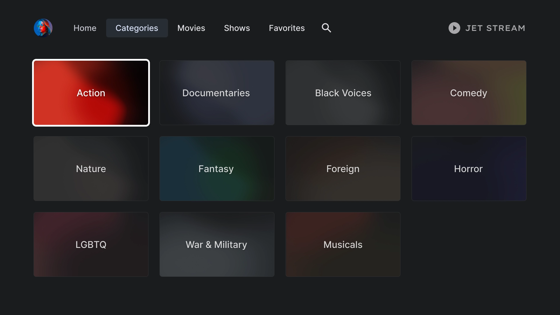
Categories
Categories
The Categories page displays genres in a grid format for easy navigation and access.
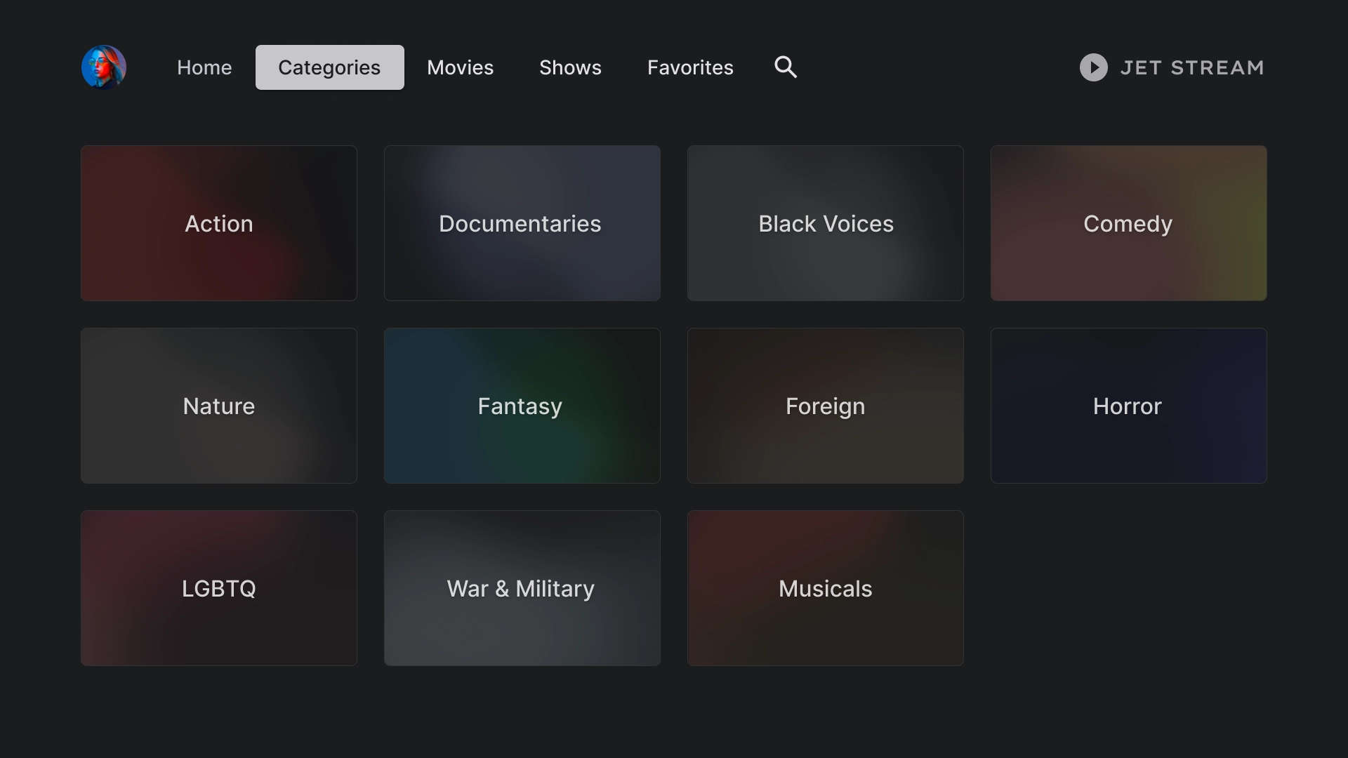
Category cards
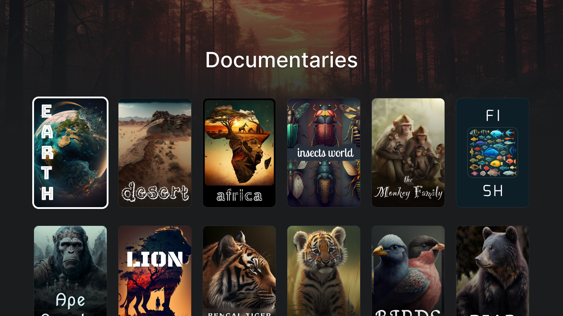
Category details
A 2:3 card grid with a header is used to create the Category details page.
Media
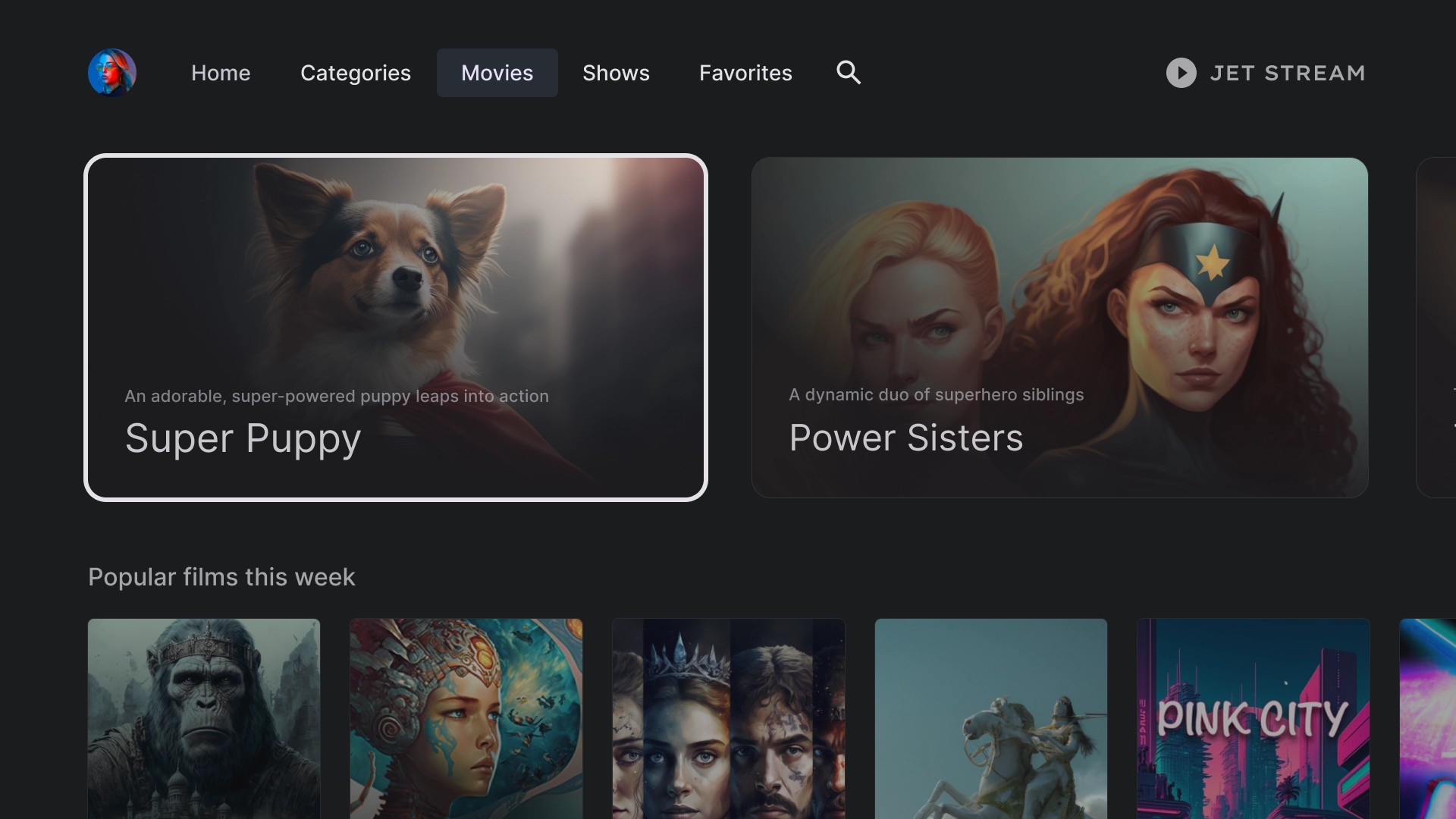
Movies
A standard movies tab with a 16:9 featured cards on the top with content grid on the bottom.
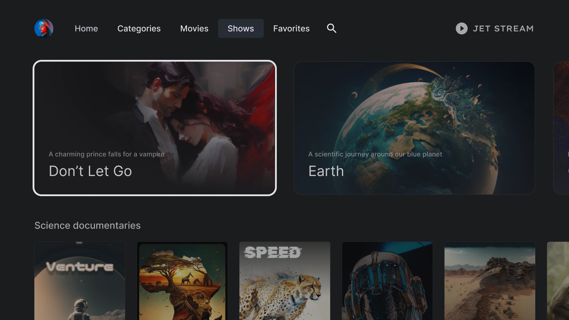
Shows
Library
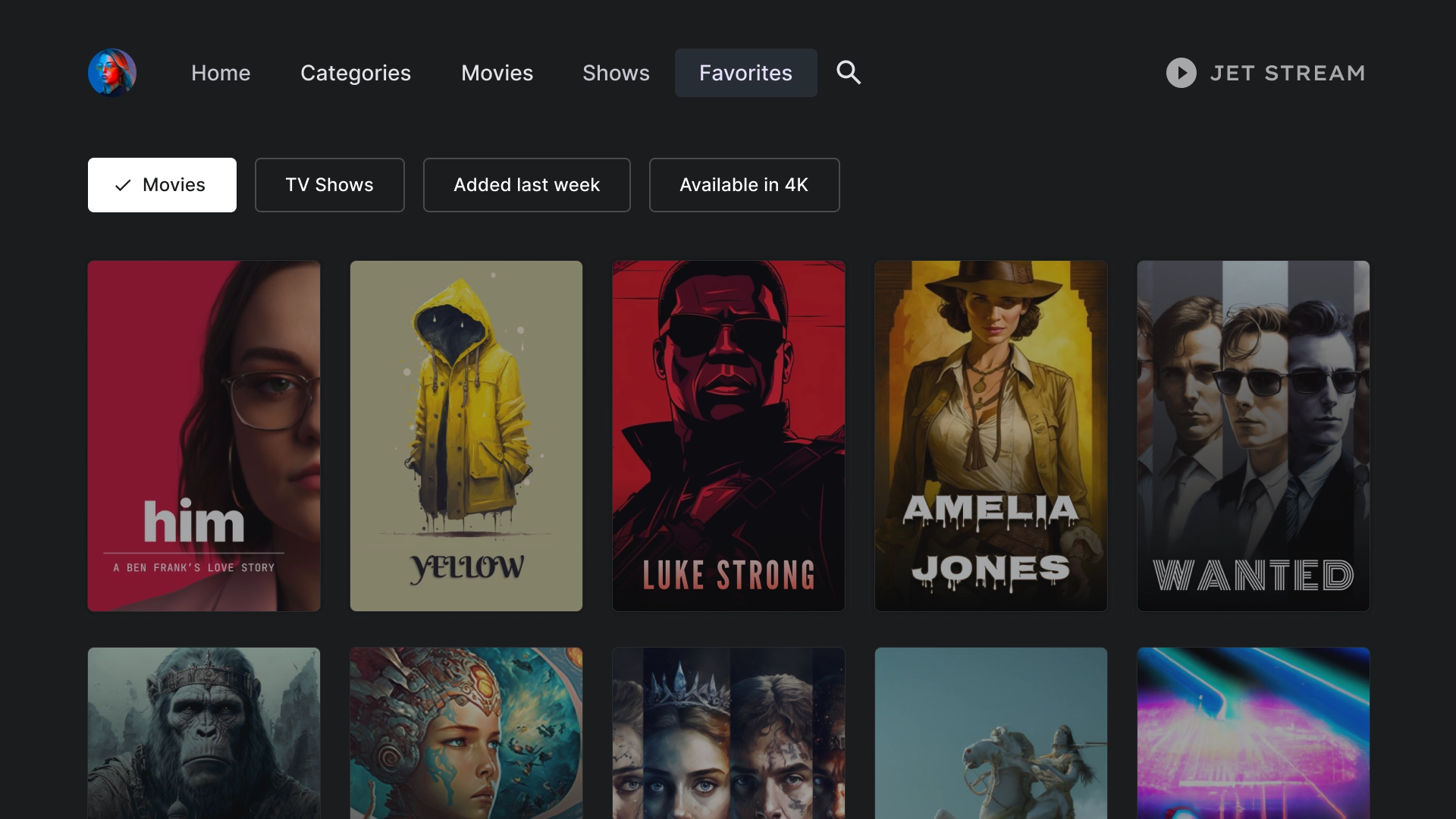
Favorites
The Favorites tab includes filter chips at the top of the screen to allow for quick content searching.
Search
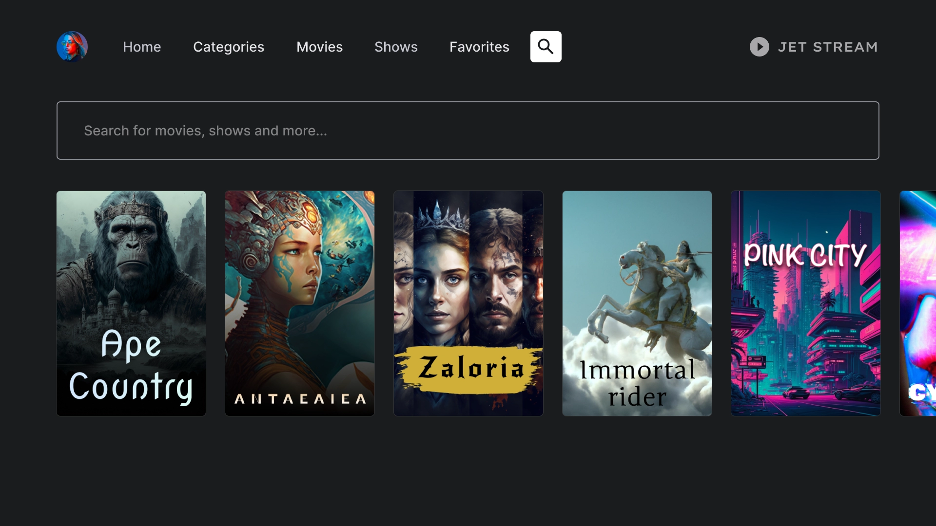
Search landing
A search page features a search bar with suggested search queries based on recent searches.
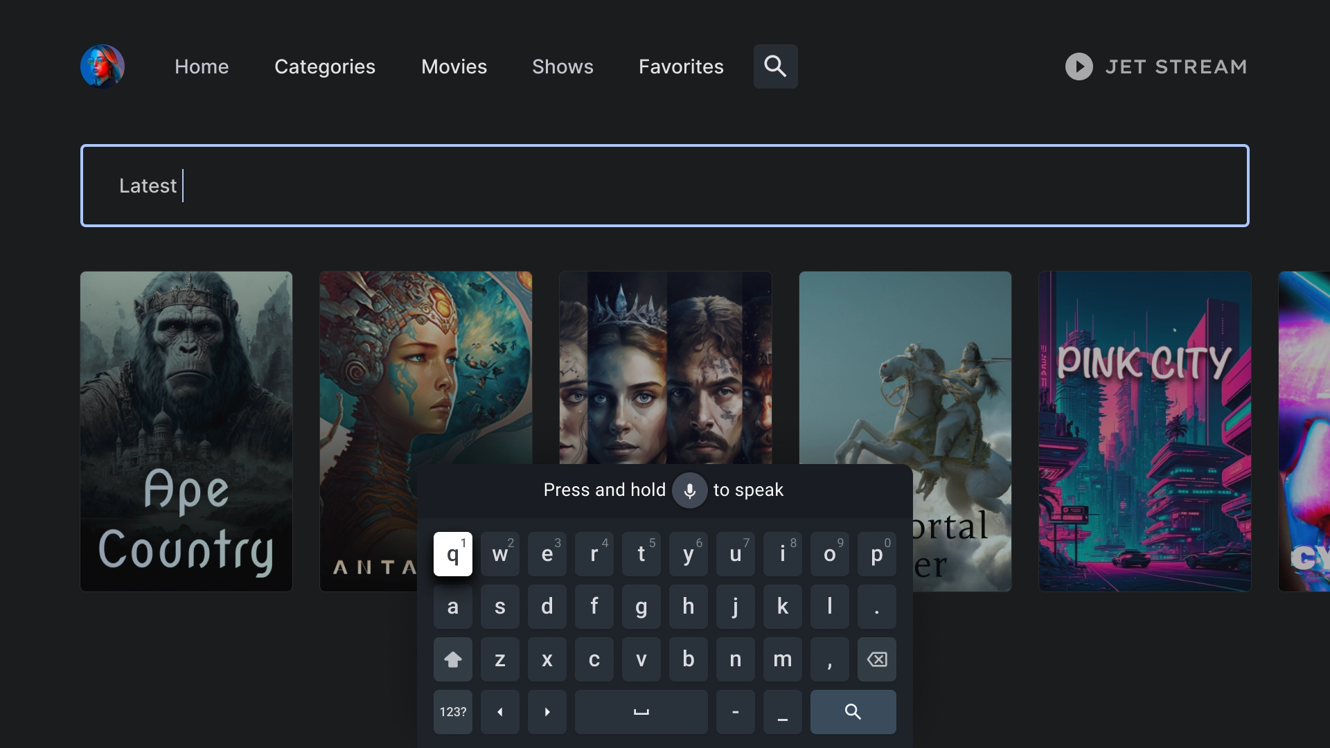
Active search
When the user focuses on the search bar, the keyboard pops up, and the results below dynamically update as the user types.
Entity details
Details landing
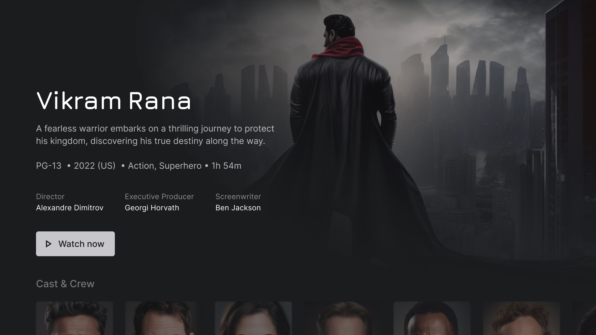
The details page presents a cinematic view with a brief plot summary and a prominent call-to-action button to watch the movie.
Cast and crew
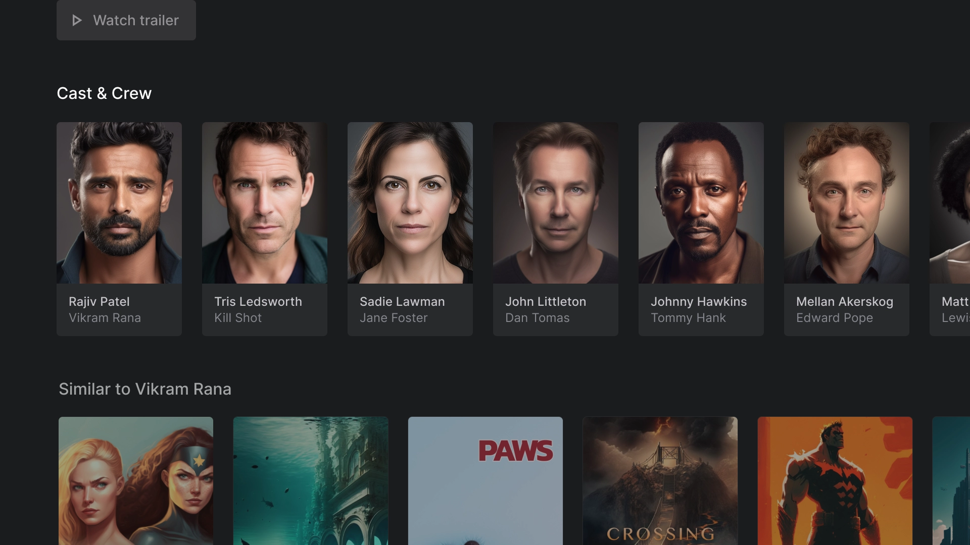
The Cast and Crew section features a row of classic cards with titles and descriptions, each accompanied by a 2:3 image asset.
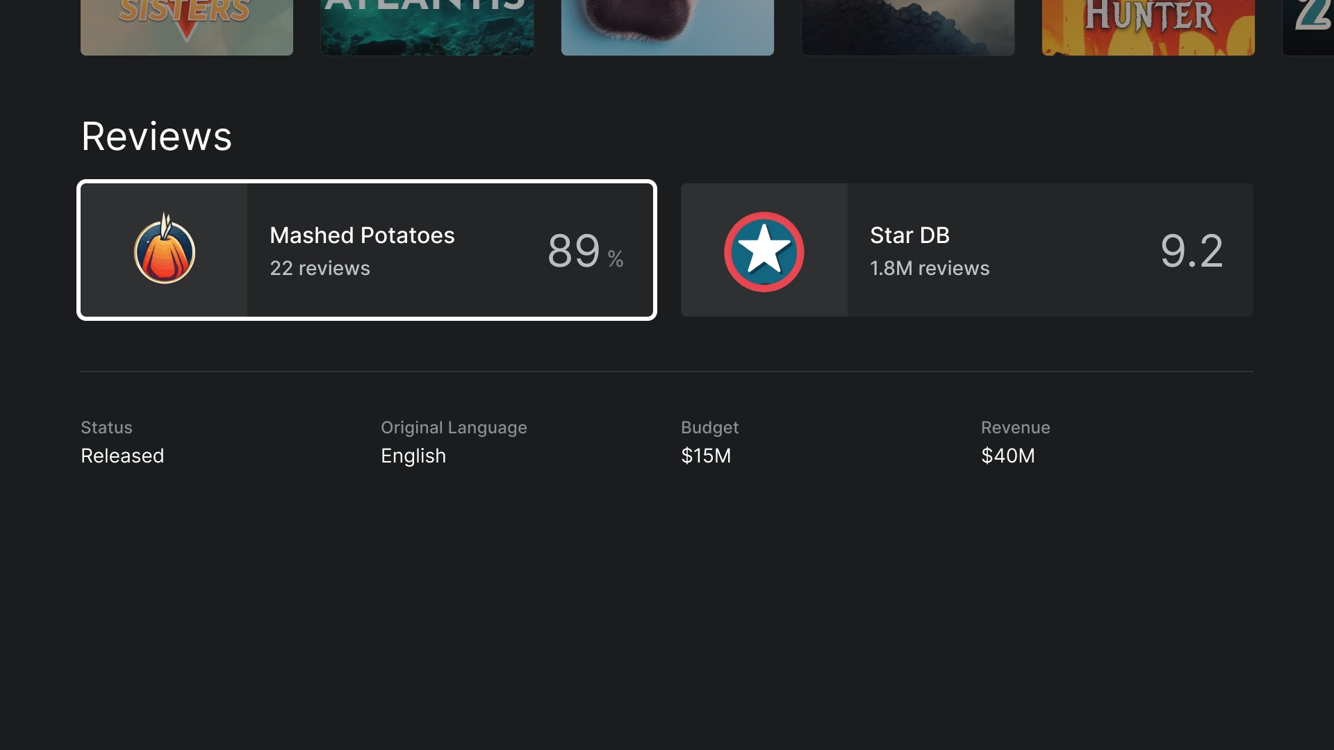
Ratings
The ratings section features a custom classic wide card that includes additional information.
Playback
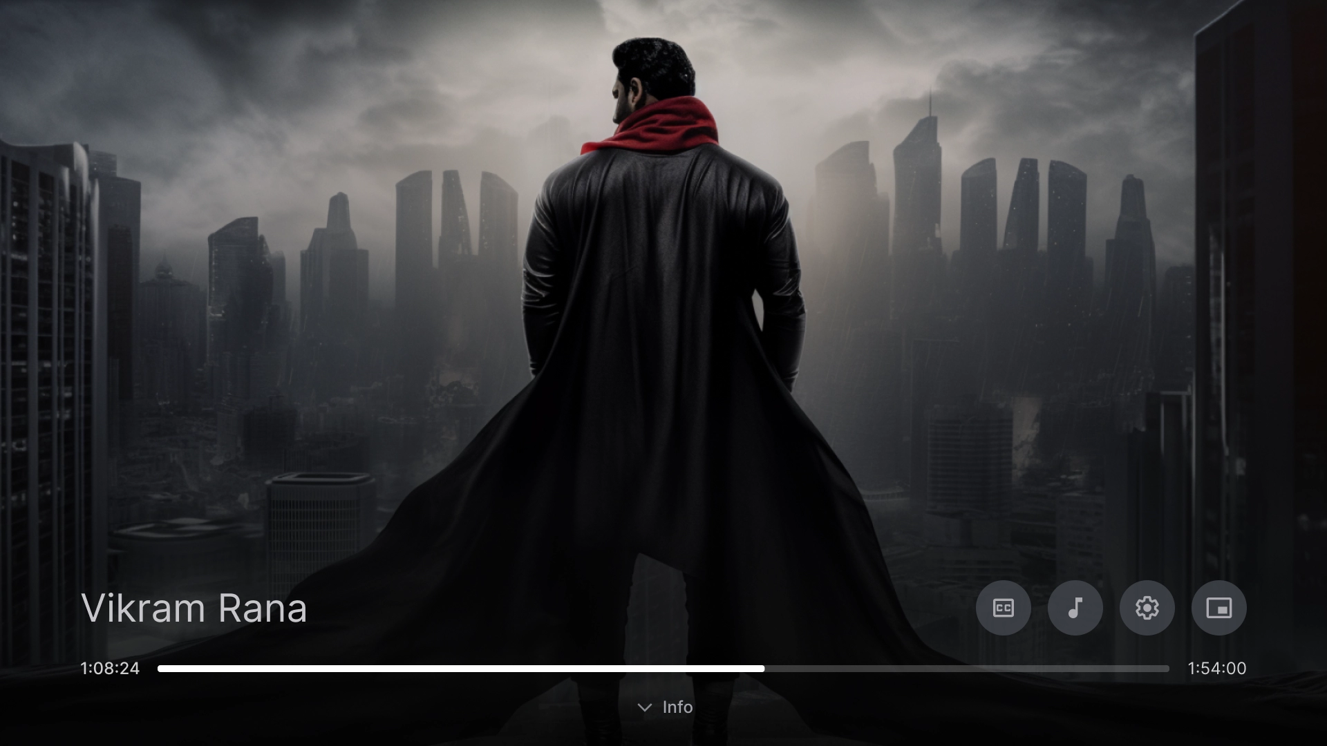
Video player
A standard video player with best practices.
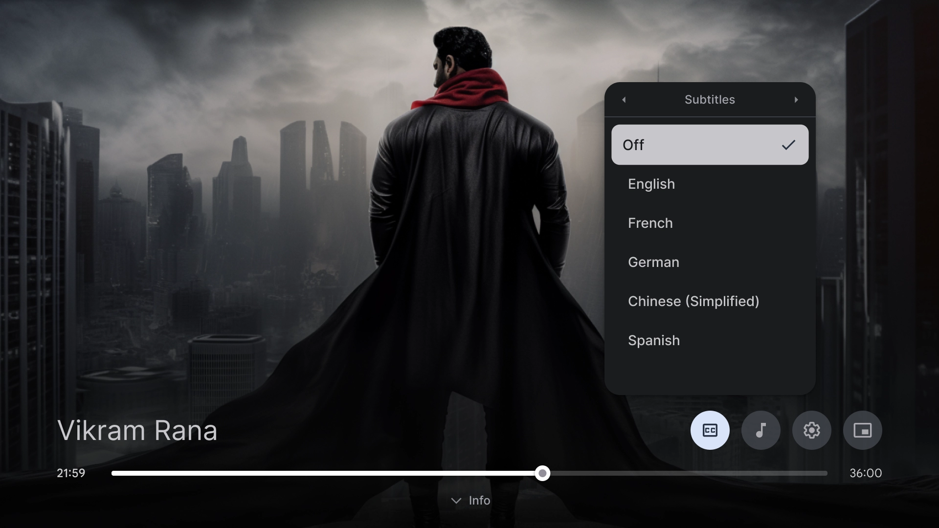
Video player settings
A close caption popover on the video player.
Settings
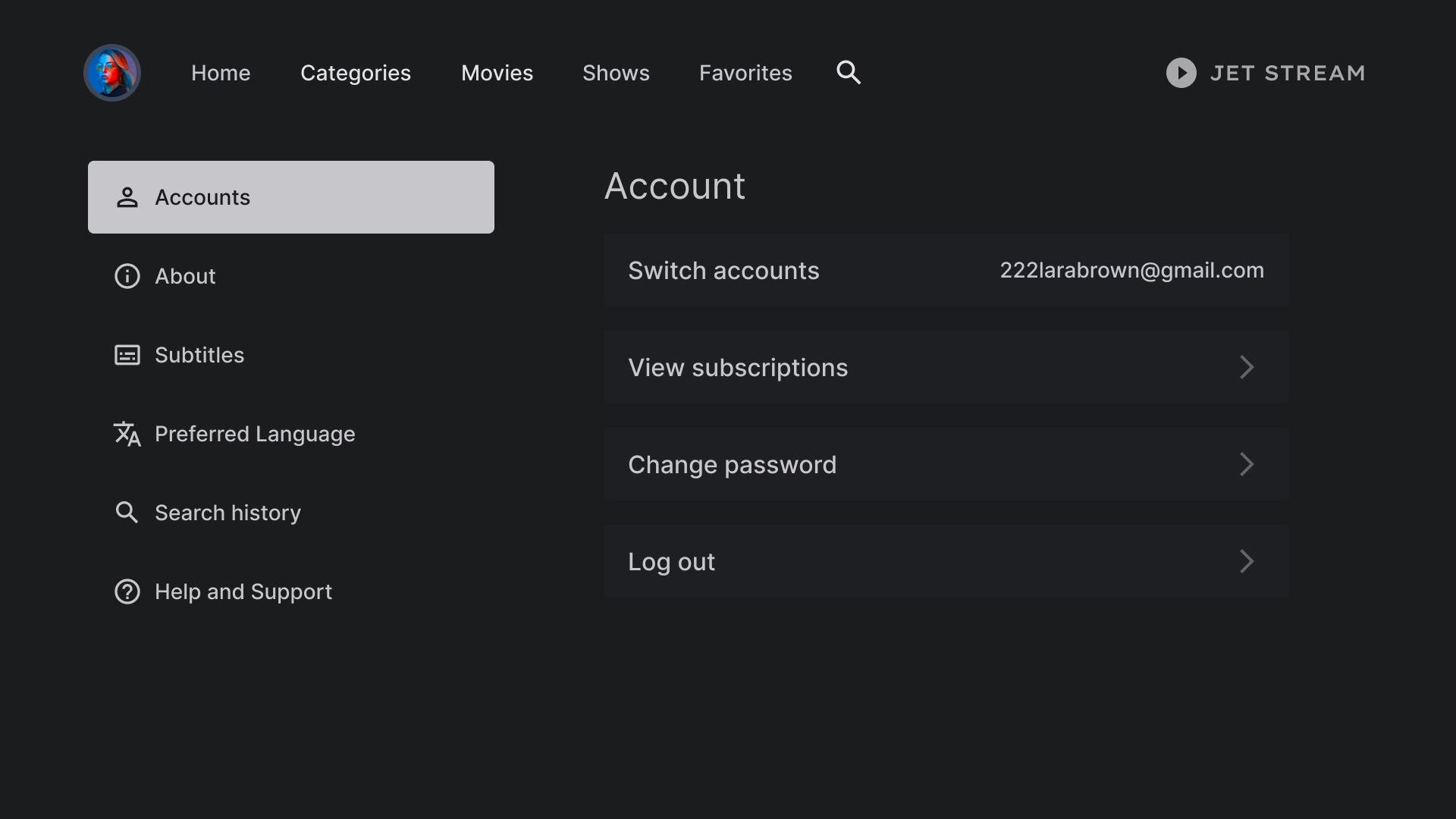
Account settings
The accounts page layout features a two-column design with a list component on the left and custom card components on the right, arranged in a grid format.
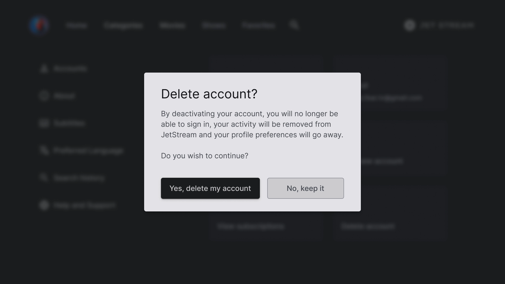
Delete account dialog
The dialog box is designed with a contrasting background to make it stand out from the rest of the screen. The two buttons in the dialog are aligned to the left for a clean and organized look.
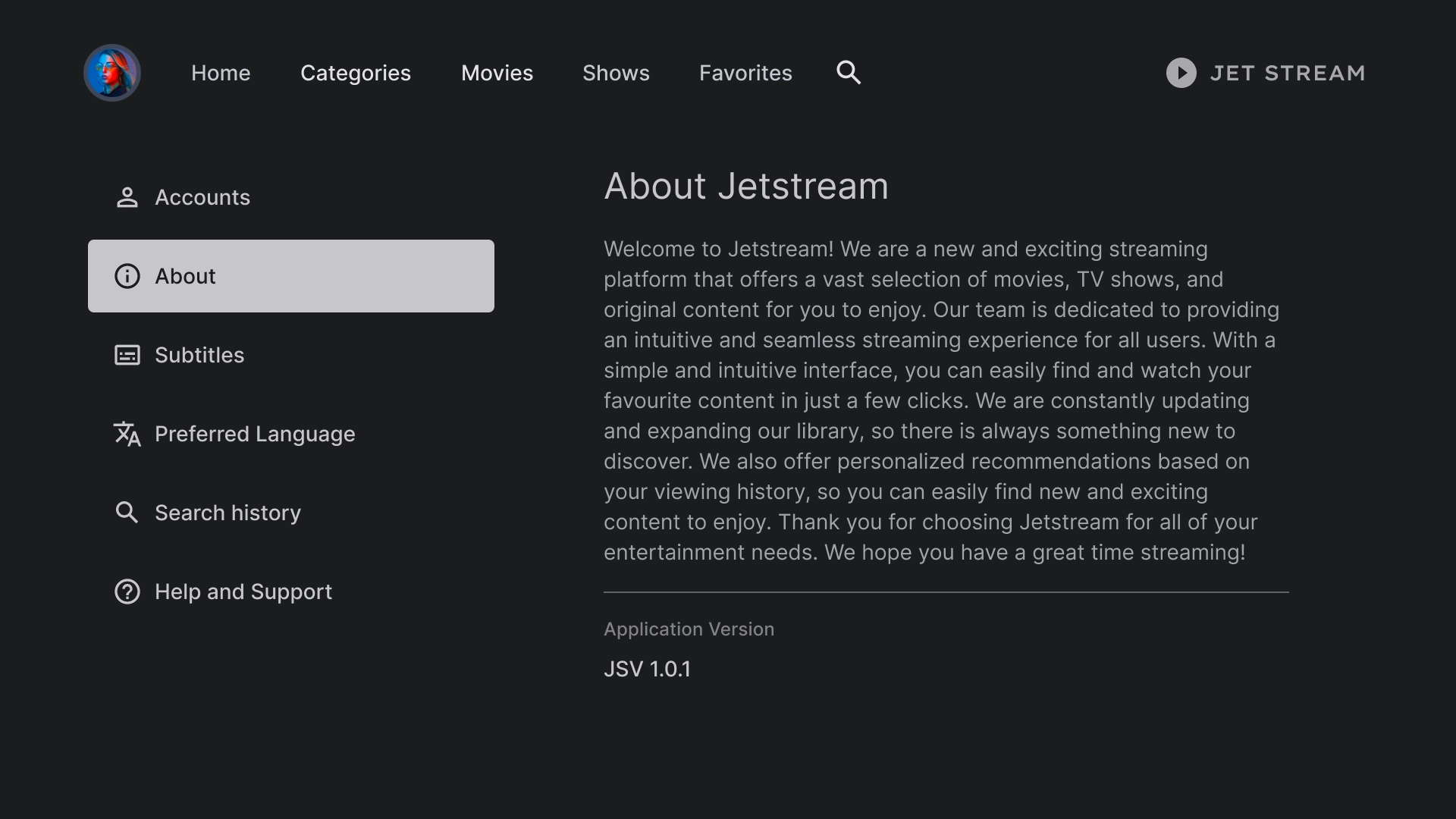
About
The About section features a right-hand panel with a scrollable text view.
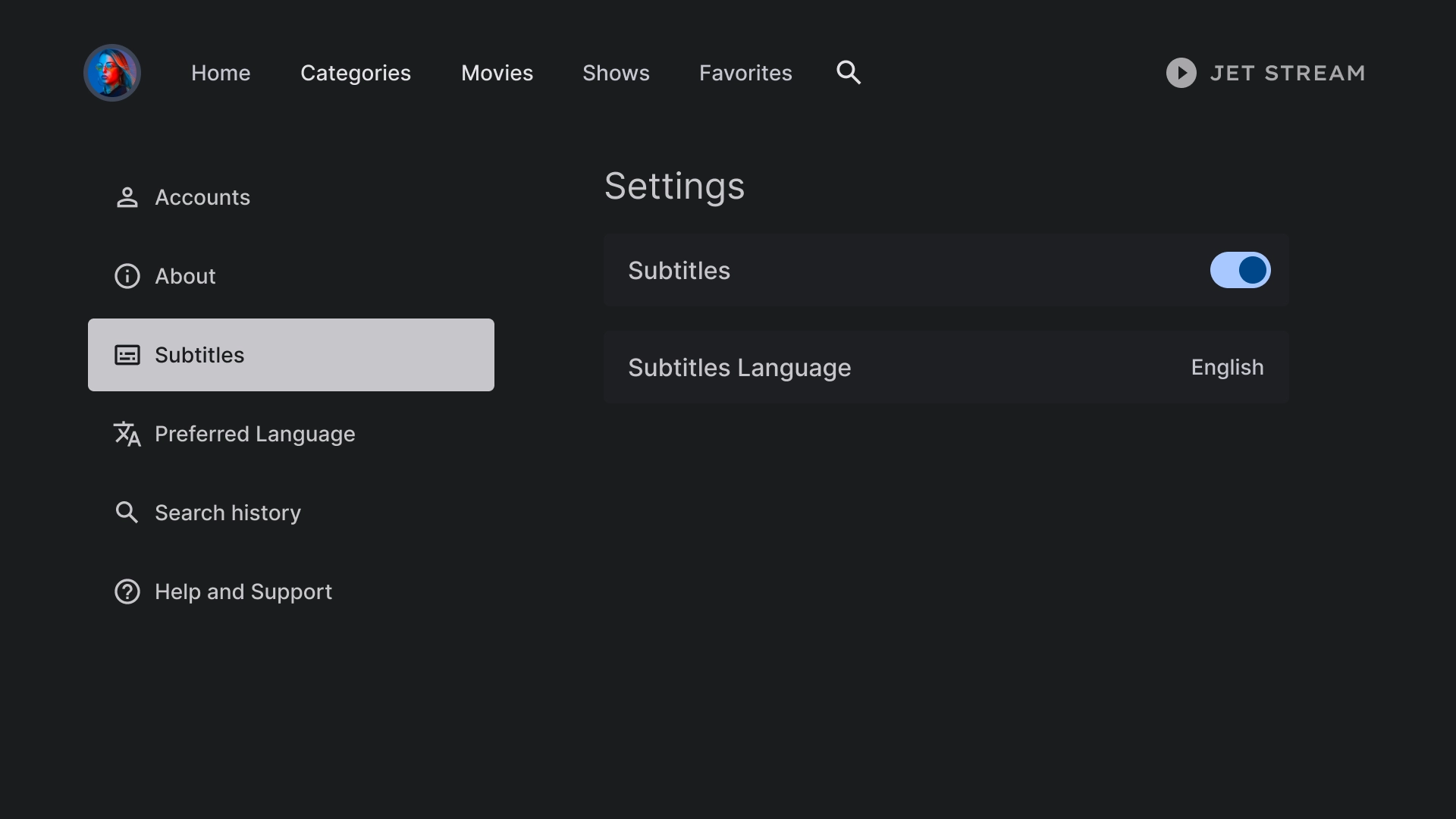
Subtitle settings
A list component is used to display various settings under subtitle, and uses actions such as a switch or a label.
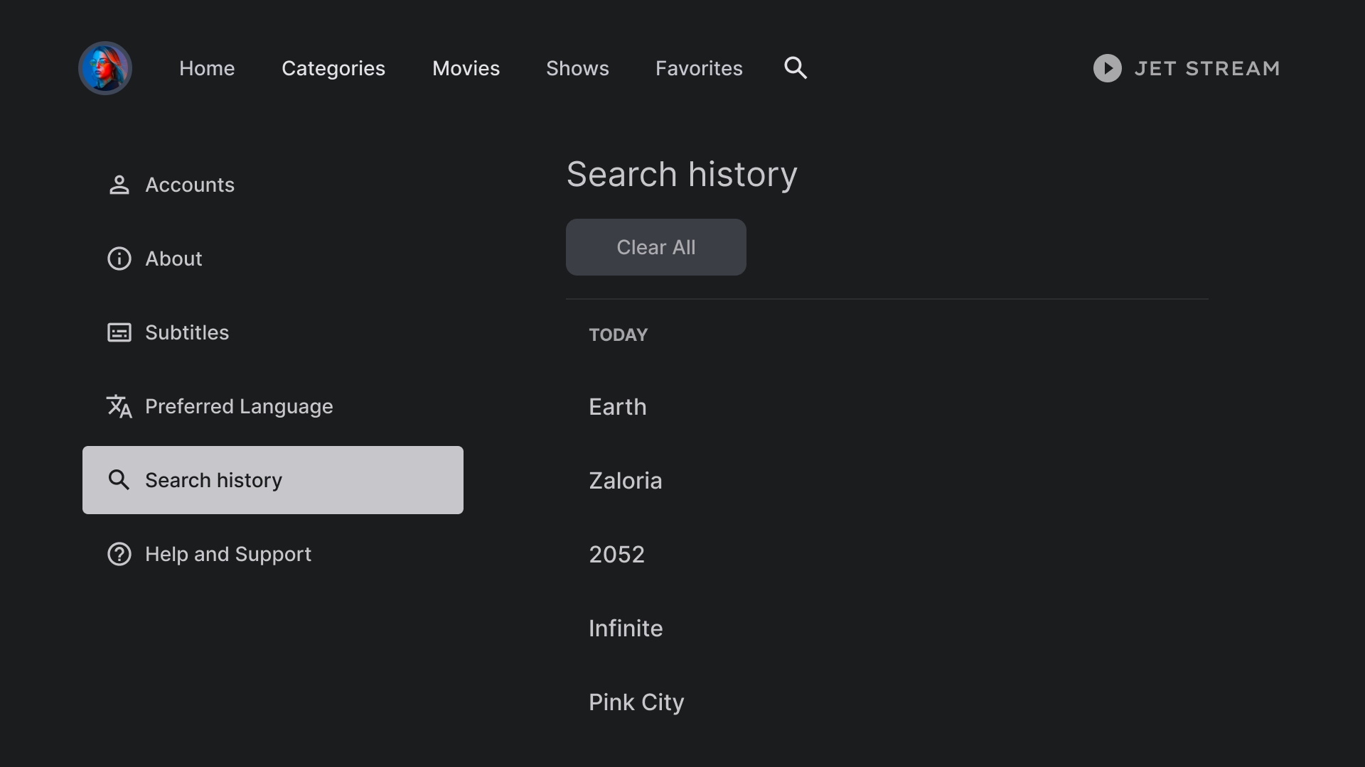
History
The search history uses a layout that displays a list of previously searched queries, along with an option to clear all the search history.
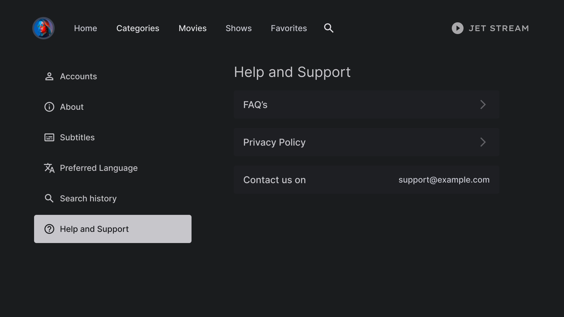
Help
The Help and Support section uses a custom list component to display various options, including contact information and FAQs.