
1. Before you begin
What you'll learn
- The unique user experiences that are made possible by the XR form factor.
- The fundamentals of how to adapt your app to make the most of running on an Android XR headset. For example, by using the composables provided by the Jetpack Compose for XR library.
- How to use the UI elements provided by the Compose for XR library.
- Where to learn more about building apps for Android XR.
What this isn't
- A guide to building Android XR apps without using Compose. See Develop UI for Android Views-based Apps.
- A guide to building Unity or OpenXR apps for Android XR. See Develop with Unity for Android XR and Develop with OpenXR.
What you'll need
- Android Studio preview (Quail Canary 1 or later).
- A computer capable of running the Android XR emulator.
- Experience with Kotlin and Jetpack Compose, for example, by completing the Android Basics with Compose course.
- Experience creating Android Virtual Devices and running apps on them.
What you'll build
In this codelab, you'll enhance a basic single-screen app to provide an immersive user experience through Android XR.
|
|
Starting point | Final result |
2. Get set up
Get the code
- The code for this codelab can be found in the
xr-fundamentalsdirectory within thexr-codelabsGitHub repository. To clone the repo, run the following command:
git clone https://github.com/android/xr-codelabs.git
- Alternatively, you can download the repository as a ZIP file:
Open the project
- After starting Android Studio, import the project, selecting just the
xr-fundamentals/startdirectory. Thexr-fundamentals/part1directory contains the solution code, which you can reference at any point if you get stuck or just want to see the full project.
Familiarize yourself with the code
- After opening the project in Android studio, take some time to look through the starting code.
3. Learn XR concepts: Spaces and Spatial Panels
In this codelab, you'll learn about two Android XR concepts: spaces and spatial panels. You'll also learn how to apply these concepts to apps running on an Android XR device.
Spaces
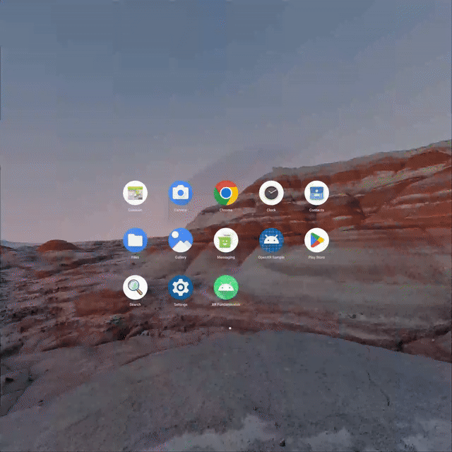
On Android XR devices, apps run in one of two spaces: Home Space or Full Space.
Home Space

In Home Space, multiple apps run side by side so users can multitask across apps. Android apps can be run in Home Space without modification.
Full Space

To learn more about these spaces, see Home Space and Full Space.
Spatial panels
Spatial panels are container elements that serve as the fundamental building blocks of Android XR apps.
When running in Home Space, your app will be contained within a single panel for an experience similar to desktop windowing on a large screen Android device.
When running in Full Space, you can break out your app's content into one or more panels to provide a more immersive experience.
To learn more about panels, see Spatial panels.
4. Run the app in the Android XR emulator
Before getting started with enhancing the app for Android XR, you can run the app in the Android XR emulator to see how it looks in Home Space.
Install the Android XR system image
- First, open the SDK Manager in Android Studio and select the SDK Platforms tab if it is not already selected. In the bottom-right corner of the SDK Manager window, make sure that the Show package details box is checked.
- Under the Android 14 section, install the Android XR ARM 64 v8a or Android XR Intel x86_64 emulator image. Images can only run on machines with the same architecture (x86/ARM) as themselves.
Create an Android XR virtual device
- After opening the Device Manager, select XR under the Category column on the left side of the window. Then, select the XR Device hardware profile from the list and click Next.
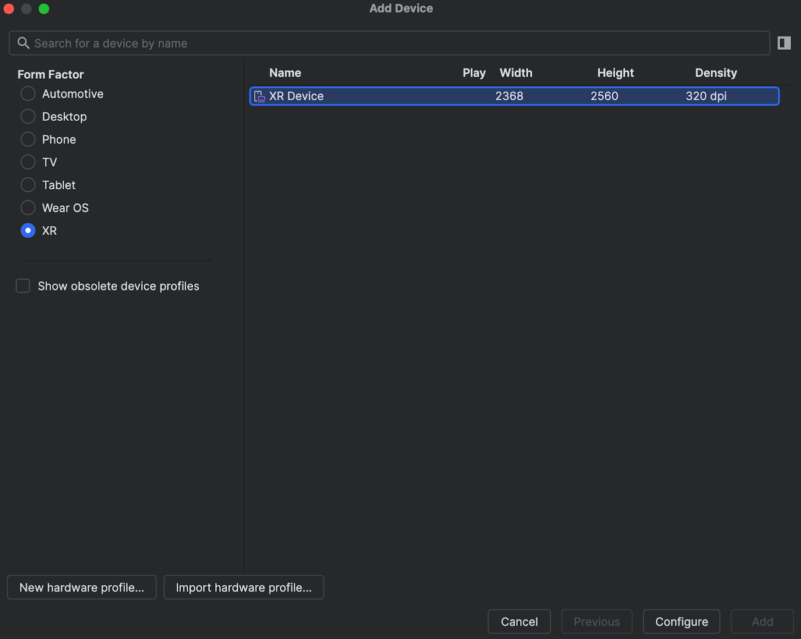
- On the next page, select the system image you installed previously. Click Next and select any advanced options you want before finally creating the AVD by clicking Finish.
- Run the app on the AVD you just created.

5. Set up dependencies
Before you can begin adding XR-specific functionality to your app, you'll need to add a dependency on the Jetpack Compose for XR library, androidx.xr.compose:compose, which contains all of the composables you need to build an Android XR differentiated experience for your app.
libs.version.toml
[versions]
...
xrCompose = "1.0.0-alpha13"

[libraries]
...
androidx-xr-compose = { group = "androidx.xr.compose", name = "compose", version.ref = "xrCompose" }
build.gradle.kts (Module :app)
dependencies {
    ...
    implementation(libs.androidx.xr.compose)
    ...
}
After updating these files, make sure to do a Gradle sync to ensure the dependencies are downloaded to your project.
6. Enter Full Space
To make use of XR features like panels, an app must be running in Full Space. There are two ways for an app to enter Full Space:
- Programmatically, such as in response to a user interaction within your app
- Immediately upon launch by adding a directive to your app manifest.
Enter Full Space programmatically
To enter Full Space programmatically, you can provide affordances in your UI to let the user control in which space they'd like to use your app. Additionally, you can also enter Full Space when it makes sense within the context of how your app is used. For example, entering Full Space when beginning to view video content and exiting when playback is complete.
To keep things simple, this can first be accomplished by adding a button to the top app bar to toggle the space.
- Create a new file,
ToggleSpaceButton.ktin thecom.example.android.xrfundamentals.ui.componentpackage and add the following composables:
ToggleSpaceButton.kt
package com.example.android.xrfundamentals.ui.component

import androidx.annotation.DrawableRes
import androidx.compose.material3.Icon
import androidx.compose.material3.FilledTonalIconButton
import androidx.compose.runtime.Composable
import androidx.compose.ui.Modifier
import androidx.compose.ui.res.painterResource
import androidx.compose.ui.tooling.preview.Preview
import androidx.xr.compose.platform.LocalSpatialCapabilities
import androidx.xr.compose.platform.LocalSpatialConfiguration
import com.example.android.xrfundamentals.R
import com.example.android.xrfundamentals.ui.theme.XRFundamentalsTheme

@Composable
fun ToggleSpaceButton(
    onHomeSpaceRequested: () -> Unit,
    onFullSpaceRequested: () -> Unit,
    modifier: Modifier = Modifier
) {
    if (LocalSpatialCapabilities.current.isSpatialUiEnabled) {
        ToggleSpaceButton(
            modifier = modifier,
            contentDescription = "Request Home Space",
            iconResource = R.drawable.ic_home_space,
            onClick = { onHomeSpaceRequested() }
        )
    } else {
        ToggleSpaceButton(
            modifier = modifier,
            contentDescription = "Request Full Space",
            iconResource = R.drawable.ic_full_space,
            onClick = { onFullSpaceRequested() }
        )
    }
}

@Composable
fun ToggleSpaceButton(
    contentDescription: String,
    @DrawableRes iconResource: Int,
    onClick: () -> Unit,
    modifier: Modifier = Modifier
) {
    FilledTonalIconButton(
        modifier = modifier,
        onClick = onClick
    ) {
        Icon(
            painterResource(iconResource),
            contentDescription
        )
    }
}
- Add the button as an action in the
TopAppBarwhen the app is running on an XR device
XRFundamentalsTopAppBar.kt
import androidx.xr.compose.platform.LocalSpatialConfiguration

...

@OptIn(ExperimentalMaterial3Api::class)
@Composable
fun XRFundamentalsTopAppBar(
    onHomeSpaceRequested: () -> Unit,
    onFullSpaceRequested: () -> Unit,
) {
    TopAppBar(
        title = { Text(stringResource(R.string.app_name)) },
        actions = {
            // Only show the space toggle if the device supports spatial UI
            if (LocalSpatialConfiguration.current.hasXrSpatialFeature) {
                ToggleSpaceButton(onHomeSpaceRequested, onFullSpaceRequested)
            }
        }
    )
}
And hoist the onHomeSpaceRequested and onFullSpaceRequested interactions through the XRFundamentalsApp and into the MainActivity:
XRFundamentalsApp.kt
import androidx.xr.compose.spatial.Subspace

...

@Composable
fun XRFundamentalsApp(
    ...
    onHomeSpaceRequested: () -> Unit,
    onFullSpaceRequested: () -> Unit,
) {
From the MainActivity, we can call the extension methods to request Home Space and Full Space
MainActivity.kt
...
class MainActivity : ComponentActivity() {
    override fun onCreate(savedInstanceState: Bundle?) {
        super.onCreate(savedInstanceState)
        enableEdgeToEdge()
        setContent {
            XRFundamentalsTheme {
                XRFundamentalsApp(
                    onHomeSpaceRequested = {
                        lifecycleScope.launch {
                            requestHomeSpace()
                        }
                    },
                    onFullSpaceRequested = {
                        lifecycleScope.launch {
                            requestFullSpace()
                        }
                    },
                )
            }
        }
    }
}
Now run the app.
|
|
The app running in Home Space when launched.Tap the button in the top right of the panel to switch into Full Space. | The app running in Full Space. Notice that the system UI for minimizing/closing the app is gone.Tap the button in the top right of the panel to switch back into Home Space. |
These snippets include two APIs of note:
LocalSpatialConfigurationis a composition local that provides access to the current spatial configuration of the app. Beyond the methods to request changing spaces, this includes other information such as the size of the volume containing the app.LocalSpatialCapabilitiesis a composition local that can be used to determine which spatial capabilities are currently available for an app to use. In addition to the space (Home or Full Space), this includes capabilities such as spatial audio and 3D content support.
Enter Full Space at launch
To instruct the OS to start an activity in Full Space, you can include a <property> element with the following attributes within the corresponding <activity> element. This is recommended only if it is unlikely that users would like to use another app at the same time that they're using yours.
AndroidManifest.xml
<activity
    android:name=".MainActivity"
    ... >
    <property
        android:name="android.window.PROPERTY_XR_ACTIVITY_START_MODE"
        android:value="XR_ACTIVITY_START_MODE_FULL_SPACE_MANAGED" />
</activity>
Now when the app is launched, the user is immediately taken into Full Space.
Before you continue, remove the aforementioned <property> element from the manifest so that the app uses the default behavior of opening in Home Space.
7. Split the UI into multiple panels
Now that your app can enter and exit Full Space, it's time to make better use of it. One great way to do this is by splitting your app's content into multiple panels to fill the space and (optionally) allow users to move and resize those panels as they see fit.
Embed your app in a subspace
To begin, add a Subspace composable after the Scaffold composable in the XRFundamentalsApp composable. Subspaces are a partition of 3D space within your app where you can build 3D layouts (e.g. adding spatial panels), place 3D models, and add depth to otherwise 2D content.
When running on a non-XR device, the contents of the Subspace composable never enter the Composition. When running on an XR device, the contents only enter the Composition when the app is running in Full Space.
XRFundamentalsApp.kt
import androidx.xr.compose.spatial.Subspace

...

HelloAndroidXRTheme {
    Scaffold(...)
    Subspace {
    }
}
Now, run the app:
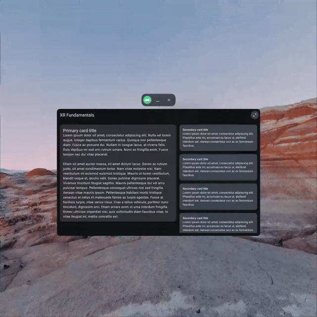
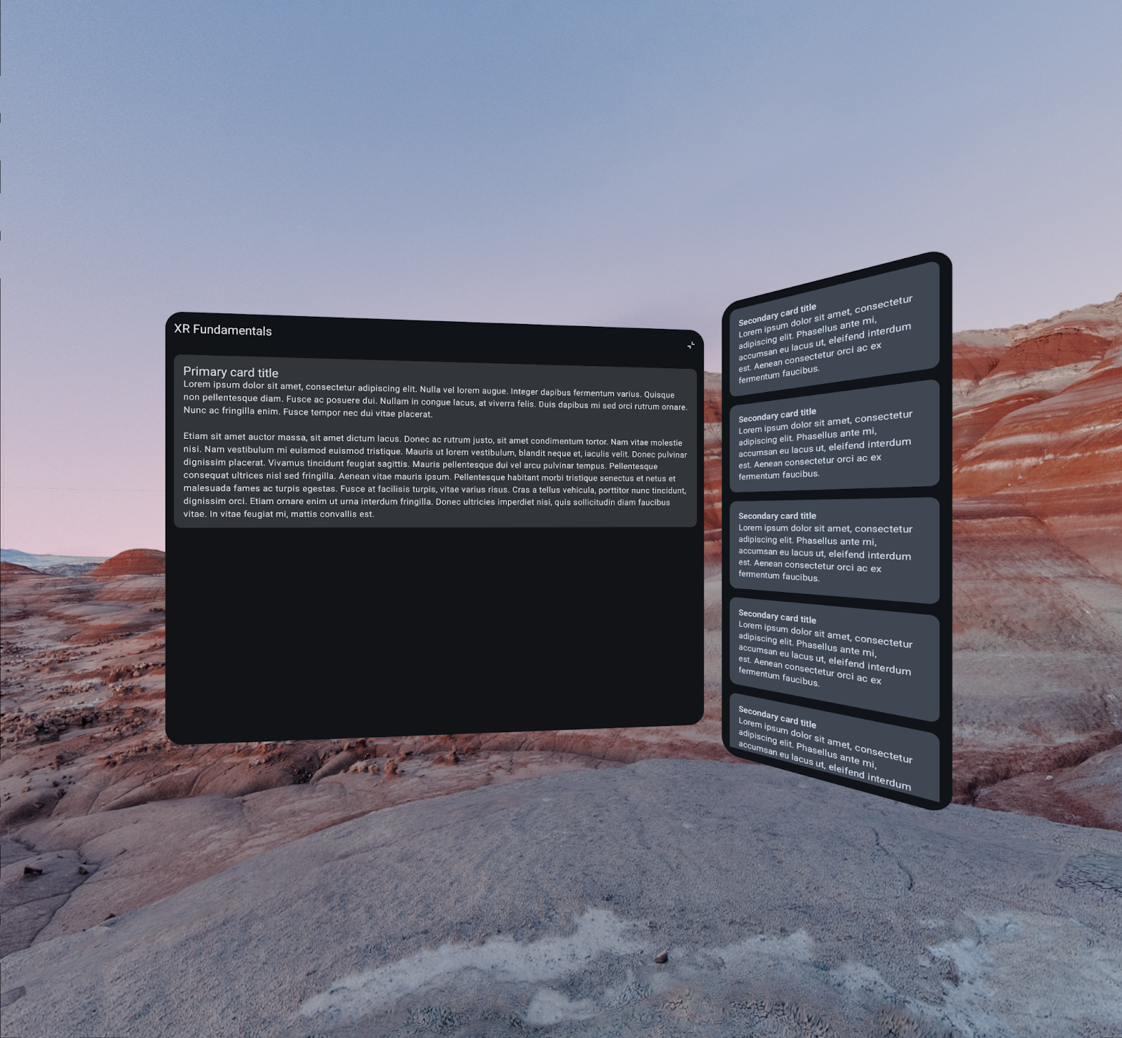
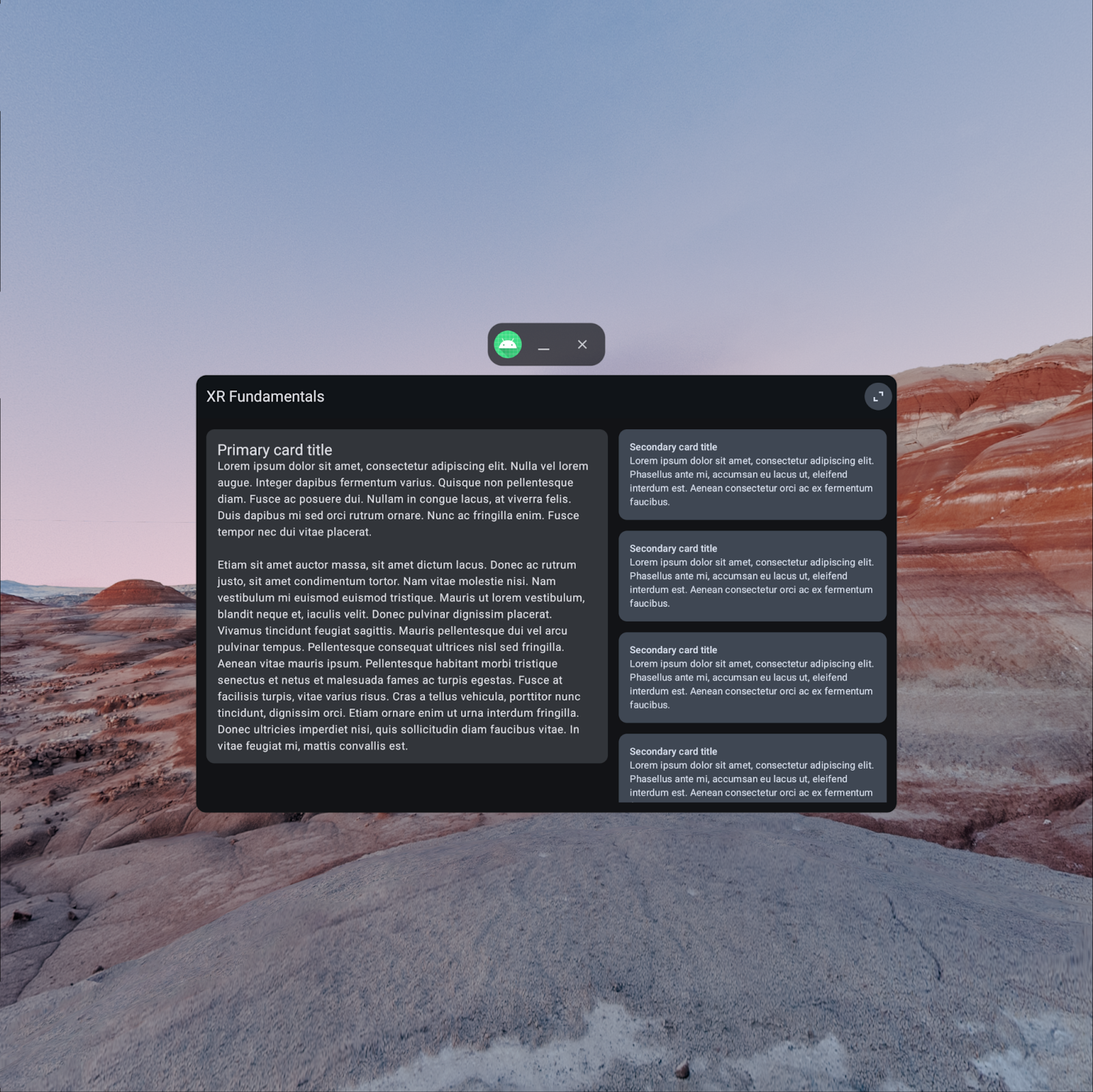
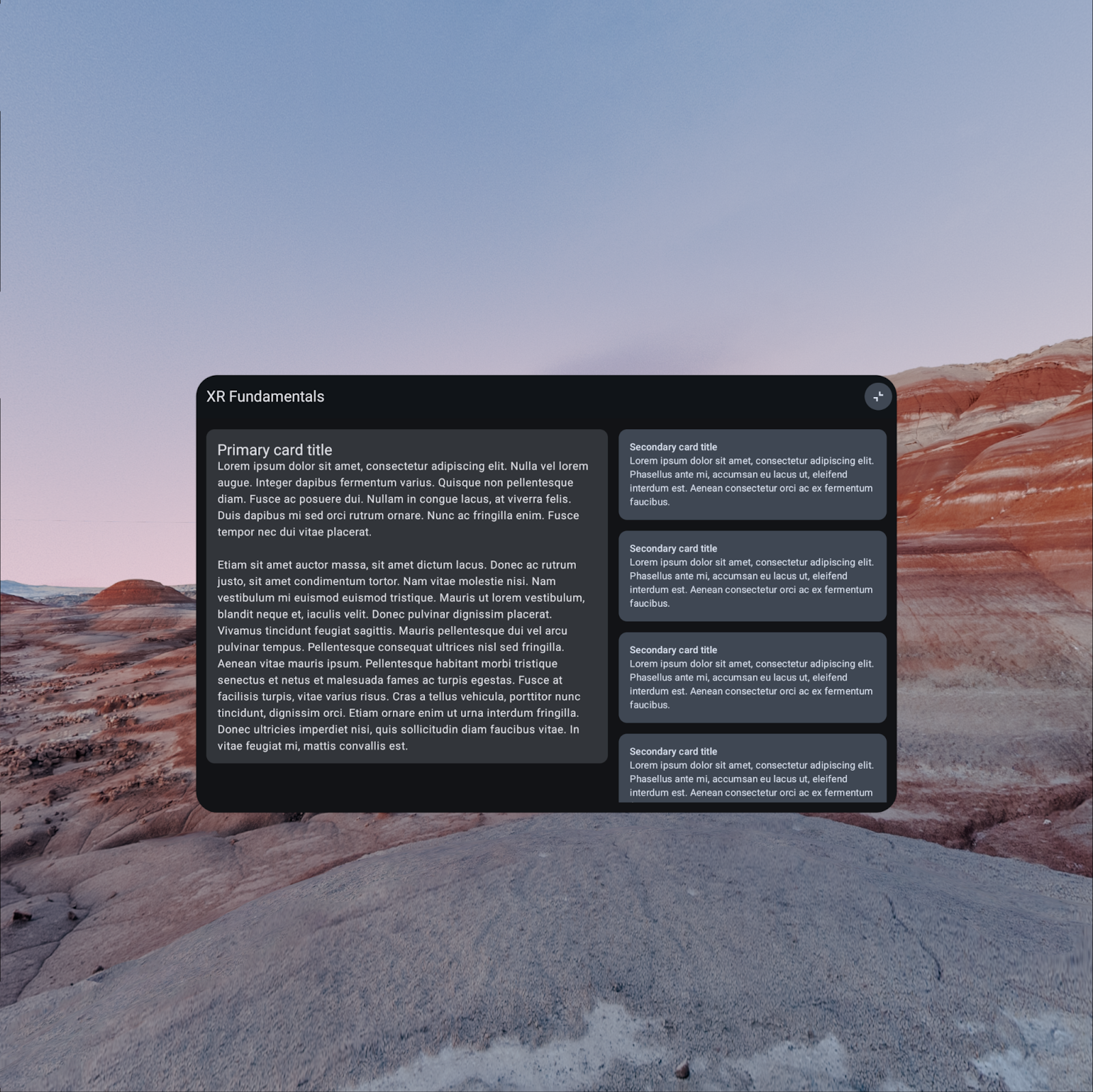
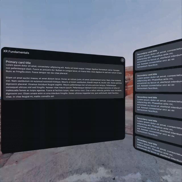
When your app includes a Subspace composable, only its contents will be shown. This means that when you click the button to enter Full Space, nothing shows up anymore. To fix this, you'll add two spatial panels in the next few steps, one to contain the primary content and another for the secondary content.
Add a panel for the primary content
To display the primary content in Full Space, add a SpatialPanel within the Subspace composable.
Since this is the primary panel of the app, you can include the Scaffold within it to keep the controls within the top app bar present.
XRFundamentalsApp.kt
import androidx.xr.compose.subspace.SpatialPanel
import androidx.xr.compose.subspace.layout.SubspaceModifier
import androidx.xr.compose.subspace.layout.height
import androidx.xr.compose.subspace.layout.width

...

Subspace {
    SpatialPanel(
        modifier = SubspaceModifier
            .width(1024.dp)
            .height(800.dp)
    ) {
        Scaffold(
            topBar = { XRFundamentalsTopAppBar() }
        ) { innerPadding ->
            Box(Modifier.padding(innerPadding)) {
                PrimaryCard(
                    modifier = Modifier
                        .padding(16.dp)
                        .verticalScroll(rememberScrollState())
                )
            }
        }
    }
}
By default, the size of a SpatialPanel is determined based on the size of the content it contains, but can also be determined by providing a SubspaceModifier parameter. Subspace modifiers are analogous to modifiers and are used to modify spatial layout components like panels.
Because this spatial panel's content doesn't specify its own size, a SubspaceModifier must be provided for the panel to have a width and height.

Add a panel for the secondary content
Now that you've got the app running in Full Space and using a panel to display the primary content, it's time to move the secondary content into its own panel. Note the use of a Surface within the spatial panel. Without it, there wouldn't be a background for the secondary cards as spatial panels themselves are transparent (the Scaffold composable handled this in the prior step).
XRFundamentalsApp.kt
import androidx.compose.material3.Surface

...

Subspace {
    SpatialPanel() { ... }
    SpatialPanel(
        modifier = SubspaceModifier
            .width(340.dp)
            .height(800.dp)
    ) {
        Surface {
            SecondaryCardList(
                modifier = Modifier
                    .padding(16.dp)
                    .verticalScroll(rememberScrollState())
            )
        }
    }
}
Now run the app again. At first glance, it may appear that the second panel isn't showing up, but it actually is – it's just being hidden behind the primary panel.

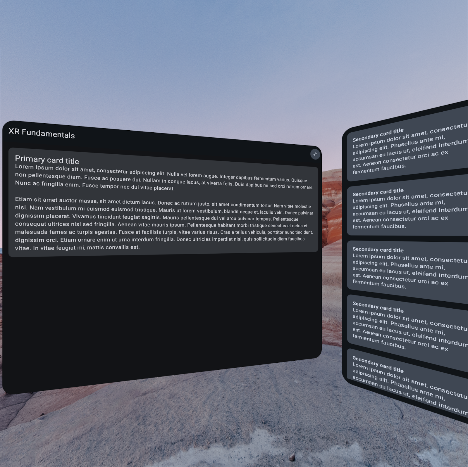
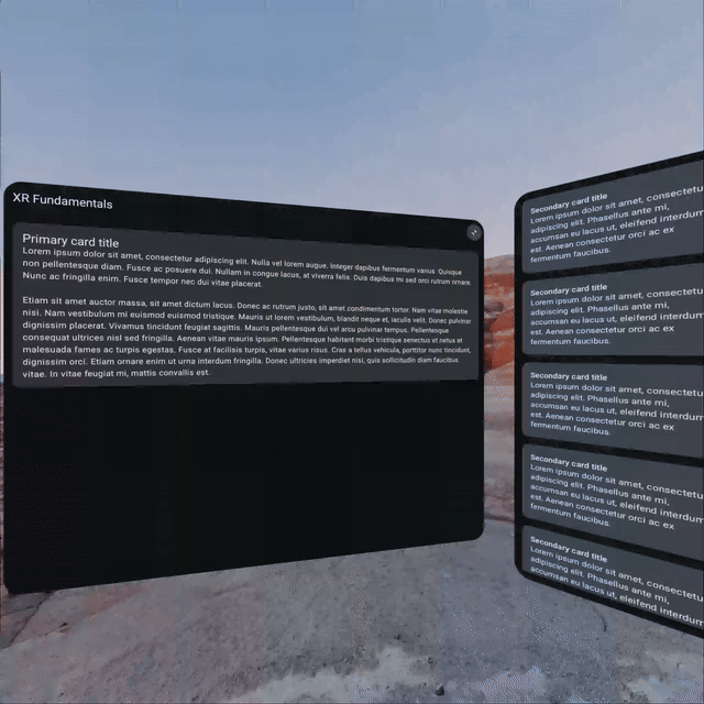
Layout the panels in a row
Just as with 2D content, using rows and columns is helpful for arranging composables side-by-side without overlapping. When working with spatial components like panels, you can use the SpatialRow, SpatialCurvedRow, and SpatialColumn composables to do this.
XRFundamentalsApp.kt
import androidx.xr.compose.subspace.SpatialCurvedRow

...

Subspace {
    SpatialCurvedRow(
        curveRadius = 825.dp
    ) {
        SpatialPanel(...) { ... }
        SpatialPanel(...) { ... }
    }
}
Run the app one more time and you should see that the panels are laid out in a row, one after the other.
Because you're using the SpatialCurvedRow composable, the panels curve around the user instead of staying in the same plane (as would be the case with a SpatialRow), providing a more encompassing experience.
Make a panel resizable
To give users control over the appearance of your app, you can make panels resizable by using a resizable modifier.
By default, resizable panels can be resized down to zero or expanded indefinitely, so you'll probably want to take the time to set appropriate minimumSize and maximumSize parameters based on the content they'll contain.
See the reference documentation for more details on all of the parameters the resizable modifier supports.
XRFundamentalsApp.kt
import androidx.xr.compose.subspace.layout.SubspaceModifier
import androidx.xr.compose.subspace.layout.resizable

...

SpatialPanel(
    modifier = SubspaceModifier
        ...
        .resizable()
)
Make a panel movable
Similarly, you can make panels movable by using a MovePolicy.
XRFundamentalsApp.kt
import androidx.xr.compose.subspace.layout.SubspaceModifier
import androidx.xr.compose.subspace.layout.movable

...

SpatialPanel(
    modifier = SubspaceModifier
        ...
        .movable()
)
See the reference documentation for more details on all of the parameters a MovePolicy supports.
8. Update the manifest
Now that you've added spatial features to your app, you'll want to update the manifest to indicate that your app supports these features. This lets Google Play highlight your app as being differentiated for Android XR devices.
To do this, add the following <uses-feature> element in the AndroidManifest.xml file:
AndroidManifest.xml
<application ...>
    ...
    <uses-feature android:name="android.software.xr.api.spatial" android:required="false"/>
    ...
</application>
Using a value of false for the android:required attribute indicates that the app makes use of the feature if it's available, but doesn't prevent the app from being distributed to devices that don't have the feature (e.g. phones). This enables you to distribute to both phone and XR devices from mobile release tracks. If you'd like to use the XR dedicated tracks, set android:required to true instead.
9. Congratulations
To continue learning about how to make the most of Android XR, check out the next codelab, Learn Android XR Fundamentals: Part 2 - Orbiters and Spatial Environments, as well as the following resources and exercises:
Further reading
- Design for XR covers design principles and best practices to use when building apps for Android XR.
- Develop with the Jetpack XR SDK contains technical guidance on the APIs and tools you can use in building your Android XR experience.
- The Android XR app quality guidelines page describes criteria to create a great user experience.
- Dig into the Hello Android XR sample
Challenges
- Use the additional parameters available for the
resizableandmovablemodifiers. - Add additional panels.
- Use other spatial components like a spatial dialog