Material Design is a system for building bold and beautiful digital products. By uniting style, branding, interaction, and motion under a consistent set of principles and components, product teams can realize their greatest design potential.
Material Components (MDC) help developers implement Material Design. Created by a team of engineers and UX designers at Google, MDC features dozens of beautiful and functional UI components and is available for Android, iOS, web and Flutter. material.io/develop |
What is Material's motion system for Android?
The Material motion system for Android is a set of transition patterns within the MDC-Android library that can help users understand and navigate an app, as described in the Material Design guidelines.
The four main Material transition patterns are as follows:
- Container Transform: transitions between UI elements that include a container; creates a visible connection between two distinct UI elements by seamlessly transforming one element into another.
- Shared Axis: transitions between UI elements that have a spatial or navigational relationship; uses a shared transformation on the x, y, or z axis to reinforce the relationship between elements.
- Fade Through: transitions between UI elements that do not have a strong relationship to each other; uses a sequential fade out and fade in, with a scale of the incoming element.
- Fade: used for UI elements that enter or exit within the bounds of the screen.
The MDC-Android library offers transition classes for these patterns, built on top of both the AndroidX Transition library (androidx.transition) and the Android Transition Framework (android.transition):
AndroidX
- Available in the
com.google.android.material.transitionpackage - Supports API Level 14+
- Supports Fragments and Views, but not Activities or Windows
- Contains backported bug fixes and consistent behavior across API Levels
Framework
- Available in the
com.google.android.material.transition.platformpackage - Supports API Level 21+
- Supports Fragments, Views, Activities, and Windows
- Bug fixes not backported and may have different behavior across API Levels
In this codelab you will be using the Material transitions built on top of the AndroidX library, meaning you will be mainly focused on Fragments and Views.
What you'll build
This codelab will guide you through building some transitions into an example Android email app called Reply, using Kotlin, to demonstrate how you can use transitions from the MDC-Android library to customize the look and feel of your app.
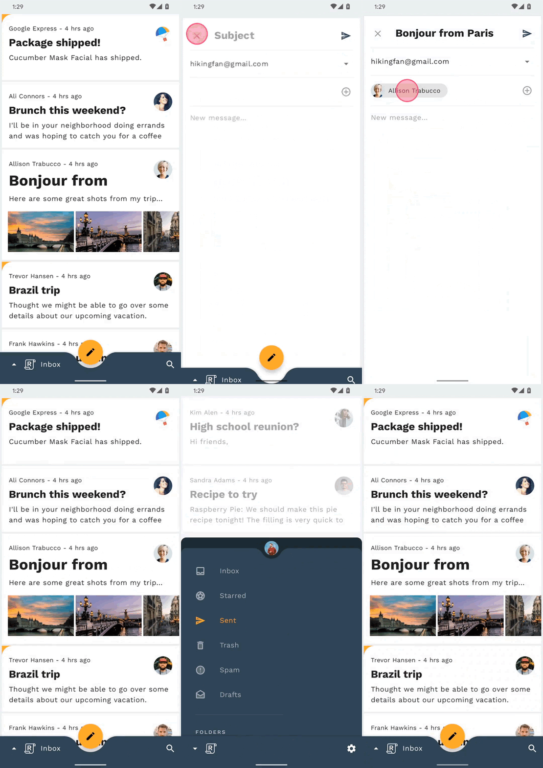
The starter code for the Reply app will be provided, and you will incorporate the following Material transitions into the app, which can be seen in the completed codelab's GIF below:
- Container Transform transition from email list to email detail page
- Container Transform transition from FAB to compose email page
- Shared Z-Axis transition from search icon to search view page
- Fade Through transition between mailbox pages
- Container Transform transition from email address chip to card view
What you'll need
- Basic knowledge of Android development and Kotlin
- Android Studio (download it here if you don't already have it)
- An Android emulator or device (available through Android Studio)
- The sample code (see next step)
How would you rate your level of experience building Android apps?
Start up Android Studio
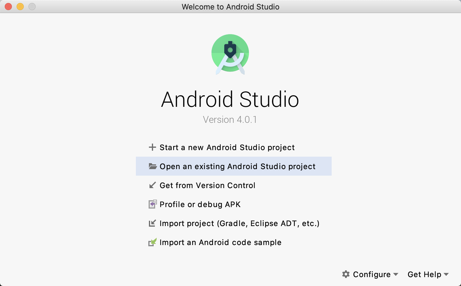
When you open Android Studio, it should display a window titled "Welcome to Android Studio". However, if this is your first time launching Android Studio, go through the Android Studio Setup Wizard steps with the default values. This step can take several minutes to download and install the necessary files, so feel free to leave this running in the background while doing the next section.
Option 1: Clone the starter codelab app from GitHub
To clone this codelab from GitHub, run the following commands:
git clone https://github.com/material-components/material-components-android-motion-codelab.git
cd material-components-android-motion-codelab
Option 2: Download the starter codelab app zip file
The starter app is located within the material-components-android-motion-codelab-develop directory.
Load the starter code in Android Studio
- Once the setup wizard finishes and the Welcome to Android Studio window is shown, click Open an existing Android Studio project.
- Navigate to the directory where you had installed the sample code and select the sample directory to open the project.
- Wait a moment for Android Studio to build and sync the project, as shown by activity indicators along the bottom of the Android Studio window.
- At this point, Android Studio might raise some build errors because you are missing the Android SDK or build tools, such as the one shown below. Follow the instructions in Android Studio to install/update these and sync your project. If you are still running into issues, follow the guide on updating your tools with the SDK Manager.

Verify project dependencies
The project needs a dependency on the MDC-Android library. The sample code you downloaded should already have this dependency listed, but let's take a look at the configuration to make sure.
Navigate to the app module's build.gradle file and make sure that the dependencies block includes a dependency on MDC-Android:
implementation 'com.google.android.material:material:1.2.0'
Run the starter app
- Ensure that the build configuration to the left of the device choice is
app. - Press the green Run / Play button to build and run the app.

- In the Select Deployment Target window, if you already have an Android device listed in your available devices, skip to Step 8. Otherwise, click Create New Virtual Device.
- In the Select Hardware screen, select a phone device, such as Pixel 3, and then click Next.
- In the System Image screen, select a recent Android version, preferably the highest API level. If it is not installed, click the Download link that is shown and complete the download.
- Click Next.
- On the Android Virtual Device (AVD) screen, leave the settings as they are and click Finish.
- Select an Android device from the deployment target dialog.
- Click Ok.
- Android Studio builds the app, deploys it, and automatically opens it on the target device.
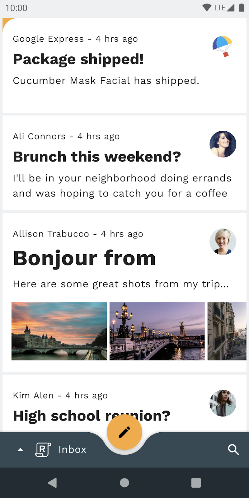
Success! The starter code for Reply's home page should be running in your emulator. You should see the Inbox containing a list of emails.
Optional: Slow down device animations
Since this codelab involves quick, yet polished transitions, it can be useful to slow down the device's animations in order to observe some of the finer details of the transitions as you are implementing. This can either be accomplished with adb shell commands or a Quick Settings Tile. Note that these methods of slowing down device animations will affect animations on the device outside of the Reply app as well.
Method 1: ADB Shell Commands
To slow down the device's animations by a factor of 10x, you can run the following commands from the command line:
adb shell settings put global window_animation_scale 10
adb shell settings put global transition_animation_scale 10
adb shell settings put global animator_duration_scale 10
To reset the device's animation speed to back to normal, run the following commands:
adb shell settings put global window_animation_scale 1
adb shell settings put global transition_animation_scale 1
adb shell settings put global animator_duration_scale 1
Method 2: Quick Settings Tile
Alternatively, to set up the Quick Settings Tile, first enable Developer Settings on your device if you haven't done so previously:
- Open the device "Settings" app
- Scroll down to the bottom and click "About emulated device"
- Scroll down to the bottom and rapidly click "Build number" until Developer Settings are enabled
Next, do the following, still within the device "Settings" app, to enable the Quick Settings Tile:
- Click the search icon or search bar at the top of the screen
- Type "tiles" in the search field
- Click the "Quick settings developer tiles" row
- Click the "Window animation scale" switch
Finally, throughout the codelab, pull down the system notification shade from the top of the screen and use the  icon to toggle between slow and normal speed animations.
Let's take a look at the code. We've provided an app that uses the Jetpack Navigation component library to navigate between a few different Fragments, all within a single Activity, MainActivity:
- HomeFragment: displays a list of emails
- EmailFragment: displays a single, full email
- ComposeFragment: allows for the composition of a new email
- SearchFragment: displays a search view
navigation_graph.xml
First, to understand how the app's navigation graph is set up, open up navigation_graph.xml in the app -> src -> main -> res -> navigation directory:
<navigation xmlns:android="http://schemas.android.com/apk/res/android"
   xmlns:app="http://schemas.android.com/apk/res-auto"
   android:id="@+id/navigation_graph"
   app:startDestination="@id/homeFragment">

   <fragment
       android:id="@+id/homeFragment"
       android:name="com.materialstudies.reply.ui.home.HomeFragment"
       android:label="HomeFragment">
       <argument...>
       <action
           android:id="@+id/action_homeFragment_to_emailFragment"
           app:destination="@id/emailFragment" />
   </fragment>
   <fragment
       android:id="@+id/emailFragment"
       android:name="com.materialstudies.reply.ui.email.EmailFragment"
       android:label="EmailFragment">
       <argument...>
   </fragment>
   <fragment
       android:id="@+id/composeFragment"
       android:name="com.materialstudies.reply.ui.compose.ComposeFragment"
       android:label="ComposeFragment">
       <argument...>
   </fragment>
   <fragment
       android:id="@+id/searchFragment"
       android:name="com.materialstudies.reply.ui.search.SearchFragment"
       android:label="SearchFragment" />
   <action
       android:id="@+id/action_global_homeFragment"
       app:destination="@+id/homeFragment"
       app:launchSingleTop="true"
       app:popUpTo="@+id/navigation_graph"
       app:popUpToInclusive="true"/>
   <action
       android:id="@+id/action_global_composeFragment"
       app:destination="@+id/composeFragment" />
   <action
       android:id="@+id/action_global_searchFragment"
       app:destination="@+id/searchFragment" />
</navigation>
Take note of how all of the fragments mentioned above are present, with the default launch fragment set to the HomeFragment via app:startDestination="@id/homeFragment". This XML definition of the fragment destination graph, as well as the actions, informs the generated Kotlin navigation code that you will encounter when hooking up transitions.
activity_main.xml
Next, take a look at the activity_main.xml layout in the app -> src -> main -> res -> layout directory. You'll see the NavHostFragment which is configured with the navigation graph from above:
<fragment
   android:id="@+id/nav_host_fragment"
   android:name="androidx.navigation.fragment.NavHostFragment"
   android:layout_width="match_parent"
   android:layout_height="match_parent"
   app:defaultNavHost="true"
   app:navGraph="@navigation/navigation_graph"/>
This NavHostFragment fills the screen and handles all of the full screen fragment navigation changes in the app. The BottomAppBar and its anchored FloatingActionButton, also in activity_main.xml, are laid out on top of the current fragment displayed by the NavHostFragment, and therefore will be shown or hidden depending on the fragment destination by the provided sample app code.
Additionally, the BottomNavDrawerFragment in activity_main.xml is a bottom drawer that contains a menu for navigating between the different email mailboxes, which is conditionally shown via the BottomAppBar Reply logo button.
MainActivity.kt
Lastly, to see an example of a navigation action being used, open up MainActivity.kt in the app -> src -> main -> java -> com.materialstudies.reply.ui directory. Locate the navigateToSearch() function, which should look like this:
private fun navigateToSearch() {
   val directions = SearchFragmentDirections.actionGlobalSearchFragment()
   findNavController(R.id.nav_host_fragment).navigate(directions)
}
This shows how you can navigate to the search view page, without any custom transition. During this codelab, you will dive into Reply's MainActivity and four main fragments to set up Material transitions that work in tandem with the various navigation actions throughout the app.
Now that you're familiar with the starter code, let's implement our first transition.
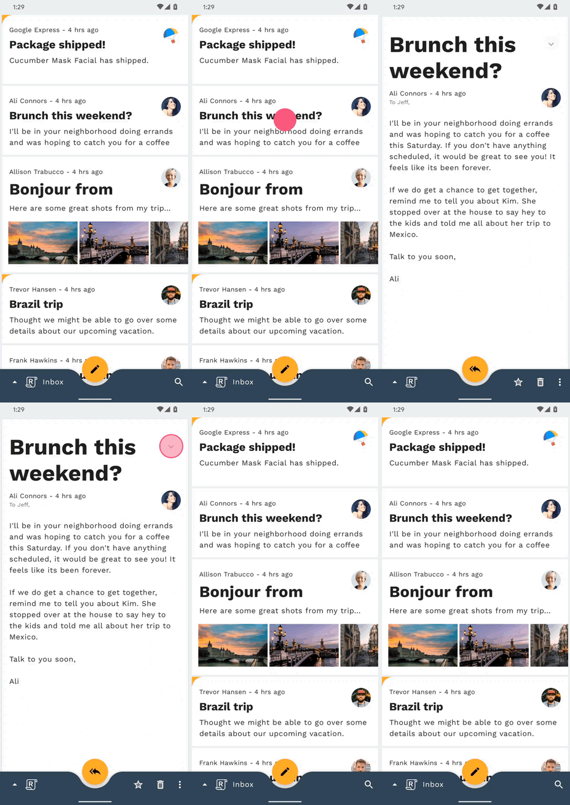
To begin, you will add a transition when clicking on an email. For this navigation change, the container transform pattern is well suited, as it's designed for transitions between UI elements that include a container. This pattern creates a visible connection between two UI elements.
Before adding any code, try running the Reply app and clicking on an email. It should do a simple jump-cut, which means the screen is replaced with no transition:
Begin by adding a transitionName attribute on the MaterialCardView in email_item_layout.xml as shown in the following snippet:
email_item_layout.xml
android:transitionName="@{@string/email_card_transition_name(email.id)}"The transition name takes in a string resource with a parameter. You need to use the id of each email to ensure each transitionName in our EmailFragment is unique.
Now that you have your email list item's transition name set, let's do the same in the email details layout. In fragment_email.xml, set the transitionName of the MaterialCardView to the following string resource:
fragment_email.xml
android:transitionName="@string/email_card_detail_transition_name"In HomeFragment.kt, replace the code in onEmailClicked with the below snippet to create the mapping from your start view (email list item) and end view (email details screen):
HomeFragment.kt
val emailCardDetailTransitionName = getString(R.string.email_card_detail_transition_name)
val extras = FragmentNavigatorExtras(cardView to emailCardDetailTransitionName)
val directions = HomeFragmentDirections.actionHomeFragmentToEmailFragment(email.id)
findNavController().navigate(directions, extras)Now that you have the plumbing configured, you can create a container transform. In the EmailFragment onCreate method, set sharedElementEnterTransition to a new instance of a MaterialContainerTransform (importing the com.google.android.material.transition version as opposed to the com.google.android.material.transition.platform version) by adding the following snippet:
EmailFragment.kt
sharedElementEnterTransition = MaterialContainerTransform().apply {
   drawingViewId = R.id.nav_host_fragment
   duration = resources.getInteger(R.integer.reply_motion_duration_large).toLong()
   scrimColor = Color.TRANSPARENT
   setAllContainerColors(requireContext().themeColor(R.attr.colorSurface))
}Now try re-running the app.

Things are starting to look great! When you click on an email in the email list, a container transform should expand the list item into a full screen details page. However, notice how pressing back doesn't collapse the email back into the list. Additionally, the email list disappears immediately at the beginning of the transition, showing the grey window background. So we're not done yet.
To fix the return transition, add the following two lines to the onViewCreated method in HomeFragment.kt:
HomeFragment.kt
postponeEnterTransition()
view.doOnPreDraw { startPostponedEnterTransition() }
Try re-running the app. Pressing back after opening an email will collapse the email back into the list. Nice! Let's keep improving the animation.
The issue of the email list disappearing is because when navigating to a new Fragment using the Navigation Component, the current Fragment is immediately removed and replaced with our new, incoming Fragment. To keep the email list visible even after being replaced, you can add an exit transition to HomeFragment.
Add the below snippet to the HomeFragment onEmailClicked method to have the list of emails subtly scale out when exiting and back in when reentering:
HomeFragment.kt
exitTransition = MaterialElevationScale(false).apply {
   duration = resources.getInteger(R.integer.reply_motion_duration_large).toLong()
}
reenterTransition = MaterialElevationScale(true).apply {
   duration = resources.getInteger(R.integer.reply_motion_duration_large).toLong()
}Next, in order to ensure that the MaterialElevationScale transition is applied to the home screen as a whole, instead of to each of the individual views in the hierarchy, mark the RecyclerView in fragment_home.xml as a transition group.
fragment_home.xml
android:transitionGroup="true"At this stage, you should have a fully working container transform. Clicking on an email expands the list item into a details screen while receding the list of emails. Pressing back collapses the email details screen back into a list item while scaling up in the list of emails.

Let's continue with container transform and add a transition from the Floating Action Button to ComposeFragment, expanding the FAB to a new email to be written by the user. First, re-run the app and click on the FAB to see that there is no transition when launching the email compose screen.
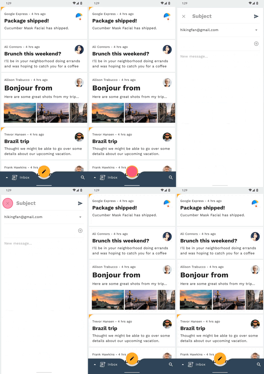
While we use the same transition class, the way we configure this instance will be different since our FAB lives in MainActivity and our ComposeFragment is placed inside our MainActivity navigation host container.
In ComposeFragment.kt, add the following snippet to the onViewCreated method, making sure to import the androidx.transition version of Slide.
ComposeFragment.kt
enterTransition = MaterialContainerTransform().apply {
   startView = requireActivity().findViewById(R.id.fab)
   endView = emailCardView
   duration = resources.getInteger(R.integer.reply_motion_duration_large).toLong()
   scrimColor = Color.TRANSPARENT
   containerColor = requireContext().themeColor(R.attr.colorSurface)
   startContainerColor = requireContext().themeColor(R.attr.colorSecondary)
   endContainerColor = requireContext().themeColor(R.attr.colorSurface)
}
returnTransition = Slide().apply {
   duration = resources.getInteger(R.integer.reply_motion_duration_medium).toLong()
   addTarget(R.id.email_card_view)
}
In addition to parameters used to configure our previous container transform, startView and endView are being set manually here. Instead of using transitionName attributes to let the Android Transition system know which views should be transformed, you can specify these manually when necessary.
Now, re-run the app. You should see the FAB transforming into the compose screen (see the GIF at the end of this step).
Similar to the previous step, you need to add a transition to HomeFragment to keep it from disappearing after being removed and replaced by ComposeFragment.
Copy the below snippet into the navigateToCompose method in MainActivity before the call NavController navigate.
MainActivity.kt
currentNavigationFragment?.apply {
   exitTransition = MaterialElevationScale(false).apply {
       duration = resources.getInteger(R.integer.reply_motion_duration_large).toLong()
   }
   reenterTransition = MaterialElevationScale(true).apply {
       duration = resources.getInteger(R.integer.reply_motion_duration_large).toLong()
   }
}That's it for this step! You should have a transition from the FAB to compose screen that looks like the following:

In this step, we'll add a transition from the search icon to the full screen search view. Since there is no persistent container involved in this navigation change, we can use a Shared Z-Axis transition to reinforce the spatial relationship between the two screens and indicate moving one level upward in the app's hierarchy.
Before adding any additional code, try running the app and tapping the search icon at the bottom right corner of the screen. This should bring up the search view screen with no transition.
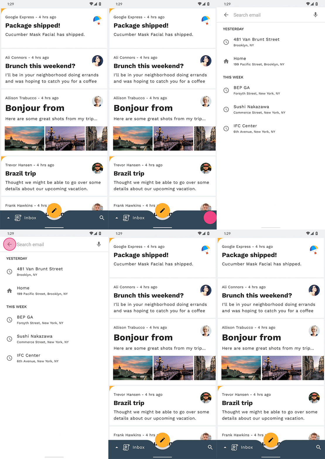
To begin, find the navigateToSearch method in MainActivity, and add the following code snippet before the NavController navigate method call to set up the current fragment's exit and reenter MaterialSharedAxis Z-Axis transitions.
MainActivity.kt
currentNavigationFragment?.apply {
   exitTransition = MaterialSharedAxis(MaterialSharedAxis.Z, true).apply {
       duration = resources.getInteger(R.integer.reply_motion_duration_large).toLong()
   }
   reenterTransition = MaterialSharedAxis(MaterialSharedAxis.Z, false).apply {
       duration = resources.getInteger(R.integer.reply_motion_duration_large).toLong()
   }
}
Next, add the following code snippet to the onCreate method in SearchFragment, which configures its enter and return MaterialSharedAxis transitions.
SearchFragment.kt
enterTransition = MaterialSharedAxis(MaterialSharedAxis.Z, true).apply {
   duration = resources.getInteger(R.integer.reply_motion_duration_large).toLong()
}
returnTransition = MaterialSharedAxis(MaterialSharedAxis.Z, false).apply {
   duration = resources.getInteger(R.integer.reply_motion_duration_large).toLong()
}Lastly, in order to ensure that the MaterialSharedAxis transition is applied to the search screen as a whole, instead of to each of the individual views in the hierarchy, mark the LinearLayout in fragment_search.xml as a transition group.
fragment_search.xml
android:transitionGroup="true"That's it! Now try re-running the app and tapping on the search icon. The home and search view screens should simultaneously fade and scale along the Z-axis in depth, creating a seamless effect between the two screens.

In this step, we'll add a transition between different mailboxes. Since we don't want to emphasize a spatial or hierarchical relationship, we'll use a fade through to perform a simple "swap" between lists of emails.
Before adding any additional code, try running the app, tapping on the Reply logo in the Bottom App Bar, and switching mailboxes. The list of emails should change with no transition.

To begin, find the navigateToHome method in MainActivity, and add the following code snippet before the NavController navigate method call to set up the current fragment's exit MaterialFadeThrough transition.
MainActivity.kt
currentNavigationFragment?.apply {
   exitTransition = MaterialFadeThrough().apply {
       duration = resources.getInteger(R.integer.reply_motion_duration_large).toLong()
   }
}
Next, open HomeFragment. In onCreate, set the fragment's enterTransition to a new instance of MaterialFadeThrough.
HomeFragment.kt
enterTransition = MaterialFadeThrough().apply {
   duration = resources.getInteger(R.integer.reply_motion_duration_large).toLong()
}Re-run the app. When you open the bottom navigation drawer and change mailboxes, the current list of emails should fade and scale out while the new list fades and scales in. Nice!

In this step, you'll add a transition that transforms a chip into a popup card. A container transform is used here to help inform the user that the action taken in the popup will affect the chip from which the popup originated.
Before adding any code, run the Reply app, click on an email, click the "reply" FAB, and then try clicking on a recipient's contact chip. The chip should disappear instantly and a card with email addresses for that contact should pop into view with no animations.
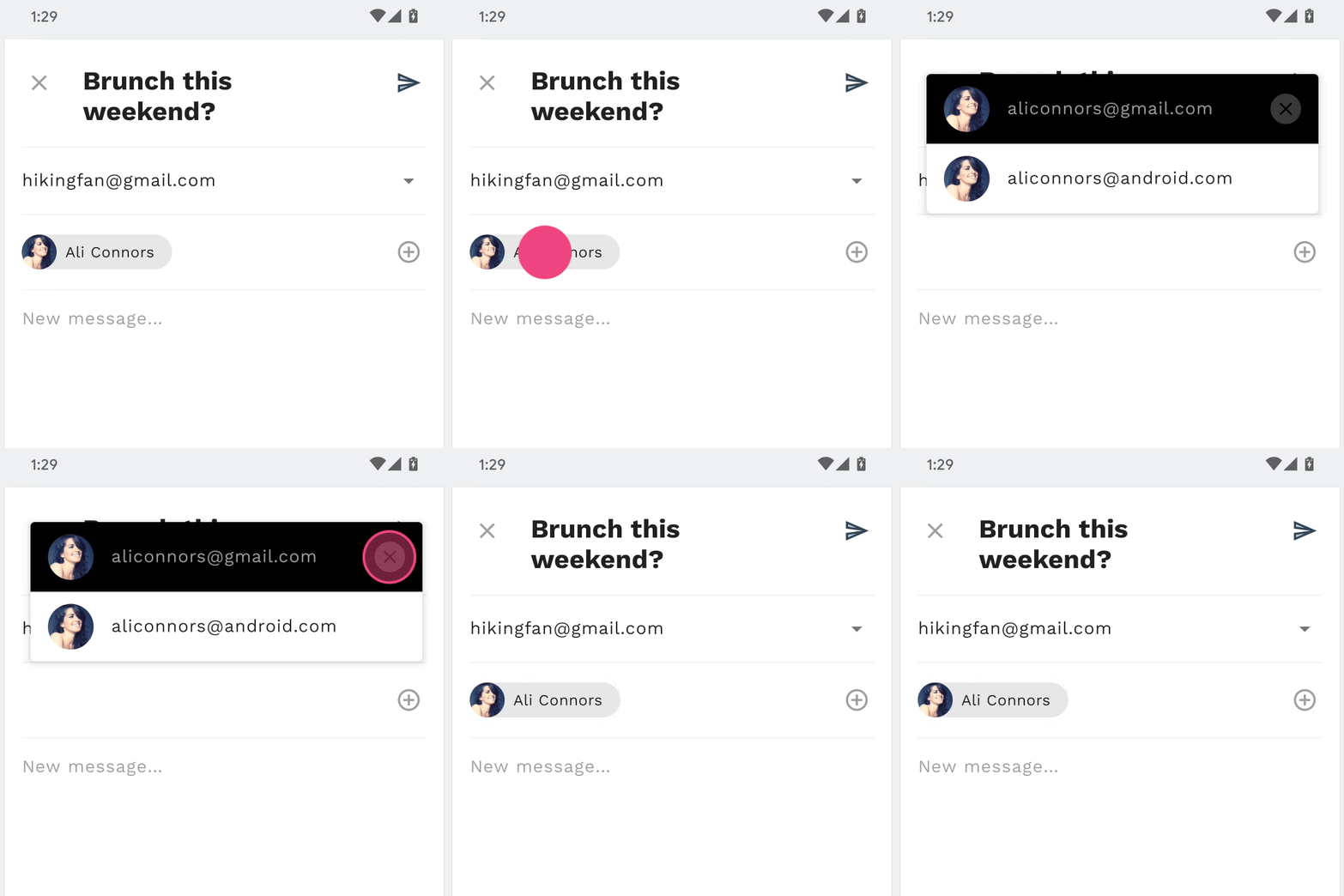
You'll be working in ComposeFragment for this step. Already added in the ComposeFragment layout are recipient chips (visible by default) and a recipient card (invisible by default). A recipient chip and this card are the two views you will create a container transform between.
To begin, open ComposeFragment and find the expandChip method. This method is called when the provided chip is clicked. Add the following code snippet above the lines that swap the recipientCardView and chip visibility, which will trigger the container transform registered via beginDelayedTransition.
ComposeFragment.kt
val transform = MaterialContainerTransform().apply {
   startView = chip
   endView = binding.recipientCardView
   scrimColor = Color.TRANSPARENT
   endElevation = requireContext().resources.getDimension(
       R.dimen.email_recipient_card_popup_elevation_compat
   )
   addTarget(binding.recipientCardView)
}

TransitionManager.beginDelayedTransition(binding.composeConstraintLayout, transform)If you run the app now, the chip should transform into a card of email addresses for the recipient. Next, let's configure the return transition to collapse the card back into the chip.
In the collapseChip method in ComposeFragment, add the below code snippet to collapse the card back into the chip.
ComposeFragment.kt
val transform = MaterialContainerTransform().apply {
   startView = binding.recipientCardView
   endView = chip
   scrimColor = Color.TRANSPARENT
   startElevation = requireContext().resources.getDimension(
       R.dimen.email_recipient_card_popup_elevation_compat
   )
   addTarget(chip)
}

TransitionManager.beginDelayedTransition(binding.composeConstraintLayout, transform)
Re-run the app. Clicking the chip should expand the chip into a card while clicking the card will collapse the card back into the chip. Nice!
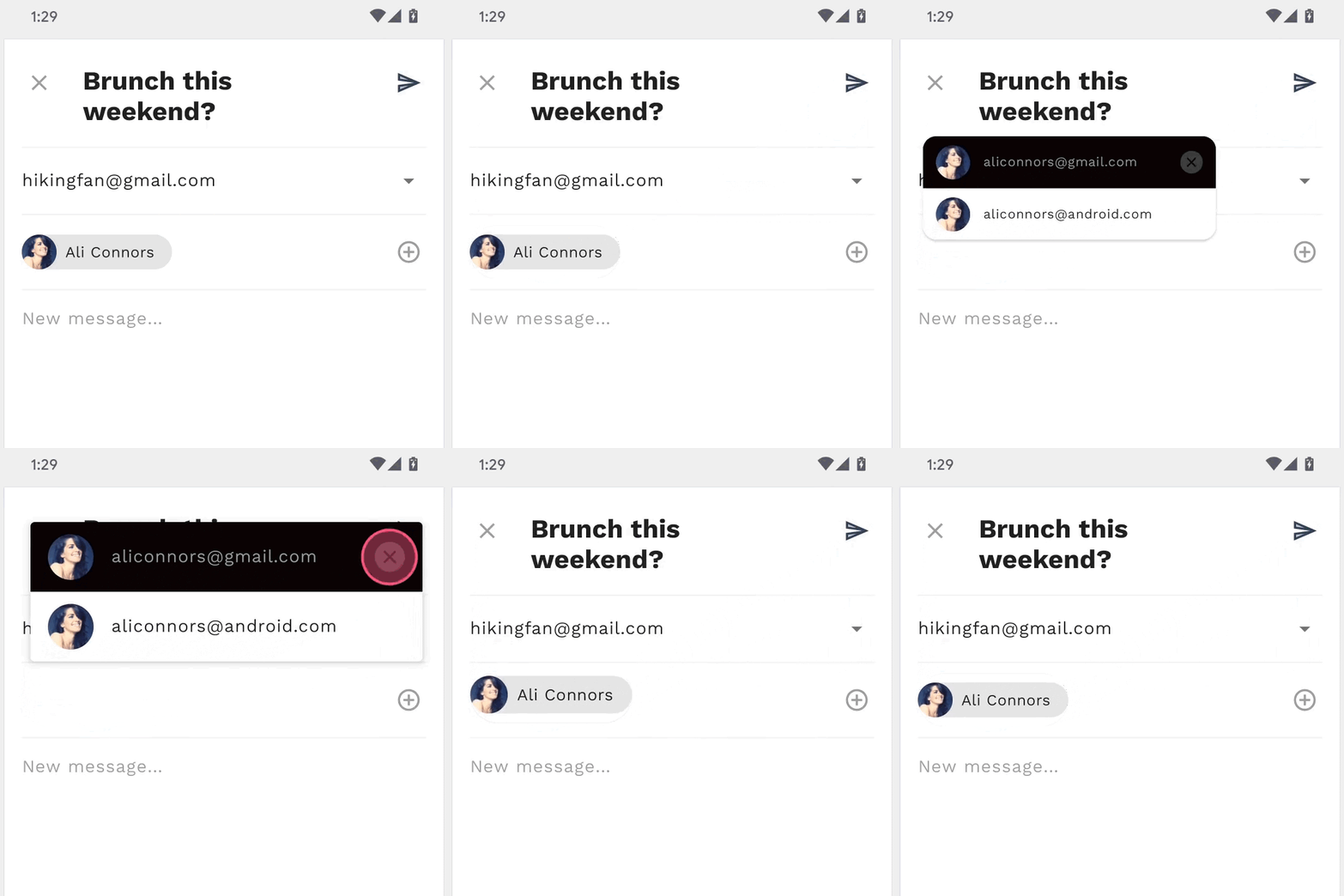
Using less than 100 lines of Kotlin code and some basic XML markup, the MDC-Android library has helped you create beautiful transitions in an existing app that conforms to the Material Design guidelines, and also looks and behaves consistently across all Android devices.

Next steps
For more information on the Material motion system, be sure to check out the spec and full developer documentation, and try adding some Material transitions to your app!
Thanks for trying Material motion. We hope you enjoyed this codelab!
