
You can validate input as the user types in a text field, such as entering a name, email, address, or other contact information. This validation reduces errors and saves your users time.
Results
Version compatibility
This implementation requires that your project minSDK be set to API level 21 or higher.
Dependencies
Validate input as the user types
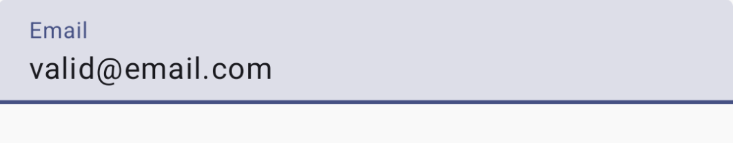
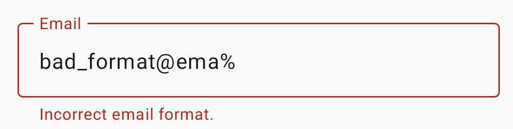
Use the following code to display the field input and validate the text while the user types. If the information is not validated, an error message helps the user correct the input.
class EmailViewModel : ViewModel() { var email by mutableStateOf("") private set val emailHasErrors by derivedStateOf { if (email.isNotEmpty()) { // Email is considered erroneous until it completely matches EMAIL_ADDRESS. !android.util.Patterns.EMAIL_ADDRESS.matcher(email).matches() } else { false } } fun updateEmail(input: String) { email = input } } @Composable fun ValidatingInputTextField( email: String, updateState: (String) -> Unit, validatorHasErrors: Boolean ) { OutlinedTextField( modifier = Modifier .fillMaxWidth() .padding(10.dp), value = email, onValueChange = updateState, label = { Text("Email") }, isError = validatorHasErrors, supportingText = { if (validatorHasErrors) { Text("Incorrect email format.") } } ) } @Preview @Composable fun ValidateInput() { val emailViewModel: EmailViewModel = viewModel<EmailViewModel>() ValidatingInputTextField( email = emailViewModel.email, updateState = { input -> emailViewModel.updateEmail(input) }, validatorHasErrors = emailViewModel.emailHasErrors ) }
Key points about the code
- Defines a composable that reuses the
OutlinedTextFieldcomponent, adding the required parameters to display validator error messages as user types. EmailViewModelis used to maintain state and provide the email validation logic.- if
isErroris true, the UI provides a visual indicator of a validation error state. - The component will display "Incorrect email format." until a complete, correct email is input.
Collections that contain this guide
This guide is part of these curated Quick Guide collections that cover broader Android development goals:
Display text
Text is a central piece of any UI. Find out different ways
you can present text in your app to provide a delightful user experience.
Request user input
Learn how to implement ways for users to interact
with your app by entering text and using other means of input.
Have questions or feedback
Go to our frequently asked questions page and learn about quick guides or reach out and let us know your thoughts.