Crea un componente di struttura per tenere insieme l'interfaccia utente
Mantieni tutto organizzato con le raccolte
Salva e classifica i contenuti in base alle tue preferenze.
In Material Design, uno scafo è una struttura di base che fornisce una piattaforma standardizzata per interfacce utente complesse. Tiene insieme diverse parti dell'interfaccia utente, come le barre delle app e i pulsanti di azione flottanti, conferendo alle app un aspetto coerente.
Compatibilità delle versioni
Questa implementazione richiede che il valore minSDK del progetto sia impostato sul livello API 21 o superiore.
Dipendenze
Creare un'impalcatura
L'esempio seguente fornisce un esempio completo di come implementare
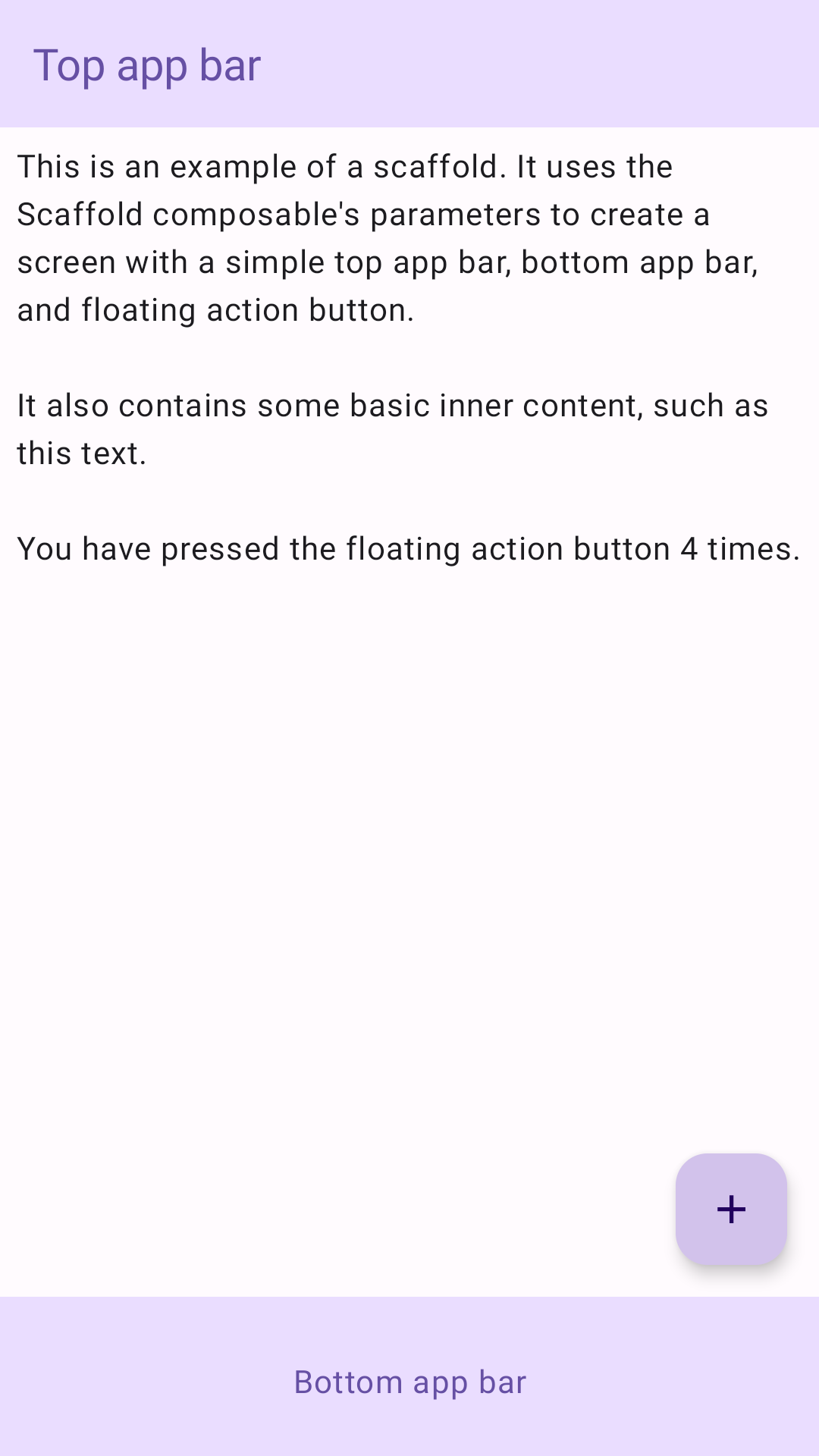
Scaffold. Contiene una barra dell'app superiore, una barra dell'app inferiore e un pulsante di azione mobile che interagisce con lo stato interno di Scaffold.
Risultati
Figura 1. Un'implementazione di uno scaffold.
Punti chiave
Il composable Scaffold fornisce un'API semplice che puoi utilizzare per assemblare rapidamente la struttura della tua app in base alle linee guida di Material Design.
Scaffold accetta diversi composibili come parametri. tra cui:
topBar: la barra delle app nella parte superiore dello schermo.
bottomBar: la barra delle app nella parte inferiore dello schermo.
floatingActionButton: un pulsante che viene visualizzato quando passi il mouse sopra l'angolo in basso a destra dello schermo e che puoi utilizzare per visualizzare le azioni principali.
Per esempi più dettagliati su come implementare le barre delle app sia in alto che in basso, consulta la pagina delle barre delle app.
Puoi anche passare i contenuti Scaffold come faresti con altri contenitori. Trasmette un valore innerPadding alla funzione lambda content che puoi poi utilizzare nei composabili secondari.
Raccolte che contengono questa guida
Questa guida fa parte di queste raccolte di guide rapide selezionate che coprono obiettivi di sviluppo Android più ampi:
Creare uno scheletro della schermata Home
Scopri come utilizzare una piattaforma standardizzata per creare interfacce utente complesse. La struttura tiene insieme le diverse parti della UI, conferendo alle app un aspetto coerente.
Scopri come le funzioni composable possono aiutarti a creare facilmente magnifici componenti dell'interfaccia utente basati sul sistema di progettazione Material Design.
I campioni di contenuti e codice in questa pagina sono soggetti alle licenze descritte nella Licenza per i contenuti. Java e OpenJDK sono marchi o marchi registrati di Oracle e/o delle sue società consociate.
Ultimo aggiornamento 2025-02-06 UTC.
[[["Facile da capire","easyToUnderstand","thumb-up"],["Il problema è stato risolto","solvedMyProblem","thumb-up"],["Altra","otherUp","thumb-up"]],[["Mancano le informazioni di cui ho bisogno","missingTheInformationINeed","thumb-down"],["Troppo complicato/troppi passaggi","tooComplicatedTooManySteps","thumb-down"],["Obsoleti","outOfDate","thumb-down"],["Problema di traduzione","translationIssue","thumb-down"],["Problema relativo a esempi/codice","samplesCodeIssue","thumb-down"],["Altra","otherDown","thumb-down"]],["Ultimo aggiornamento 2025-02-06 UTC."],[],[],null,["# Create a scaffold component to hold the UI together\n\n\u003cbr /\u003e\n\nIn Material Design, a scaffold is a fundamental structure that provides a\nstandardized platform for complex user interfaces. It holds together different\nparts of the UI, such as app bars and floating action buttons, giving apps a\ncoherent look and feel.\n\nVersion compatibility\n---------------------\n\nThis implementation requires that your project minSDK be set to API level 21\nor higher.\n\n### Dependencies\n\n### Kotlin\n\n\u003cbr /\u003e\n\n```kotlin\n implementation(platform(\"androidx.compose:compose-bom:2025.08.00\"))\n \n```\n\n\u003cbr /\u003e\n\n### Groovy\n\n\u003cbr /\u003e\n\n```groovy\n implementation platform('androidx.compose:compose-bom:2025.08.00')\n \n```\n\n\u003cbr /\u003e\n\nCreate a scaffold\n-----------------\n\nThe following example provides a full example of how you might implement\n[`Scaffold`](/reference/kotlin/androidx/compose/material/package-summary#Scaffold(androidx.compose.foundation.layout.WindowInsets,androidx.compose.ui.Modifier,androidx.compose.material.ScaffoldState,kotlin.Function0,kotlin.Function0,kotlin.Function1,kotlin.Function0,androidx.compose.material.FabPosition,kotlin.Boolean,kotlin.Function1,kotlin.Boolean,androidx.compose.ui.graphics.Shape,androidx.compose.ui.unit.Dp,androidx.compose.ui.graphics.Color,androidx.compose.ui.graphics.Color,androidx.compose.ui.graphics.Color,androidx.compose.ui.graphics.Color,androidx.compose.ui.graphics.Color,kotlin.Function1)). It contains a top app bar, bottom app bar, and a floating action\nbutton that interacts with `Scaffold`'s internal state.\n\n\u003cbr /\u003e\n\n```kotlin\n@Composable\nfun ScaffoldExample() {\n var presses by remember { mutableIntStateOf(0) }\n\n Scaffold(\n topBar = {\n TopAppBar(\n colors = topAppBarColors(\n containerColor = MaterialTheme.colorScheme.primaryContainer,\n titleContentColor = MaterialTheme.colorScheme.primary,\n ),\n title = {\n Text(\"Top app bar\")\n }\n )\n },\n bottomBar = {\n BottomAppBar(\n containerColor = MaterialTheme.colorScheme.primaryContainer,\n contentColor = MaterialTheme.colorScheme.primary,\n ) {\n Text(\n modifier = Modifier\n .fillMaxWidth(),\n textAlign = TextAlign.Center,\n text = \"Bottom app bar\",\n )\n }\n },\n floatingActionButton = {\n FloatingActionButton(onClick = { presses++ }) {\n Icon(Icons.Default.Add, contentDescription = \"Add\")\n }\n }\n ) { innerPadding -\u003e\n Column(\n modifier = Modifier\n .padding(innerPadding),\n verticalArrangement = Arrangement.spacedBy(16.dp),\n ) {\n Text(\n modifier = Modifier.padding(8.dp),\n text =\n \"\"\"\n This is an example of a scaffold. It uses the Scaffold composable's parameters to create a screen with a simple top app bar, bottom app bar, and floating action button.\n\n It also contains some basic inner content, such as this text.\n\n You have pressed the floating action button $presses times.\n \"\"\".trimIndent(),\n )\n }\n }\n}\n \n https://github.com/android/snippets/blob/dd30aee903e8c247786c064faab1a9ca8d10b46e/compose/snippets/src/main/java/com/example/compose/snippets/components/Scaffold.kt#L47-L100\n \n```\n\n\u003cbr /\u003e\n\nResults\n-------\n\n**Figure 1.** An implementation of scaffold.\n\nKey points\n----------\n\nThe [`Scaffold`](/reference/kotlin/androidx/compose/material/ScaffoldState) composable provides a straightforward API you can use to\nquickly assemble your app's structure according to Material Design guidelines.\n`Scaffold` accepts several composables as parameters. Among these are the\nfollowing:\n\n- `topBar`: The app bar across the top of the screen.\n- `bottomBar`: The app bar across the bottom of the screen.\n- `floatingActionButton`: A button that hovers over the bottom-right corner of the screen that you can use to expose key actions.\n\nFor more detailed examples on how you can implement both top and bottom\napp bars, see the app bars page.\n\nYou can also pass `Scaffold` content as you would to other containers. It passes\nan `innerPadding` value to the `content` lambda that you can then use in child\ncomposables.\n\nCollections that contain this guide\n-----------------------------------\n\nThis guide is part of these curated Quick Guide collections that cover\nbroader Android development goals: \n\n### Create a home screen scaffold\n\nFind out how to use a standardized platform to build complex user interfaces. The scaffold holds together different parts of the UI, giving apps a coherent look and feel. \n[Quick guide collection](/develop/ui/compose/quick-guides/collections/create-a-home-screen-scaffold) \n\n### Display interactive components\n\nLearn how composable functions can enable you to easily create beautiful UI components based on the Material Design design system. \n[Quick guide collection](/develop/ui/compose/quick-guides/collections/display-interactive-components) \n\nHave questions or feedback\n--------------------------\n\nGo to our frequently asked questions page and learn about quick guides or reach out and let us know your thoughts. \n[Go to FAQ](/quick-guides/faq) [Leave feedback](https://issuetracker.google.com/issues/new?component=1573691&template=1993320)"]]