With Jetpack Compose for XR, you can declaratively build your spatial UI and layout using familiar Compose concepts such as rows and columns. This lets you extend your existing Android UI into 3D space or build entirely new immersive 3D applications.
If you are spatializing an existing Android Views-based app, you have several development options. You can use interoperability APIs, use Compose and Views together, or work directly with the SceneCore library. See our guide to working with views for more details.
About subspaces and spatialized components
When you're writing your app for Android XR, it's important to understand the concepts of subspace and spatialized components.
About subspace
When developing for Android XR, you'll need to add a Subspace to your app
or layout. A subspace is a partition of 3D space within your app where you can
place 3D content, build 3D layouts, and add depth to otherwise 2D content. A
subspace is rendered only when spatialization is enabled. In Home Space or on
non-XR devices, any code within that subspace is ignored.
There are two ways to create a subspace:
Subspace: This composable can be placed anywhere within your app's UI hierarchy, allowing you to maintain layouts for 2D and spatial UI without losing context between files. This makes it easier to share things like existing app architecture between XR and other form factors without needing to hoist state through your whole UI tree or re-architect your app.ApplicationSubspace: This function creates app-level subspace only and must be placed at the top most level in your application's spatial UI hierarchy.ApplicationSubspacerenders spatial content with optionalVolumeConstraints. UnlikeSubspace,ApplicationSubspacecannot be nested within anotherSubspaceorApplicationSubspace.
For more information, see Add a subspace to your app.
About spatialized components
Subspace composables: These components can only be rendered in a subspace.
They must be enclosed within Subspace before being placed within a 2D layout.
A SubspaceModifier lets you add attributes like depth, offset, and
positioning to your subspace composables.
Other spatialized components don't require being called inside a subspace. They consist of conventional 2D elements wrapped within a spatial container. These elements can be used within 2D or 3D layouts if defined for both. When spatialization is not enabled, their spatialized features will be ignored and they will fall back to their 2D counterparts.
Create a spatial panel
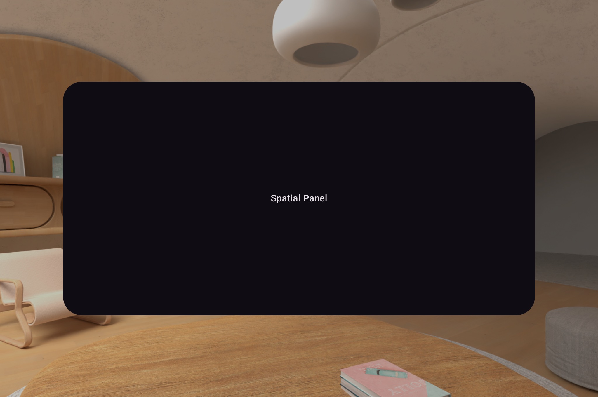
A SpatialPanel is a subspace composable that lets you display app
content–for example, you could display video playback, still images, or any
other content in a spatial panel.

You can use SubspaceModifier to change the size, behavior, and positioning of
the spatial panel, as shown in the following example.
Subspace { SpatialPanel( SubspaceModifier .height(824.dp) .width(1400.dp), dragPolicy = MovePolicy(), resizePolicy = ResizePolicy(), ) { SpatialPanelContent() } }
@Composable fun SpatialPanelContent() { Box( Modifier .background(color = Color.Black) .height(500.dp) .width(500.dp), contentAlignment = Alignment.Center ) { Text( text = "Spatial Panel", color = Color.White, fontSize = 25.sp ) } }
Key points about the code
- Because
SpatialPanelAPIs are subspace composables, you must call them insideSubspace. Calling them outside of a subspace throws an exception. - The size of the
SpatialPanelhas been set using theheightandwidthspecifications on theSubspaceModifier. Omitting these specifications lets the size of the panel be determined by the measurements of its contents. - Allow the user to move a panel by adding a
MovePolicy. - Allow the user to resize a panel by adding a
ResizePolicy. - See our spatial panel design guidance for details on sizing and positioning. See our reference documentation for more specifics on code implementation.
How a MovePolicy works
As a user moves a panel away from them, by default, a MovePolicy
scales the panel in a similar way to how panels are resized by the system in
home space. All children content inherit this behavior. To disable this,
set the shouldScaleWithDistance parameter to false.
Create an orbiter
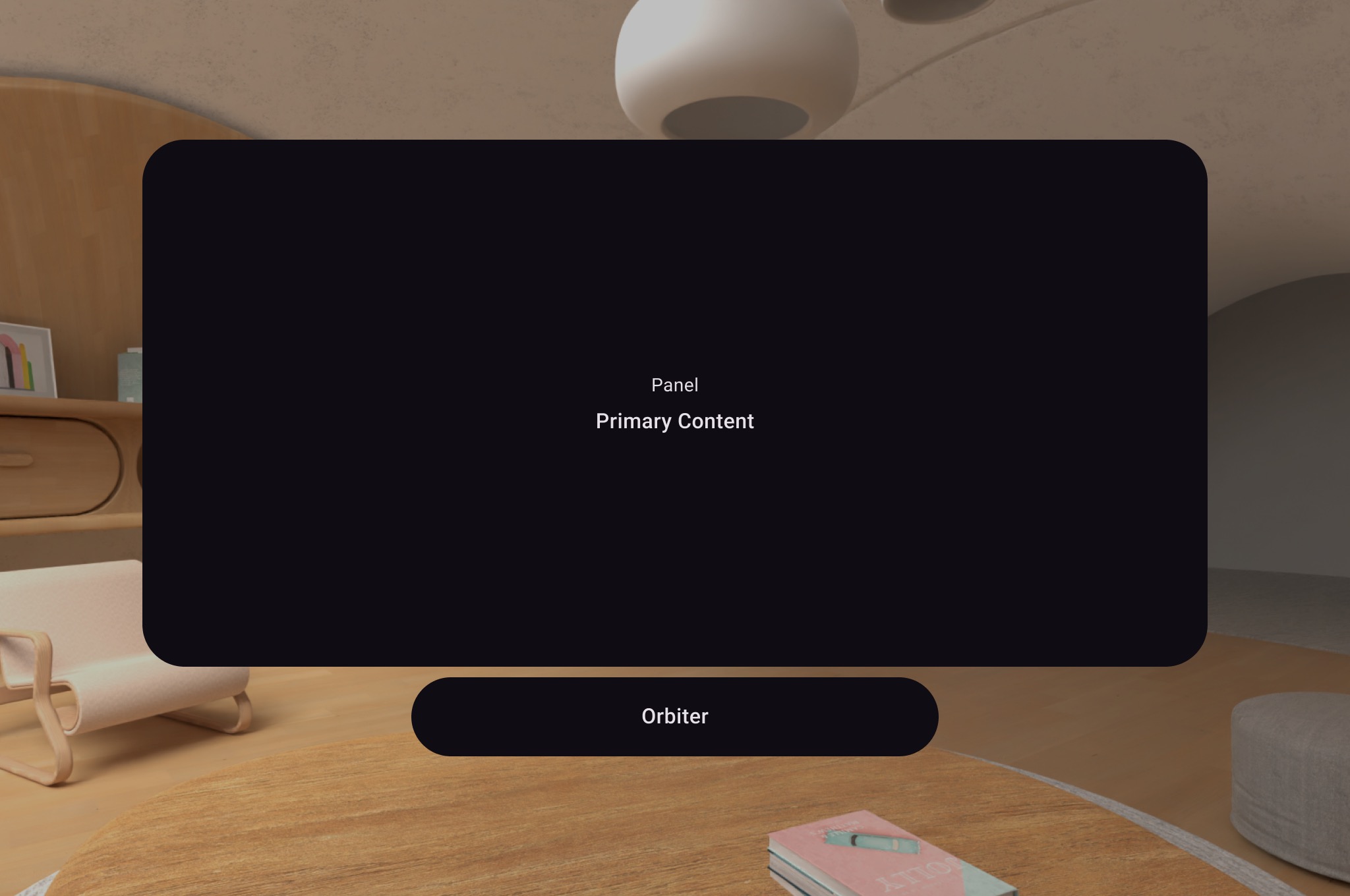
An orbiter is a spatial UI component. It's designed to be attached to a corresponding spatial panel, layout, or other entity. An orbiter typically contains navigation and contextual action items related to the entity it's anchored to. For example, if you've created a spatial panel to display video content, you could add video playback controls inside an orbiter.

As shown in the following example, call an orbiter inside the 2D layout in a
SpatialPanel to wrap user controls like navigation. Doing so extracts them
from your 2D layout and attaches them to the spatial panel according to your
configuration.
Subspace { SpatialPanel( SubspaceModifier .height(824.dp) .width(1400.dp), dragPolicy = MovePolicy(), resizePolicy = ResizePolicy(), ) { SpatialPanelContent() OrbiterExample() } }
@Composable fun OrbiterExample() { Orbiter( position = ContentEdge.Bottom, offset = 96.dp, alignment = Alignment.CenterHorizontally ) { Surface(Modifier.clip(CircleShape)) { Row( Modifier .background(color = Color.Black) .height(100.dp) .width(600.dp), horizontalArrangement = Arrangement.Center, verticalAlignment = Alignment.CenterVertically ) { Text( text = "Orbiter", color = Color.White, fontSize = 50.sp ) } } } }
Key points about the code
- Because orbiters are spatial UI components, the code can be reused in 2D or 3D layouts. In a 2D layout, your app renders only the content inside the orbiter and ignores the orbiter itself.
- Check out our design guidance for more information on how to use and design orbiters.
Add multiple spatial panels to a spatial layout
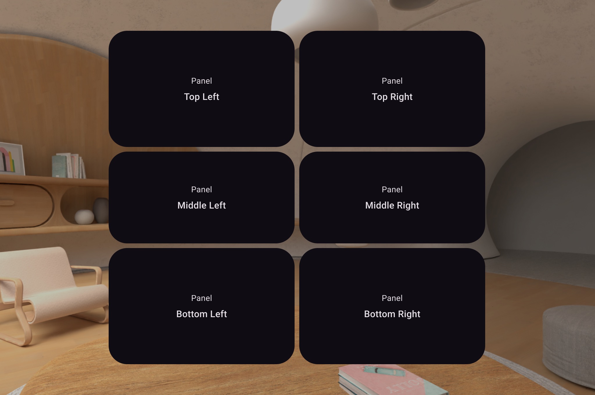
You can create multiple spatial panels and place them within a spatial layout
using SpatialRow, SpatialColumn, SpatialBox, and
SpatialLayoutSpacer.

The following code example shows how to do this.
Subspace { SpatialRow { SpatialColumn { SpatialPanel(SubspaceModifier.height(250.dp).width(400.dp)) { SpatialPanelContent("Top Left") } SpatialPanel(SubspaceModifier.height(200.dp).width(400.dp)) { SpatialPanelContent("Middle Left") } SpatialPanel(SubspaceModifier.height(250.dp).width(400.dp)) { SpatialPanelContent("Bottom Left") } } SpatialColumn { SpatialPanel(SubspaceModifier.height(250.dp).width(400.dp)) { SpatialPanelContent("Top Right") } SpatialPanel(SubspaceModifier.height(200.dp).width(400.dp)) { SpatialPanelContent("Middle Right") } SpatialPanel(SubspaceModifier.height(250.dp).width(400.dp)) { SpatialPanelContent("Bottom Right") } } } }
@Composable fun SpatialPanelContent(text: String) { Column( Modifier .background(color = Color.Black) .fillMaxSize(), horizontalAlignment = Alignment.CenterHorizontally, verticalArrangement = Arrangement.Center ) { Text( text = "Panel", color = Color.White, fontSize = 15.sp ) Text( text = text, color = Color.White, fontSize = 25.sp, fontWeight = FontWeight.Bold ) } }
Key points about the code
SpatialRow,SpatialColumn,SpatialBox, andSpatialLayoutSpacerare all subspace composables and must be placed within a subspace.- Use
SubspaceModifierto customize your layout. - For layouts with multiple panels in a row, we recommend setting a curve
radius of 825dp using a
SubspaceModifierso the panels will surround your user. See our design guidance for details.
Use a SceneCoreEntity to place entities in your layout
To place a 3D object in your layout, you'll need to use a subspace composable
called a SceneCoreEntity. Here's an example of how to do that.
Subspace { SceneCoreEntity( modifier = SubspaceModifier.offset(x = 50.dp), factory = { SurfaceEntity.create( session = session, pose = Pose.Identity, stereoMode = SurfaceEntity.StereoMode.MONO ) }, update = { entity -> // compose state changes may be applied to the // SceneCore entity here. entity.stereoMode = SurfaceEntity.StereoMode.SIDE_BY_SIDE }, sizeAdapter = SceneCoreEntitySizeAdapter({ IntSize2d(it.width, it.height) }), ) { // Content here will be children of the SceneCoreEntity // in the scene graph. } }
Additional information
- See Add 3D models to your app to better understand how to load 3D
content within a
SceneCoreEntity.
Add a surface for image or video content
A SpatialExternalSurface is a subspace composable that creates and
manages the Surface into which your app can draw content, such as an
image or video. SpatialExternalSurface supports either
stereoscopic or monoscopic content.
This example demonstrates how to load side-by-side stereoscopic video using
Media3 Exoplayer and SpatialExternalSurface:
For 180 or 360 degree video use
SpatialExternalSurface180Hemisphere and
SpatialExternalSurface360Sphere.
@OptIn(ExperimentalComposeApi::class) @Composable fun SpatialExternalSurfaceContent() { val context = LocalContext.current Subspace { SpatialExternalSurface( modifier = SubspaceModifier .width(1200.dp) // Default width is 400.dp if no width modifier is specified .height(676.dp), // Default height is 400.dp if no height modifier is specified // Use StereoMode.Mono, StereoMode.SideBySide, or StereoMode.TopBottom, depending // upon which type of content you are rendering: monoscopic content, side-by-side stereo // content, or top-bottom stereo content stereoMode = StereoMode.SideBySide, ) { val exoPlayer = remember { ExoPlayer.Builder(context).build() } val videoUri = Uri.Builder() .scheme(ContentResolver.SCHEME_ANDROID_RESOURCE) // Represents a side-by-side stereo video, where each frame contains a pair of // video frames arranged side-by-side. The frame on the left represents the left // eye view, and the frame on the right represents the right eye view. .path("sbs_video.mp4") .build() val mediaItem = MediaItem.fromUri(videoUri) // onSurfaceCreated is invoked only one time, when the Surface is created onSurfaceCreated { surface -> exoPlayer.setVideoSurface(surface) exoPlayer.setMediaItem(mediaItem) exoPlayer.prepare() exoPlayer.play() } // onSurfaceDestroyed is invoked when the SpatialExternalSurface composable and its // associated Surface are destroyed onSurfaceDestroyed { exoPlayer.release() } } } }
Key points about the code
- Set
StereoModetoMono,SideBySide, orTopBottomdepending upon which type of content you are rendering:Mono: The image or video frame consists of a single, identical image shown to both eyes.SideBySide: The image or video frame contains a pair of images or video frames arranged side-by-side, where the image or frame on the left represents the left eye view, and the image or frame on the right represents the right eye view.TopBottom: The image or video frame contains a pair of images or video frames stacked vertically, where the image or frame on the top represents the left eye view, and the image or frame on the bottom represents the right eye view.
SpatialExternalSurfaceonly supports rectangular surfaces.- This
Surfacedoesn't capture input events. - It's not possible to synchronize
StereoModechanges with application rendering or video decoding. - This composable can't render in front of other panels, so you shouldn't use
a
MovePolicyif there are other panels in the layout.
Add a surface for DRM protected video content
SpatialExternalSurface also supports playback of DRM-protected video
streams. To enable this, you must create a secure surface that renders to
protected graphics buffers. This prevents the content from being screen-recorded
or accessed by non-secure system components.
To create a secure surface, set the surfaceProtection parameter to
SurfaceProtection.Protected on the SpatialExternalSurface composable.
Additionally, you must configure Media3 Exoplayer with the appropriate DRM
information to handle the license acquisition from a license server.
The following example demonstrates how to configure SpatialExternalSurface and
ExoPlayer to play a DRM-protected video stream:
@OptIn(ExperimentalComposeApi::class) @Composable fun DrmSpatialVideoPlayer() { val context = LocalContext.current Subspace { SpatialExternalSurface( modifier = SubspaceModifier .width(1200.dp) .height(676.dp), stereoMode = StereoMode.SideBySide, surfaceProtection = SurfaceProtection.Protected ) { val exoPlayer = remember { ExoPlayer.Builder(context).build() } // Define the URI for your DRM-protected content and license server. val videoUri = "https://your-content-provider.com/video.mpd" val drmLicenseUrl = "https://your-license-server.com/license" // Build a MediaItem with the necessary DRM configuration. val mediaItem = MediaItem.Builder() .setUri(videoUri) .setDrmConfiguration( MediaItem.DrmConfiguration.Builder(C.WIDEVINE_UUID) .setLicenseUri(drmLicenseUrl) .build() ) .build() onSurfaceCreated { surface -> // The created surface is secure and can be used by the player. exoPlayer.setVideoSurface(surface) exoPlayer.setMediaItem(mediaItem) exoPlayer.prepare() exoPlayer.play() } onSurfaceDestroyed { exoPlayer.release() } } } }
Key points about the code
- Protected Surface: Setting
surfaceProtection = SurfaceProtection.ProtectedonSpatialExternalSurfaceis essential so that the underlyingSurfaceis backed by secure buffers suitable for DRM content. - DRM Configuration: You must configure the
MediaItemwith the DRM scheme (for example,C.WIDEVINE_UUID) and the URI of your license server. ExoPlayer uses this information to manage the DRM session. - Secure Content: When rendering to a protected surface, the video content is decoded and displayed on a secure path, which helps satisfy content licensing requirements. This also prevents the content from appearing in screen captures.
Add other spatial UI components
Spatial UI components can be placed anywhere in your application's UI hierarchy. These elements can be reused in your 2D UI, and their spatial attributes will only be visible when spatial capabilities are enabled. This lets you add elevation to menus, dialogs, and other components without the need to write your code twice. See the following examples of spatial UI to better understand how to use these elements.
UI Component |
When spatialization is enabled |
In 2D environment |
|---|---|---|
|
Panel will push slightly back in z-depth to display an elevated dialog |
Falls back to 2D |
|
Panel will push slightly back in z-depth to display an elevated popup |
Falls back to a 2D |
|
|
Shows without spatial elevation. |
SpatialDialog
This is an example of a dialog that opens after a short delay. When
SpatialDialog is used, the dialog appears at the same z-depth as the
spatial panel, and the panel is pushed back by 125dp when spatialization is
enabled. SpatialDialog can also be used when spatialization isn't enabled, in
which case SpatialDialog falls back to its 2D counterpart, Dialog.
@Composable fun DelayedDialog() { var showDialog by remember { mutableStateOf(false) } LaunchedEffect(Unit) { delay(3000) showDialog = true } if (showDialog) { SpatialDialog( onDismissRequest = { showDialog = false }, SpatialDialogProperties( dismissOnBackPress = true ) ) { Box( Modifier .height(150.dp) .width(150.dp) ) { Button(onClick = { showDialog = false }) { Text("OK") } } } } }
Key points about the code
- This is an example of
SpatialDialog. UsingSpatialPopupandSpatialElevationis very similar. See our API reference for more detail.
Create custom panels and layouts
To create custom panels that are not supported by Compose for XR, you can work
directly with PanelEntity instances and the scene graph using the
SceneCore APIs.
Anchor orbiters to spatial layouts and other entities
You can anchor an orbiter to any entity declared in Compose. This involves
declaring an orbiter in a spatial layout of UI elements such as SpatialRow,
SpatialColumn, or SpatialBox. The orbiter anchors to the parent entity
nearest to where you've declared it.
The orbiter's behavior is determined by where you declare it:
- In a 2D layout wrapped in a
SpatialPanel(as shown in a preceding code snippet), the orbiter anchors to thatSpatialPanel. - In a
Subspace, the orbiter anchors to the nearest parent entity, which is the spatial layout the orbiter is declared in.
The following example shows how to anchor an orbiter to a spatial row:
Subspace { SpatialRow { Orbiter( position = ContentEdge.Top, offset = 8.dp, offsetType = OrbiterOffsetType.InnerEdge, shape = SpatialRoundedCornerShape(size = CornerSize(50)) ) { Text( "Hello World!", style = MaterialTheme.typography.titleMedium, modifier = Modifier .background(Color.White) .padding(16.dp) ) } SpatialPanel( SubspaceModifier .height(824.dp) .width(1400.dp) ) { Box( modifier = Modifier .background(Color.Red) ) } SpatialPanel( SubspaceModifier .height(824.dp) .width(1400.dp) ) { Box( modifier = Modifier .background(Color.Blue) ) } } }
Key points about the code
- When you declare an orbiter outside of a 2D layout, the orbiter anchors to
its nearest parent entity. In this case, the orbiter anchors to the top of
the
SpatialRowit's declared in. - Spatial layouts such as
SpatialRow,SpatialColumn,SpatialBoxall have contentless entities associated with them. Therefore, an orbiter declared in a spatial layout anchors to that layout.

