Оптимизируйте свои подборки
Сохраняйте и классифицируйте контент в соответствии со своими настройками.
Создайте нижнюю панель приложения, чтобы помочь пользователям перемещаться и получать доступ к функциям в вашем приложении. Следуйте этим инструкциям, чтобы добавить нижнюю панель приложения в ваше приложение с помощью BottomAppBar .
Совместимость версий
Для этой реализации требуется, чтобы minSDK вашего проекта был установлен на уровне API 21 или выше.
Зависимости
Создать нижнюю панель приложений
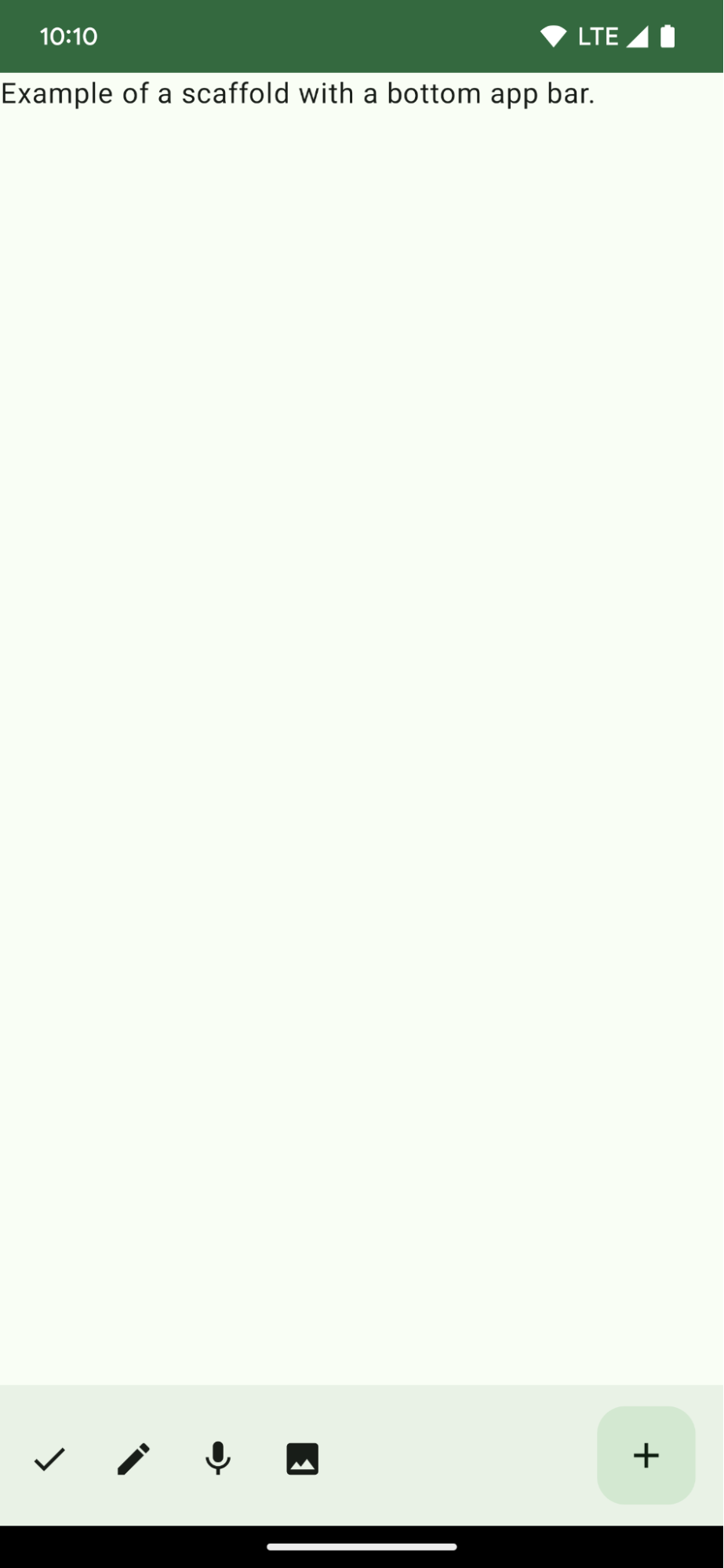
Используйте следующий код для создания нижней панели приложения, содержащей четыре кнопки-значка и плавающую кнопку действия:
@ComposablefunBottomAppBarExample(){Scaffold(bottomBar={BottomAppBar(actions={IconButton(onClick={/* do something */}){Icon(Icons.Filled.Check,contentDescription="Localized description")}IconButton(onClick={/* do something */}){Icon(Icons.Filled.Edit,contentDescription="Localized description",)}IconButton(onClick={/* do something */}){Icon(Icons.Filled.Mic,contentDescription="Localized description",)}IconButton(onClick={/* do something */}){Icon(Icons.Filled.Image,contentDescription="Localized description",)}},floatingActionButton={FloatingActionButton(onClick={/* do something */},containerColor=BottomAppBarDefaults.bottomAppBarFabColor,elevation=FloatingActionButtonDefaults.bottomAppBarFabElevation()){Icon(Icons.Filled.Add,"Localized description")}})},){innerPadding->
Text(modifier=Modifier.padding(innerPadding),text="Example of a scaffold with a bottom app bar.")}}
Внешние Scaffold , имеющие bottomBar набор стержней.
Реализация bottomBar , содержащая список действий.
Действия, которые являются реализациями IconButton , содержащими Icon для изображения и текста описания содержимого, каждое из которых имеет лямбда- onClick для выполнения этих действий.
Вы можете передавать составные элементы для следующих ключевых параметров:
actions : ряд иконок, которые появляются на левой стороне панели. Обычно это либо ключевые действия для данного экрана, либо элементы навигации.
floatingActionButton : плавающая кнопка действия, которая появляется с правой стороны панели.
Результаты
Рисунок 1. Пример нижней панели приложений.
Коллекции, содержащие это руководство
Это руководство является частью тщательно подобранной коллекции кратких руководств, охватывающих более широкие цели разработки Android:
Создайте каркас домашнего экрана
Узнайте, как использовать стандартизированную платформу для создания сложных пользовательских интерфейсов. Каркас объединяет различные части пользовательского интерфейса, придавая приложениям согласованный вид и ощущение.
Узнайте, как компонуемые функции позволяют легко создавать красивые компоненты пользовательского интерфейса на основе системы проектирования Material Design.
Контент и образцы кода на этой странице предоставлены по лицензиям. Java и OpenJDK – это зарегистрированные товарные знаки корпорации Oracle и ее аффилированных лиц.
Последнее обновление: 2025-06-04 UTC.
[[["Прост для понимания","easyToUnderstand","thumb-up"],["Помог мне решить мою проблему","solvedMyProblem","thumb-up"],["Другое","otherUp","thumb-up"]],[["Отсутствует нужная мне информация","missingTheInformationINeed","thumb-down"],["Слишком сложен/слишком много шагов","tooComplicatedTooManySteps","thumb-down"],["Устарел","outOfDate","thumb-down"],["Проблема с переводом текста","translationIssue","thumb-down"],["Проблемы образцов/кода","samplesCodeIssue","thumb-down"],["Другое","otherDown","thumb-down"]],["Последнее обновление: 2025-06-04 UTC."],[],[],null,["# Display a bottom app bar\n\n\u003cbr /\u003e\n\nCreate a bottom app bar to help users navigate and access functions in your app.\nFollow this guidance to add a bottom app bar to your app by using the\n[`BottomAppBar`](/reference/com/google/android/material/bottomappbar/BottomAppBar) composable.\n\nVersion compatibility\n---------------------\n\nThis implementation requires that your project minSDK be set to API level 21 or\nhigher.\n\n### Dependencies\n\n### Kotlin\n\n\u003cbr /\u003e\n\n```kotlin\n implementation(platform(\"androidx.compose:compose-bom:2025.08.00\"))\n implementation (\"androidx.compose.material:material-icons-extended\")\n \n```\n\n\u003cbr /\u003e\n\n### Groovy\n\n\u003cbr /\u003e\n\n```groovy\n implementation platform('androidx.compose:compose-bom:2025.08.00')\n implementation 'androidx.compose.material:material-icons-extended'\n \n```\n\n\u003cbr /\u003e\n\nCreate a bottom app bar\n-----------------------\n\nUse the following code to create a bottom app bar containing four icon buttons,\nand a floating action button:\n\n\n```kotlin\n@Composable\nfun BottomAppBarExample() {\n Scaffold(\n bottomBar = {\n BottomAppBar(\n actions = {\n IconButton(onClick = { /* do something */ }) {\n Icon(Icons.Filled.Check, contentDescription = \"Localized description\")\n }\n IconButton(onClick = { /* do something */ }) {\n Icon(\n Icons.Filled.Edit,\n contentDescription = \"Localized description\",\n )\n }\n IconButton(onClick = { /* do something */ }) {\n Icon(\n Icons.Filled.Mic,\n contentDescription = \"Localized description\",\n )\n }\n IconButton(onClick = { /* do something */ }) {\n Icon(\n Icons.Filled.Image,\n contentDescription = \"Localized description\",\n )\n }\n },\n floatingActionButton = {\n FloatingActionButton(\n onClick = { /* do something */ },\n containerColor = BottomAppBarDefaults.bottomAppBarFabColor,\n elevation = FloatingActionButtonDefaults.bottomAppBarFabElevation()\n ) {\n Icon(Icons.Filled.Add, \"Localized description\")\n }\n }\n )\n },\n ) { innerPadding -\u003e\n Text(\n modifier = Modifier.padding(innerPadding),\n text = \"Example of a scaffold with a bottom app bar.\"\n )\n }\n}https://github.com/android/snippets/blob/dd30aee903e8c247786c064faab1a9ca8d10b46e/compose/snippets/src/main/java/com/example/compose/snippets/components/AppBar.kt#L138-L183\n```\n\n\u003cbr /\u003e\n\n### Key points about the code\n\n- An outer [`Scaffold`](/reference/kotlin/androidx/compose/material/package-summary#Scaffold(androidx.compose.foundation.layout.WindowInsets,androidx.compose.ui.Modifier,androidx.compose.material.ScaffoldState,kotlin.Function0,kotlin.Function0,kotlin.Function1,kotlin.Function0,androidx.compose.material.FabPosition,kotlin.Boolean,kotlin.Function1,kotlin.Boolean,androidx.compose.ui.graphics.Shape,androidx.compose.ui.unit.Dp,androidx.compose.ui.graphics.Color,androidx.compose.ui.graphics.Color,androidx.compose.ui.graphics.Color,androidx.compose.ui.graphics.Color,androidx.compose.ui.graphics.Color,kotlin.Function1)) that has a `bottomBar` set.\n- A `bottomBar` implementation that contains a list of actions.\n- Actions that are implementations of [`IconButton`](/reference/kotlin/androidx/compose/material/package-summary#IconButton(kotlin.Function0,androidx.compose.ui.Modifier,kotlin.Boolean,androidx.compose.foundation.interaction.MutableInteractionSource,kotlin.Function0)) that contain [`Icon`](/reference/kotlin/androidx/compose/material3/package-summary#Icon(androidx.compose.ui.graphics.ImageBitmap,kotlin.String,androidx.compose.ui.Modifier,androidx.compose.ui.graphics.Color)) for image and content description text, each with an `onClick` lambda to perform these actions.\n\nYou can pass composables for the following key parameters:\n\n- `actions`: a series of icons that appear on the left side of the bar. These are commonly either key actions for the given screen, or navigation items.\n- [`floatingActionButton`](/reference/com/google/android/material/floatingactionbutton/FloatingActionButton): the floating action button that appears on the right side of the bar.\n\n| **Note:** After you add the bottom app bar, you can customize it with content as you do with other containers by filling the `BottomAppBar` composable with other content. You can also use `BottomAppBar` without passing a value for `actions` or `floatingActionButton`.\n\nResults\n-------\n\n**Figure 1.** An example of a bottom app bar.\n\nCollections that contain this guide\n-----------------------------------\n\nThis guide is part of these curated Quick Guide collections that cover\nbroader Android development goals: \n\n### Create a home screen scaffold\n\nFind out how to use a standardized platform to build complex user interfaces. The scaffold holds together different parts of the UI, giving apps a coherent look and feel. \n[Quick guide collection](/develop/ui/compose/quick-guides/collections/create-a-home-screen-scaffold) \n\n### Display interactive components\n\nLearn how composable functions can enable you to easily create beautiful UI components based on the Material Design design system. \n[Quick guide collection](/develop/ui/compose/quick-guides/collections/display-interactive-components) \n\nHave questions or feedback\n--------------------------\n\nGo to our frequently asked questions page and learn about quick guides or reach out and let us know your thoughts. \n[Go to FAQ](/quick-guides/faq) [Leave feedback](https://issuetracker.google.com/issues/new?component=1573691&template=1993320)"]]