Widgets are a critical component for customizing a user's home screen. Often, users can achieve a critical user journey for an app with a single tap using widgets or get a quick summary of important updates. Users can also customize widgets to tailor them to individual preferences.
Widget compatibility checklists
Widget quality affects user engagement with your app content and features. The compatibility checklists define criteria to help you assess the quality of your widget. Tiers include the following:
TIER 3 - Low quality
These widgets fail to meet the minimum quality bar and offer a poor user experience. A widget is deemed low quality if it doesn't meet standard layout, color, discovery, and content criteria.
TIER 2 - Standard
These widgets are helpful, usable, and provide a quality experience.To be considered standard, the widget meets all of the following layout, color, discovery, and content criteria.
TIER 1 - Differentiated
These are exemplary widgets that offer personalized hero experiences and that help users create unique and productive homescreens.
TIER 3
Low quality widget characteristics
If your widget can be described by any of the following, it is considered low quality:
| Category | ID | Description |
|---|---|---|
| Layout | WL-1 | Widget doesn't fill the bounds set by the launcher grid when dropped on the homescreen. |
| WL-1.1 | Widget doesn't touch at least 2 opposing edges of the grid. In other words, widgets don't need to all be rectangular, they can have custom shapes, so long as the edges of the shape touch at least 2 edges of the grid. |
|
| Color | WC-3 | Widget text and icon buttons have insufficient color contrast ratios to meet accessibility requirements. |
| Discovery | WD-4.2 | Widget name isn't included in the widget design. |
| WD-4.3 | Widget has no preview image. |
|
| Content | WT-3 | Widget content is consistently stale or untimely. |
| WT-3.1 | Widget doesn't update after user completes an action from the widget. |
|
| WT-3.2 | Widget doesn't update after user completes a related action from within the app. |
|
| WT-4 | Widget UI isn't functional or content is cropped. |
TIER 2
Standard widget requirements
Widgets that meet this baseline quality bar are considered standard, but aren't considered showcase widgets that will be featured or recommended.
| Category | ID | Description |
|---|---|---|
| Layout | WL-1 | Widget aligns properly to other home screen elements on the vertical or horizontal axis, and doesn't occupy unnecessary space. |
| WL-1.2 | All shapes should hit at least 2 opposing edges of the bounds of the grid. |
|
| WL-4 | If resizable, widgets must have an appropriate minimum and maximum size. |
|
| WL-4.1 | Max size should be set if resizing the widget only adds blank space. |
|
| WL-4.2 | The minimum size of your widget should still offer value and meet touch target requirements (48x48). |
|
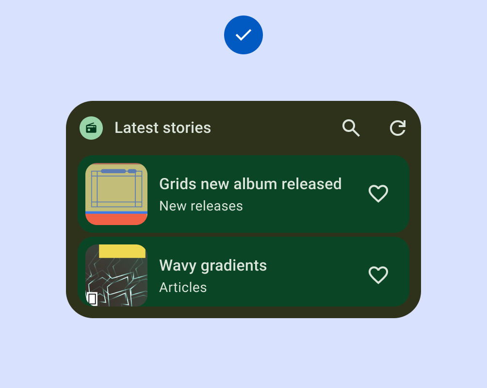
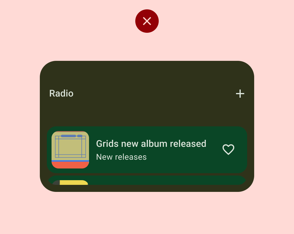
| Discovery | WD-4 | Widget should have accurate previews in the widget picker (static asset). |
| Content | WT-1 | Zero and empty states are intentional and show the value of the widget and/or provide a call to action when the widget is installed but the user isn't yet logged in. |
| WT-2 | Widget allows users to manually refresh content if there is an expectation that the data refreshes more frequently than the UI. |

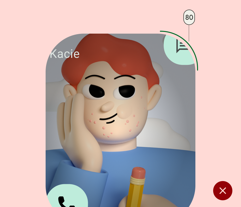
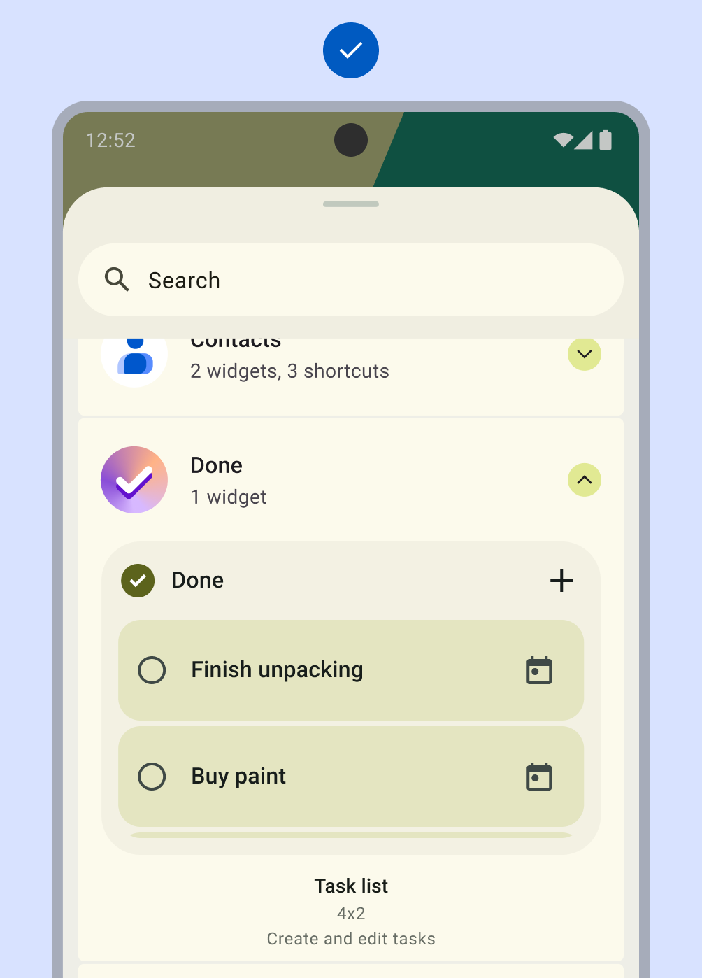
Do
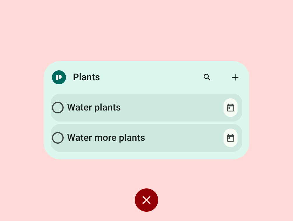
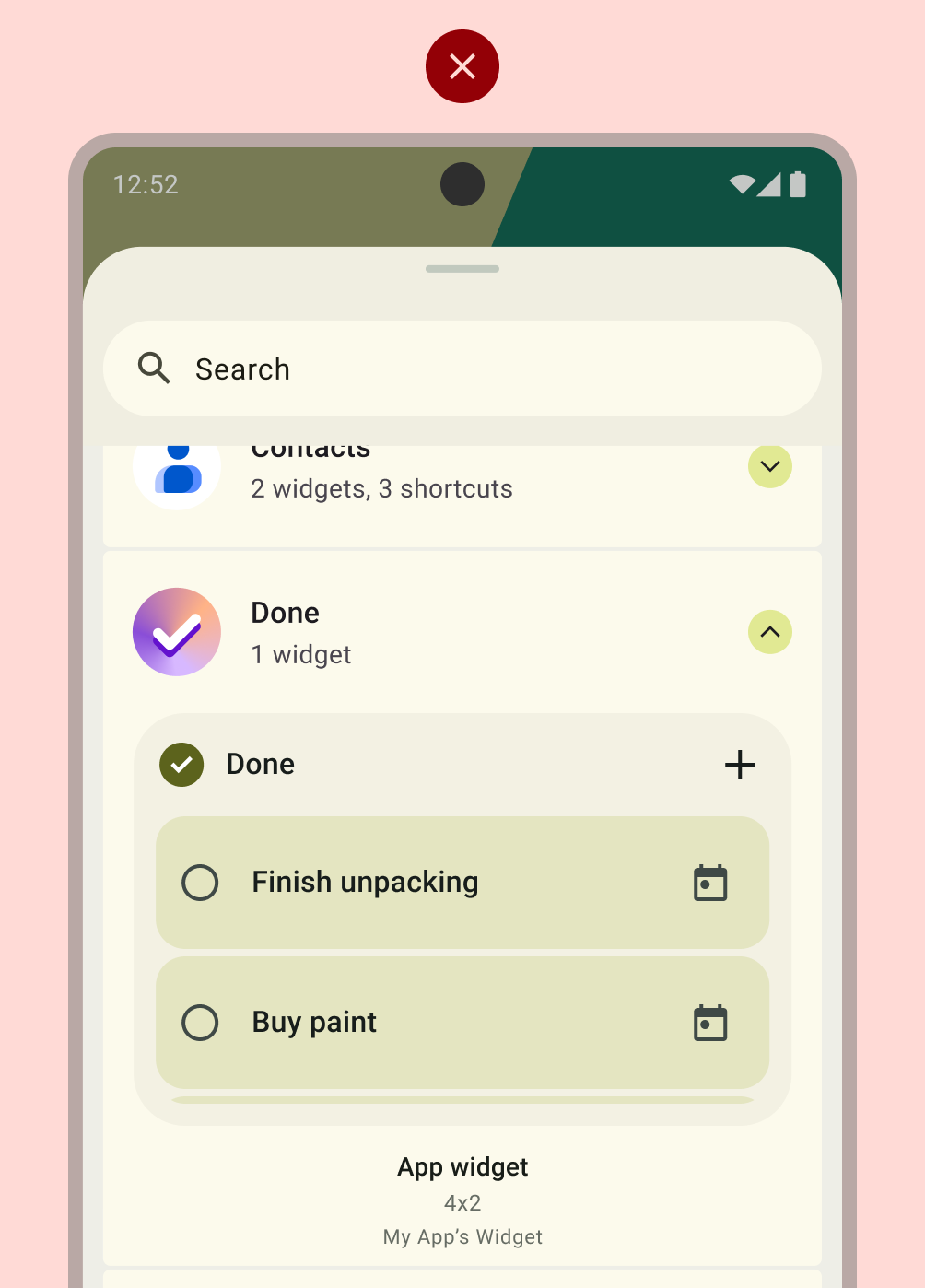
Don't
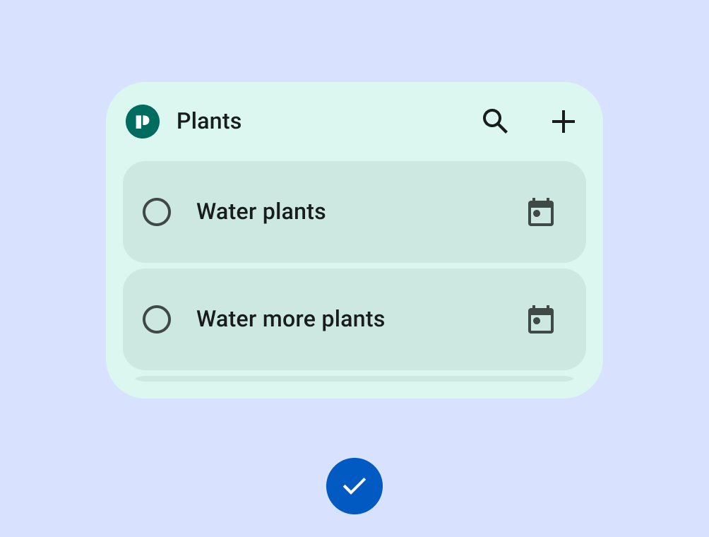
Do
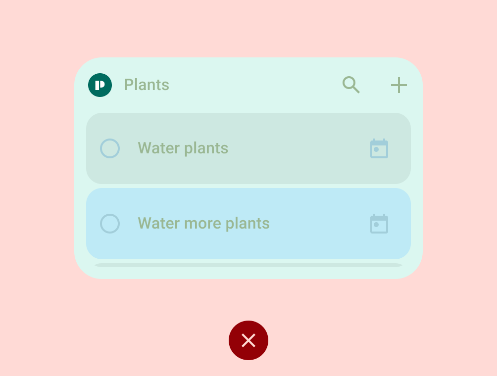
Don't
TIER 1
Differentiated widget requirements
These widgets support premium homescreen customizations and will be recommended to users and featured to developers as best practice. Differentiated widgets offer hero experiences, and are leveraged by Android to inspire and invigorate the ecosystem. They meet all of the differentiated layout, color, discovery, and content criteria.
| Category | ID | Description |
|---|---|---|
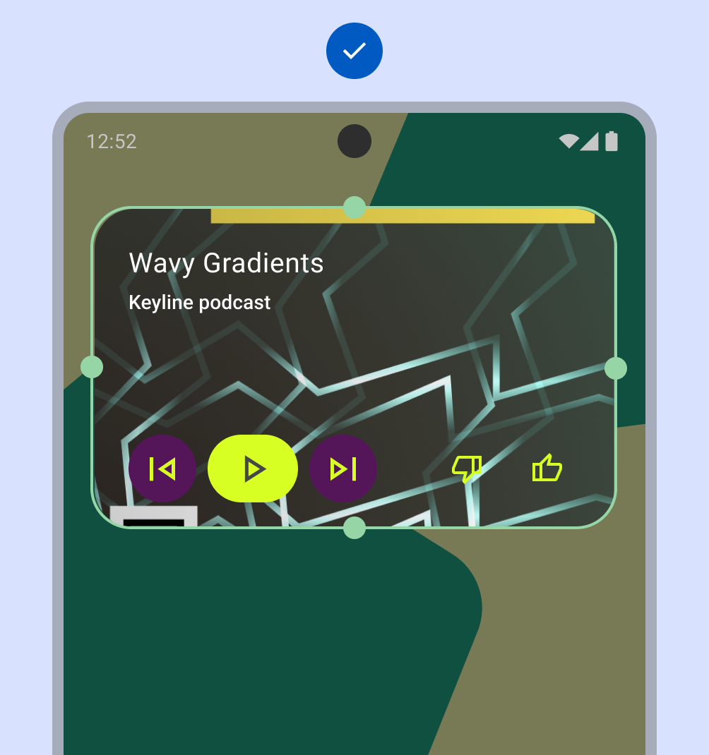
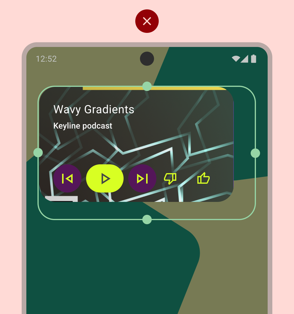
| Layout | WL-1 | Widget aligns properly to other home screen elements on the vertical or horizontal axis, and does not occupy unnecessary space. |
| WL-1.1 | All rectangular widgets MUST hit all four edges of the bounds of the grid. All custom shaped widgets MUST hit all 4 edges of the bounds of a square grid. If the size is 4x1, and contains a search bar, it is permitted to hit only 2 edges. |
|
| WL-2 | Widget can be resized to at least one of the following sizes: 2x2, 4x1, 4x2. |
|
| WL-3 | Widget header is used and applied consistently.
|
|
| Color | WC-1 | Widget supports color theming based on a device or app context. |
| WC-2 | Widget supports light theme and dark theme palettes. |
|
| Discovery | WD-1 | Preview includes user content and/or applies a system theme. |
| WD-4.4 | Widget has a description that helps users understand the value of the widget. |
|
| WD-4.5 | Widget name is descriptive and unique from the app's other widgets. |
|
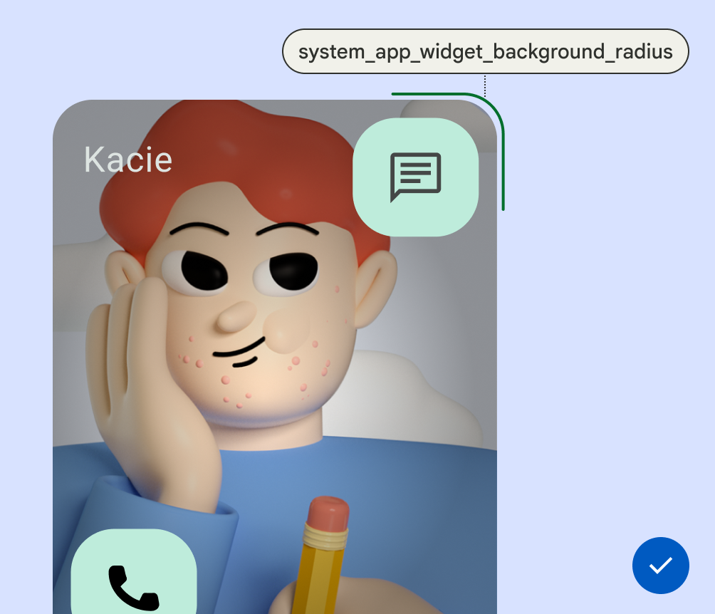
| System Coherence | WS-2 | Rectangular widgets must use the corner radius provided by system (OEM specific). |
| WS-3 | Widget uses loading state spec. |
|
| WS-4 | Widget uses system configuration instead of a custom widget settings entry point. |
|
| WS-5 | Widget uses system launch transition when entering/exiting app from widget. |
Do
Don't
Do
Don't
Do
Don't
Do