
1. Before you begin
Prerequisites
- Experience building Android apps.
- Experience with Jetpack Compose.
What you need
- The latest stable version of Android Studio.
What you'll learn
- Adaptive layouts and Navigation 3 basics
- Implementing drag and drop
- Supporting keyboard shortcuts
- Enabling context menus
2. Get set up
To get started, follow these steps:
- Launch Android Studio
- Click on File > New >
Project from Version control - Paste the URL:
https://github.com/android/socialite.git
- Click
Clone
Wait until the project fully loads.
- Open the Terminal and run:
$ git checkout codelab-adaptive-apps-start
- Run a Gradle sync
In Android Studio, select File > Sync Project with Gradle Files
- (optional) Download Large Desktop emulator
In Android Studio select Tools > Device Manager > + > Create Virtual Device > New hardware profile
Select Device Type: Desktop
Screen size: 14 inch
Resolution: 1920 x 1080 px
Click Finish
- Run the app on a tablet or desktop emulator
3. Understand the sample app
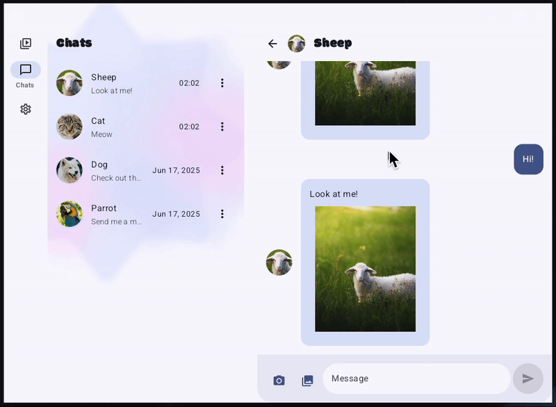
In this tutorial, you'll work with a sample chat application called Socialite, built with Jetpack Compose. 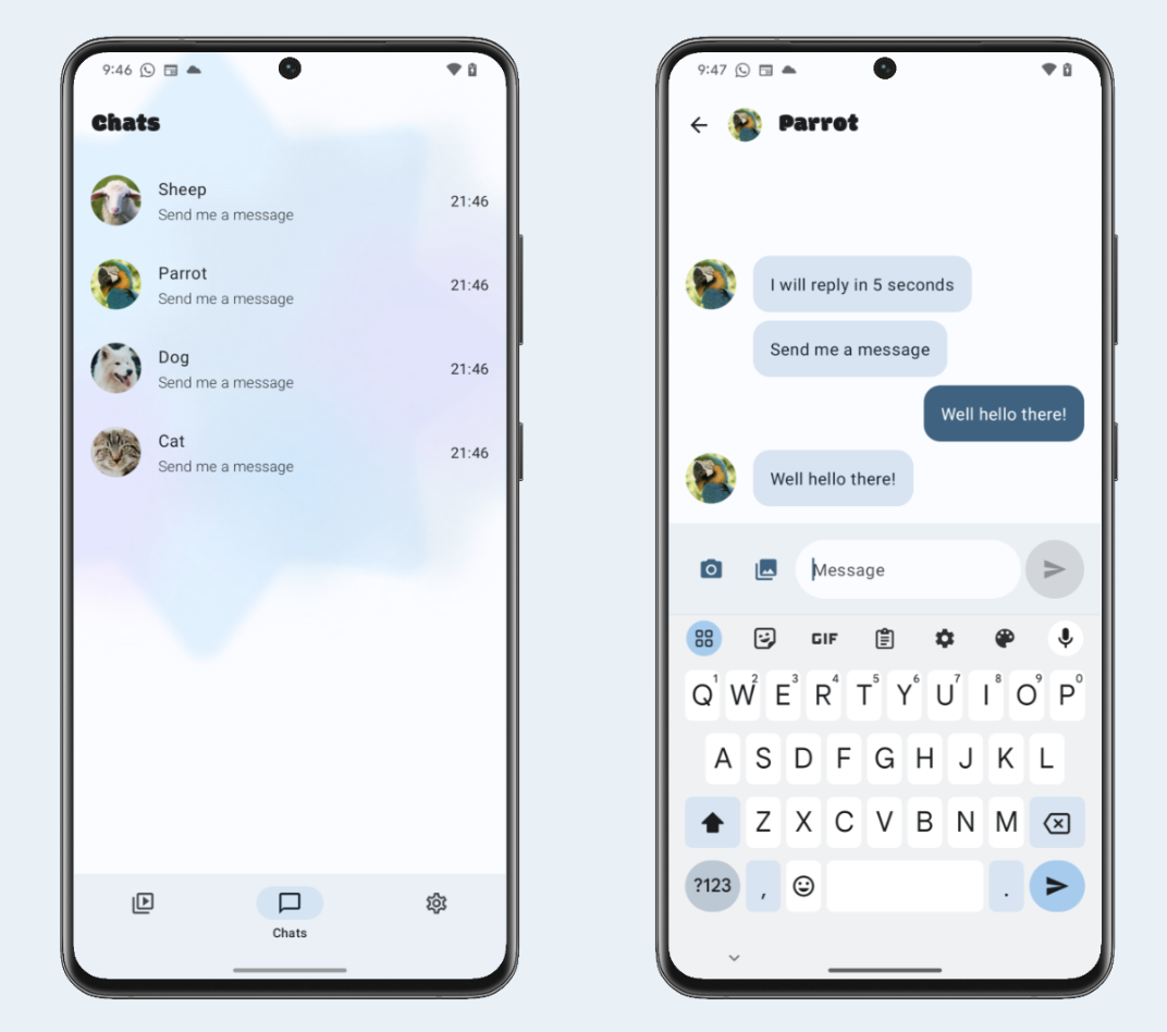
In this app, you can chat with different animals — and they respond to your messages, each in their own way.
Right now, it's a mobile-first application that is not optimized for large devices like tablets or desktops.
We're going to adapt the app for large screens — and add a few features to improve the experience across all form factors.
Let's get started!
4. Adaptive layouts + Navigation 3 basics
$ git checkout codelab-adaptive-apps-step-1
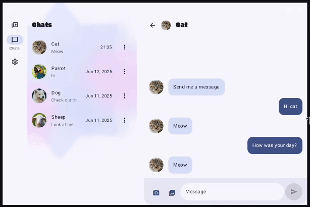
Currently, the app always shows just one pane at a time, no matter how much screen space is available.
We'll fix that by using adaptive layouts, which display one or multiple panes depending on the current window size. In this codelab, we'll use adaptive layouts to automatically display the chat list and chat detail screens side by side — when there's enough window space.
Adaptive layouts are designed for seamless integration into any application.
In this tutorial, we'll focus on how to use them with the Navigation 3 library, which is what Socialite app is built on.
Navigation 3 basics
To understand Navigation 3, let's start with some terminology:
- NavEntry - Some content that is displayed within an app that a user can navigate to. It is uniquely identified by a key. A NavEntry does not have to fill the entire window available to the app. More than one NavEntry can be displayed at the same time (more on this later).
- Key - A unique identifier for a NavEntry. The keys are stored in the back stack.
- Back stack - A stack of keys representing NavEntry elements that have previously been displayed, or are currently being displayed. To navigate, push keys onto, or pop keys off, the stack.
In Socialite, the first screen we want to show when the user launches the app is the chat list. Therefore, we create the back stack and initialize it with the key representing that screen.
Main.kt
// Create a new back stack
val backStack = rememberNavBackStack(ChatsList)

...

// Navigate to a particular chat
backStack.add(ChatThread(chatId = chatId))

...

// Navigate back
backStack.removeLastOrNull()
Navigation 3 implementation
We'll implement Navigation 3 directly in the Main entry point composable.
Uncomment the MainNavigation function call to hook up the navigation logic.
Now let's start building out the navigation infrastructure.
First things first, create the back stack. It's the cornerstone of Navigation 3.
NavDisplay
Up to this point we've covered several Navigation 3 concepts. But how does the library determine which object represents the back stack, and how to turn its elements into actual UI?
Meet NavDisplay. It is the component that brings everything together and renders the back stack. It takes a few important parameters. Let's walk through them one by one.
Parameter 1 — Back stack
NavDisplay needs access to the back stack to render its content. Let's pass it in.
Parameter 2 — EntryProvider
The EntryProvider is a lambda that transforms back stack keys to composable UI content. It takes a key and returns a NavEntry, which contains the content to display — and metadata about how to display it (more on that later).
NavDisplay calls this lambda whenever it needs to obtain content for a given key — for example, when a new key is added to the back stack.
Currently, if we click the Timeline icon in Socialite, we'll see "Unknown back stack key: Timeline".
That's because, even though the Timeline key gets added to the back stack, the EntryProvider doesn't know how to render it — so it falls back to the default implementation. The same thing happens when we click the Settings icon. Let's fix that by making sure EntryProvider handles Timeline and Settings back stack keys correctly.
Parameter 3 — SceneStrategy
The next important parameter of NavDisplay is SceneStrategy. It's used when we want to display multiple NavEntry elements at the same time. Each strategy defines how multiple NavEntry elements are displayed side by side or layered on top of each other.
For example, if we use DialogSceneStrategy and mark some NavEntry with a special metadata, it will appear as a dialog on top of the current content instead of taking up the full screen.
In our case, we'll use a different SceneStrategy — ListDetailSceneStrategy. It's designed for the canonical list-detail layout.
First, let's add it in the NavDisplay constructor.
sceneStrategy = rememberListDetailSceneStrategy(),
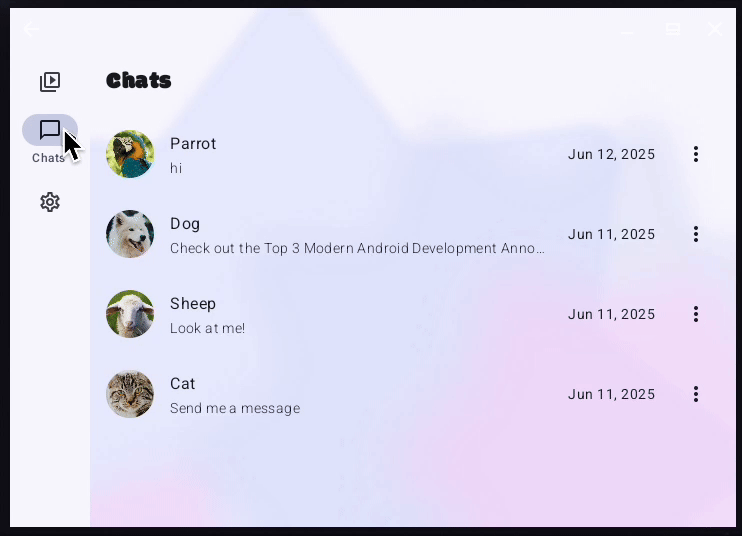
Now we need to mark the ChatList NavEntry as a list pane, and ChatThread NavEntry as a detail pane, so that the strategy is able to determine when both of these NavEntry elements are in the back stack they should be shown together side by side.
As the next step, mark ChatsList NavEntry as a list pane.
entryProvider = { backStackKey ->
   when (backStackKey) {
      is ChatsList -> NavEntry(
         key = backStackKey,
         metadata = ListDetailSceneStrategy.listPane(),
      ) {
         ...
      }
      ...
   }
}
Similarly mark ChatThread NavEntry as detail pane.
entryProvider = { backStackKey ->
   when (backStackKey) {
      is ChatThread -> NavEntry(
         key = backStackKey,
         metadata = ListDetailSceneStrategy.detailPane(),
      ) {
         ...
      }
      ...
   }
}
And with that, we've successfully integrated adaptive layouts into our app.
5. Drag and drop
$ git checkout codelab-adaptive-apps-step-2
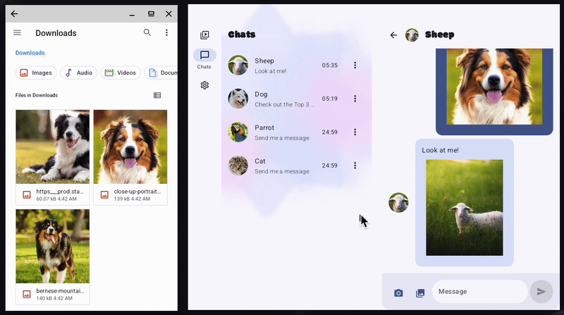
In this step, we'll add drag-and-drop support, allowing users to drag images from the Files app into Socialite.
Our goal is to enable drag and drop in the message list area, which is defined by the MessageList composable, located in the ChatScreen.kt file.
In Jetpack Compose, drag and drop support is implemented by the dragAndDropTarget modifier. We apply it to composables that need to accept dropped items.
Modifier.dragAndDropTarget(
   shouldStartDragAndDrop = { event ->
       // condition to accept dragged item
   },
   target = // DragAndDropTarget
)
The modifier has two parameters.
- The first one,
shouldStartDragAndDrop, allows the composable to filter drag and drop events. In our case, we only want to accept images and ignore all other types of data. - The second one,
target, is a callback that defines the logic for handling accepted drag and drop events.
First, let's start by adding dragAndDropTarget to MessageList composable.
.dragAndDropTarget(
   shouldStartDragAndDrop = { event ->
       event.mimeTypes().any { it.startsWith("image/") }
   },
   target = remember {
       object : DragAndDropTarget {
           override fun onDrop(event: DragAndDropEvent): Boolean {
               TODO("Not yet implemented")
           }
       }
   }
),
The target callback object needs to implement the onDrop() method, which takes a DragAndDropEvent as its argument.
This method is invoked when the user drops an item onto the composable. It returns true if the item was handled; false, if it was rejected.
Each DragAndDropEvent contains a ClipData object, which encapsulates the data being dragged.
The data inside ClipData is an array of Item objects. Since multiple items can be dragged at once, each Item represents one of them.
target = remember {
   object : DragAndDropTarget {
       override fun onDrop(event: DragAndDropEvent): Boolean {
           val clipData = event.toAndroidDragEvent().clipData
           if (clipData != null && clipData.itemCount > 0) {
               repeat(clipData.itemCount) { i ->
                   val item = clipData.getItemAt(i)
                   // TODO: Implement Item handling
               }
               return true
           }
           return false
       }
   }
}
An Item can contain data in the form of URI, text or Intent.
In our case, since we only accept images, we're specifically looking for a URI.
If an Item contains one, we need to:
- Request drag and drop permission to access the URI
- Handle the URI (in our case by calling the already-implemented
onMediaItemAttached()function) - Release the permission
override fun onDrop(event: DragAndDropEvent): Boolean {
   val clipData = event.toAndroidDragEvent().clipData
   if (Build.VERSION.SDK_INT >= Build.VERSION_CODES.N
       && clipData != null && clipData.itemCount > 0) {
       repeat(clipData.itemCount) { i ->
           val item = clipData.getItemAt(i)
           val passedUri = item.uri?.toString()
           if (!passedUri.isNullOrEmpty()) {
               val dropPermission = activity
                   .requestDragAndDropPermissions(
                       event.toAndroidDragEvent()
                   )
               try {
                   val mimeType = context.contentResolver
                       .getType(passedUri.toUri()) ?: ""
                   onMediaItemAttached(MediaItem(passedUri, mimeType))
               } finally {
                   dropPermission.release()
               }
           }
       }
       return true
   }
   return false
}
At this point, drag and drop is fully implemented, and you can successfully drag photos from the Files app into Socialite.
Let's make it look even better by adding a visual border to highlight that the area can accept dropped items.
To do this, we can use additional hooks that correspond to different stages of the drag and drop session:
onStarted(): Called when a drag and drop session begins and thisDragAndDropTargetis eligible to receive items. This is a good place to prepare UI state for the incoming session.onEntered(): Triggered when a dragged item enters the bounds of thisDragAndDropTarget.onMoved(): Called when the dragged item moves within the bounds of thisDragAndDropTarget.onExited(): Called when the dragged item moves outside the bounds of thisDragAndDropTarget.onChanged(): Invoked when something changes in the drag-and-drop session while within this target's bounds — for example, if a modifier key is pressed or released.onEnded(): Called when the drag-and-drop session ends. AnyDragAndDropTargetthat previously received anonStartedevent will receive this. Useful for resetting UI state.
To add the visual border, we need to do the following:
- Create a remembered boolean variable that is set to
truewhen a drag and drop starts, and reset back tofalsewhen it ends. - Apply a modifier to
MessageListcomposable that renders a border when this variable istrue
override fun onEntered(event: DragAndDropEvent) {
   super.onEntered(event)
   isDraggedOver = true
}

override fun onEnded(event: DragAndDropEvent) {
   super.onExited(event)
   isDraggedOver = false
}
6. Keyboard shortcuts
$ git checkout codelab-adaptive-apps-step-3
When using a chat app on desktop, users expect familiar keyboard shortcuts — like sending a message with the Enter key.
In this step, we'll add that behavior to our app.
Keyboard events in Compose are handled with modifiers.
There are two main ones:
onPreviewKeyEvent- intercepts the keyboard event before it is handled by the focused element. As a part of implementation, we decide whether to propagate the event further or consume it.onKeyEvent- intercepts the keyboard event after it's been handled by the focused element. It only triggers if the other handlers didn't consume the event.
In our case, using onKeyEvent on a TextField wouldn't work, because the default handler consumes the Enter key event — and moves the cursor to the new line.
.onPreviewKeyEvent { keyEvent ->
   //TODO: implement key event handling
},
The lambda inside the modifier will be called twice for each keystroke — when the user presses the key and once when they release it.
We can determine which by checking the type property of the KeyEvent object. The event object also exposes modifier flags, including:
isAltPressedisCtrlPressedisMetaPressedisShiftPressed
Returning true from the lambda notifies Compose that our code has handled the key event and prevents the default behavior, such as inserting a newline.
Now implement the onPreviewKeyEvent modifier. Check if the event corresponds to the pressed Enter key and none of the shift, alt, ctrl or meta modifiers are applied. Then call the onSendClick() function.
.onPreviewKeyEvent { keyEvent ->
   if (keyEvent.key == Key.Enter && keyEvent.type == KeyEventType.KeyDown
       && keyEvent.isShiftPressed == false
       && keyEvent.isAltPressed == false
       && keyEvent.isCtrlPressed == false
       && keyEvent.isMetaPressed == false) {
       onSendClick()
       true
   } else {
       false
   }
},
7. Context menus
$ git checkout codelab-adaptive-apps-step-4
Context menus are an important part of an adaptive UI.
In this step, we'll add a Reply pop up menu that appears when the user right-clicks on a message.
There are many different gestures that are supported out-of-the-box, for example the clickable modifier allows easy detection of a click.
For custom gestures, like right-clicks, we can use the pointerInput modifier, which gives us access to raw pointer events and full control over gesture detection.
First, let's add the UI that will respond to a right-click. In our case, we want to show DropdownMenu with a single item: a Reply button. We'll need 2 remember-ed variables:
rightClickOffsetstores the position of the click so we could move the Reply button near the cursorisMenuVisibleto control whether to show or hide the Reply button
Their values will be updated as a part of the right-click gesture handling.
We also need to wrap the message composable in a Box, so the DropdownMenu can appear layered above it.
@Composable
internal fun MessageBubble(
   ...
) {
   var rightClickOffset by remember { mutableStateOf<DpOffset>(DpOffset.Zero) }
   var isMenuVisible by remember { mutableStateOf(false) }
   val density = LocalDensity.current

   Box(
       modifier = Modifier
           .pointerInput(Unit) {
               // TODO: Implement right click handling
           }
           .then(modifier),
   ) {
       AnimatedVisibility(isMenuVisible) {
           DropdownMenu(
               expanded = true,
               onDismissRequest = { isMenuVisible = false },
               offset = rightClickOffset,
           ) {
               DropdownMenuItem(
                   text = { Text("Reply") },
                   onClick = {
                       // Custom Reply functionality
                   },
               )
           }
       }
       MessageBubbleSurface(
           ...
       ) {
           ...
       }
   }
}
Now let's implement the pointerInput modifier. First, we add awaitEachGesture, which starts a fresh scope every time the user begins a new gesture. Inside that scope we need to:
- Get the next pointer event —
awaitPointerEvent()provides an object representing the pointer event - Filter for a pure right‑click press — we check that only the secondary button is pressed
- Capture the click position — take the position in pixels and convert it to
DpOffsetso the menu placement is DPI‑independent - Show the menu — set
isMenuVisible=trueand store the offset so theDropdownMenupops up exactly where the pointer was - Consume the event — call
consume()on both the press and its matching release, preventing other handlers from reacting
.pointerInput(Unit) {
   awaitEachGesture { // Start listening for pointer gestures
       val event = awaitPointerEvent()

       if (
           event.type == PointerEventType.Press
           && !event.buttons.isPrimaryPressed
           && event.buttons.isSecondaryPressed
           && !event.buttons.isTertiaryPressed
           // all pointer inputs just went down
           && event.changes.fastAll { it.changedToDown() }
       ) {
           // Get the pressed pointer info
           val press = event.changes.find { it.pressed }
           if (press != null) {
               // Convert raw press coordinates (px) to dp for positioning the menu
               rightClickOffset = with(density) {
                   isMenuVisible = true // Show the context menu
                   DpOffset(
                       press.position.x.toDp(),
                       press.position.y.toDp()
                   )
               }
           }
           // Consume the press event so it doesn't propagate further
           event.changes.forEach {
               it.consume()
           }
           // Wait for the release and consume it as well
           waitForUpOrCancellation()?.consume()
       }
   }
}
8. Congratulations
Congratulations! You've successfully migrated the app to Navigation 3 and added:
- Adaptive Layouts
- Drag and drop
- Keyboard shortcuts
- Context menu
That's a solid foundation for building a fully adaptive app!
Learn more