
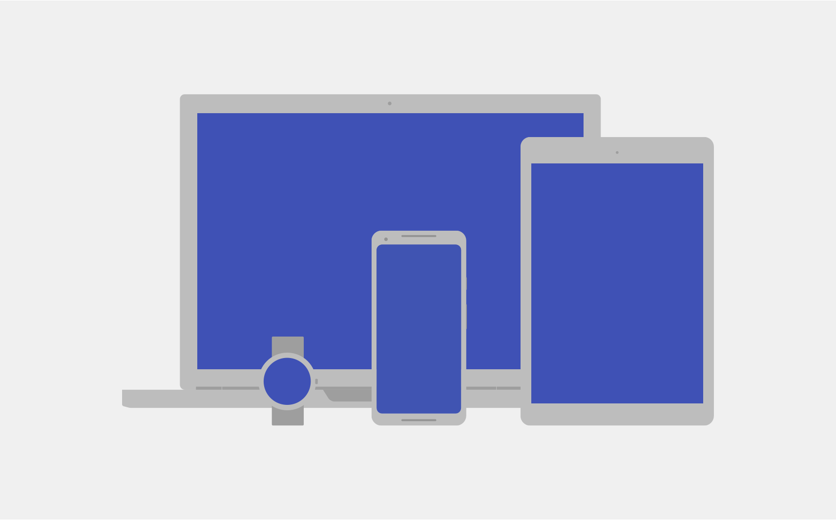
Android runs on a variety of devices that have different screen sizes and pixel densities. The system performs basic scaling and resizing to adapt your user interface to different screens, but there are ways to help your UI adapt better to each screen type.
This page provides an overview of the features available on Android to help your app adapt accordingly. For more specific instructions about how to build your app for different screen variations, see the following documentation:
Screen sizes
The screen size is the visible space for your app UI. The screen size, as it's recognized by your app, isn't the actual size of the device screen. Apps must take into account the screen orientation, system decorations—such as the navigation bar—and window configuration changes, such as when the user enables multi-window mode.
Flexible layouts
By default, Android resizes your app layout to fit the current screen. To help your layout resize well for small variations in screen size, implement your layout with flexibility in mind. Don't hardcode the position and size of your UI components. Instead, let view sizes stretch and specify view positions relative to the parent view or other sibling views so that your intended order and relative sizes remain the same as the layout grows.
To learn more about flexible layouts, see Responsive design.
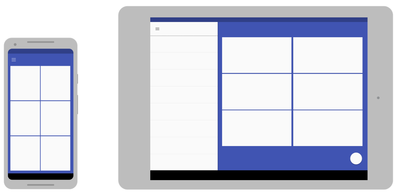
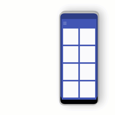
Alternative layouts
A flexible layout is important, but you also need to design different layouts that optimize the user experience for the available space on different devices. Android lets you provide alternative layout files that the system applies at runtime based on the current device's screen size.
To learn how to create alternative layouts, see Adaptive design.
Stretchable images
Because your layout needs to stretch to fit the current screen, so do the bitmaps that you attach to any of the layout views. However, stretching an ordinary bitmap in arbitrary directions can result in strange scaling artifacts and skewed images.
To solve this, Android supports nine-patch bitmaps, in which you specify small pixel regions that are stretchable, while the rest of the image remains unscaled.
To learn more about nine-patch bitmaps, see NinePatch drawables.
Pixel densities
The pixel density is the number of pixels within a physical area of the screen. It is referred to as dpi (dots per inch). This is different from the screen resolution, which is the total number of pixels on a screen.
Density independence
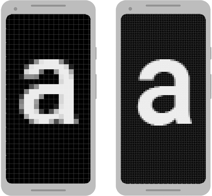
Your app achieves "density independence" when it preserves the physical size—from the user's point of view—of your UI design when displayed on screens with different pixel densities, as shown in figure 3. Maintaining density independence is important, because without it, a UI element like a button might appear larger on a low-density screen and smaller on a high-density screen.
Android helps you achieve density independence by providing the density-independent pixel (dp or dip) as a unit of measurement that you use instead of pixels (px).
To learn more about density independent pixels, see Use density-independent pixels.
Alternate bitmaps
To make your images look their best on all screens, provide alternate bitmaps to match each screen density. If your app provides bitmaps only for lower-density screens, Android scales them up when on a high-density screen so that the images occupy the same physical space on the screen. This can cause visible scaling artifacts in bitmaps. So, your app must include alternate bitmaps at a higher resolution.
To learn how to provide alternate bitmaps, see Provide alternative bitmaps.
Vector graphics
For simple types of images, like icons, you can avoid creating separate images for each density by using vector graphics. Because vector graphics define the illustration with geometric line paths instead of pixels, they can be drawn at any size without scaling artifacts.
To learn more about using vector graphics, see Prefer vector graphics.
Wear OS, TV, Cars, and ChromeOS
The preceding recommendations apply to all Android form factors, but if you want to build an app for Wear OS, Android TV, Android Auto, Android Automotive OS, or ChromeOS devices, you need to do more work.
Each of these device types has its own user interaction model that your app must accommodate. In some cases, such as for Wear OS, you need to rethink your app's user experience and build an app that's specialized for that device. On the other hand, to support ChromeOS devices, such as the Google Pixelbook, you might need only slight modifications to your existing app to support keyboard or mouse interaction and a larger screen.
To support these devices, refer to the following documentation:
Foldables
Foldable devices typically have multiple displays, with different displays—or combinations of displays—becoming active for different states of the device folding. Follow the guidelines in this document to make your app adapt to those changing configurations. However, some configurations can have unusual aspect ratios, so test how your app behaves on a variety of devices.
Usually, an app that works well in multi-window mode for various window sizes also behaves well on foldable devices.
To learn more about building apps for foldables, see Learn about foldables.