
App bars are containers at the top or the bottom of the screen that give your users access to key features and navigation items:
Type |
Appearance |
Purpose |
|---|---|---|
| Top app bar | Across the top of the screen. |
Provides access to key tasks and information. Typically hosts a title, core action items, and certain navigation items. |
| Bottom app bar | Across the bottom of the screen. |
Typically includes core navigation items. Might give access to other actions, for example, by using a floating action button. |
Version compatibility
This implementation requires that your project minSDK be set to API level 21 or higher.
Dependencies
Implement a top app bar
The following code shows implementations for the four types of top app bars, including varying examples of how you can control scroll behavior.
Small top app bar
To create a small top app bar, use the TopAppBar composable. This is the
simplest possible top app bar and in this example just contains a title.
Result
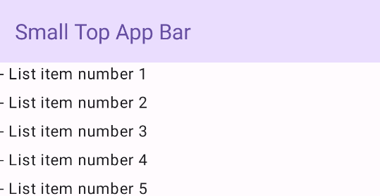
Implement a small top app bar
The following example does not pass TopAppBar a value for
scrollBehavior, so the top app bar does not react to scrolling of the inner
content.
Center-aligned top app bar
The center-aligned top app bar is the same as the small app bar,
except the title is centered within the component. To implement it, use the
dedicated CenterAlignedTopAppBar composable.
Result
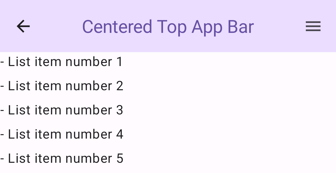
Implement a center-aligned top app bar
This example uses enterAlwaysScrollBehavior() to get the value that it passes
for scrollBehavior. The bar collapses when the user scrolls the
scaffold's inner content.
Medium top app bar
The medium top app bar places the title beneath any additional icons. To create
one, use the MediumTopAppBar composable.
Result
enterAlwaysScrollBehavior.Implement a medium top app bar
Like the previous code, this example uses enterAlwaysScrollBehavior() to
get the value that it passes for scrollBehavior.
Large top app bar
A large top app bar is similar to the medium, though the padding between the
title and the icons is greater and it occupies more space on screen overall. To
create one, use the LargeTopAppBar ) composable.
Result
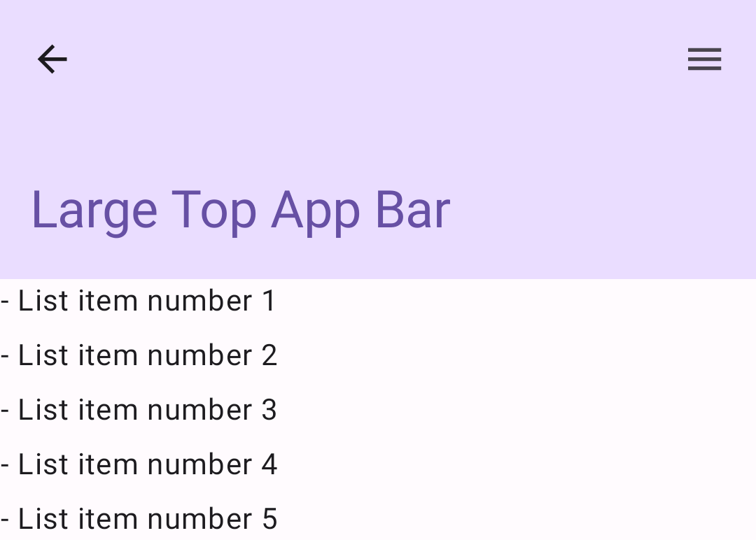
Implement a large top app bar
This example uses
exitUntilCollapsedScrollBehavior() to get the value that it passes for
scrollBehavior. The bar collapses when the user scrolls the
scaffold's inner content, but then expands when the user scrolls to the end of
the inner content.
Implement a bottom app bar
To create a bottom app bar, use the BottomAppBar composable, which is
similar to the top app bar composable.
Result
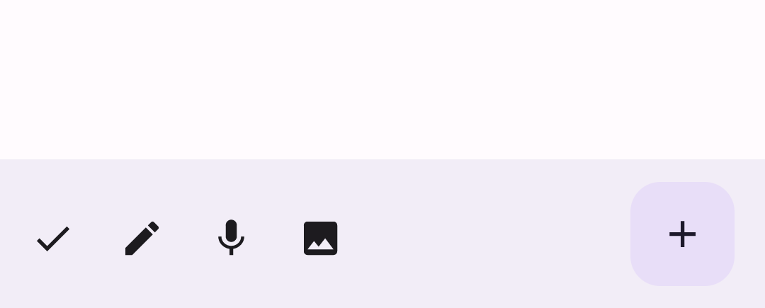
Implement a bottom app bar
You pass composables for the following key parameters:
actions: A series of icons that appear on the left side of the bar. These are commonly either key actions for the given screen, or navigation items.floatingActionButton: The floating action button that appears on the right side of the bar.
Key points
- You generally pass app bars to the
Scaffoldcomposable, which has specific parameters to receive them. The composables that you use to implement top app bars share key parameters:
title: The text that appears across the app bar.navigationIcon: The primary icon for navigation, which appears on the left of the app bar.actions: Icons that provide the user access to key actions, which appear on the right of the app bar.scrollBehavior: Determines how the top app bar responds to scrolling of the scaffold's inner content.colors: Determines how the app bar appears.
You can control how the app bar responds when the user scrolls the scaffold's inner content. To do so, create an instance of
TopAppBarScrollBehaviorand pass it to your top app bar for thescrollBehaviorparameter. There are three types ofTopAppBarScrollBehavior:enterAlwaysScrollBehavior: When the user pulls up the scaffold's inner content, the top app bar collapses. The app bar expands when the user pulls down the inner content.exitUntilCollapsedScrollBehavior: Similar toenterAlwaysScrollBehavior, though the app bar also expands when the user reaches the end of the scaffold's inner content.pinnedScrollBehavior: The app bar remains in place and does not react to scrolling.
Collections that contain this guide
This guide is part of these curated Quick Guide collections that cover broader Android development goals:
Display interactive components