Buttons let the user trigger a defined action. There are five types of button:
Type |
Appearance |
Purpose |
|---|---|---|
| Filled | Solid background with contrasting text. |
For primary actions, such as "Submit" and "Save." The shadow effect emphasizes the button's importance. |
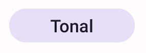
| Tonal | Background color varies to match the surface. |
For primary or significant actions. Filled buttons provide visual weight and are appropriate for actions like "Add to cart" and "Sign in." |
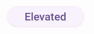
| Elevated | Shadow makes it stand out. |
For primary or significant actions. Increase elevation to make the button more prominent. |
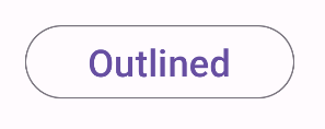
| Outlined | Features a border with no fill. |
For actions that are important but not primary. Outlined buttons pair well with other buttons to indicate alternative, secondary actions like "Cancel" or "Back." |
| Text | Text with no background or border. |
For less critical actions such as navigational links, or secondary actions like "Learn more" or "View details." |
Version compatibility
This implementation requires that your project minSDK be set to API level 21 or higher.
Dependencies
Create a filled button
The filled button component uses the basic Button composable. It is
filled with a solid color by default.
Results

Create a filled tonal button
The filled tonal button component uses the FilledTonalButton composable.
It is filled with a tonal color by default.
Results

Create an outlined button
The outlined button component uses the OutlinedButton composable. It
appears with an outline by default.
Results

Create an elevated button
The elevated button component uses the ElevatedButton composable. It has
a shadow that represents the elevation effect by default and appears as
an outlined button with a shadow.
Results

Create a text button
The text button component uses the TextButton composable. Until clicked,
it appears only as text. It does not have a solid fill or outline by default.
Results

Key points
onClick: The function called when the user presses the button.enabled: When false, this parameter causes the button to appear unavailable and inactive.colors: An instance ofButtonColorsthat determines the colors used in the button.contentPadding: The padding within the button.
Collections that contain this guide
This guide is part of these curated Quick Guide collections that cover broader Android development goals:


