
TIER 2: 대형 및 소형 디스플레이에 맞게 앱을 준비하는 대형 화면 앱 품질 가이드라인
대형 화면에 최적화된 앱은 대형 화면 기기의 넓은 디스플레이를 활용하여 생산적이고 몰입도 높은 사용자 환경을 제공합니다.
최적화된 앱은 세로 모드 방향과 가로 모드 방향, 멀티 윈도우 모드, 접힌 기기 상태와 펼쳐진 기기 상태를 준수하는 반응형/적응형 레이아웃으로 빌드됩니다. 탐색 레일과 창은 최적의 사용자 환경을 위해 버튼, 텍스트 필드, 대화상자와 같은 요소의 형식을 동적으로 지정하고 배치하는 사용자 인터페이스를 개선합니다.
대형 화면에 최적화된 앱은 키보드 탐색, 단축키, 마우스 및 트랙패드 확대/축소, '마우스 오른쪽 버튼 클릭', 마우스 오버 동작을 지원합니다.
권장사항과 금지사항
권장사항
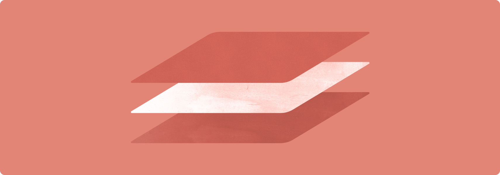
- 창이 두 개인 레이아웃을 만듭니다.
- 그리드 및 열 레이아웃을 사용합니다.
- 탐색 메뉴를 탐색 레일 및 창으로 대체합니다.
- 기존의 다중 활동 앱에서 활동 삽입을 사용합니다.
- 고급 키보드, 마우스, 트랙패드 기능을 지원합니다.
금지사항
- UI 요소(텍스트 필드, 버튼, 대화상자)를 늘려 추가 공간을 채웁니다.
- 이미지를 늘리거나 자릅니다.
- 패널이나 시트를 전체 너비로 설정합니다.
가이드라인
Tier 2 가이드라인에 따라 대형 화면에 맞게 앱을 최적화하세요.
UX
최적의 사용자 환경을 제공하는 반응형/적응형 레이아웃으로 모든 종류의 기기에서 모든 크기의 화면을 지원합니다.
내용
앱 레이아웃이 대형 화면 크기를 따릅니다. 앱 UI에는 다음이 포함됩니다.
- 선행 가장자리 탐색 레일 및 창
- 창 크기 변경을 수용하는 그리드 레이아웃
- 열 레이아웃
- 대형 화면에서 기본적으로 열리는 후행 가장자리 패널
창이 두 개인 레이아웃은 대형 화면 공간을 활용합니다. 다중 활동 앱은 활동 삽입을 구현하여 활동의 다중 창 레이아웃을 나란히 만듭니다.
터치 영역이 크고 도달 가능합니다. 대화형 드로어블은 포커스 가능합니다.
이유
대형 화면 기기에는 태블릿, 폴더블, ChromeOS 기기를 비롯한 다양한 폼 팩터가 포함됩니다. 디스플레이 크기는 다양합니다. 기기는 주로 가로 모드 방향으로 사용됩니다.
방법
UX 개요를 참고하세요.
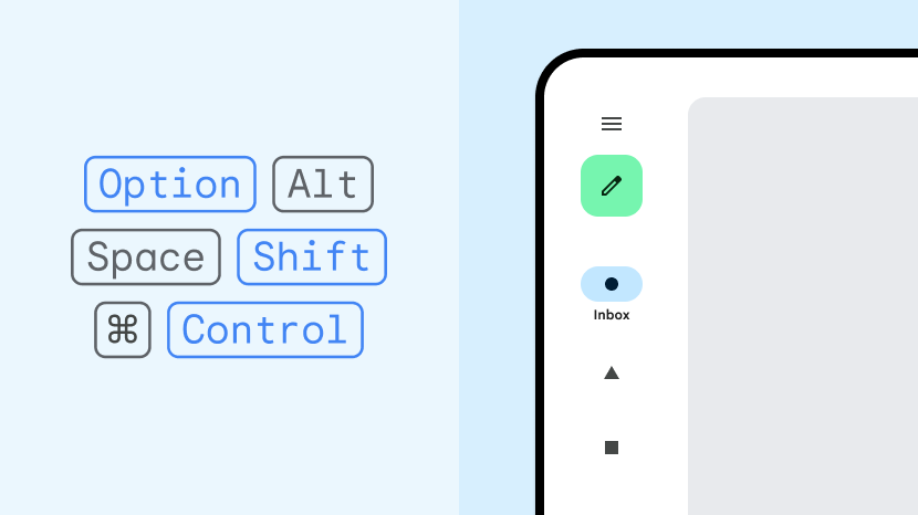
키보드, 마우스, 트랙패드
외부 하드웨어 입력 장치를 지원하여 앱 사용성과 사용자 만족도를 높입니다.
내용
앱이 키보드, 마우스, 트랙패드 입력 지원을 개선합니다. 마우스 및 트랙패드 오른쪽 버튼 클릭(보조 마우스 버튼 또는 보조 탭) 동작으로 옵션 메뉴에 액세스할 수 있습니다. 마우스 스크롤 휠과 트랙패드 손가락 모으기 동작을 사용하여 앱 콘텐츠를 확대/축소할 수 있습니다. UI 요소에는 마우스 오버 상태가 있습니다.
이유
키보드, 마우스, 트랙패드와 같은 주변기기는 대형 화면 기기에 연결되는 경우가 많습니다. ChromeOS 기기에는 일반적으로 키보드와 트랙패드가 내장되어 있습니다. 사용자는 단축키, 여러 마우스 버튼, 마우스 스크롤 휠, 트랙패드 동작을 익숙하게 사용합니다.
방법
키보드, 마우스, 트랙패드 개요를 참고하세요.