
TIER 2 — Adaptive app quality guidelines that prepare your app for displays large and small.

ADAPTIVE OPTIMIZED APPS take advantage of the expansive displays of large screen devices to provide a productive, engaging user experience.
Optimized apps are built with responsive/adaptive layouts that conform to portrait and landscape orientations, multi‑window mode, and folded and unfolded device states. Navigation rails and drawers enhance a user interface that dynamically formats and positions elements such as buttons, text fields, and dialogs for an optimal user experience.
Adaptive optimized apps provide support for keyboard navigation, keyboard shortcuts, and mouse and trackpad zoom, right‑click, and hover behavior.
Do's and don'ts
Do
- Create two-pane layouts
- Use grid and column layouts
- Replace navigation bars with navigation rails and drawers
- Use activity embedding in legacy, multi-activity apps
- Support advanced keyboard, mouse, and trackpad functionality
Don't
- Stretch UI elements (text fields, buttons, dialogs) to fill extra space
- Stretch or crop images
- Make panels or sheets full width
Guidelines
Follow the Tier 2 guidelines to optimize your apps for all form factors, including large screens.
User interface
Support screens of all sizes on devices of all kinds with responsive/adaptive layouts that provide an optimal user experience.
What
App layouts conform to display dimensions. App UI includes:
- Leading-edge navigation rails and drawers
- Grid layouts that accommodate window size changes
- Column layouts
- Trailing-edge panels that are open by default on large screens
Two-pane layouts take advantage of large screen space. Multi‑activity apps implement activity embedding to create multi‑pane layouts of activities side by side.
Touch targets are large and reachable. Interactive drawables are focusable.
Why
Large screen devices encompass a variety of form factors, including tablets, foldables, desktop computers, car displays, and XR. Display sizes vary. Devices are often—sometimes primarily—used in landscape orientation.
How
See the User interface overview.
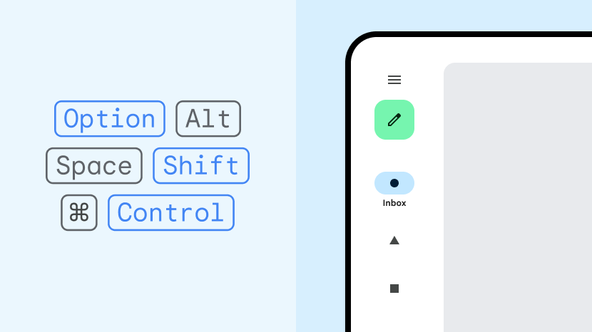
Keyboard, mouse, and trackpad
Support external hardware input devices to increase app usability and user satisfaction.
Guidelines:
What
App provides enhanced support for keyboard, mouse, and trackpad input. Context menus are accessible by mouse and trackpad right‑click (secondary mouse button or secondary tap) behavior. App content can be zoomed using the mouse scroll wheel and trackpad pinch gestures. UI elements have hover states.
Why
Peripherals such as keyboards, mice, and trackpads are often connected to large screen devices. ChromeOS devices typically have a built‑in keyboard and trackpad. Users are accustomed to using keyboard shortcuts, multiple mouse buttons, mouse scroll wheel, and trackpad gestures.
How
See the Keyboard, mouse, and trackpad overview.