Your 2D mobile or large-screen Android app works by default in Android XR, displayed as a 2D panel inside 3D space. You can add immersive XR features to enhance your existing 2D Android app, transitioning it from a flat screen experience to a dynamic, 3D environment.
Consider these important principles when bringing your Android app into XR.
- Spatial capabilities: Android XR offers a diverse range of spatial features available to your app, but you don't have to implement every single capability. Strategically implement those that complement your app's visual hierarchy, layouts, and user journeys. Consider incorporating custom environments and multiple panels to create a truly immersive experience. Refer to the spatial UI design guidance to determine the optimal integration of spatial elements.
- Adaptive UI: XR gives you the flexibility to design a spacious UI that adapts seamlessly to an infinite canvas and freely resizable windows. One of the most important considerations is to use our large screen design guidance to optimize your app's layout for this expansive environment. Even if your app is mobile-only today, you can still utilize captivating environments to enhance the user experience, but a UI that's optimized for large screens is one of the best ways to optimize your app for Android XR.
- UI framework: We recommend constructing your UI with Jetpack Compose for XR. If your app relies on Views, review working with Views in XR to learn more about leveraging Compose interoperability when working with Views, or evaluate working directly with the Jetpack SceneCore library.
- Publishing on the Play Store: To verify your XR-enhanced app is
discoverable on the Play Store:
- Consider streamlining your app by removing any unnecessary feature requirements.
- Verify your app isn't opted-out of XR publishing from your Google Play Console to prevent your app from being excluded from Play Store search results.
Tips for converting 2D UI components to 3D
Following these tips can make a big difference in making your app feel like it's been optimized for XR.
- Prioritize large screen compatibility: Ensure your app's UI adheres to large screen design principles to help ensure optimal legibility of text and content in expansive XR environments.
- Use spatial features strategically: Identify key moments within your app's user journey where incorporating spatial features will enhance the experience and take advantage of the unique capabilities of the platform.
- Place spatial panels with user comfort in mind: When designing your layout with spatial panels, position them at a comfortable distance from the user to avoid overwhelming or feeling too close.
- Use adaptive UI for spatial layouts: Utilize adaptive UI concepts such as panes and progressive revealing to effectively decompose your layout into multiple spatial panels, optimizing information presentation.
- Use orbiters for persistent elements and patterns: Reserve orbiters for persistent and contextual UX elements such as navigation and controls. Limit the use of orbiters to maintain clarity and avoid clutter.
- Make judicious use of elevation: Apply spatial elevation to temporary components that remain stationary and don't scroll with the content. Avoid elevating large areas to prevent visual discomfort and maintain a balanced visual hierarchy.
Jetpack Compose for XR introduces new components that manage XR enhancements so
that you don't have to. For example, you can use SpatialPopup and
SpatialDialog to replace their 2D counterparts. These components appear
as typical 2D UI when spatial UI isn't available, and they show your app's
spatial UI when they can. Using them is as straightforward as making a one-line
change to replace the corresponding 2D UI element.
Convert a dialog to SpatialDialog
// Previous approach Dialog( onDismissRequest = onDismissRequest ) { MyDialogContent() } // New XR differentiated approach SpatialDialog( onDismissRequest = onDismissRequest ) { MyDialogContent() }
Convert a popup to SpatialPopup
// Previous approach Popup(onDismissRequest = onDismissRequest) { MyPopupContent() } // New XR differentiated approach SpatialPopup(onDismissRequest = onDismissRequest) { MyPopupContent() }
Elevate 2D UI elements
When you want to elevate UI with more fine-grained control, we provide
SpatialElevation to allow you to elevate any composable in your app to a level
above the spatial panel on the Z-axis that you set with SpatialElevationLevel.
This helps get a user's attention, creates better hierarchy, and improves
legibility, as shown in the following example.
// Elevate an otherwise 2D Composable (signified here by ComposableThatShouldElevateInXr). SpatialElevation(elevation = SpatialElevationLevel.Level4) { ComposableThatShouldElevateInXr() }
Key points about the code
- Don't spatialize or elevate big areas and planes such as bottom sheets and side sheets.
- Don't elevate UI elements that are scrollable with the content.
Migrate 2D components to orbiters
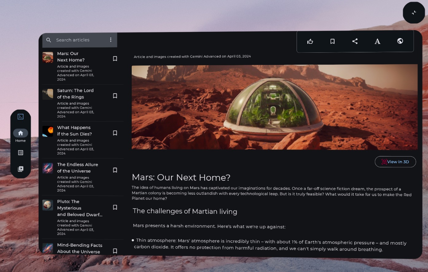
Orbiters are floating elements that typically contain controls the user can interact with. Orbiters can be anchored to spatial panels or other entities such as spatial layouts. They allow the content to have more space and give users quick access to features without obstructing the main content.

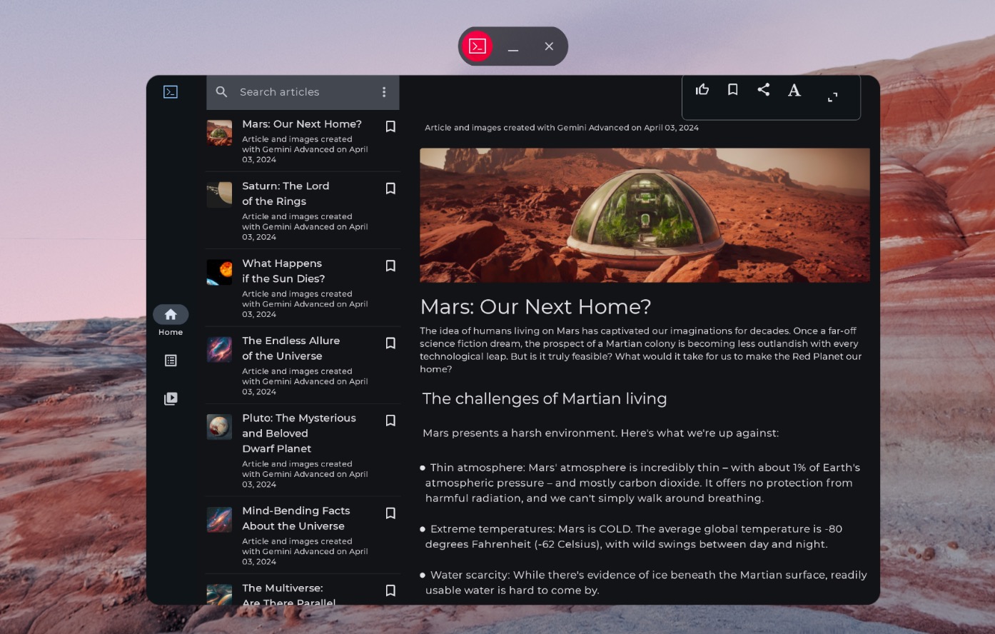
Non-spatialized navigation rail

Spatialized (XR-adapted) navigation rail
The following example code shows how you might migrate a 2D UI component to an orbiter.
// Previous approach NavigationRail() // New XR differentiated approach Orbiter( anchorPoint = OrbiterAnchorPoint.StartTop, offset = DpVolumeOffset(x = dimensionResource(R.dimen.start_orbiter_padding)), ) { NavigationRail() }
Key points about orbiters
- Orbiters are components designed to attach existing UI elements to a spatial panel
- See our Android XR app design guidance to verify which elements to migrate for orbiters, and for patterns to avoid.
- We recommend adapting only a few navigation components like the navigation rail, top app bar, or bottom app bar.
- Orbiters don't show up when spatial UI isn't enabled. For example, they won't show up in Home Space or on devices like phones, tablets, and foldables.
Migrate 2D components to Spatial panels
Spatial panels are the fundamental building blocks of Android XR apps' UI.
Panels serve as containers for UI elements, interactive components, and immersive content. When designing, you can add components like orbiters for user controls, and spatially elevate UI elements to call attention to specific interactions.
Key points about the code
- See Android XR app design guidance to verify which elements to migrate to panels, and for patterns to avoid.
- Follow best practices for spatial panel placement:
- Panels should spawn center 1.5m from the user's eyes.
- Content should appear in the center 41° of the user's field of view.
- Panels stay in place as a user moves. Anchoring is only available for passthrough.
- Stick to the system recommended 32 dp rounded corners for panels.
- Touch targets should be 56 dp and no smaller than 48 dp.
- Keep contrast ratios for readability, especially if you use any transparent backgrounds.
- Follow Android design Color principles and use the Material Design color system to implement dark and light themes for your app.
- Use the spatial panels API with existing UI elements.
Migrate 2D UI to a single spatial panel
By default, your app shows with a single panel in Home Space. Learn how to
transition between Home Space and Full Space. To bring that content to Full
Space, you can use SpatialPanel.
Here's an example of how you might do this.
if (LocalSpatialCapabilities.current.isSpatialUiEnabled) { Subspace { SpatialPanel( modifier = SubspaceModifier.movable(), resizePolicy = ResizePolicy(), ) { AppContent() } } } else { AppContent() }
Migrate your 2D UI to multiple spatial panels
You can either use a single spatial panel for your app's UI, or you can migrate
your 2D UI to multiple spatial panels. If you choose to use multiple panels for
your app's UI, you can position and rotate panels (analogous to laying out your
UI in 2D). You'll start with a clear design vision for what you want to
accomplish, and then you can use Spatial UI Layout APIs (SpatialBox,
SpatialRow, SpatialColumn, SpatialLayoutSpacer,
SpatialAlignment) and subspace modifiers to position and rotate panels.
There are some key patterns that you'll want to avoid as you implement multiple
panels.
- Avoid overlapping panels that would block the user from seeing critical information.
- Avoid overwhelming the user with panels.
- Avoid placing panels in uncomfortable or unnoticeable placements. Example: panels placed behind the user are difficult to notice.
- For more on developing your spatial UI, check out our full guidance.

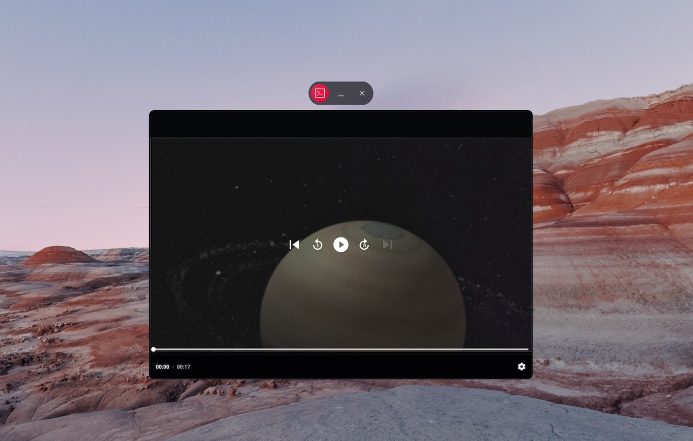
Non-spatialized content

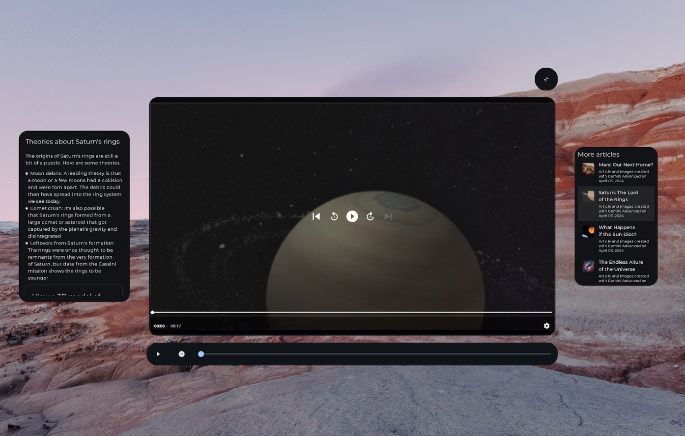
Spatialized (XR-adapted) media controls within an orbiter and content broken up into multiple spatial panels
SpatialRow { SpatialPanel( SubspaceModifier .width(384.dp) .height(592.dp) ) { StartSupportingPanelContent() } SpatialPanel( SubspaceModifier .height(824.dp) .width(1400.dp) ) { App() } SpatialPanel( SubspaceModifier .width(288.dp) .height(480.dp) ) { EndSupportingPanelContent() } }
Check for spatial capabilities
When you're deciding whether to display a specific UI element, avoid checking
for specific XR devices or modes. Checking for devices or modes rather than
capabilities can cause problems when the capabilities on a given device change
over time. Instead, use
LocalSpatialCapabilities.current.isSpatialUiEnabled to directly check
for the necessary spatialization capabilities as shown in the following example.
This approach ensures your app adapts correctly to a wide range of XR
experiences without needing updates every time new devices emerge or
capabilities change.
if (LocalSpatialCapabilities.current.isSpatialUiEnabled) { SupportingInfoPanel() } else { ButtonToPresentInfoModal() } // Similar check for audio val spatialAudioEnabled = LocalSpatialCapabilities.current.isSpatialAudioEnabled
Use environments to change the user's surroundings
When you want to create a feeling of immersion in your app by changing your user's surroundings, you can do so with environments. Adding an environment in code is a straightforward change that you can make without significantly impacting your app's existing UI. For more on setting environments, be sure to check out our full guidance.
Add 3D content
3D content such as 3D models and spatial video can help create a more immersive experience and add spatial understanding. Your app can only show 3D content when spatial capabilities are available, so you'll want to check if spatial capabilities are available first.
Refer to the appropriate guide for adding 3D models, spatial video or spatial audio.


