קל לארגן דפים בעזרת אוספים
אפשר לשמור ולסווג תוכן על סמך ההעדפות שלך.
אפשר לאמת את הקלט בזמן שהמשתמש מקלידים בשדה טקסט, למשל כניסה של שם, כתובת אימייל, כתובת או פרטים אחרים ליצירת קשר. האימות הזה מפחית שגיאות וחוסכ למשתמשים זמן.
תאימות גרסאות
כדי להטמיע את האפשרות הזו, צריך להגדיר את minSDK של הפרויקט לרמת API 21 ואילך.
יחסי תלות
אימות הקלט בזמן שהמשתמש מקליד
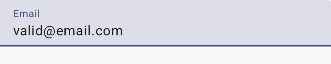
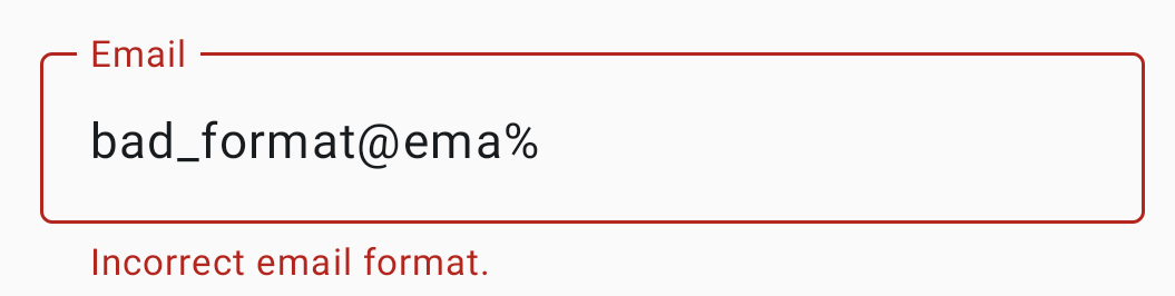
ים
משתמשים בקוד הבא כדי להציג את הקלט בשדה ולאמת את הטקסט בזמן שהמשתמש מקלידים. אם המידע לא מאומת, תוצג הודעת שגיאה שתעזור למשתמש לתקן את הקלט.
classEmailViewModel:ViewModel(){varemailbymutableStateOf("")privatesetvalemailHasErrorsbyderivedStateOf{if(email.isNotEmpty()){// Email is considered erroneous until it completely matches EMAIL_ADDRESS.!android.util.Patterns.EMAIL_ADDRESS.matcher(email).matches()}else{false}}funupdateEmail(input:String){email=input}}@ComposablefunValidatingInputTextField(email:String,updateState:(String)->Unit,validatorHasErrors:Boolean){OutlinedTextField(modifier=Modifier.fillMaxWidth().padding(10.dp),value=email,onValueChange=updateState,label={Text("Email")},isError=validatorHasErrors,supportingText={if(validatorHasErrors){Text("Incorrect email format.")}})}@Preview@ComposablefunValidateInput(){valemailViewModel:EmailViewModel=viewModel<EmailViewModel>()ValidatingInputTextField(email=emailViewModel.email,updateState={input->emailViewModel.updateEmail(input)},validatorHasErrors=emailViewModel.emailHasErrors)}
הגדרה של רכיב שאפשר להשתמש בו שוב, שמשתמש שוב ברכיב OutlinedTextField, ומוסיף את הפרמטרים הנדרשים כדי להציג את הודעות השגיאה של המאמת כסוגי משתמשים.
השדה EmailViewModel משמש לשמירת המצב ולסיפוק הלוגיקה לאימות האימייל.
אם הערך של isError הוא true, ממשק המשתמש מספק אינדיקטור חזותי של מצב שגיאה באימות.
הרכיב יציג את ההודעה 'פורמט האימייל שגוי' עד שתזינו כתובת אימייל מלאה ונכונה.
תוצאות
איור 1. שדה להזנת טקסט עם מאמתי אימייל שלא מציגים הודעות שגיאה לגבי כתובת אימייל תקינה.איור 2. שדה להזנת טקסט שבו מוצגת הודעת שגיאה כשמזינים כתובת אימייל לא חוקית.
אוספים שמכילים את המדריך הזה
המדריך הזה הוא חלק מהאוספים הבאים של מדריכים מהירים, שמכסים יעדים רחבים יותר לפיתוח Android:
הטקסט שיוצג
טקסט הוא רכיב מרכזי בכל ממשק משתמש. כאן מוסבר איך אפשר להציג טקסט באפליקציה כדי לספק חוויית משתמש נעימה.
דוגמאות התוכן והקוד שבדף הזה כפופות לרישיונות המפורטים בקטע רישיון לתוכן. Java ו-OpenJDK הם סימנים מסחריים או סימנים מסחריים רשומים של חברת Oracle ו/או של השותפים העצמאיים שלה.
עדכון אחרון: 2025-02-22 (שעון UTC).
[[["התוכן קל להבנה","easyToUnderstand","thumb-up"],["התוכן עזר לי לפתור בעיה","solvedMyProblem","thumb-up"],["סיבה אחרת","otherUp","thumb-up"]],[["חסרים לי מידע או פרטים","missingTheInformationINeed","thumb-down"],["התוכן מורכב מדי או עם יותר מדי שלבים","tooComplicatedTooManySteps","thumb-down"],["התוכן לא עדכני","outOfDate","thumb-down"],["בעיה בתרגום","translationIssue","thumb-down"],["בעיה בדוגמאות/בקוד","samplesCodeIssue","thumb-down"],["סיבה אחרת","otherDown","thumb-down"]],["עדכון אחרון: 2025-02-22 (שעון UTC)."],[],[],null,["# Validate input as the user types\n\n\u003cbr /\u003e\n\nYou can validate input as the user types in a text field, such as entering a\nname, email, address, or other contact information. This validation reduces\nerrors and saves your users time.\n\nVersion compatibility\n---------------------\n\nThis implementation requires that your project minSDK be set to API level 21 or\nhigher.\n\n### Dependencies\n\n### Kotlin\n\n\u003cbr /\u003e\n\n```kotlin\n implementation(platform(\"androidx.compose:compose-bom:2025.08.00\"))\n \n```\n\n\u003cbr /\u003e\n\n### Groovy\n\n\u003cbr /\u003e\n\n```groovy\n implementation platform('androidx.compose:compose-bom:2025.08.00')\n \n```\n\n\u003cbr /\u003e\n\nValidate input as the user types\n--------------------------------\n\nUse the following code to display the field input and validate the text while\nthe user types. If the information is not validated, an error message helps the\nuser correct the input.\n\n\n```kotlin\nclass EmailViewModel : ViewModel() {\n var email by mutableStateOf(\"\")\n private set\n\n val emailHasErrors by derivedStateOf {\n if (email.isNotEmpty()) {\n // Email is considered erroneous until it completely matches EMAIL_ADDRESS.\n !android.util.Patterns.EMAIL_ADDRESS.matcher(email).matches()\n } else {\n false\n }\n }\n\n fun updateEmail(input: String) {\n email = input\n }\n}\n\n@Composable\nfun ValidatingInputTextField(\n email: String,\n updateState: (String) -\u003e Unit,\n validatorHasErrors: Boolean\n) {\n OutlinedTextField(\n modifier = Modifier\n .fillMaxWidth()\n .padding(10.dp),\n value = email,\n onValueChange = updateState,\n label = { Text(\"Email\") },\n isError = validatorHasErrors,\n supportingText = {\n if (validatorHasErrors) {\n Text(\"Incorrect email format.\")\n }\n }\n )\n}\n\n@Preview\n@Composable\nfun ValidateInput() {\n val emailViewModel: EmailViewModel = viewModel\u003cEmailViewModel\u003e()\n ValidatingInputTextField(\n email = emailViewModel.email,\n updateState = { input -\u003e emailViewModel.updateEmail(input) },\n validatorHasErrors = emailViewModel.emailHasErrors\n )\n}https://github.com/android/snippets/blob/dd30aee903e8c247786c064faab1a9ca8d10b46e/compose/snippets/src/main/java/com/example/compose/snippets/text/TextSnippets.kt#L913-L962\n```\n\n\u003cbr /\u003e\n\n### Key points about the code\n\n- Defines a composable that reuses the [`OutlinedTextField`](/reference/kotlin/androidx/compose/material/package-summary#TextField(kotlin.String,kotlin.Function1,androidx.compose.ui.Modifier,kotlin.Boolean,kotlin.Boolean,androidx.compose.ui.text.TextStyle,kotlin.Function0,kotlin.Function0,kotlin.Function0,kotlin.Function0,kotlin.Boolean,androidx.compose.ui.text.input.VisualTransformation,androidx.compose.foundation.text.KeyboardOptions,androidx.compose.foundation.text.KeyboardActions,kotlin.Boolean,kotlin.Int,androidx.compose.foundation.interaction.MutableInteractionSource,androidx.compose.ui.graphics.Shape,androidx.compose.material.TextFieldColors)) component, adding the required parameters to display validator error messages as user types.\n- `EmailViewModel` is used to maintain state and provide the email validation logic.\n- if `isError` is true, the UI provides a visual indicator of a validation error state.\n- The component will display \"Incorrect email format.\" until a complete, correct email is input.\n\nResults\n-------\n\n**Figure 1.** A text input field with email validators displaying no error messages for a valid email address. **Figure 2.** A text input field displaying an error message when an invalid email address is entered.\n\nCollections that contain this guide\n-----------------------------------\n\nThis guide is part of these curated Quick Guide collections that cover\nbroader Android development goals: \n\n### Display text\n\nText is a central piece of any UI. Find out different ways you can present text in your app to provide a delightful user experience. \n[Quick guide collection](/develop/ui/compose/quick-guides/collections/display-text) \n\n### Request user input\n\nLearn how to implement ways for users to interact with your app by entering text and using other means of input. \n[Quick guide collection](/develop/ui/compose/quick-guides/collections/request-user-input) \n\nHave questions or feedback\n--------------------------\n\nGo to our frequently asked questions page and learn about quick guides or reach out and let us know your thoughts. \n[Go to FAQ](/quick-guides/faq) [Leave feedback](https://issuetracker.google.com/issues/new?component=1573691&template=1993320)"]]