
The Card composable acts as a Material Design container for your UI.
Cards present a single coherent piece of content, such as:
- A product in a shopping app.
- A news story in a news app.
- A message in a communications app.
The focus on portraying a single piece of content distinguishes
Card from other containers. For example, Scaffold provides general structure
to a whole screen. Card is a smaller UI element inside a larger
layout, whereas a layout component such as Column or Row provides a simpler
and more generic API.
This topic shows you how to implement four types of cards:
Version compatibility
This implementation requires that your project minSDK be set to API level 21 or higher.
Dependencies
Create a basic card
Card behaves much like other containers in Compose. You declare its content by
calling other composables within it. For example, consider how Card contains a
call to Text in the following minimal example:
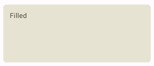
Create a filled card
The key here is the use of the colors property to change the filled
color:
Results
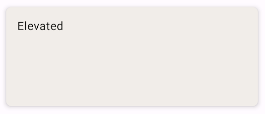
Create an elevated card
The following snippet demonstrates how to implement an elevated card. Use the
dedicated ElevatedCard composable.
You can use the elevation property to control the appearance of elevation and
the resulting shadow.
Results
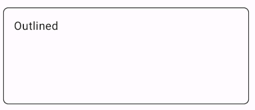
Create an outlined card
The following is an example of an outlined card. Use the dedicated
OutlinedCard composable.
Results
Key points
See the reference for the API definition of Card. It defines several
parameters that you can use to customize the appearance and behavior of the
component.
Some key parameters include:
elevation: Adds a shadow to the component that makes it look elevated above the background.colors: Uses theCardColorstype to set the default color of both the container and any children.enabled: If you passfalsefor this parameter, the card appears as disabled and does not respond to user input.onClick: Ordinarily, aCarddoes not accept click events. As such, the primary overload you would like to note is that which defines anonClickparameter. Use this overload when you want your implementation ofCardto respond to clicks from the user.
Cards don't come with inherent scroll or dismiss actions, but can integrate into
composables offering these features. For example, to implement swipe to dismiss
on a card, integrate it with the SwipeToDismissBox composable. To integrate
with scroll, use scroll modifiers such as verticalScroll. See the Scroll
documentation for more information.
Collections that contain this guide
This guide is part of these curated Quick Guide collections that cover broader Android development goals:

Display interactive components