
ชีตด้านล่างแสดงเนื้อหารองที่ยึดอยู่ที่ด้านล่างของหน้าจอ
ความเข้ากันได้ของเวอร์ชัน
การใช้งานนี้กำหนดให้โปรเจ็กต์ของคุณตั้งค่า minSDK เป็น API ระดับ 21 ขึ้นไป
ทรัพยากร Dependency
ใช้ Bottom Sheet
หากต้องการใช้ Bottom Sheet ให้ใช้คอมโพสิชัน ModalBottomSheet ดังนี้
ขยายและยุบชีต
หากต้องการขยายและยุบชีต ให้ใช้ SheetState ดังนี้
ข้อมูลสำคัญ
- ใช้ช่อง
contentซึ่งใช้ColumnScopeเพื่อวางองค์ประกอบที่คอมโพสได้ของชีตในคอลัมน์ - ใช้
rememberSheetStateเพื่อสร้างอินสแตนซ์ของSheetStateที่ส่งไปยังModalBottomSheetด้วยพารามิเตอร์sheetState SheetStateให้สิทธิ์เข้าถึงฟังก์ชันshowและhideรวมถึงพร็อพเพอร์ตี้ที่เกี่ยวข้องกับสถานะชีตปัจจุบัน ฟังก์ชันเหล่านี้ต้องใช้CoroutineScopeเช่นrememberCoroutineScopeและสามารถเรียกให้แสดงเพื่อตอบสนองต่อเหตุการณ์ UIอย่าลืมนำ
ModalBottomSheetออกจากองค์ประกอบเมื่อคุณซ่อนชีตด้านล่าง
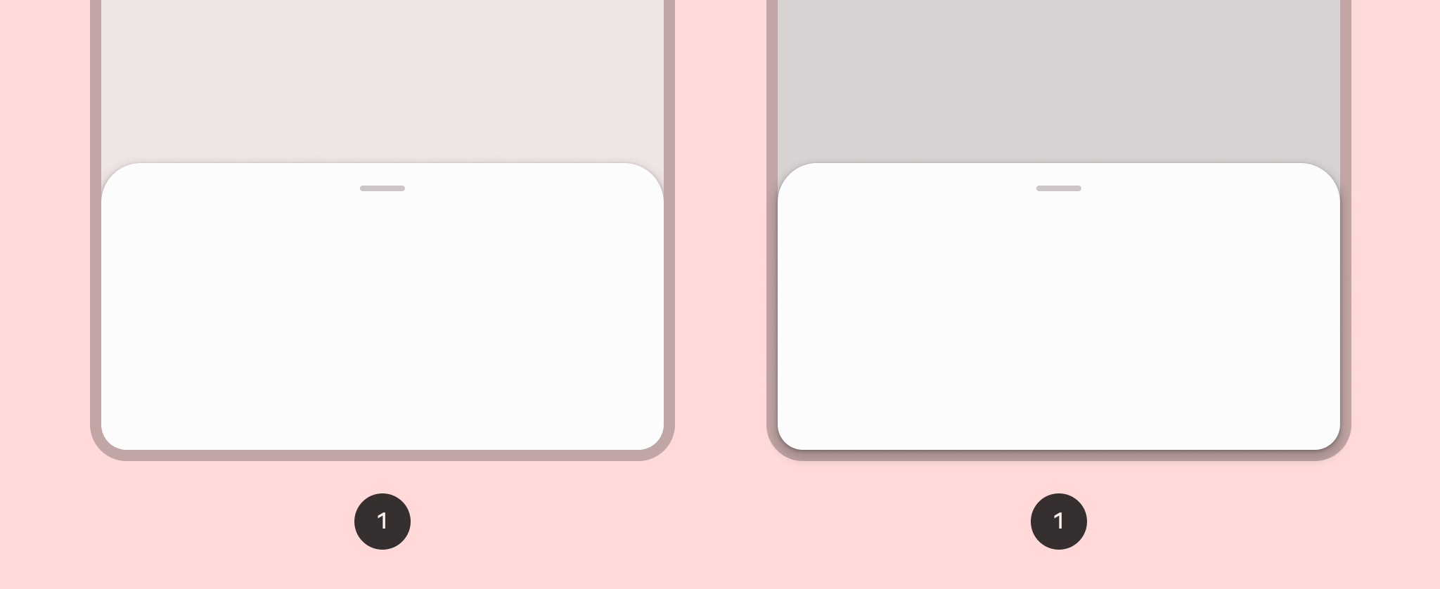
ผลลัพธ์
คอลเล็กชันที่มีคู่มือนี้
คู่มือนี้เป็นส่วนหนึ่งของคอลเล็กชันคู่มือฉบับย่อที่มีการดูแลจัดการซึ่งครอบคลุมเป้าหมายการพัฒนา Android ที่กว้างขึ้น ดังนี้

แสดงคอมโพเนนต์แบบอินเทอร์แอกทีฟ
ดูวิธีที่ฟังก์ชันคอมโพสิเบิลช่วยให้คุณสร้างคอมโพเนนต์ UI ที่สวยสะดุดตาตามระบบการออกแบบ Material Design ได้อย่างง่ายดาย
หากมีคำถามหรือความคิดเห็น
ไปที่หน้าคำถามที่พบบ่อยเพื่อดูคู่มือฉบับย่อหรือติดต่อเราเพื่อบอกความคิดเห็นของคุณ