
표준 레이아웃은 검증된 다목적 레이아웃으로, 다양한 폼 팩터에서 최적의 사용자 환경을 제공합니다.
표준 레이아웃은 태블릿, 폴더블, ChromeOS 기기는 물론 소형 화면 휴대전화도 지원합니다. Material Design 가이드에서 파생된 레이아웃은 보기에도 좋고 기능적입니다.
Android 프레임워크에는 간단하고 안정적으로 레이아웃을 구현할 수 있는 특수 구성요소가 포함되어 있습니다.
표준 레이아웃은 참여도와 생산성을 높이며 뛰어난 앱의 토대를 이루는 UI를 만듭니다.
목록 세부정보

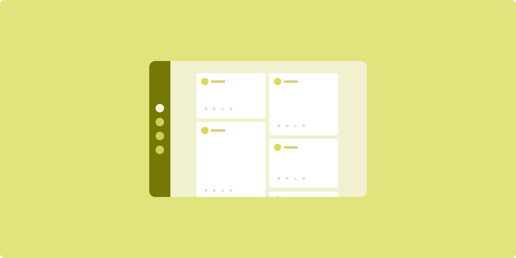
목록 세부정보 레이아웃에서 사용자는 설명 정보 또는 기타 추가 정보가 있는 항목의 목록(항목 세부정보)을 탐색할 수 있습니다.
이 레이아웃은 앱 창을 목록 창과 세부정보 창으로 하나씩, 두 개의 나란한 창으로 나눕니다. 사용자는 목록에서 항목을 선택하여 항목 세부정보를 표시합니다. 세부정보의 딥 링크는 세부정보 창에 추가 콘텐츠를 표시합니다.
넓은 너비 디스플레이 (창 크기 클래스 사용 참고)는 목록과 세부정보를 동시에 수용합니다. 목록 항목을 선택하면 세부정보 창이 업데이트되어 선택한 항목의 관련 콘텐츠가 표시됩니다.
중간 너비 및 좁은 너비 디스플레이는 사용자와 앱의 상호작용에 따라 목록이나 세부정보를 표시합니다. 목록만 표시된 경우 목록 항목을 선택하면 목록 대신 세부정보가 표시됩니다. 세부정보만 표시된 경우 뒤로 버튼을 누르면 목록이 다시 표시됩니다.
기기 방향 변경이나 앱 창 크기 변경과 같은 구성 변경으로 인해 디스플레이의 창 크기 클래스가 변경될 수 있습니다. 목록-세부정보 레이아웃이 적절하게 응답하여 앱 상태를 유지합니다.
- 목록 창과 세부정보 창을 모두 표시하는 넓은 너비 디스플레이가 중간 너비나 좁은 너비로 축소되는 경우 세부정보 창이 계속 표시되고 목록 창이 숨겨집니다.
- 중간 너비 또는 좁은 너비 디스플레이에 세부정보 창만 표시되고 창 크기 클래스가 펼쳐지는 경우 목록과 세부정보가 함께 표시되며 목록은 세부정보 창의 콘텐츠에 해당하는 항목이 선택되었음을 나타냅니다.
- 중간 너비 또는 좁은 너비 디스플레이에 목록 창만 표시되고 이 디스플레이가 펼쳐지는 경우 목록 및 자리표시자 세부정보 창이 함께 표시됩니다.
목록-세부정보는 메시지 앱, 연락처 관리자, 대화형 미디어 브라우저 또는 추가 정보를 표시하는 항목 목록으로 콘텐츠를 구성할 수 있는 앱에 적합합니다.
구현
The declarative paradigm of Compose supports window size class logic that determines whether to show the list and detail panes at the same time (when the width window size class is expanded) or just the list or detail pane (when the width window size class is medium or compact).
To ensure unidirectional data flow, hoist all state, including current window size class and detail of the selected list item (if any), so all composables have access to the data and can render correctly.
When showing just the detail pane on small window sizes, add a BackHandler
to remove the detail pane and display just the list pane. The BackHandler is
not part of the overall app navigation since the handler is dependent on the
window size class and selected detail state.
ListDetailPaneScaffold is a high-level composable that simplifies the
implementation of list-detail layouts. It automatically handles pane logic based
on window size classes and supports navigation between panes.
Here is a minimal implementation using ListDetailPaneScaffold:
@OptIn(ExperimentalMaterial3AdaptiveApi::class) @Composable fun MyListDetailPaneScaffold() { val navigator = rememberListDetailPaneScaffoldNavigator() ListDetailPaneScaffold( directive = navigator.scaffoldDirective, value = navigator.scaffoldValue, listPane = { // Listing Pane }, detailPane = { // Details Pane } ) }
The following are the key components in this example:
rememberListDetailPaneScaffoldNavigator: Creates a navigator to manage navigation between the list and detail panes.listPane: Displays the list of items.detailPane: Displays the content of a selected item.
For detailed implementation examples, see:
- Build a list-detail layout developer guide
- list-detail-compose sample
피드
피드 레이아웃은 구성 가능한 그리드에 동등한 콘텐츠 요소를 정렬하여 많은 양의 콘텐츠를 빠르고 편리하게 표시합니다.
크기 및 위치는 콘텐츠 요소 간의 관계를 설정합니다.
콘텐츠 그룹은 요소의 크기를 동일하게 만들고 위치를 함께 지정하여 생성됩니다. 요소를 주변 요소보다 크게 만들어 요소에 주의를 끌 수 있습니다.
카드와 목록은 피드 레이아웃의 일반적인 구성요소입니다.
피드 레이아웃은 거의 모든 크기의 디스플레이를 지원합니다. 그리드를 단일 스크롤 열에서 다중 열 스크롤 콘텐츠 피드로 조정할 수 있기 때문입니다.
피드는 뉴스 및 소셜 미디어 앱에 특히 적합합니다.
구현
A feed consists of a large number of content elements in a vertical scrolling container laid out in a grid. Lazy lists efficiently render a large number of items in columns or rows. Lazy grids render items in grids, supporting configuration of the item sizes and spans.
Configure the columns of the grid layout based on the available display area to set the minimum allowable width for grid items. When defining grid items, adjust column spans to emphasize some items over others.
For section headers, dividers, or other items designed to occupy the full width
of the feed, use maxLineSpan to take up the full width of the layout.
On compact-width displays that don't have enough space to show more than one
column, LazyVerticalGrid behaves just like a LazyColumn.
Here is a minimal implementation using LazyVerticalGrid:
@Composable fun MyFeed(names: List<String>) { LazyVerticalGrid( // GridCells.Adaptive automatically adapts column count based on available width columns = GridCells.Adaptive(minSize = 180.dp), ) { items(names) { name -> Text(name) } } }
The key to an adaptive feed is the columns configuration.
GridCells.Adaptive(minSize = 180.dp) creates a grid where each column is at
least 180.dp wide. The grid then displays as many columns as can fit in the
available space.
For an example implementation, see the Feed with Compose sample.
지원 창

지원 창 레이아웃은 앱 콘텐츠를 기본 및 보조 디스플레이 영역으로 구성합니다.
기본 디스플레이 영역은 앱 창의 대부분 (일반적으로 약 2/3)를 차지하며 기본 콘텐츠를 포함합니다. 보조 디스플레이 영역은 앱 창의 나머지 부분을 차지하며 기본 콘텐츠를 지원하는 콘텐츠를 표시하는 창입니다.
지원 창 레이아웃은 가로 방향의 넓은 너비 디스플레이 (창 크기 클래스 사용 참고)에서 잘 작동합니다. 중간 너비 또는 좁은 너비 디스플레이는 콘텐츠가 좁은 디스플레이 공간에 맞게 조정되는 경우 또는 메뉴나 버튼 등의 컨트롤로 추가 콘텐츠를 처음에 하단 또는 측면 시트에 숨길 수 있는 경우 기본 및 보조 디스플레이 영역을 모두 표시하도록 지원합니다.
지원 창 레이아웃은 기본 콘텐츠와 보조 콘텐츠의 관계에서 목록 세부정보 레이아웃과 다릅니다. 보조 창 콘텐츠는 기본 콘텐츠와 관련해서만 의미가 있습니다. 예를 들어 지원 창 도구 창은 그 자체만으로는 관련이 없습니다. 그러나 목록 세부정보 레이아웃의 세부정보 창에 표시되는 보조 콘텐츠는 제품 등록정보의 제품 설명과 같이 기본 콘텐츠가 없는 경우에도 의미가 있습니다.
지원 창의 사용 사례는 다음과 같습니다.
- 생산성 앱: 지원 창에서 평가자 의견이 포함된 문서 또는 스프레드시트
- 미디어 앱: 지원 창의 스트리밍 동영상 및 관련 동영상 목록 또는 재생목록이 추가된 음악 앨범 묘사
- 도구 및 설정: 지원 창에 팔레트, 효과, 기타 설정이 있는 미디어 편집 도구
구현
Compose는 창 크기 클래스 로직을 지원하므로, 기본 콘텐츠와 지원 콘텐츠를 동시에 표시할지 아니면 지원 콘텐츠를 대체 위치에 배치할지 결정할 수 있습니다.
현재 창 크기 클래스와 기본 콘텐츠 및 지원 콘텐츠의 데이터와 관련된 정보를 포함한 모든 상태를 끌어올립니다.
좁은 너비 디스플레이의 경우 지원 콘텐츠를 기본 콘텐츠 아래나 하단 시트 내부에 배치합니다. 중간 너비 및 확장 후 너비의 경우 기본 콘텐츠 옆에 지원 콘텐츠를 배치하여 콘텐츠와 사용 가능한 공간에 맞게 크기를 조절합니다. 중간 너비의 경우 기본 콘텐츠와 지원 콘텐츠 사이에 디스플레이 공간을 균등하게 분할합니다. 확장 후 너비의 경우 공간의 70% 를 기본 콘텐츠에, 30% 를 지원 콘텐츠에 부여합니다.
SupportingPaneScaffold는 지원 창 레이아웃의 구현을 간소화하는 상위 수준 컴포저블입니다. 컴포저블은 창 크기 클래스를 기반으로 창 로직을 자동으로 처리하여 대형 화면에서는 창을 나란히 표시하고 소형 화면에서는 지원 창을 숨깁니다. SupportingPaneScaffold은 창 간 탐색도 지원합니다.
다음은 최소 구현입니다.
@OptIn(ExperimentalMaterial3AdaptiveApi::class) @Composable fun MySupportingPaneScaffold() { // Creates and remembers a navigator to control pane visibility and navigation val navigator = rememberSupportingPaneScaffoldNavigator() SupportingPaneScaffold( // Directive and value help control pane visibility based on screen size and state directive = navigator.scaffoldDirective, value = navigator.scaffoldValue, mainPane = { // Main Pane for the primary content }, supportingPane = { //Supporting Pane for supplementary content } ) }
rememberSupportingPaneScaffoldNavigator: 창 표시 상태를 관리하는 탐색기를 만드는 컴포저블입니다 (예: 소형 화면에서 지원 창 숨기기 또는 표시).mainPane: 기본 콘텐츠를 표시하는 컴포저블supportingPane: 보조 콘텐츠를 표시하는 컴포저블
자세한 구현 예는 다음을 참고하세요.
- 지원 창 레이아웃 빌드 개발자 가이드
- supporting-pane-compose 샘플
추가 리소스
- Material Design — 표준 레이아웃