Design for large screens
Create a high quality, engaging user experience on tablets, foldables, and ChromeOS devices.
Get inspired
Gallery
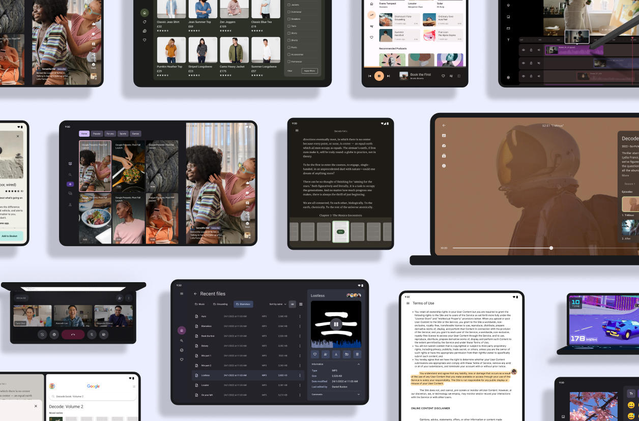
Tour the large screen gallery
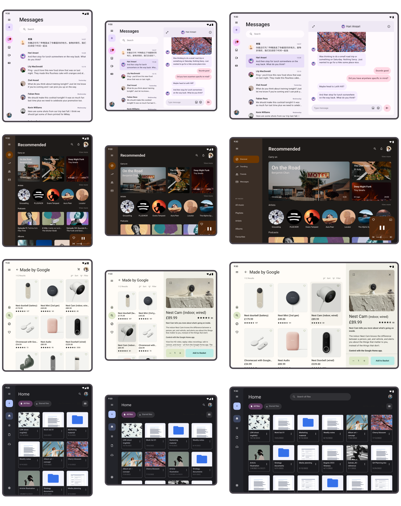
Explore inspiring, optimized designs for large screen devices. Browse UI/UX templates for popular app categories, including media, creativity, games, and more.
Use proven patterns
Canonical layouts ensure an optimal user experience for all large screen form factors— tablets, foldables, and ChromeOS devices—as well as supporting all phone sizes. Navigation rail and drawer components provide out-of-the way navigation for UI convenience and control.
Canonical
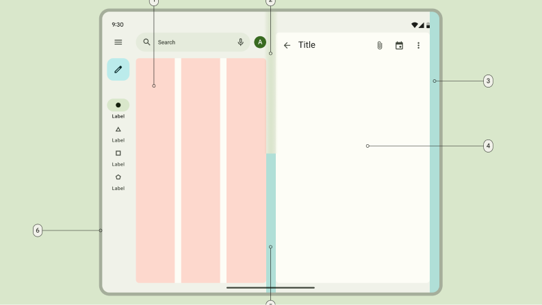
List-detail
Enables one-click access to descriptive, explanatory, or other supplementary information for content organized in lists.
Canonical
Feed
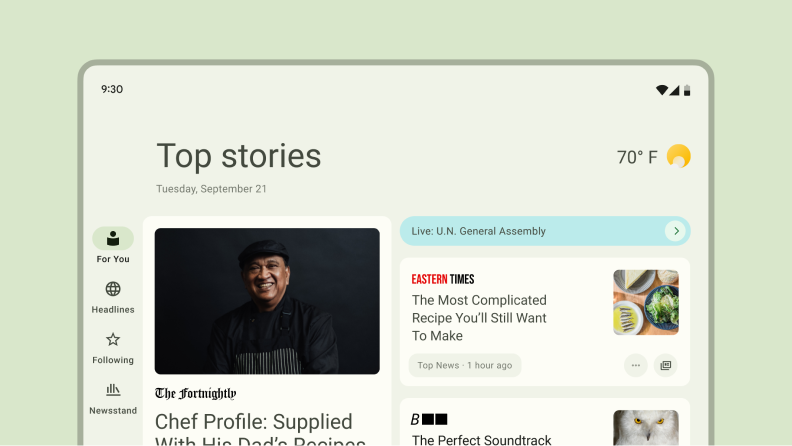
Arranges content elements in an expansive grid, associating elements by size and placement, drawing attention to elements using proportion and scale.
Canonical
Supporting pane
Organizes apps into primary and secondary display areas to make tools, options, and settings readily accessible and applicable to the main content.
Canonical
Navigation rail and drawer
Complements the canonical layouts by positioning primary navigation destinations within easy reach while occupying a minimum of screen space.
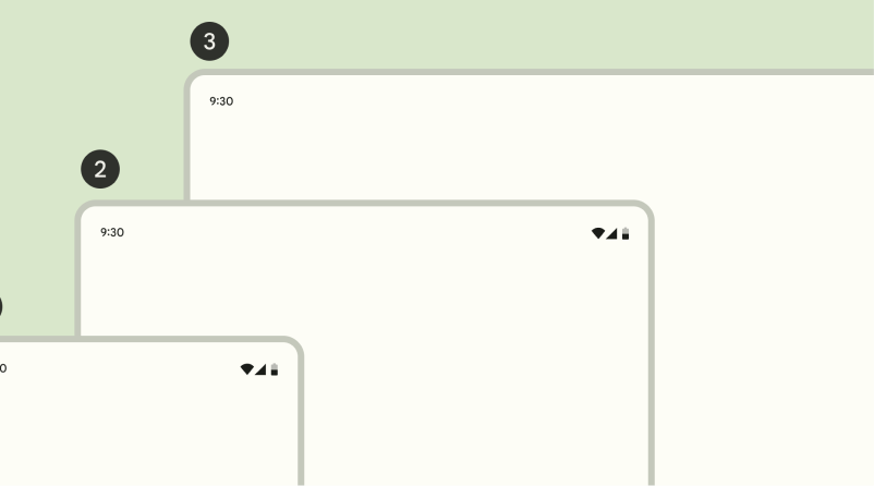
Compact
< 600 dp
Medium
≥ 600 - < 840 dp
Expanded
≥ 840 dp
Use window size classes
Use compact, medium, and expanded window size classes to support different form
factors for an optimal user experience.
Use a proven design system
Try Material Design 3
Material Design 3 is an open source, adaptable system of guidelines, components, and tools that support the best practices of user interface design.
Develop for large screens
Developer guides
Use our developer guides and reference to build your app design.
Quality guides
Lay out your designs following Android best practices.
Articles & reading
Material Design
Understanding layout
Layout is the visual arrangement of elements. It directs attention to the most important information on the screen and makes it easy for users to take action.
Material Design
Applying layout
Window size classes help you to create layouts that scale across devices and form factors.
Material Design
Using canonical layouts
Canonical layouts are ready-to-use compositions that help layouts adapt for common use cases and screen sizes.
Check out our latest videos
YouTube video
Canonical layouts and visual hierarchy: Designing for larger screens
November 10, 2022

