
Lists let users select an item from a set of choices on Wear OS devices.
Many Wear OS devices use round screens, which makes it more difficult to see
list items that appear near the top and bottom of the screen. For this reason,
Compose for Wear OS includes a version of the LazyColumn class called
TransformingLazyColumn, which supports scaling and morphing animations.
When items move to the edges, they get smaller and fade out.
To apply the recommended scaling and scrolling effects:
- Use
Modifier.transformedHeightto allow Compose to calculate the height change as the item scrolls through the screen. - Use
transformation = SurfaceTransformation(transformationSpec)to apply the visual effects, including scaling down the item contents. - Use a custom
TransformationSpecfor components that don't taketransformationas a parameter such asText.
The following animation shows how a list element scales and changes shape when approaching the top and bottom of the screen:
The following code snippet shows how to create a list usingTransformingLazyColumn layout to create content that
looks great on a variety of Wear OS screen sizes.
The snippet also demonstrates the use of the
minimumVerticalContentPadding modifier, which you should set on the list items
to apply the correct padding at the top and bottom of the list.
To show the scroll indicator, share the columnState between
the ScreenScaffold and the TransformingLazyColumn:
val columnState = rememberTransformingLazyColumnState() val transformationSpec = rememberTransformationSpec() ScreenScaffold( scrollState = columnState ) { contentPadding -> TransformingLazyColumn( state = columnState, contentPadding = contentPadding ) { item { ListHeader( modifier = Modifier .fillMaxWidth() .transformedHeight(this, transformationSpec) .minimumVerticalContentPadding(ListHeaderDefaults.minimumTopListContentPadding), transformation = SurfaceTransformation(transformationSpec) ) { Text(text = "Header") } } // ... other items item { Button( modifier = Modifier .fillMaxWidth() .transformedHeight(this, transformationSpec) .minimumVerticalContentPadding(ButtonDefaults.minimumVerticalListContentPadding), transformation = SurfaceTransformation(transformationSpec), onClick = { /* ... */ }, icon = { Icon( imageVector = Icons.Default.Build, contentDescription = "build", ) }, ) { Text( text = "Build", maxLines = 1, overflow = TextOverflow.Ellipsis, ) } } } }
Add a snap-and-fling effect
Snapping ensures that when a user finishes a scroll or fling gesture, the list settles with an item positioned precisely at a specific point, typically the center of the screen. On round screens, where items scale and morph as they move away from the center, snapping is particularly useful to ensure the most relevant item remains fully visible and readable in the optimal viewing area.To add a snap-and-fling behavior, set the flingBehavior parameter to
TransformingLazyColumnDefaults.snapFlingBehavior(columnState).
Set the rotaryScrollableBehavior to match, using
RotaryScrollableDefaults.snapBehavior(columnState) for a consistent experience
when using the physical crown or bezel.
val columnState = rememberTransformingLazyColumnState() ScreenScaffold(scrollState = columnState) { contentPadding -> TransformingLazyColumn( state = columnState, flingBehavior = TransformingLazyColumnDefaults.snapFlingBehavior(columnState), rotaryScrollableBehavior = RotaryScrollableDefaults.snapBehavior(columnState) ) { // ... // ... } }
Reverse layout
By default, a scrollable list anchors to its top edge. If a user has scrolled to the bottom of a standard list and a new item is added to the end, the list maintains the user's view on the current item. For example, if the user is viewing item 10 at the bottom of the screen, and item 11 is added, the view remains focused on item 10, and item 11 appears off-screen below the current view.
For use cases like messaging applications or live logs, this behavior is usually not wanted. When new items arrive, users typically want to see the latest content immediately if they are already at the bottom of the list. If many items arrive at once, the list should skip to display the very latest item at the bottom (meaning some intermediate items might not be displayed at all unless the user scrolls back up).
To support these use cases, TransformingLazyColumn lets you reverse the
layout by setting reverseLayout = true. This changes the list's anchor from
the top edge to the bottom edge.
For convenience, setting reverseLayout = true also reverses the visual order
of the items and the direction of scrolling gestures:
- Items are composed from the bottom to the top, meaning index 0 appears at the bottom of the screen.
- Scrolling up reveals items with higher indexes.
To add a snap-and-fling behavior along with reverse layout, you can combine
flingBehavior and rotaryScrollableBehavior as shown in the following
snippet:
val columnState = rememberTransformingLazyColumnState() val transformationSpec = rememberTransformationSpec() ScreenScaffold(scrollState = columnState) { contentPadding -> TransformingLazyColumn( state = columnState, contentPadding = contentPadding, reverseLayout = true, modifier = Modifier.fillMaxWidth() ) { items(10) { index -> Button( label = { Text( text = "Item ${index + 1}" ) }, onClick = {}, modifier = Modifier .fillMaxWidth() .transformedHeight(this, transformationSpec) .minimumVerticalContentPadding(ButtonDefaults.minimumVerticalListContentPadding), transformation = SurfaceTransformation(transformationSpec) ) } item { // With reverseLayout = true, the last item declared appears at the top. ListHeader( modifier = Modifier .fillMaxWidth() .transformedHeight(this, transformationSpec) .minimumVerticalContentPadding(ListHeaderDefaults.minimumTopListContentPadding), transformation = SurfaceTransformation(transformationSpec) ) { Text("Header") } } } }
The following images show the difference between a normal list and a reversed list:
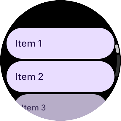
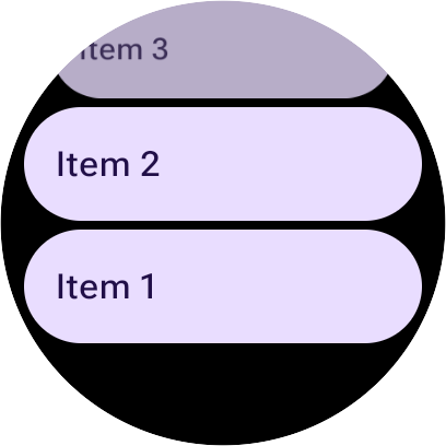
Edge buttons on lists
For Material 3, you can add an EdgeButton which is an edge-hugging button at
the bottom of the lists. However, take care not to add this as an item within
the TransformingLazyColumn but instead to use the edgeButton slot in the
ScreenScaffold.
Using the edgeButton slot ensures that the button is positioned correctly at
the bottom of the screen and behaves appropriately when the list is scrolled.
The following code snippet shows how to implement EdgeButton:
val columnState = rememberTransformingLazyColumnState() ScreenScaffold( scrollState = columnState, edgeButton = { EdgeButton( onClick = { /* TODO */ }, modifier = Modifier.scrollable( columnState, orientation = Orientation.Vertical, reverseDirection = true, // Apply overscroll to the EdgeButton for proper scrolling behavior. overscrollEffect = rememberOverscrollEffect(), ) ) { Text("More") } } ) { contentPadding -> TransformingLazyColumn( contentPadding = contentPadding, state = columnState, ) { // ... // ... } }
SwipeToReveal in Lists
The SwipeToReveal component lets you access actions for a list item, such
as a Card or Chip, by swiping. Swiping typically reveals one or two action
buttons (such as "Delete" or "More") from the side.
When using SwipeToReveal within a TransformingLazyColumn, follow these
guidelines:
- Reset on scroll: When the user scrolls the list, reset any swiped-open items to their covered state.
- Consistent heights: Set the action button heights to match the inner
swiped item (whether it's a
Buttonor aCard) to ensure a consistent look. - Transform the container: Apply the
transformedHeightmodifier andtransformationSpecto theSwipeToRevealcomponent itself. - Do not double-transform: Don't apply
transformedHeightortransformationmodifiers to the inner swiped item (the card or button inside theSwipeToRevealcontainer).
Recommended for you
- Note: link text is displayed when JavaScript is off
- Compose for Wear OS Codelab
- Lists and Grids
- Using Views in Compose