تنظيم صفحاتك في مجموعات
يمكنك حفظ المحتوى وتصنيفه حسب إعداداتك المفضّلة.
يعرض المكوّن Dialog رسائل منبثقة أو يطلب إدخال المستخدم في
طبقة فوق محتوى التطبيق الرئيسي. تؤدي إلى إنشاء تجربة واجهة مستخدم متداخلة لجذب انتباه المستخدمين.
تشمل حالات استخدام مربّع الحوار ما يلي:
تأكيد إجراء المستخدم، مثل حذف ملف
طلب إدخال المستخدم، مثل طلب إدخال بيانات في تطبيق قائمة المهام
عرض قائمة خيارات للمستخدم لاختيارها، مثل اختيار بلد في
إعداد الملف الشخصي
يتطلّب هذا التنفيذ ضبط الحد الأدنى من إصدار حزمة تطوير البرامج (SDK) لمشروعك على المستوى 21 من واجهة برمجة التطبيقات أو
مستوى أعلى.
التبعيات
إنشاء مربّع حوار تنبيه
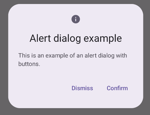
يقدّم العنصر القابل للتجميع AlertDialog واجهة برمجة تطبيقات ملائمة لإنشاء مربع حوار
بتصميم مستوحى من أسلوب Material Design. ينفِّذ المثال التالي زرَّين في
مربّع حوار تنبيه، أحدهما لإغلاق مربّع الحوار والآخر لتأكيد
طلبه:
يشير هذا التنفيذ إلى عنصر مكوّن رئيسي يُرسِل الوسيطات إلى العنصر المكوّن
الثانوي بهذه الطريقة:
النتائج
الشكل 1. مربّع حوار تنبيه مزوّد بأزرار
النقاط الرئيسية
يحتوي AlertDialog على مَعلمات محدّدة لمعالجة عناصر معيّنة من
المربّع الحواري. ومن بين هذه التحسينات ما يلي:
title: النص الذي يظهر في أعلى مربّع الحوار
text: النص الذي يظهر في وسط مربّع الحوار
icon: الرسم الذي يظهر في أعلى مربّع الحوار
onDismissRequest: الدالة التي يتمّ استدعاؤها عندما يغلِق المستخدِم مربّع الحوار،
مثلاً من خلال النقر خارج مربّع الحوار
dismissButton: عنصر قابل للتجميع يعمل كزر لإغلاق التطبيق
confirmButton: عنصر قابل للتجميع يعمل كزر تأكيد
عندما ينقر المستخدم على أيّ من الزرَّين، يتم إغلاق مربّع الحوار. عندما يُقرّ المستخدم على الإجراء، يتمّ استدعاء وظيفة تعالج أيضًا عملية التأكيد. في
هذا المثال، الدالتان هما onDismissRequest() و
onConfirmRequest().
في الحالات التي يتطلّب فيها مربّع الحوار مجموعة أكثر تعقيدًا من الأزرار، يمكنك
الاستفادة من استخدام عنصر Dialog القابل للتجميع وملؤه بطريقة
أكثر حرية.
إنشاء مربّع حوار
Dialog هو عنصر تركيبي أساسي لا يقدّم أيّ تنسيق أو
مواقع محدّدة مسبقًا للمحتوى. وهي حاوية بسيطة يجب
ملؤها بحاوية مثل Card. في ما يلي بعض المناقشات العميقة عن المَعلمات الرئيسية للمحادثة:
onDismissRequest: دالة lambda التي يتمّ استدعاؤها عندما يغلق المستخدِم مربّع الحوار
properties: مثيل DialogProperties يقدّم بعض
النطاق الإضافي للتخصيص
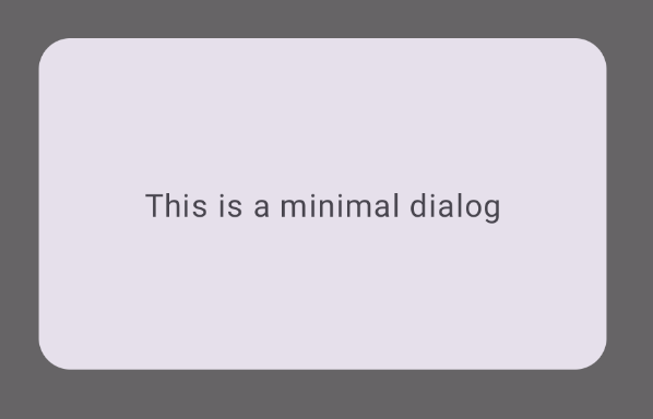
إنشاء مربّع حوار أساسي
المثال التالي هو عملية تنفيذ أساسية للعنصر القابل للتجميع Dialog. يُرجى ملاحظة
أنّه يستخدم Card كحاوية ثانوية. بدون الرمز Card، سيظهر المكوّن Text
بمفرده أعلى محتوى التطبيق الرئيسي.
النتيجة
يُرجى العلم أنّه عندما يكون مربّع الحوار مفتوحًا، يظهر محتوى التطبيق الرئيسي تحته
مظلمًا ورمماديًا:
الشكل 2. استخدام الحد الأدنى من مربّعات الحوار
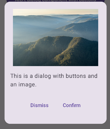
إنشاء مربّع حوار متقدّم
في ما يلي تنفيذ أكثر تقدمًا للعنصر القابل للتجميع Dialog. في
هذا الحالة، ينفِّذ المكوّن يدويًا واجهة مشابهة للمثال السابق
AlertDialog.
النتيجة
الشكل 3. مربّع حوار يتضمّن صورة
المجموعات التي تتضمّن هذا الدليل
هذا الدليل هو جزء من مجموعات الأدلة السريعة المنظَّمة التي تتناول
أهداف تطوير Android الأوسع نطاقًا:
النص الذي يظهر للمستخدم
يشكّل النص جزءًا أساسيًا من أي واجهة مستخدم. تعرَّف على الطرق المختلفة
التي يمكنك من خلالها عرض النص في تطبيقك لتوفير تجربة رائعة للمستخدم.
يخضع كل من المحتوى وعيّنات التعليمات البرمجية في هذه الصفحة للتراخيص الموضحّة في ترخيص استخدام المحتوى. إنّ Java وOpenJDK هما علامتان تجاريتان مسجَّلتان لشركة Oracle و/أو الشركات التابعة لها.
تاريخ التعديل الأخير: 2025-02-06 (حسب التوقيت العالمي المتفَّق عليه)
[[["يسهُل فهم المحتوى.","easyToUnderstand","thumb-up"],["ساعَدني المحتوى في حلّ مشكلتي.","solvedMyProblem","thumb-up"],["غير ذلك","otherUp","thumb-up"]],[["لا يحتوي على المعلومات التي أحتاج إليها.","missingTheInformationINeed","thumb-down"],["الخطوات معقدة للغاية / كثيرة جدًا.","tooComplicatedTooManySteps","thumb-down"],["المحتوى قديم.","outOfDate","thumb-down"],["ثمة مشكلة في الترجمة.","translationIssue","thumb-down"],["مشكلة في العيّنات / التعليمات البرمجية","samplesCodeIssue","thumb-down"],["غير ذلك","otherDown","thumb-down"]],["تاريخ التعديل الأخير: 2025-02-06 (حسب التوقيت العالمي المتفَّق عليه)"],[],[],null,["\u003cbr /\u003e\n\nThe [`Dialog`](/reference/kotlin/androidx/compose/ui/window/package-summary#Dialog(kotlin.Function0,androidx.compose.ui.window.DialogProperties,kotlin.Function0)) component displays pop-up messages or requests user input on a\nlayer above the main app content. It creates an interruptive UI experience to\ncapture user attention.\n\nAmong the use cases for a dialog are the following:\n\n- Confirming user action, such as when deleting a file.\n- Requesting user input, such as in a to-do list app.\n- Presenting a list of options for user selection, like choosing a country in a profile setup.\n\nThis topic provides the following implementations:\n\n- [Alert](#alert)\n- [Basic dialog](#basic)\n- [Advanced dialog](#advanced)\n\nVersion compatibility\n\nThis implementation requires that your project minSDK be set to API level 21 or\nhigher.\n\nDependencies\n\nCreate an Alert dialog\n\nThe [`AlertDialog`](/reference/kotlin/androidx/compose/material3/package-summary#AlertDialog(kotlin.Function0,kotlin.Function0,androidx.compose.ui.Modifier,kotlin.Function0,kotlin.Function0,kotlin.Function0,kotlin.Function0,androidx.compose.ui.graphics.Shape,androidx.compose.ui.graphics.Color,androidx.compose.ui.graphics.Color,androidx.compose.ui.graphics.Color,androidx.compose.ui.graphics.Color,androidx.compose.ui.unit.Dp,androidx.compose.ui.window.DialogProperties)) composable provides a convenient API for creating a\nMaterial Design themed dialog. The following example implements two buttons in\nan alert dialog, one that dismisses the dialog, and another that confirms its\nrequest:\n\nThis implementation implies a parent composable that passes arguments to the\nchild composable in this way:\n\nResults **Figure 1.** An alert dialog with buttons.\n\nKey points\n\n`AlertDialog` has specific parameters for handling particular elements of the\ndialog. Among them are the following:\n\n- `title`: The text that appears along the top of the dialog.\n- `text`: The text that appears centered within the dialog.\n- `icon`: The graphic that appears at the top of the dialog.\n- `onDismissRequest`: The function called when the user dismisses the dialog, such as by tapping outside of it.\n- `dismissButton`: A composable that serves as the dismiss button.\n- `confirmButton`: A composable that serves as the confirm button.\n\n- When the user clicks either of the buttons, the dialog closes. When the user\n clicks confirm, it calls a function that also handles the confirmation. In\n this example, those functions are `onDismissRequest()` and\n `onConfirmRequest()`.\n\n In cases where your dialog requires a more complex set of buttons, you may\n benefit from using the `Dialog` composable and populating it in a more\n freeform manner.\n\nCreate a dialog\n\n[`Dialog`](/reference/kotlin/androidx/compose/ui/window/package-summary#Dialog(kotlin.Function0,androidx.compose.ui.window.DialogProperties,kotlin.Function0)) is a basic composable that doesn't provide any styling or\npredefined slots for content. It is a straightforward container that you should\npopulate with a container such as `Card`. The following are some of the key\nparameters of a dialog:\n\n- **`onDismissRequest`**: The lambda called when the user closes the dialog.\n- **`properties`** : An instance of [`DialogProperties`](/reference/kotlin/androidx/compose/ui/window/DialogProperties) that provides some additional scope for customization.\n\n| **Caution:** You must manually specify the size and shape of `Dialog`. You also must provide an inner container.\n\nCreate a basic dialog\n\nThe following example is a basic implementation of the `Dialog` composable. Note\nthat it uses a `Card` as the secondary container. Without the `Card`, the `Text`\ncomponent would appear alone above the main app content.\n\nResult\n\nNote that when the dialog is open, the main app content beneath it appears\ndarkened and grayed out:\n**Figure 2.** Minimal dialog.\n\nCreate an advanced dialog\n\nThe following is a more advanced implemented of the `Dialog` composable. In this\ncase, the component manually implements a similar interface to the preceding\n`AlertDialog` example.\n| **Caution:** If you only need to display a two-button dialog as in this example, you should use `AlertDialog` and its more convenient API. However, if you want to create a more complex dialog, perhaps with forms and multiple buttons, you should use `Dialog` with custom content, as in the following example.\n\nResult **Figure 3.** A dialog that includes an image.\n\nCollections that contain this guide\n\nThis guide is part of these curated Quick Guide collections that cover\nbroader Android development goals: \n\nDisplay text \nText is a central piece of any UI. Find out different ways you can present text in your app to provide a delightful user experience. \n[Quick guide collection](/develop/ui/compose/quick-guides/collections/display-text) \n\nRequest user input \nLearn how to implement ways for users to interact with your app by entering text and using other means of input. \n[Quick guide collection](/develop/ui/compose/quick-guides/collections/request-user-input) \n\nDisplay interactive components \nLearn how composable functions can enable you to easily create beautiful UI components based on the Material Design design system. \n[Quick guide collection](/develop/ui/compose/quick-guides/collections/display-interactive-components) \n\nHave questions or feedback \nGo to our frequently asked questions page and learn about quick guides or reach out and let us know your thoughts. \n[Go to FAQ](/quick-guides/faq) [Leave feedback](https://issuetracker.google.com/issues/new?component=1573691&template=1993320)"]]