
The Dialog component displays pop-up messages or requests user input on a
layer above the main app content. It creates an interruptive UI experience to
capture user attention.
Among the use cases for a dialog are the following:
- Confirming user action, such as when deleting a file.
- Requesting user input, such as in a to-do list app.
- Presenting a list of options for user selection, like choosing a country in a profile setup.
This topic provides the following implementations:
Version compatibility
This implementation requires that your project minSDK be set to API level 21 or higher.
Dependencies
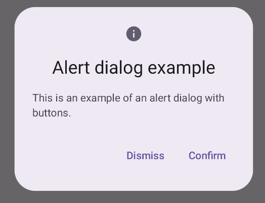
Create an Alert dialog
The AlertDialog composable provides a convenient API for creating a
Material Design themed dialog. The following example implements two buttons in
an alert dialog, one that dismisses the dialog, and another that confirms its
request:
This implementation implies a parent composable that passes arguments to the child composable in this way:
Results
Key points
AlertDialog has specific parameters for handling particular elements of the
dialog. Among them are the following:
title: The text that appears along the top of the dialog.text: The text that appears centered within the dialog.icon: The graphic that appears at the top of the dialog.onDismissRequest: The function called when the user dismisses the dialog, such as by tapping outside of it.dismissButton: A composable that serves as the dismiss button.confirmButton: A composable that serves as the confirm button.When the user clicks either of the buttons, the dialog closes. When the user clicks confirm, it calls a function that also handles the confirmation. In this example, those functions are
onDismissRequest()andonConfirmRequest().In cases where your dialog requires a more complex set of buttons, you may benefit from using the
Dialogcomposable and populating it in a more freeform manner.
Create a dialog
Dialog is a basic composable that doesn't provide any styling or
predefined slots for content. It is a straightforward container that you should
populate with a container such as Card. The following are some of the key
parameters of a dialog:
onDismissRequest: The lambda called when the user closes the dialog.properties: An instance ofDialogPropertiesthat provides some additional scope for customization.
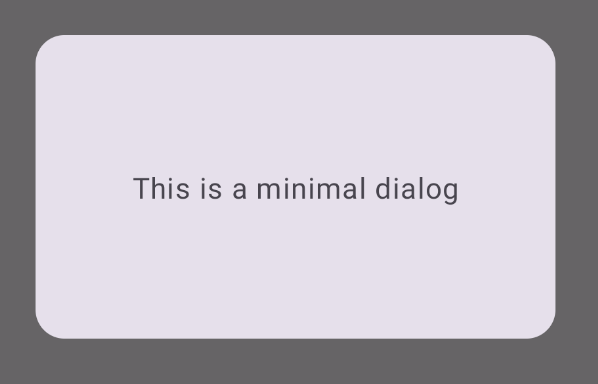
Create a basic dialog
The following example is a basic implementation of the Dialog composable. Note
that it uses a Card as the secondary container. Without the Card, the Text
component would appear alone above the main app content.
Result
Note that when the dialog is open, the main app content beneath it appears darkened and grayed out:
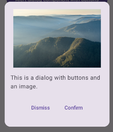
Create an advanced dialog
The following is a more advanced implemented of the Dialog composable. In this
case, the component manually implements a similar interface to the preceding
AlertDialog example.
Result
Collections that contain this guide
This guide is part of these curated Quick Guide collections that cover broader Android development goals:
Display text
Request user input
Display interactive components