สร้างเมนูแบบเลื่อนเข้าด้วยคอมโพเนนต์ลิ้นชักการนำทาง
จัดทุกอย่างให้เป็นระเบียบอยู่เสมอด้วยคอลเล็กชัน
บันทึกและจัดหมวดหมู่เนื้อหาตามค่ากำหนดของคุณ
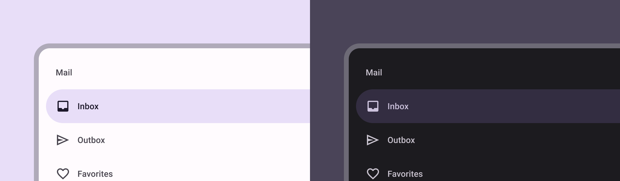
คอมโพเนนต์ลิ้นชักการนำทางคือเมนูแบบเลื่อนเข้าที่ช่วยให้ผู้ใช้ได้ไปยังส่วนต่างๆ ของแอป โดยผู้ใช้สามารถเปิดใช้งานลิ้นชักการนำทางด้วยการปัดจากด้านข้างหรือแตะไอคอนเมนู
พิจารณากรณีการใช้งาน 3 กรณีต่อไปนี้ในการใช้ลิ้นชักการนำทาง
- การจัดระเบียบเนื้อหา: อนุญาตให้ผู้ใช้สลับระหว่างหมวดหมู่ต่างๆ เช่น ในแอปข่าวหรือการเขียนบล็อก
- การจัดการบัญชี: แสดงลิงก์ด่วนไปยังการตั้งค่าบัญชีและส่วนโปรไฟล์ในแอปที่มีบัญชีผู้ใช้
- การค้นพบฟีเจอร์: จัดระเบียบฟีเจอร์และการตั้งค่าหลายรายการไว้ในเมนูเดียวเพื่ออำนวยความสะดวกในการค้นพบและการเข้าถึงของผู้ใช้ในแอปที่ซับซ้อน
ใน Material Design ลิ้นชักการนำทางมี 2 ประเภท ได้แก่
- มาตรฐาน: แชร์พื้นที่ภายในหน้าจอกับเนื้อหาอื่นๆ
- โมดัล: ปรากฏเหนือเนื้อหาอื่นๆ ภายในหน้าจอ
ความเข้ากันได้ของเวอร์ชัน
การใช้งานนี้กำหนดให้โปรเจ็กต์ของคุณตั้งค่า minSDK เป็น API ระดับ 21 ขึ้นไป
ทรัพยากร Dependency
ใช้ลิ้นชักการนำทาง
คุณสามารถใช้คอมโพสิชัน ModalNavigationDrawer
เพื่อติดตั้งใช้งานลิ้นชักการนำทางได้ ดังนี้
ข้อมูลสำคัญ
ใช้ช่อง drawerContent
เพื่อระบุ ModalDrawerSheet
และระบุเนื้อหาของลิ้นชัก
ModalNavigationDrawer
ยอมรับพารามิเตอร์ลิ้นชักเพิ่มเติมจํานวนหนึ่ง
ตัวอย่างเช่น คุณสามารถสลับการตั้งค่าว่าลิ้นชักจะตอบสนองต่อการลากหรือไม่ด้วยพารามิเตอร์ gesturesEnabled
ดังตัวอย่างต่อไปนี้
ควบคุมลักษณะการทำงานของลิ้นชักการนำทาง
หากต้องการควบคุมวิธีเปิดและปิดลิ้นชัก ให้ใช้ DrawerState
ดังนี้
ข้อมูลสำคัญ
- ส่ง
DrawerState
ไปยัง ModalNavigationDrawer
โดยใช้พารามิเตอร์ drawerState
DrawerState
ให้สิทธิ์เข้าถึงฟังก์ชัน open
และ close
รวมถึงพร็อพเพอร์ตี้ที่เกี่ยวข้องกับสถานะลิ้นชักปัจจุบัน ฟังก์ชันที่ระงับเหล่านี้ต้องใช้ CoroutineScope
ซึ่งคุณสร้างอินสแตนซ์ได้โดยใช้ rememberCoroutineScope
นอกจากนี้ คุณยังเรียกใช้ฟังก์ชันการระงับเพื่อตอบสนองต่อเหตุการณ์ UI ได้ด้วย
ผลลัพธ์
รูปที่ 1 ลิ้นชักการนำทางแบบมาตรฐาน (ซ้าย) และลิ้นชักการนำทางแบบโมดัล (ขวา)
คอลเล็กชันที่มีคู่มือนี้
คู่มือนี้เป็นส่วนหนึ่งของคอลเล็กชันคู่มือแนะนำโดยผู้เชี่ยวชาญที่ครอบคลุมเป้าหมายการพัฒนา Android ที่กว้างขึ้น ดังนี้
แสดงคอมโพเนนต์แบบอินเทอร์แอกทีฟ
ดูวิธีที่ฟังก์ชันคอมโพสิเบิลช่วยให้คุณสร้างคอมโพเนนต์ UI ที่สวยสะดุดตาตามระบบการออกแบบ Material Design ได้อย่างง่ายดาย
ตัวอย่างเนื้อหาและโค้ดในหน้าเว็บนี้ขึ้นอยู่กับใบอนุญาตที่อธิบายไว้ในใบอนุญาตการใช้เนื้อหา Java และ OpenJDK เป็นเครื่องหมายการค้าหรือเครื่องหมายการค้าจดทะเบียนของ Oracle และ/หรือบริษัทในเครือ
อัปเดตล่าสุด 2025-02-06 UTC
[[["เข้าใจง่าย","easyToUnderstand","thumb-up"],["แก้ปัญหาของฉันได้","solvedMyProblem","thumb-up"],["อื่นๆ","otherUp","thumb-up"]],[["ไม่มีข้อมูลที่ฉันต้องการ","missingTheInformationINeed","thumb-down"],["ซับซ้อนเกินไป/มีหลายขั้นตอนมากเกินไป","tooComplicatedTooManySteps","thumb-down"],["ล้าสมัย","outOfDate","thumb-down"],["ปัญหาเกี่ยวกับการแปล","translationIssue","thumb-down"],["ตัวอย่าง/ปัญหาเกี่ยวกับโค้ด","samplesCodeIssue","thumb-down"],["อื่นๆ","otherDown","thumb-down"]],["อัปเดตล่าสุด 2025-02-06 UTC"],[],[],null,["\u003cbr /\u003e\n\nThe [navigation drawer](https://material.io/components/navigation-drawer) component is a slide-in menu that lets users navigate\nto various sections of your app. Users can activate it by swiping from the side\nor tapping a menu icon.\n\nConsider these three use cases for implementing a navigation drawer:\n\n- **Content organization:** Enable users to switch between different categories, such as in news or blogging apps.\n- **Account management:** Provide quick links to account settings and profile sections in apps with user accounts.\n- **Feature discovery:** Organize multiple features and settings in a single menu to facilitate user discovery and access in complex apps.\n\nIn Material Design, there are two types of navigation drawers:\n\n- **Standard:** Share space within a screen with other content.\n- **Modal:** Appears over the top of other content within a screen.\n\nVersion compatibility\n\nThis implementation requires that your project minSDK be set to API level 21 or\nhigher.\n\nDependencies\n\nImplement a navigation drawer\n\nYou can use the [`ModalNavigationDrawer`](/reference/kotlin/androidx/compose/material3/package-summary#ModalNavigationDrawer(kotlin.Function0,androidx.compose.ui.Modifier,androidx.compose.material3.DrawerState,kotlin.Boolean,androidx.compose.ui.graphics.Color,kotlin.Function0)) composable to implement a\nnavigation drawer:\n\nKey points\n\n- Use the `drawerContent` slot to provide a [`ModalDrawerSheet`](/reference/kotlin/androidx/compose/material3/package-summary#ModalDrawerSheet(androidx.compose.ui.Modifier,androidx.compose.ui.graphics.Shape,androidx.compose.ui.graphics.Color,androidx.compose.ui.graphics.Color,androidx.compose.ui.unit.Dp,androidx.compose.foundation.layout.WindowInsets,kotlin.Function1)) and\n provide the drawer's contents.\n\n- `ModalNavigationDrawer` accepts a number of additional drawer parameters.\n For example, you can toggle whether or not the drawer responds to drags with\n the `gesturesEnabled` parameter as in the following example:\n\nControl navigation drawer behavior\n\nTo control how the drawer opens and closes, use [`DrawerState`](/reference/kotlin/androidx/compose/material3/DrawerState):\n\nKey points\n\n- Pass a `DrawerState` to `ModalNavigationDrawer` using the `drawerState` parameter.\n- `DrawerState` provides access to the [`open`](/reference/kotlin/androidx/compose/material3/DrawerState#open) and [`close`](/reference/kotlin/androidx/compose/material3/DrawerState#close) functions, as well as properties related to the current drawer state. These suspending functions require a `CoroutineScope`, which you can instantiate using [`rememberCoroutineScope`](/reference/kotlin/androidx/compose/runtime/package-summary#remembercoroutinescope). You can also call the suspending functions in response to UI events.\n\nResults\n\n\n**Figure 1.** A standard navigation drawer (left) and a modal navigation drawer (right).\n\n\u003cbr /\u003e\n\nCollections that contain this guide\n\nThis guide is part of these curated Quick Guide collections that cover\nbroader Android development goals: \n\nDisplay interactive components \nLearn how composable functions can enable you to easily create beautiful UI components based on the Material Design design system. \n[Quick guide collection](/develop/ui/compose/quick-guides/collections/display-interactive-components) \n\nHave questions or feedback \nGo to our frequently asked questions page and learn about quick guides or reach out and let us know your thoughts. \n[Go to FAQ](/quick-guides/faq) [Leave feedback](https://issuetracker.google.com/issues/new?component=1573691&template=1993320)"]]