使用導覽匣元件建立滑入式選單
透過集合功能整理內容
你可以依據偏好儲存及分類內容。
「導覽匣」元件是滑入式選單,可讓使用者前往應用程式的各個部分。使用者可以從側邊滑動或輕觸選單圖示來啟用此元件。
請考慮實作導覽匣的三種用途:
- 內容分類:讓使用者在不同類別之間切換,例如在新聞或網誌應用程式中。
- 帳戶管理:提供帳戶設定和個人資料區段的快速連結,讓使用者可透過應用程式存取帳戶。
- 功能探索:將多項功能和設定整理至單一選單,方便使用者在複雜的應用程式中進行探索及存取。
Material Design 有兩種導覽匣:
- 標準:與其他內容共用畫面空間。
- 模式:會顯示在畫面中其他內容的上方。
版本相容性
這個實作方式需要將專案 minSDK 設為 API 級別 21 以上。
依附元件
實作導覽匣
您可以使用 ModalNavigationDrawer 可組合項來實作導覽匣:
重點
控管導覽匣行為
如要控制抽屜的開啟和關閉方式,請使用 DrawerState:
重點
- 使用
drawerState 參數將 DrawerState 傳遞至 ModalNavigationDrawer。
DrawerState 提供 open 和 close 函式的存取權,以及與目前導覽匣狀態相關的屬性。這些暫停函式需要 CoroutineScope,您可以使用 rememberCoroutineScope 將其例項化。您也可以呼叫暫停函式,回應 UI 事件。
結果
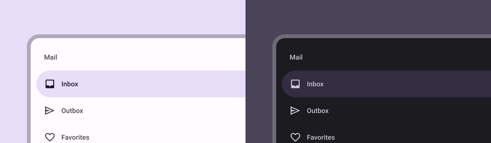
圖 1. 標準導覽匣 (左) 和模態導覽匣 (右)。
包含此指南的集合
本指南是精選的快速指南系列之一,涵蓋更廣泛的 Android 開發目標:
顯示互動式元件
瞭解可組合函式如何讓您輕鬆根據 Material Design 設計系統,建立美觀的 UI 元件。
這個頁面中的內容和程式碼範例均受《內容授權》中的授權所規範。Java 與 OpenJDK 是 Oracle 和/或其關係企業的商標或註冊商標。
上次更新時間:2025-02-06 (世界標準時間)。
[[["容易理解","easyToUnderstand","thumb-up"],["確實解決了我的問題","solvedMyProblem","thumb-up"],["其他","otherUp","thumb-up"]],[["缺少我需要的資訊","missingTheInformationINeed","thumb-down"],["過於複雜/步驟過多","tooComplicatedTooManySteps","thumb-down"],["過時","outOfDate","thumb-down"],["翻譯問題","translationIssue","thumb-down"],["示例/程式碼問題","samplesCodeIssue","thumb-down"],["其他","otherDown","thumb-down"]],["上次更新時間:2025-02-06 (世界標準時間)。"],[],[],null,["\u003cbr /\u003e\n\nThe [navigation drawer](https://material.io/components/navigation-drawer) component is a slide-in menu that lets users navigate\nto various sections of your app. Users can activate it by swiping from the side\nor tapping a menu icon.\n\nConsider these three use cases for implementing a navigation drawer:\n\n- **Content organization:** Enable users to switch between different categories, such as in news or blogging apps.\n- **Account management:** Provide quick links to account settings and profile sections in apps with user accounts.\n- **Feature discovery:** Organize multiple features and settings in a single menu to facilitate user discovery and access in complex apps.\n\nIn Material Design, there are two types of navigation drawers:\n\n- **Standard:** Share space within a screen with other content.\n- **Modal:** Appears over the top of other content within a screen.\n\nVersion compatibility\n\nThis implementation requires that your project minSDK be set to API level 21 or\nhigher.\n\nDependencies\n\nImplement a navigation drawer\n\nYou can use the [`ModalNavigationDrawer`](/reference/kotlin/androidx/compose/material3/package-summary#ModalNavigationDrawer(kotlin.Function0,androidx.compose.ui.Modifier,androidx.compose.material3.DrawerState,kotlin.Boolean,androidx.compose.ui.graphics.Color,kotlin.Function0)) composable to implement a\nnavigation drawer:\n\nKey points\n\n- Use the `drawerContent` slot to provide a [`ModalDrawerSheet`](/reference/kotlin/androidx/compose/material3/package-summary#ModalDrawerSheet(androidx.compose.ui.Modifier,androidx.compose.ui.graphics.Shape,androidx.compose.ui.graphics.Color,androidx.compose.ui.graphics.Color,androidx.compose.ui.unit.Dp,androidx.compose.foundation.layout.WindowInsets,kotlin.Function1)) and\n provide the drawer's contents.\n\n- `ModalNavigationDrawer` accepts a number of additional drawer parameters.\n For example, you can toggle whether or not the drawer responds to drags with\n the `gesturesEnabled` parameter as in the following example:\n\nControl navigation drawer behavior\n\nTo control how the drawer opens and closes, use [`DrawerState`](/reference/kotlin/androidx/compose/material3/DrawerState):\n\nKey points\n\n- Pass a `DrawerState` to `ModalNavigationDrawer` using the `drawerState` parameter.\n- `DrawerState` provides access to the [`open`](/reference/kotlin/androidx/compose/material3/DrawerState#open) and [`close`](/reference/kotlin/androidx/compose/material3/DrawerState#close) functions, as well as properties related to the current drawer state. These suspending functions require a `CoroutineScope`, which you can instantiate using [`rememberCoroutineScope`](/reference/kotlin/androidx/compose/runtime/package-summary#remembercoroutinescope). You can also call the suspending functions in response to UI events.\n\nResults\n\n\n**Figure 1.** A standard navigation drawer (left) and a modal navigation drawer (right).\n\n\u003cbr /\u003e\n\nCollections that contain this guide\n\nThis guide is part of these curated Quick Guide collections that cover\nbroader Android development goals: \n\nDisplay interactive components \nLearn how composable functions can enable you to easily create beautiful UI components based on the Material Design design system. \n[Quick guide collection](/develop/ui/compose/quick-guides/collections/display-interactive-components) \n\nHave questions or feedback \nGo to our frequently asked questions page and learn about quick guides or reach out and let us know your thoughts. \n[Go to FAQ](/quick-guides/faq) [Leave feedback](https://issuetracker.google.com/issues/new?component=1573691&template=1993320)"]]

