
After you understand how to handle different watch shapes, decide which surface you want to use.
Common app layouts include the following:
- Single screen (simplest): UI elements are limited to what is visible at one time without scrolling.
- Vertical container (most common): content exists beyond the viewable portion of the screen and is accessible by scrolling.
- Other options: lists, paging, or 2D panning.
These layout types are described in the sections that follow. You can use a combination of layout types if you need multiple screens.
Note: For your activity, inherit from either a
ComponentActivity or, if you use fragments, a FragmentActivity.
The other activity types use mobile-specific UI elements that you don't need for Wear OS.
Single screen
The user sees all elements in a single screen without scrolling. This means you can include only a small number of elements.
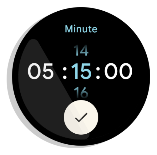
Figure 1. An example of a single screen layout.
Single screens work well with a
BoxInsetLayout
in combination with a
ConstraintLayout
to arrange your elements.
Vertical container
A vertical container is the most common type of app layout. Some content isn't visible on the screen, but it is accessible by scrolling.
Figure 2 shows several complete app layouts in which only a portion of the content can be seen on the circular screen of a watch. In these examples, the main content is in the top portion of the container, and other Critical User Journeys (CUJs) and settings are at the bottom. This is a best practice for laying out content.
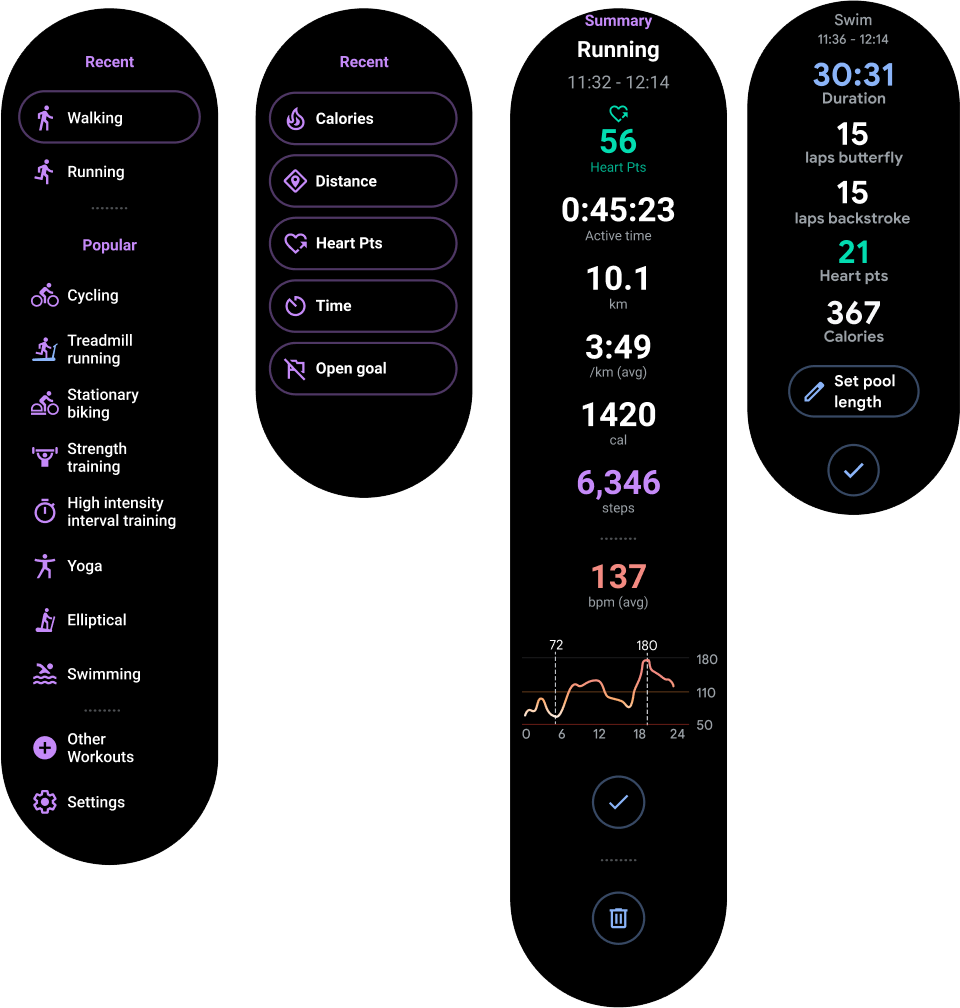
Figure 2. Examples of vertical container layouts.
Unlike in a single screen app layout, don't use BoxInsetLayout. Instead, use
a ConstraintLayout inside a
NestedScrollView.
Inside the ConstraintLayout, place whatever widgets make the most sense for
your app. This lets you take advantage of the extra space on the sides of a circular display.
Figure 3. Content in a ConstraintLayout inside a
NestedScrollView.
Make sure the content at the top and bottom of your vertical container is small enough to fit in the top and bottom of a circular display, as in the example in figure 3.
Note:
When possible, add a scroll indicator to your NestedScrollView by setting
android:scrollbars="vertical" in the XML. This helps users identify that there is
more content available and helps them see where they are in relation to all the content.
Other options for app layouts
-
Lists: display large sets of data with the
WearableRecyclerViewwidget optimized for Wearable surfaces. For more information, see Create lists on Wear OS. - Horizontal paging: for use cases with multiple sibling screens, use a horizontal swipe. If you use horizontal paging, you must support swipe-to-dismiss for the left edge.
- 2D Panning: for use cases like maps, users can drag to pan in different directions. Enable swipe-to-dismiss if your activity takes up the entire screen.