
The Switch component lets users toggle between two states: checked
and unchecked. Use a switch to let the user to do one of the
following:
- Toggle a setting on or off.
- Enable or disable a feature.
- Select an option.
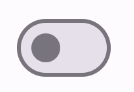
The component has two parts: the thumb and the track. The thumb is the draggable part of the switch, and the track is the background. The user can drag the thumb to the left or right to change the state of the switch. They can also tap the switch to check and clear it.
Version compatibility
This implementation requires that your project minSDK be set to API level 21 or higher.
Dependencies
Implement a switch
The following example is a minimal implementation of the Switch composable:
Results

Create a custom thumb
You can pass any composable for the thumbContent parameter to create a custom
thumb. The following is an example of a switch that uses a custom icon for its
thumb:
Results
The unchecked appearance is the same as the example in the preceding section. However, when checked, this implementation appears as follows:
Use custom colors
Use the colors parameter to
change the color of a switch's thumb and track, taking into account whether the
switch is checked.
Results

Key points
Basic parameters:
checked: The initial state of the switch.onCheckedChange: A callback that is called when the state of the switch changes.enabled: Whether the switch is enabled or disabled.colors: The colors used for the switch.
Advanced parameters
thumbContent: Use this to customize the appearance of the thumb when it is checked.colors: Use this to customize the color of the track and thumb.
Collections that contain this guide
This guide is part of these curated Quick Guide collections that cover broader Android development goals:

Display interactive components