
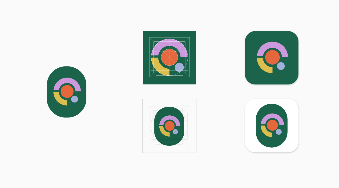
Google Play 上的应用和游戏现已采用新的图标系统,可根据 Google Play 的各种界面布局、设备类型和设备调整各种开发者效果图,进而为 Google Play 打造简洁一致的外观。
统一的图标形状在视觉上更具吸引力,也让画面更加一目了然,有助于将用户的注意力集中到图片本身,而非图标的外在形状。统一的形状还能解决随机空白区域导致的对齐问题,从而更好地呈现标题、评分和价格等周边信息。
本页介绍了为应用创建 Google Play 商品详情素材资源时需要遵循的指南。例如,Google Play 会为您的应用图标动态呈现圆角和阴影,因此您在原始素材资源中可省去这些设计。
重要提示:本页仅说明了 Google Play 图标相关信息,如果您有兴趣详细了解如何制作 APK 启动器图标,请参考以下资源:
- Android 自适应图标
请遵循这些 APK 图标指南,了解如何制作在 Android 8.0(API 级别 26)中推出的自适应启动器图标。 - 产品图标
了解产品图标的 Material Design 原则,包括图标设计、形状、规范和处理指南。
创建素材资源
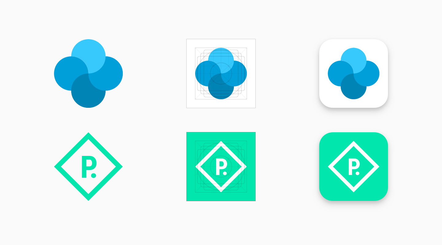
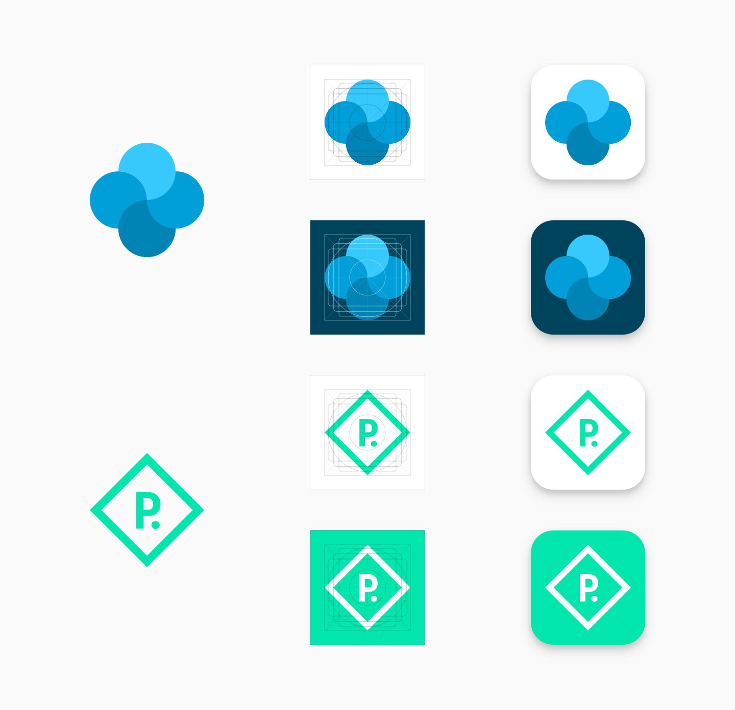
本部分介绍了您为 Google Play 中的应用创建可视化素材资源时应遵循的一些指南。
属性
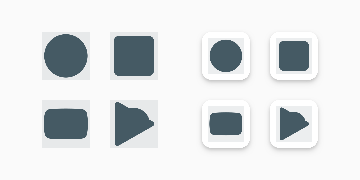
您可以用图标图片填充整个素材资源空间,也可以设计徽标等图片元素并放置到框线网格上。放置图片时,请以框线作为参考,但这不是硬性规定。
制作图片时,请确保图片符合以下要求:
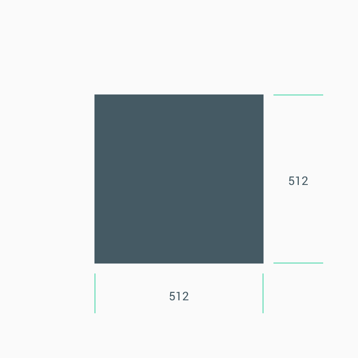
- 最终尺寸:512 x 512 像素
- 格式:32 位 PNG
- 颜色空间:sRGB
- 文件大小上限:1024KB
- 形状:完整正方形 - Google Play 会动态处理遮盖部分。半径相当于图标大小的 20%。
- 阴影:无 - Google Play 会动态处理阴影。请参阅下文的“阴影”部分,了解如何在图片中添加阴影。
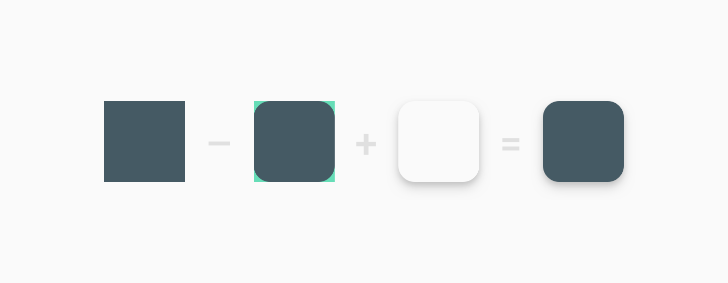
素材资源上传后,Google Play 会动态应用圆角遮盖部分和阴影,确保所有应用/游戏图标的设计保持一致。
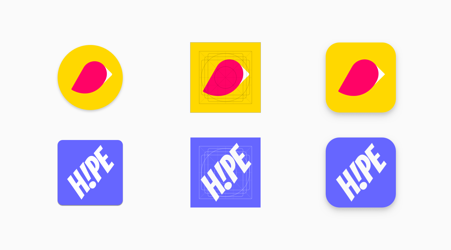
大小
处理极简图片时,请将整个素材资源空间用作背景。
放置徽标等图片元素时,请使用框线作为参考。
请勿强制将您的徽标或图片铺满整个素材资源空间。建议您改用框线网格来调整。
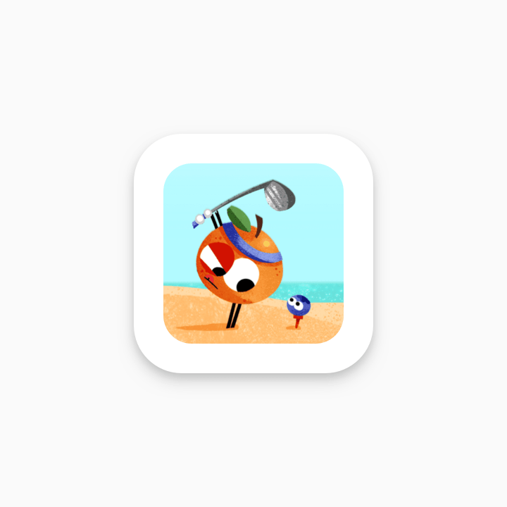
错误
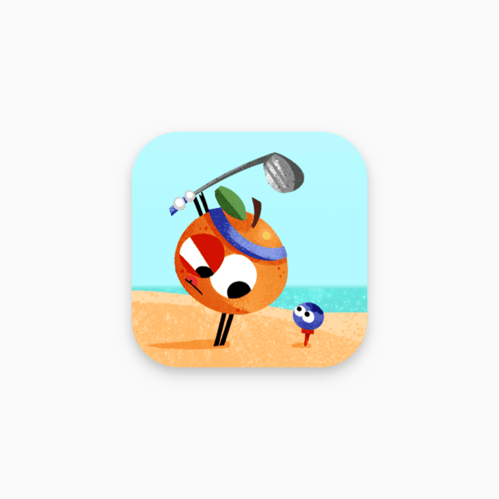
正确
一般来说,插图图片以全宽图标呈现的效果比较好。
错误
正确
以下是会误导用户和违反 Play 开发者政策的图标元素示例。请避免以下所有做法,并参阅 Google Play 的“元数据”政策和“用户评分、评价和安装次数”政策,以获取进一步的指导。
错误做法
错误做法
错误做法
错误做法
阴影
图标上传后,Google Play 会以动态方式在最终图标周围添加阴影。
在图标图片中添加阴影时,请遵循 Google Material 指南,以便与 Android 平台设计保持一致。
错误
正确
角半径
Google Play 会以动态方式应用圆角半径。这可以确保图标针对不同界面布局调整大小时,能够保持一致。半径相当于图标大小的 20%。
错误
正确
品牌适应
如果徽标的形状非常重要,请勿强制将图片调整为全宽配置, 而应将其放置在新的框线网格上。
如果可能,请为素材资源选择适合您品牌的背景颜色,不要保留任何透明部分。透明的素材资源会显示 Google Play 界面的背景颜色。
如果徽标四周没有明显的形状来确定其边界,请将其放到全宽背景中。
如果您的图片设计足够灵活,可以考虑调整图片,以便充分利用素材资源的大小。如果无法做到这一点,可改回将徽标放置在框线网格上。
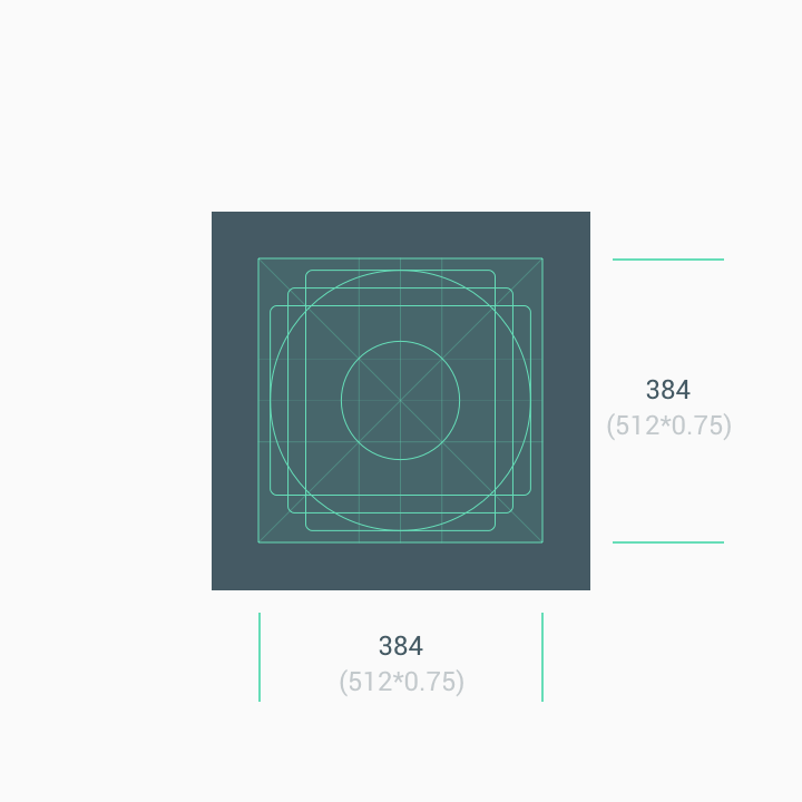
旧版模式
原有的图标素材资源如未根据新规范更新,最终都会迁移到旧版模式,并依据框线网格缩小为 75% 的大小(512 * 0.75 = 384 像素)。
自 2019 年 5 月起,系统将不允许按原来的规范上传图标。有关详情,请参阅时间线。
面向 API 用户的说明
API 用户的迁移日期略有不同,但最终结果都是在 2019 年 6 月 24 日之前需要使所有图标遵守新规范,否则自动转换为“旧版模式”。
在 2019 年 6 月 17 日之前,开发者必须使用 Play 管理中心对其图标应用新规范。所有对 Edits.images: upload 的调用都将应用在 Play 管理中心中配置的规范。无法通过 API 应用新规范。如果仍然应用旧规范,则 Edits.images: upload 调用可能会出错,并且该特定图标的错误消息会将您指向此规范。使用 Play 管理中心应用新规范后,您可以重试 Edits.images: upload 调用。您可能需要多次重试该调用,它才能成功。
从 2019 年 6 月 17 日开始,对 Edits.images: upload 的所有 API 调用都会自动对图标应用新规范。2019 年 6 月 17 日之后,您只能上传符合新规范的图标。
下载设计模板和资源
要开始使用,请下载下面的其中一个素材资源模板:
- Sketch 模板 (.sketch)
- Illustrator 模板 (.ai)
- Photoshop 模板 (.psd)