Kullanıcı girişi isteklerini veya pop-up mesajları gösterme
Koleksiyonlar ile düzeninizi koruyun
İçeriği tercihlerinize göre kaydedin ve kategorilere ayırın.
Dialog bileşeni, ana uygulama içeriğinin üstündeki bir katmanda pop-up mesajlar gösterir veya kullanıcıdan giriş ister. Kullanıcıların dikkatini çekmek için kesintiye uğratan bir kullanıcı arayüzü deneyimi oluşturur.
İletişim kutularının kullanım alanları arasında şunlar yer alır:
Kullanıcının işlemini onaylama (ör. dosya silme)
Kullanıcıdan giriş isteğinde bulunma (ör. yapılacaklar listesi uygulamasında)
Profil kurulumunda ülke seçme gibi kullanıcı seçimi için seçeneklerin listesini sunma
Bu uygulama için projenizin minSDK değerinin API düzeyi 21 veya üstü olarak ayarlanması gerekir.
Bağımlılıklar
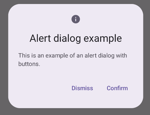
Uyarı iletişim kutusu oluşturma
AlertDialog bileşeni, Material Design temalı bir iletişim kutusu oluşturmak için kullanışlı bir API sağlar. Aşağıdaki örnekte, uyarı iletişim kutusunda biri iletişim kutusunu kapatan, diğeri ise isteği onaylayan iki düğme uygulanmaktadır:
Bu uygulama, alt composable'a şu şekilde bağımsız değişkenler aktaran bir üst composable içerir:
Sonuçlar
Şekil 1. Düğmeler içeren bir uyarı iletişim kutusu.
Önemli noktalar
AlertDialog, iletişim kutusunun belirli öğelerini işlemek için özel parametrelere sahiptir. Bunlardan bazıları şunlardır:
title: İletişim kutusunun üst kısmında görünen metin.
text: İletişim kutusunun ortasında görünen metin.
icon: İletişim kutusunun üst kısmında görünen grafik.
onDismissRequest: Kullanıcı iletişim kutusunu kapattığında (ör. iletişim kutusunun dışına dokunarak) çağrılan işlev.
dismissButton: Kapatma düğmesi işlevi gören bir kompozisyon.
confirmButton: Onay düğmesi olarak kullanılan bir bileşen.
Kullanıcı düğmelerden birini tıkladığında iletişim kutusu kapanır. Kullanıcı onay'ı tıkladığında, onayı da işleyen bir işlev çağrılır. Bu örnekte bu işlevler onDismissRequest() ve onConfirmRequest()'tir.
İletişim kutunuz için daha karmaşık bir düğme grubu gerekiyorsa Dialog bileşenini kullanarak ve daha serbest bir şekilde doldurarak fayda sağlayabilirsiniz.
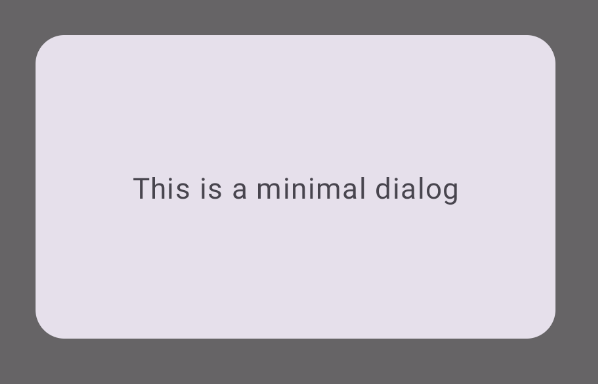
İletişim kutusu oluşturma
Dialog, içerik için herhangi bir stil veya önceden tanımlanmış yuva sağlamayan temel bir bileşendir. Card gibi bir kapsayıcıyla doldurmanız gereken basit bir kapsayıcıdır. Aşağıda, bir iletişim kutusunun temel parametrelerinden bazıları verilmiştir:
onDismissRequest: Kullanıcı iletişim kutusunu kapattığında çağrılan lambda.
properties: Özelleştirme için ek kapsam sağlayan bir DialogProperties örneği.
Temel bir iletişim kutusu oluşturma
Aşağıdaki örnek, Dialog bileşeninin temel bir uygulamasıdır. İkincil kapsayıcı olarak Card kullanıldığını unutmayın. Card olmadan Text bileşeni, ana uygulama içeriğinin üstünde tek başına görünür.
Sonuç
İletişim kutusu açıkken altındaki ana uygulama içeriğinin karartılmış ve devre dışı göründüğünü unutmayın:
Şekil 2. Minimum düzeyde iletişim.
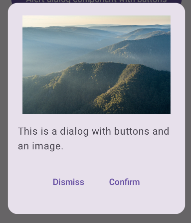
Gelişmiş iletişim kutusu oluşturma
Aşağıda, Dialog bileşeninin daha gelişmiş bir uygulaması verilmiştir. Bu durumda bileşen, önceki AlertDialog örneğine benzer bir arayüzü manuel olarak uygular.
Sonuç
Şekil 3. Resim içeren bir iletişim kutusu.
Bu kılavuzu içeren koleksiyonlar
Bu kılavuz, daha geniş Android geliştirme hedeflerini kapsayan, özel olarak seçilmiş Hızlı Kılavuz koleksiyonlarından biridir:
Görünen metin
Metin, her kullanıcı arayüzünün temel bileşenidir. Kullanıcılara keyifli bir deneyim sunmak için uygulamanızda metinleri sunmanın farklı yollarını öğrenin.
Birleştirilebilir işlevlerin, Materyal Tasarım tasarım sistemine dayalı güzel kullanıcı arayüzü bileşenleri oluşturmanızı nasıl kolaylaştırabileceğini öğrenin.
Bu sayfadaki içerik ve kod örnekleri, İçerik Lisansı sayfasında açıklanan lisanslara tabidir. Java ve OpenJDK, Oracle ve/veya satış ortaklarının tescilli ticari markasıdır.
Son güncelleme tarihi: 2025-02-06 UTC.
[[["Anlaması kolay","easyToUnderstand","thumb-up"],["Sorunumu çözdü","solvedMyProblem","thumb-up"],["Diğer","otherUp","thumb-up"]],[["İhtiyacım olan bilgiler yok","missingTheInformationINeed","thumb-down"],["Çok karmaşık / çok fazla adım var","tooComplicatedTooManySteps","thumb-down"],["Güncel değil","outOfDate","thumb-down"],["Çeviri sorunu","translationIssue","thumb-down"],["Örnek veya kod sorunu","samplesCodeIssue","thumb-down"],["Diğer","otherDown","thumb-down"]],["Son güncelleme tarihi: 2025-02-06 UTC."],[],[],null,["\u003cbr /\u003e\n\nThe [`Dialog`](/reference/kotlin/androidx/compose/ui/window/package-summary#Dialog(kotlin.Function0,androidx.compose.ui.window.DialogProperties,kotlin.Function0)) component displays pop-up messages or requests user input on a\nlayer above the main app content. It creates an interruptive UI experience to\ncapture user attention.\n\nAmong the use cases for a dialog are the following:\n\n- Confirming user action, such as when deleting a file.\n- Requesting user input, such as in a to-do list app.\n- Presenting a list of options for user selection, like choosing a country in a profile setup.\n\nThis topic provides the following implementations:\n\n- [Alert](#alert)\n- [Basic dialog](#basic)\n- [Advanced dialog](#advanced)\n\nVersion compatibility\n\nThis implementation requires that your project minSDK be set to API level 21 or\nhigher.\n\nDependencies\n\nCreate an Alert dialog\n\nThe [`AlertDialog`](/reference/kotlin/androidx/compose/material3/package-summary#AlertDialog(kotlin.Function0,kotlin.Function0,androidx.compose.ui.Modifier,kotlin.Function0,kotlin.Function0,kotlin.Function0,kotlin.Function0,androidx.compose.ui.graphics.Shape,androidx.compose.ui.graphics.Color,androidx.compose.ui.graphics.Color,androidx.compose.ui.graphics.Color,androidx.compose.ui.graphics.Color,androidx.compose.ui.unit.Dp,androidx.compose.ui.window.DialogProperties)) composable provides a convenient API for creating a\nMaterial Design themed dialog. The following example implements two buttons in\nan alert dialog, one that dismisses the dialog, and another that confirms its\nrequest:\n\nThis implementation implies a parent composable that passes arguments to the\nchild composable in this way:\n\nResults **Figure 1.** An alert dialog with buttons.\n\nKey points\n\n`AlertDialog` has specific parameters for handling particular elements of the\ndialog. Among them are the following:\n\n- `title`: The text that appears along the top of the dialog.\n- `text`: The text that appears centered within the dialog.\n- `icon`: The graphic that appears at the top of the dialog.\n- `onDismissRequest`: The function called when the user dismisses the dialog, such as by tapping outside of it.\n- `dismissButton`: A composable that serves as the dismiss button.\n- `confirmButton`: A composable that serves as the confirm button.\n\n- When the user clicks either of the buttons, the dialog closes. When the user\n clicks confirm, it calls a function that also handles the confirmation. In\n this example, those functions are `onDismissRequest()` and\n `onConfirmRequest()`.\n\n In cases where your dialog requires a more complex set of buttons, you may\n benefit from using the `Dialog` composable and populating it in a more\n freeform manner.\n\nCreate a dialog\n\n[`Dialog`](/reference/kotlin/androidx/compose/ui/window/package-summary#Dialog(kotlin.Function0,androidx.compose.ui.window.DialogProperties,kotlin.Function0)) is a basic composable that doesn't provide any styling or\npredefined slots for content. It is a straightforward container that you should\npopulate with a container such as `Card`. The following are some of the key\nparameters of a dialog:\n\n- **`onDismissRequest`**: The lambda called when the user closes the dialog.\n- **`properties`** : An instance of [`DialogProperties`](/reference/kotlin/androidx/compose/ui/window/DialogProperties) that provides some additional scope for customization.\n\n| **Caution:** You must manually specify the size and shape of `Dialog`. You also must provide an inner container.\n\nCreate a basic dialog\n\nThe following example is a basic implementation of the `Dialog` composable. Note\nthat it uses a `Card` as the secondary container. Without the `Card`, the `Text`\ncomponent would appear alone above the main app content.\n\nResult\n\nNote that when the dialog is open, the main app content beneath it appears\ndarkened and grayed out:\n**Figure 2.** Minimal dialog.\n\nCreate an advanced dialog\n\nThe following is a more advanced implemented of the `Dialog` composable. In this\ncase, the component manually implements a similar interface to the preceding\n`AlertDialog` example.\n| **Caution:** If you only need to display a two-button dialog as in this example, you should use `AlertDialog` and its more convenient API. However, if you want to create a more complex dialog, perhaps with forms and multiple buttons, you should use `Dialog` with custom content, as in the following example.\n\nResult **Figure 3.** A dialog that includes an image.\n\nCollections that contain this guide\n\nThis guide is part of these curated Quick Guide collections that cover\nbroader Android development goals: \n\nDisplay text \nText is a central piece of any UI. Find out different ways you can present text in your app to provide a delightful user experience. \n[Quick guide collection](/develop/ui/compose/quick-guides/collections/display-text) \n\nRequest user input \nLearn how to implement ways for users to interact with your app by entering text and using other means of input. \n[Quick guide collection](/develop/ui/compose/quick-guides/collections/request-user-input) \n\nDisplay interactive components \nLearn how composable functions can enable you to easily create beautiful UI components based on the Material Design design system. \n[Quick guide collection](/develop/ui/compose/quick-guides/collections/display-interactive-components) \n\nHave questions or feedback \nGo to our frequently asked questions page and learn about quick guides or reach out and let us know your thoughts. \n[Go to FAQ](/quick-guides/faq) [Leave feedback](https://issuetracker.google.com/issues/new?component=1573691&template=1993320)"]]