
Create a bottom app bar to help users navigate and access functions in your app.
Follow this guidance to add a bottom app bar to your app by using the
BottomAppBar composable.
Results
Version compatibility
This implementation requires that your project minSDK be set to API level 21 or higher.
Dependencies
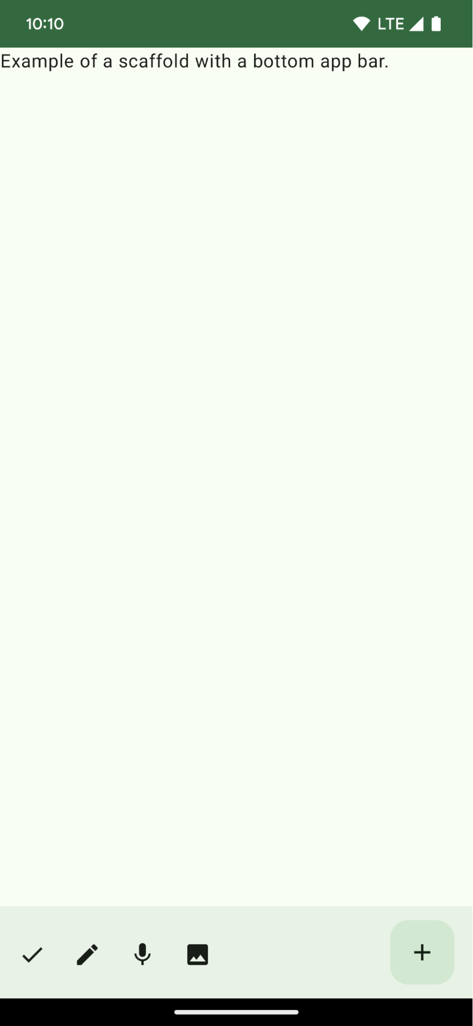
Create a bottom app bar
Use the following code to create a bottom app bar containing four icon buttons, and a floating action button:
@Composable fun BottomAppBarExample() { Scaffold( bottomBar = { BottomAppBar( actions = { IconButton(onClick = { /* do something */ }) { Icon(Icons.Filled.Check, contentDescription = "Localized description") } IconButton(onClick = { /* do something */ }) { Icon( Icons.Filled.Edit, contentDescription = "Localized description", ) } IconButton(onClick = { /* do something */ }) { Icon( Icons.Filled.Mic, contentDescription = "Localized description", ) } IconButton(onClick = { /* do something */ }) { Icon( Icons.Filled.Image, contentDescription = "Localized description", ) } }, floatingActionButton = { FloatingActionButton( onClick = { /* do something */ }, containerColor = BottomAppBarDefaults.bottomAppBarFabColor, elevation = FloatingActionButtonDefaults.bottomAppBarFabElevation() ) { Icon(Icons.Filled.Add, "Localized description") } } ) }, ) { innerPadding -> Text( modifier = Modifier.padding(innerPadding), text = "Example of a scaffold with a bottom app bar." ) } }
Key points about the code
- An outer
Scaffoldthat has abottomBarset. - A
bottomBarimplementation that contains a list of actions. - Actions that are implementations of
IconButtonthat containIconfor image and content description text, each with anonClicklambda to perform these actions.
You can pass composables for the following key parameters:
actions: a series of icons that appear on the left side of the bar. These are commonly either key actions for the given screen, or navigation items.floatingActionButton: the floating action button that appears on the right side of the bar.
Collections that contain this guide
This guide is part of these curated Quick Guide collections that cover broader Android development goals:
Create a home screen scaffold
Find out how to use a standardized platform to build
complex user interfaces. The scaffold holds together different parts of
the UI, giving apps a coherent look and feel.
Display interactive components
Learn how composable functions can enable you to easily
create beautiful UI components based on the Material Design design
system.
Have questions or feedback
Go to our frequently asked questions page and learn about quick guides or reach out and let us know your thoughts.